ANLY482 AY2017-18T2 Group06 Analysis Finding Finals
Contents
- 1 DATA PREPARATION
- 2 TECHNICAL ANALYSIS: BOLLINGER BANDS & RELATIVESTRENGTHINDEX
- 3 TIME SERIES FORECASTING-ARIMA
- 3.1 ARIMA MODEL WITH MINUTES DATA
- 3.1.1 Decomposition Chart
- 3.1.2 The Autocorrelation Function Chart
- 3.1.3 The Partial Autocorrelation Function Chart
- 3.1.4 Lag Order 1 Deseasonal Chart
- 3.1.5 ACF Differenced Series
- 3.1.6 PACF Differenced Series
- 3.1.7 Model Residuals (Auto ARIMA)
- 3.1.8 Model Errors for other ARIMA models
- 3.1.9 Testing and Cross Validation
- 3.1.10 FORECAST OF ARIMA
- 3.1 ARIMA MODEL WITH MINUTES DATA
DATA PREPARATION
We configured a total of 4 functions to access our client’s brokerage platform, OANDA. These functions can retrieve/send data directly from the brokerage on demand through a live connection. Considerations put into deciding on these functions include:
• Retrieval of historical data from a chosen time period, with the latest possible date being ‘now’.
• Ability to choose the granularity of the data retrieved, ranging from minutes, daily to weekly.
• The specific financial instrument, currency pair, which we want to retrieve data on.
• Submission and modification of orders to the brokerage upon decision at the coding end for a buy/sell trading action.
The resulting functions to achieve all of the following considerations are below:
1. ActualPriceV20: Returns the current bid/ask price of the chosen currency pair
2. AccountInfoV20: Returns account information (balance, profit & loss)
3. AccountPositionsV20: Returns all open trade positions in chosen trading account
4. HisPricesV20: Returns the currency pair’s information according to parameters
TECHNICAL ANALYSIS: BOLLINGER BANDS & RELATIVESTRENGTHINDEX
For the currency pair of USD/JPY, we will be using BBs & RSI to predict currency price movements and deliver a trading action based on their analysis.
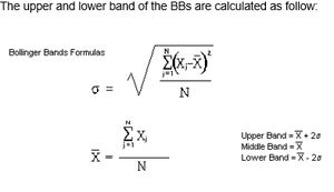
The BBs consist of two lines, 2 standard deviation from the center line which is a 20-day simple moving average of the prices. The widening and contraction of the bands directly relates to the increase and decrease of volatility respectively as standard deviation is a measure of volatility. One of the pattern analysis seen by many traders, including our clients, on BBs is a pattern when prices moves significantly closer to the bands, indicating an overbought or oversold situation in the market. This would be a situation where traders might consider selling in an overbought situation and buying in an oversold market.
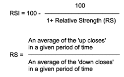
The Relative Strength Index (RSI) is a momentum indicator which compares the magnitude of the recent gain and loss over a specific period of time, to measure speed and change in price movements. The primary use of RSI is for identifying an overbought or oversold market.
BBs and RSI function from the TTR package were used with mins data from 3rd January 2017 to 4th January 2017. The day will be split into 4 quarters in order to better visualize the data for the Bollinger bands. Basic descriptive analysis are in each individual quarters. Thereafter, the Bollinger band width of the chart will be plotted to analyses the day, followed by the relative strength index section.
BBs Minute Data Analysis
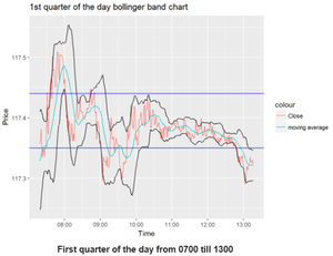
From 0800hours till 0930 hours, the market is more volatile from the +8gmt market opening hours. Forex traders tend to be active during market opening hours causing more volatility as they have information from the US market, affecting the prices of the currency. Hence, traders could take advantage of the situation. Volatility also decreases past 1030hours after the market stabilizes.
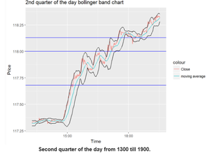
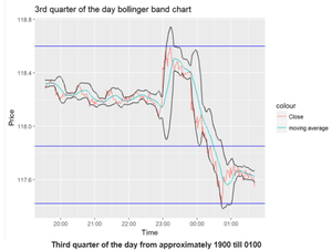
At 1500, there is a very strong uptrend which caused the price to spike from approximately 117.3 to approximately 118.2 at 1800hours.Whenever such strong uptrend or downtrend occurs, the price will touch the upper or lower bounds of the BBs respectively. Also, it can be noted that the bands expanded upon the strong uptrend occurring. Nearing the 1800hours at the approximate price of 118.1, the trend eventually reflects less volatility and the bandwidth decreases and eventually climbs to 118.3 at 2000hours.
The US market opens at 2000hours, a time usually marked with the highest trading volumes. The bands have a bigger bandwidth in this period compared to the previous 2 as seen from the difference in the Y axis across the charts. 2300hours marks the sharpest bullish trend in the day which reflects an approximate 0.6 increase in price in less than an hour. After 2300hours, the bandwidth eventually expanded to almost 1.0 in the next few minutes, signifying a period of extreme volatility. Thereafter, in the next hour after the peak, there was a reversal in the direction of the price. This is followed by a price drop to 117.6 at 0200hours the next day.
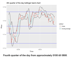
At 0200 hours, there was a minor drop of price from 117.5 to 117.3 with a reversal in the direction of the price followed by an increase to an approximate value of 117.6 for the rest of the day. However, the main takeaway is the difficulty in analysis with this chart alone. Hence, a plot for the BBs width will be done to analyze the volatility for the day.
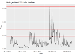
From the chart, BB width of the period from 8am to 1300hours is relatively low, below 0.002. From 1300, there are 4 occurrences of it exceeding 0.002. At 2300 hours, there is one huge spike from the chart exceeding 0.006 width and at 0000 hours. There is another huge spike observed in the chart followed by a decrease in volatility as time passes
RSI Minute Data Analysis
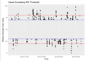
This plot shows the timestamps where the RSI is deemed as overbought or oversold. The red lines indicate an RSI upper limit of 80 and lower limit of 20 while the blue lines indicate RSI 70 and 30 respectively. Our focus is on the timings of overbought or oversold for potential entries. First point to note is that there are plenty of such occurrences in a minute tick data as the RSI is subjected to large spikes in price leading to false signals. Hence, we would use the values of 80-20.
BB & RSI ANALYSIS
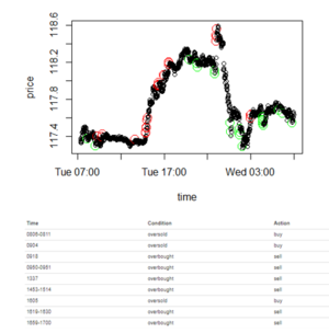
The plot above shows the recommended buy or sell based on the 2 technical indicators. The red circle on the chart represents an overbought situation and the recommended action will be selling at the indicated price. The green circle represents an oversold situation and the recommended action will be buying at the indicated price. The table shows the detailed time when the action should be taken, the condition identified by both technical indicators, and the recommended buy or sell trading action.
TIME SERIES FORECASTING-ARIMA
ARIMA analyses the autocorrelation within the price data to identify patterns within them, with the additional consideration for seasonality and making the data stationary by differencing. We chose ARIMA as it has better forecasting abilities base on our literature review and our technical analysis with BBs and Relative Strength Index (RSI) perform stronger in short time periods like the minute tick data. ARIMA relies on past values and is expected to work better than BBs and RSI for daily and weekly data. We will be performing ARIMA on 3 different sets of data: Minutes, Daily, Weekly
ARIMA MODEL WITH MINUTES DATA
The data is from 3rd January 2017 to 4th January 2017, first half of the day, extracted from the OANDA brokerage.
Decomposition Chart
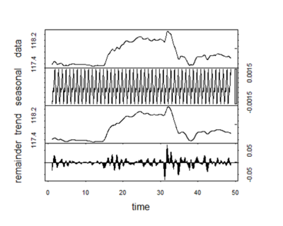
Based on the decomposition, there is a trend of frequent seasonality. In the decomposition, there are 48 cycles of seasons for the day data of 2nd to 3rd January 2017. It points out into a single season per 30 minutes in the day for the data of the USD/JPY currency pair, due to the popularity of using 30-minute chart with intraday trading. With such strong seasonality involved, we would be removing the seasonality by using the seasadj() function in R before proceeding to next step
The null hypothesis is that the unit root is present in time series, the alternative hypothesis is that it is stationary. The test statistic is -1.2466 which is not past the threshold of -2.87 with a 5% confidence level. Hence null hypothesis of unit root present in time series is not rejected. The function used above are from the forecast package: - seasadj:used to remove the seasonal component in a dataset. With the input being the data. - adf.test: To perform the Augmented Dickey-Fuller test for the null hypothesis of a unit root of a time series object.
The Autocorrelation Function Chart
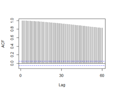
ACF is used to find the similarity of the observations with the lag of time inputted. The value of the lag 2 and above are likely because of the propagation of lag 1, meaning that the partial autocorrelation function should be used to confirm the lags. The function above is from the forecast package: - ACF: used to calculate the auto correlation function value of a dataset. input: moving average data
The Partial Autocorrelation Function Chart
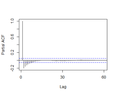
PACF is a conditional correlation. It is different from ACF with linear dependency with signal at shorter lags removed. Based on the PACF, the significant lag PACF value is for lag order 1, confirming the propagation of the lag. The function above is from the forecast package: - PACF: used to calculate the partial auto correlation function value of a dataset. input: moving average data
Lag Order 1 Deseasonal Chart
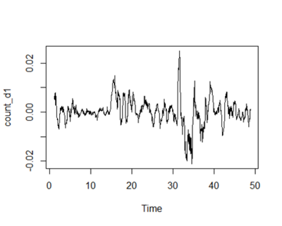
The chart shows a differencing of lag order 1 and stationarity can be observed. The function above is from the base package: - diff: returns the difference of the dataset. input: dataset and order of difference
ACF Differenced Series
The null hypothesis is that the unit root is present in time series, the alternative hypothesis is that it is stationary. In this case, the test statistic is -7.1651. Hence, the null hypothesis is rejected and alternative hypothesis of stationarity is accepted.
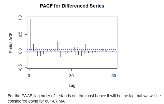
The graph has many values present that past the boundary. The value of lag 2 and above are likely due to the propagation of lag 1 and hence we will be relying on the partial ACF to determine the lags.
PACF Differenced Series
Model Residuals (Auto ARIMA)
The function is used with raw data. The auto. ARIMA suggests an ARIMA of ARIMA(1,2,0)(1,0,0)[30] model. The best model is selected from the following four: 1. ARIMA (2, d,2), 2. ARIMA(0,d,0), 3. ARIMA(1,d,0), 4. ARIMA(0,d,1). However, it does not mean that it is the ideal choice. Based on the PACF suggesting the AR value to be (1), we will be trying out a variety of models of ARIMA(1,1,0), ARIMA(1,1,1), ARIMA(1,1,2), ARIMA(1,1,3), ARIMA(1,2,1), ARIMA(1,2,2), ARIMA(1,2,3). The seasonal component suggests ARIMA of order (1,0,0) and we will be using that together while trying out other variants of ARIMA in the other segments. The ACF and the PACF functions illustrate good results in terms of not having any significant positive PACF or ACF values in any of the lag orders.
Model Errors for other ARIMA models
However, the default method of ARIMA of Maximum Likelihood are unable to compute ARIMA of order (1,2,1)(1,0,0) and ARIMA of order (1,2,3)(1,0,0). Alternatively, we could use sum of squares, but it does not generate the AICC, BIC and AIC values
Based on the figure above, ARIMA (1,1,3)(1,0,0) has the smallest AICC value at -16518.32 hence we will be selecting the model, in contrary from the auto ARIMA value. Our second smallest value for AICC is ARIMA(1,1,1)(1,0,0) which has a close AICc value at -16516.35
Testing and Cross Validation
To determine the performance of the model, we did a hold out and comparison to the actual values. It is done for both the selected choice of ARIMA(1,1,3)(1,0,0) and the one done by auto ARIMA function ARIMA(1,2,0)(1,0,0).
Means square error (MSE) is the difference between the actual results and the forecasted value. A smaller mean square error would indicate a higher accuracy for model fit.
From the chart, the forecast deviates slightly from the actual value. The calculated has a mean square error between the forecast and actual is 0.009882969. The function used above is from the forecast package:
forecast: used to forecast time series models based on the type of model used. input: model
The forecast deviates slightly from the actual value as seen above. The calculated has a mean square error between the forecast and actual is 0.08584668. Comparing both of the error, the order of ARIMA(1,1,3)(1,0,0) is selected as the mean squared error is lower. However, this is done for a whole day dataset and is not granular enough. Hence, we split the data into 1 hour sets to observe their individual holdouts.
We split the data into 1 hour sets to prepare the data to do holdout periods for individual hours. A holdout of 10% is done for all the hourly data. The plots and the mean squared error is calculated and shown below.
The mean squared errors with each individual hour of the day above are sorted in ascending order. The 7pm forecast has the lowest mean squared error while the 11pm had the highest.
FORECAST OF ARIMA
From the chart, it shows the forecast with ARIMA(1,1,3)(1,0,0). The forecast has a very small confidence interval range for 10 predictions from 117.5935 to 117.6301 for 80% confidence interval and 117.5838 to 117.6398 for 95% confidence interval. In this case, there is a prediction of the price going upwards for the next 10 minutes.
