Hiryuu Methodology
|
|
|
|
|
|
|
| Background | Data | Methodology |
|---|
Contents
Introduction
The main aim of this practicum is to give our sponsor an insight into the delivery patterns in the different countries managed, focusing on Australia and Japan as these 2 countries have posed the most problems. To do so we will first analyse the trends from 3 months worth of data using 3 main techniques, Exploratory, Time Series, and Geospatial.
With these analysis done, we hope to give our sponsors a clearer picture as to the reasons of failed deliveries so that it will aid the company in avoiding similar pitfalls in the future.
Objectives
There are 5 main objectives we aim to achieve:
- Understanding the patterns and trends across shipment routes in different countries
- Identify patterns such as the locations and timing for shipments with frequent issues
- Conducting time series analysis to determine the presence of seasonality in shipments
- Build a dashboard for single view of all data statistics for a particular country that can measure KPI easily. The sponsors we’re working with are focused on the marketing simplicity and efficiency only. The functions we hope to show includes the following:
Design Specification
- Showing data records of parcels picked up but not replied
- Show visual summary of shipments and current status
- View failed deliveries at a single glance and detailed breakdown at a single click, including track by reference number for both inbound and outbound
- Peak of the failure points when time series analysis
- Simple to understand bar charts and histograms that represents KPI
Multiple iterations of the dashboard will be conducted to increase the usability for our sponsor. We will conduct frequent feedbacks with our supervisor and sponsor to ensure that the dashboard is equipped with the data statistics and KPI most readily useful for the decision making.
Restrictions in Hong Kong
Due to the limitations in the postal code system in Hong Kong as well as the inconsistencies in recording addresses in the database, it is thus difficult for our team to conduct geospatial analysis until further data resolutions are conducted in the future.
Alternative Ways to Geocoding - Japan
Other than the postal code system in Japan, they also have a geocoding system known as the JIS Code (市区町村コード). Unlike postal codes that may see updates following changes in addresses and how postal codes may be assigned separately for the commercial entities beyond geolocation specifications, JIS codes are bound to the addresses by geolocation. JIS codes are also used as identifiers in geospatial data files for Japan unlike postal codes, allowing for greater convenience and compatibility in using them as an identifier.
The JIS code system is handled by Japan’s Ministry of Internal Affairs and Communications. The JIS code system assigns a unique number to identify a specific geolocation based on geographical classifications used in the country. For example, JIS code 131041 is Shinjuku ward of Tokyo. This makes it more compatible with geospatial data files such as shapefiles that tends to have polygons on the same level of detail. Hence we have used the JIS code for our geospatial analysis.
Determining Different End Points in a Shipment
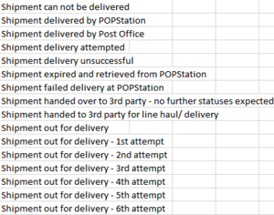
One major difference between App1 and App2 is the list of endpoints recorded for each system. App2 provides an advantage is having specific starting and ending points to a shipment. This thus allows the ease in calculating the turnaround time of a shipment in App2. However, with specific starting and ending points, this results in less flexibility in further understanding the process of a shipment. As such, this is incorporated into App1, which contains a list of stage codes in categorising an ending point.
However with flexibility, there exists complexity is easily identifying an endpoint or the first delivery attempt of a shipment and thus difficulty in calculating the turnaround time for a shipment as seen in figure 6. As such, our team have come up with the solution in providing flexibility for our sponsors in determining the endpoints for shipments from a check box provided in the dashboard. The dashboard takes into account the endpoints checked and calculates the turnaround time for each shipment from the start till the end.
Manipulating Different Data Systems
As mentioned and elaborated above in the differences in data structures for App1 and App2, we have thus created two separate dashboards to accommodate the differences. However, the reporting of the information and charts used will be same to provide consistency in data understanding for our clients.
Dashboard Design
In this section, we will explain our application design of the dashboard we have created to best fit the shipment data given to us by our sponsor. In this project, we have used R Shiny to create a dashboard to integrate the different insights we have gathered.
R Shiny is a web application framework for R, which allows us to turn our analyses done in R into interactive web applications that can be hosted on a server for easy access by our sponsors. Our choice of using R Shiny is because of its ease of use, and flexibility in integrating different types of charts, as well as it being open-sourced and free. Compared to other commercial platforms available, R Shiny would serve to be a more sustainable platform for our sponsors to use for that it is free and that no web development skills are required, making it easier for them to make changes to fit their situation. An interactive application would best fit the needs of the sponsors, for the easy usage with controls fit to their specifications would suit the needs of the sales team.
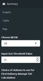
The full dashboard consists of the main body and the sidebar. The sidebar consists of filters and the navigation tabs for the main body. The main body displays the different data visualizations available, such as the graphs, the data tables and the geospatial map. We will explain the 4 main parts to our dashboard below, namely, the Filters, Summary and Graphs, Data table and Geospatial Map.
- Filters
To capture the flexibility in determining the start and ending points of a shipment, filters in the form of a check box have been created to allow our sponsors to set the start and end statuses according to their specifications to be taken into the calculation for the turnaround time. Additionally, an Inbound/Outbound (IB/OB) filter has been created to allow our sponsors to easily filter to those categories of shipments so that they can understand the situation of the shipments respectively.
- Graphs
Summary - Understanding of the Overall Situation
On the summary tab, 2 graphs are created to show an overview of the statuses of all the shipments for each country. These graphs have been filtered to either Inbound or Outbound shipments for clearer understanding of the shipment progress.
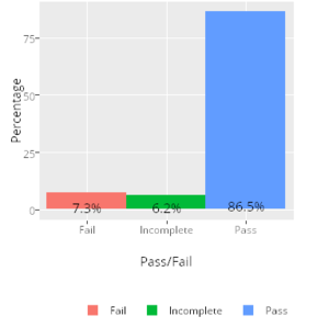
Figure 8 shows the distribution of all the shipments with regards to its status being “Pass”, “Fail” or “Incomplete”. The term “Pass” is referred to as having a turnaround time lesser than or equal to the stated SLA in our project. On the other hand, “Fail” would refer to having a turnaround time exceeding the SLA, and “Incomplete” refers to a shipment having a starting point but without any ending points hence cannot have its turnaround time calculated. This graph would allow our sponsors to easily understand the overall situation in a particular country, and to easily delve into shipments which have failed or are incomplete.
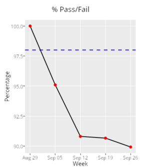
Figure 9 shows the percentage of shipments which have “Passed” for each working week. The x-axis shows the starting date of each week included in the data. The SLA threshold level is taken from an input, which allows our sponsors to tweak and adjust to the value desired instead of taking a static value. This graph thus gives a time series breakdown of the situation in each country.
Deeper Understanding of the Situation
The second tab of graphs provide a deeper understanding of the shipments in a specific country in providing more details on the shipment distribution performance.


