AY1516 T2 Team13 Natasha Studio Findings
| EXPLORATORY DATA ANALYSIS | OTHER ANALYSIS | DATABASE CREATION | ASSOCIATION RULE MINING |
|---|
Contents
Purchases Data
Exploratory data analysis allows us to better understand Natasha Studio business performance. As mentioned earlier, the purchase data between year 2010 to 2012 and year 2014 to 2015 will be analyzed separately due to the missing observations.
Price Packages
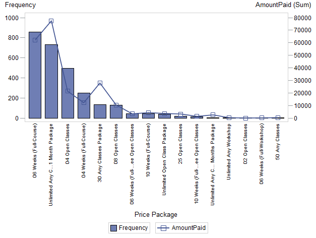
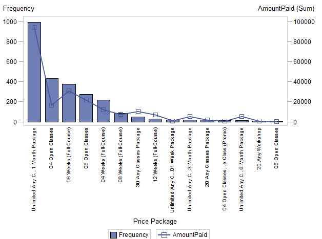
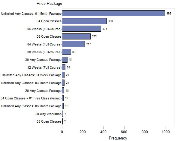
The graphs above show that the most popular package type between the year 2010 to 2012 and 2014-2015
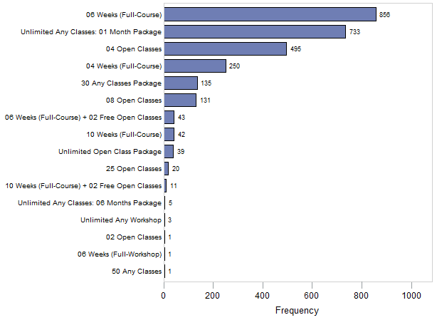
For 2010-2012, we can see that the “06 Weeks (Full-Course)” package, contributing to 31% of the package purchases at 856 purchases. The “Unlimited Any Classes: 1 Month” package follows closely behind at 26.5% of the total package purchases number, followed by “04 Open Class” package at 17.9% and “04 Weeks (Full-Course)” package at 9% of the total number of packages bought.
In contrast, frequency analysis for package purchase data for year 2014-2015 reveals that the “Unlimited Any Classes: 1 Month” became the most popular package, and contributes to 39.1% of the entire package sales at 992 packages. This is despite the fact that the 2010 – 2012 dataset span for a longer temporal duration, highlighting a dominant changing trend of “Unlimited Any Classes: 1 Month” package as a significant revenue contributor to Natasha Studio. In addition, the next popular packages are only half as popular compared to the “Unlimited Any Classes: 1 Month” package. The “04 Open Classes” package remains popular and contributes to a stable 17% of total packages bought. However, it can be observed that the “06 Weeks (Full-Course)” package is relegated to being the third most popular package, contributing to 14.7% of total packages bought, and the number of package purchased is less than half compared to 2010 – 2012 dataset.
Price Package Vs. Amount Paid
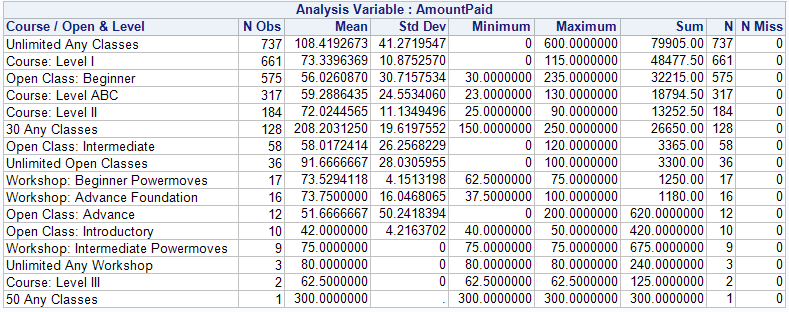
We observe that the most revenue generating package is the “Unlimited Any Classes: 1 Month” package, followed by the “06 Weeks (Full-Course)” in 2010 – 2012. A difference in minimum and maximum prices reflects the varying pricing decisions adopted by Natasha Studio for each package. Furthermore, those packages with minimum of $0 amount paid indicates promotional strategies, such as the “Buy 2 Free 1” promotion for the unlimited any class packages. Those packages included in the free bundle promotions are listed as $0 paid in the Purchase data. In addition, it could be observed in Figure 6 that the “Unlimited Any Classes: 1 Month” and the “30 Any Classes” package brings in a disproportionate amount of revenue for the number of such packages sold. Hence, this could indicate that retaining these two package types would be beneficial for Natasha Studio in terms of revenue gains.
Analyzing the 2014-2015 Purchase Data, the “Unlimited Any Classes: 1 Month” package is the greatest revenue generator for Natasha Studio. This phenomenon is likely caused by the large number of “Unlimited Any Classes: 1 Month “packages bought in 2014-2015. One interesting observation is that although the “06 Weeks (Full-Course)” package is the 3rd most popular package in terms of frequency, it is the 2nd highest revenue generator for Natasha Studio, followed by the “08 Open Classes” package which is ranked 4th in terms of frequency purchase. This indicates that for the same number of lessons, courses tend to generate more revenue. This observation might be related to the dance genre associated with the courses offered, and will be analyzed in later sections.
Course/Open & Level
Next, the summary statistics table in Table 18 indicates the difficulty levels associated with the classes. The 2010-2012 dataset reveals that Natasha Studio appeals to the beginner group of dancers, where the top 3 course difficulties levels are ABC, I and II. Similarly, beginner open class packages are the most popular package amongst the open class packages.
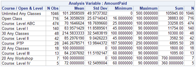
As mentioned previously, difficulty levels for open classes for year 2014-2015 are not available due to the nature of the hardcopy data records provided. Once again, it is observed that the lower level courses are more popular compared to those of higher difficulties. Furthermore, despite the larger number of open class packages sold, the total amount of revenue generated by courses packages is greater than open classes. This highlights the importance of offering course packages for Natasha Studio in order to reap revenue benefits.
Time series Analysis
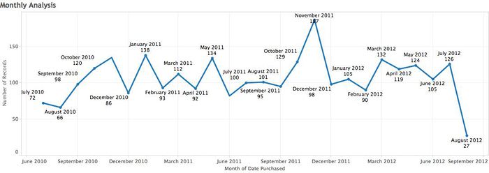
Lastly, running a time-series analysis for purchase packages reveals that there are no distinct seasonal time trend for particular package type in both 2010 – 2012 and 2014 – 2015 datasets
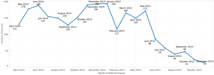
Yet, conducting time-series analysis for the total number of package purchased reveals indications of time trend relating to the package purchase behavior. Months such as November, December, May and June are observed to have higher sales than other months. This coincides with school holiday periods, hence indicating that a seasonal trend for package purchase does exist.
However, a worrying trend is observed in 2014-2015, where the later months of 2015 shows a clear declining trend in terms of the total number of packages bought. This data evidence indicates that Larry’s concern regarding Natasha Studio’s competitiveness and recent business performance are not unfounded. Hence, the team hopes that the data modelling provided in this project will assist Natasha Studio in their product offering.
Attendance Data
Genre
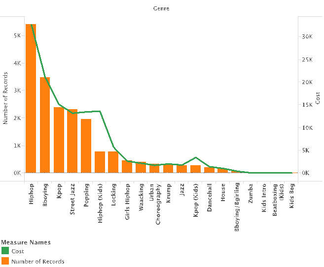
We can see that the most popular dance genre in Natasha Studio is Hiphop, followed by Bboying and Kpop (Note that not all of the genre was seen here, as some were hidden for a clear illustration purposes). However, after cost is added into the mix, even though Hiphop is the most popular and highest revenue generating class, the above graph highlights the profitability of Hiphop (Kids) classes despite having lesser classes. This better efficiency in revenue generation is due to the higher price charged for Hiphop (Kids) classes. Natasha Studio could consider increasing the level of these courses to improve its overall revenue generation
Course / Open & Level
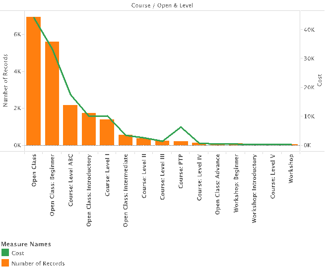
Natasha Studio is seen to be more focused on introductory level course and open classes. This is seen in the high frequency of Open Class: Beginner/Introductory as well as Course: Level ABC. Again, when adding cost to the mix, we get a more interesting picture. This above graph identifies “Course: PTP” has the best revenue generator per number of participants. Performance Training Programmes (PTP) are priced higher than traditional courses due to its higher level of performance and rigor expected from students.
Time Series Analysis
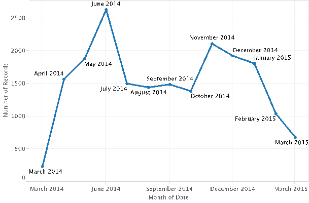
We can see that there is a seasonal monthly trend, with June and November being the more popular months. Once again similar to the observations in Purchase data, the higher attendance rate for lessons are likely due to school holidays. As students are less involved in school work, they are more likely to pursue non-academic interest and attend Natasha Studio’s dance classes.
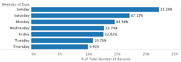
We can see that Saturday and Sunday is more popular likely due to it being the weekend. Thus, Natasha Studio should focus on holding more classes during Saturdays and Sundays to capture more of the market.
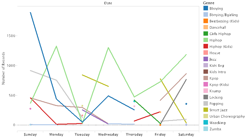
If we further break it down into genres, we are able to obtain greater insights. For instance, the two most popular genres, Bboying and Hiphop are shown to be popular on different days of the week. Bboying is most popular on Sunday, whereas Hiphop is most popular on Monday, Wednesday and Saturday . This is likely because Bboying and Hiphop are traditionally taught by 2 different set of instructors, who likely set different schedules.
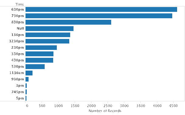
Evening time is also seen in Figure 19 to be the most popular. However, we also note a significant number of null data – 1,461 out of 19,712 records, is about 7.4% of the total dataset. Thus, there is as high a level of missing data. Even it if we recode all the null values into 830pm (3rd most popular), it still would not exceed the popularities of 630pm to 730pm. However, in light of our current project scope, we are leave this variable as it is, unless we decide to use it in our subsequent analysis.
Instructor
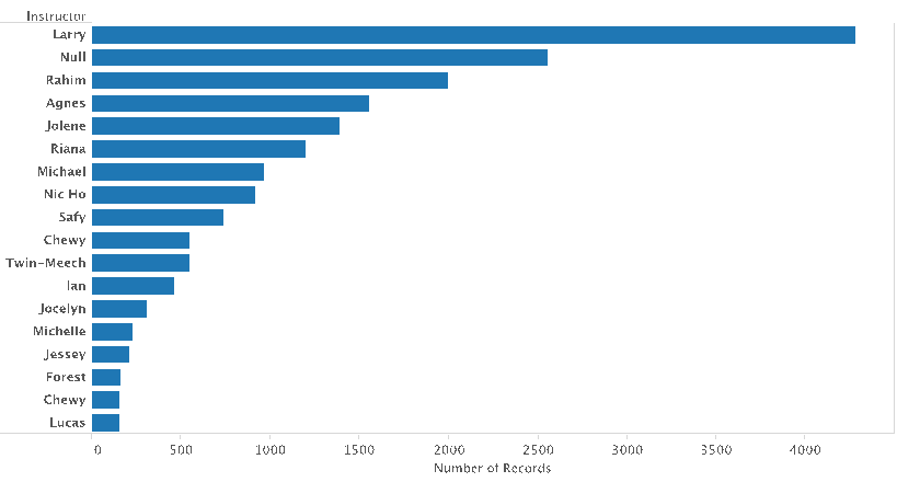 Larry, the owner is also observed to be the instructor that teaches the most number of members. However, we also note the high number of null data – 2,558 out of 19,712 records, 13% of the total dataset. Instructors are typically tied to the genres. Thus, for the purpose of our project, we are focusing on analyzing the attendance pattern by dance genre. Hence, in light of our project scope, we will leave this variable as it is, as we are likely to exclude this field in our further analysis.
