Difference between revisions of "AY1516 T2 Team SkyTrek Analysis"
| Line 139: | Line 139: | ||
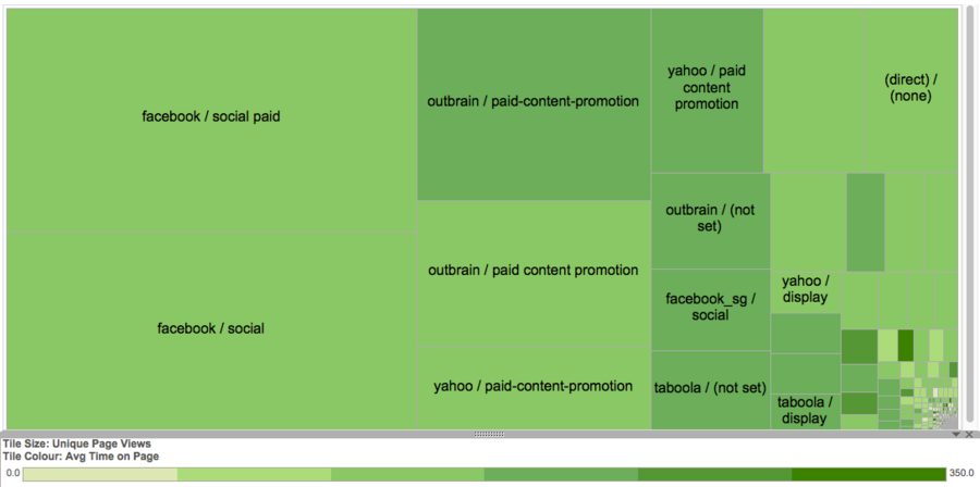
In order to look at the different paid sources and compare them, we conducted exploratory analysis using tableau charts. One such chart can be found above where each tile represents a traffic source. The tile size indicates the Unique Page views for the source while the colour represents the Average Time on page. This can help the client decide which paid source to use depending on whether she wants to focus on high traffic through page views or readership engagement through greater average time on page. | In order to look at the different paid sources and compare them, we conducted exploratory analysis using tableau charts. One such chart can be found above where each tile represents a traffic source. The tile size indicates the Unique Page views for the source while the colour represents the Average Time on page. This can help the client decide which paid source to use depending on whether she wants to focus on high traffic through page views or readership engagement through greater average time on page. | ||
</p> | </p> | ||
| − | |||
| − | |||
| − | |||
| − | |||
| − | |||
| − | |||
| − | |||
| − | |||
| − | |||
| − | |||
| − | |||
| − | |||
| − | |||
| − | |||
| − | |||
| − | |||
| − | |||
| − | |||
| − | |||
| − | |||
| − | |||
| − | |||
Revision as of 22:00, 17 April 2016
Content Theme Analysis
We had previously highlighted the 7 Content Themes (CT) Skyscanner believes its articles belong to. The aim of this analysis is 3 fold. To validate if these 7 CT are representative of the article content being written. To identify the top 3 CT with the greatest yield. Lastly, to understand the performance across each CT. As mentioned earlier, we will be measuring yield and performance by the metrics UVP and ATOP.
It was not going to be possible to read each and every single article in order to identify the various CT, hence verifying our client list of CT. Hence, we would employ the use of the K-means clustering algorithm to identify the latent groups of CT within our dataset.
Preparing the Dataset
Our database contains the html for each of the 399 articles hosted on Skyscanner Singapore’s travel news site. RapidMiner was used to clean this data. HTML tags were removed from the html content, leaving only the article content. The content was then tokenized, transformed to lowercase, filtered for stop words from the English dictionary, then filtered for tokens with character length between 3 and 41. Following which, a tf-idf matrix was generated for each every token in each article. Tf-idf was used because it accentuates the value of rare word in distinguishing an article from another, thereby augmenting our goal of discovering the latent CT.
Applying K-Means Clustering and Discovering more CT
In clustering, we seek to reduce the intra-cluster distance while maximizing the inter-cluster distance. The Davies Bouldin Index (DB) captures this information, with the ideal being a lower value. We see a general improvement in DB as the number of clusters (K) increases. From 70 clusters onward, this improvement starts to taper off significantly. This analysis is based on the article text content. Similar analysis was done on the article titles, and K = 20 was found to be a good value.
Validating the Representativeness of the 7 Identified CT
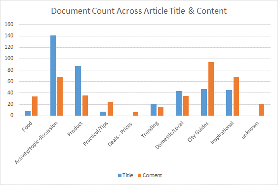
In the course of doing so, we found all 7 CT to be represented in the article. However, we felt it appropriate to generate 2 new CT, ‘Activity/topic discussion’ and ‘Food’ since they represented 17% and 8% of articles respectively. The following pie chart shows the proportion of each CT.

City Guides, Inspirational and Activity/topic discussion are the top 3 most represented CT at the moment.
There was a discrepancy in the CT allocation after we analyzed the results of both article text and article title.
Upon review of the series of decisions a reader makes in determining whether to invest time in reading the article, we have found article titles to have greater influence. If the title does not incite the reader to read the article, there would be no metrics to gather. Hence, we will focus ensuing recommendations based on the article title clustering.

Identifying the Top Performing 3 CT
Under UPV, City Guides, Trending and Food are ranked highest in descending order. Under ATOP, Inspirational, Food and Trending are ranked highest in descending order. It is interesting to note that only Food made it to the top 3 place across both metrics. The client has expressed her opinion that strong performance in both these fields would be a good indicator of high quality traffic since it is both able to get high viewership rates as well as sustain viewer interest in reading the article. Thus, Skyscanner might choose to focus its efforts on writing food articles.
Understanding each CT Performance (Z score)
We used the z-score to evaluate the relative performance of each CT against one another, represented in Figure 4 below. Taking the mean and the baseline for comparison, it is interesting to note that a CT that fares well in one metric tends to do badly in the other. ‘Food’, ‘Product’, ‘Trending’, ‘Domestic/Local’, ‘City Guides’ and ‘Inspirational’ are such CT. This negative correlation between UPV and ATOP is also represented in the correlation analysis done in Figure 5 below.
We would recommend Skyscanner direct more resources to the Food CT in view of its strong metric performance. Conversely, we would recommend to avoid the Product CT in view of its weak performance. However, if this was purposefully done for product brand awareness, another CT to avoid would be Inspirational Topics.
Organic Articles Dataset
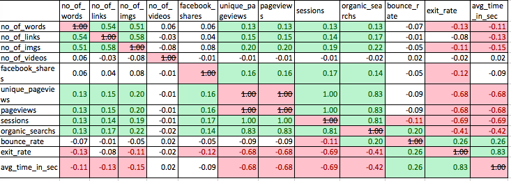
In order to understand the relationship between the target variables and other attributes of the dataset, we have considered running a regression analysis with UPVs and ATOM as the dependant variables. This method would be appropriate as the goal here is to understand the factors that can help predict the performance of a news article.Since most of the data is numerical in nature regression is an appropriate modelling method that will help determine the incremental impact of a unit increase in one variable on the target variables that define performance. Before conducting this, we ran a correlation analysis to check the relationship of the variables with each other, in order to prevent multicollinearity.
Correlation Analysis
Given this correlation matrix, some of the variables that are highly correlated can be removed, in order to prevent multicollinearity. Some examples of these are unique page views, page views and sessions. Since these are highly correlated, we can drop sessions and page views from the dataset for the regression model and use only unique page views. One interesting insight here is that the two target variables ‘Unique page views’ and ‘Average time on page’ are negatively correlated with a correlation coefficient of -0.68. This shows an inverse relationship and hence indicates that there might be a need to give up focus on one of these metrics in order to drive the other one up.
Regression Model Analysis
Since we have two dependant variables UPVs and ATOP, we will create two regression models. All other attributes in the dataset will be the independent variables. The goal here is to better understand the relationship between these attributes and the content performance attributes - UPVs and ATOP
Unique Page Views as Target Variable
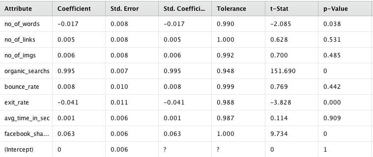
The first regression model, using UPVs as the dependent variable, gives us three attributes with p-value greater than 0.05, indicating that the coefficients can be used to predict the relationship with the dependant variable. At this stage we can drop the attributes that give us a high p-value(0.05). The three attributes that seem to have a relationship with UPV are:
- Organic Searches: An increase in organic searches leads to a positive increase in UPVs
- Exit Rate: An increase in exit rate leads to a negative change in UPVs
- Facebook Shares: An increase in Facebook shares leads to a positive increase in UPVs.
One issue with using these coefficients from these 3 attributes is the fact that they may not be in control of the client and hence cannot be considered ‘actionable’. Given that many of the other attributes do not have a predictive linear relationship with UPVs, it is possible that regression may not be the best approach to understand the performance of articles.
Average Time on page as target
The regression results show a high p-value (>0.05) indicating that the attributes in the model are not good predictors of average time on page and hence should be dropped. This again indicates that regression may not be the best approach to measuring the performance of these variables.
Conclusion
Our regression analysis has shown that from a business point of view that there is no particular attribute that tends to have a strong linear relationship with content performance. This indicates that there is no one ‘winning formula’ when it comes to designing an article, especially in terms of ‘changeable’ attributes such a number of images, links, total words and videos. While organic searches, facebook shares and exit rate did show a significant relationship with Unique Page views, these metric are not very ‘actionable’ meaning they will be difficult for the client to change in the short term, making the regression results not very impactful from a business point of view. This indicates that there might be move value in the qualitative nature ie Content themes and text analysis results in determining what makes a ‘high performing’ news article.
One interesting insight from the correlation matrix was that the two target variables ‘Unique page views’ and ‘Average time on page’ are negatively correlated with each other with a correlation coefficient of -0.68. This shows an inverse relationship and hence indicates that there might be a need to give up focus on one of these metrics in order to drive the other one up. This is an important question to consider from a business point of view.
Paid Source Dataset
Data Visualization and Exploration
In order to look at the different paid sources and compare them, we conducted exploratory analysis using tableau charts. One such chart can be found above where each tile represents a traffic source. The tile size indicates the Unique Page views for the source while the colour represents the Average Time on page. This can help the client decide which paid source to use depending on whether she wants to focus on high traffic through page views or readership engagement through greater average time on page.
Software Tools Assessment
We considered the pros and cons of 3 data analysis tools, namely RapidMiner, SAS Enterprise Miner (EM) and R. While EM offers greater visualization capabilities it is not necessary for our analysis. Considering that we only had 399 articles to deal with, each K-means clustering run (most expensive analysis) averages at a mere 7 minutes. Hence, it would not be reasonable to expect the client to invest in a license.
On top of the benefits of RapidMiner being a free open-source software, it has a wide selection of operators available for immediate and relevant use in our project. More specifically, they can be used for the ETL process in preparation for K-means clustering. RapidMiner is identified to be capable of accomplishing our project objectives at a lower learning curve and at no monetary cost, hence selected as our tool of choice.
| Software | Advantages | Disadvantages |
|---|---|---|
| RapidMiner |
|
|
|
SAS Enterprise Miner |
|
|
| R |
|
|


