Difference between revisions of "ANLY482 AY2017-18 T2 Group 17 Project Overview Methodology"
| Line 113: | Line 113: | ||
</p> | </p> | ||
[[File:ANLY482 Mosaic.jpg|500px|center]] | [[File:ANLY482 Mosaic.jpg|500px|center]] | ||
| + | </div> | ||
==<div style="background: #6A8D9D; line-height: 0.3em; font-family:helvetica; border-left: #466675 solid 15px;"><div style="border-left: #FFFFFF solid 5px; padding:15px;font-size:15px;"><font color= "#F2F1EF"><strong>Wilcoxon Test</strong></font></div></div>== | ==<div style="background: #6A8D9D; line-height: 0.3em; font-family:helvetica; border-left: #466675 solid 15px;"><div style="border-left: #FFFFFF solid 5px; padding:15px;font-size:15px;"><font color= "#F2F1EF"><strong>Wilcoxon Test</strong></font></div></div>== | ||
| Line 120: | Line 121: | ||
</p> | </p> | ||
| + | </div> | ||
Latest revision as of 13:07, 13 April 2018
| Background | Data | Methodology |
|---|
Data Preparation process
SMU Libraries provided us data logs with metadata, but minimal information was given regarding the information available within the URL column, which consists of many information needed for our analysis. Our observations found out that the URL column consists of information about database, type of document, document ID and chapter of e-book. When accessing each database, the URL generated for each page differs. As each database URL generated is different in structure and some information may be available for a database but lacking in another, resulting in a need for different data retrieval method.
In preparing the data, a 5-step systematic approach was formulated which consists of identifying URL patterns, deciphering the URL, classifying it based on relevancy, extracting data or filtering it out and lastly, transforming data to suit our analytical needs.
1. Identifying patterns
With the use of software, Charles Proxy, we attempt to replicate how the proxy log data is generated by browsing the database with the ‘Doc ID’ taken from the dataset and clicking on the various links available on the e-book. In doing so, we form expectations on the various interactions and map to the type of URL generated.When identifying common patterns in URL, the commonly used directory will be identified.
Non-Material Rows
Amongst the non-material rows identified, for the example above, ‘/assets/’ has been identified to be a common directory used.
Material Rows
For the material rows identified above, ‘/stable/’ is a common directory identified. But it differs because users are given the option to download the document or viewing the material online. For online view, the identifier would be the directory after ’10.XXXX/’ whereas for downloads, the identifier would be after ‘/pdf/10.XXXX/’.
2. Identifying patterns
For each of the sample URL extracted, it will be checked on the browser to see what the page loads.
Non- Material Rows
Material Rows
3. Identifying patterns
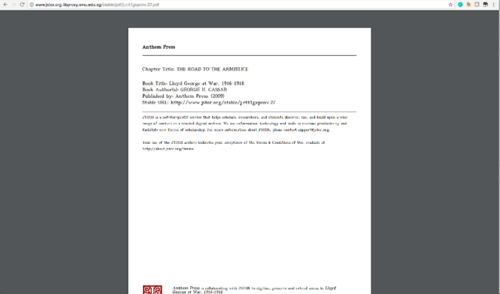
Judging on the content displayed, the URL accessed in the log will be deemed relevant for our analysis or not. For the non-material row result above, the logo of Jstor is displayed, suggesting that the ‘/assets/’ directory holds the images and styling files (CSS, JavaScript), which we would not need and therefore be classified as irrelevant. As for the material row result above, the content shown is the actual pdf file of the e-book which is useful for our analysis.
4. Identifying patterns
Based on the data relevancy, we will choose to extract the information to be a specific column or filter the entire record out of our analysis. In the instance of non-material rows, since all the URL with ‘/assets/’ directory are not needed in our analysis, it will be programmatically filtered out. While the material rows will be extracted for further transformation and analysis.
5. Identifying patterns
Data like timestamp will need to be transformed to suit the SQL’s standard of storing datatype datetime so that we can use functions for the datetime stored. Once data transformation is complete, sample checks are conducted on the cleaned data to ensure that the data is coherent before moving on to undergo exploratory data analysis (EDA).
Treemap
Treemap is an area based visualization that has existed for decades and were first used as a tool to visualize available storage capacity in large disk drives. The algorithm of treemaps stems from the idea of dividing screens into rectangles which its size representing some quantitative variable. The rectangles can be further broken down into sub-categories which showcases its hierarchical features. Being invented by Ben Shneiderman in 1990, treemapping has transformed from a basic visualization tool for managing disk storage to one that allows for monitoring of complex activities within organization with thousands of products (Shneiderman, 1998)
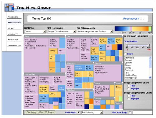
Besides the hierarchical structure, treemaps’ colour representation has also help ease the understandability of data. Treemaps can highlight issue of particular importance to users through its colour intensity which provides striking contrast against the average population. In the business context, usage of treemaps has been extensive. For instance, in 2006, iTunes uses treemapping techniques to visual the top-ranking songs across different genres with a colour coding system to represent its rising or declining popularity (Shneiderman, 2006) as seen in Figure below
As such, this shows how treemaps is especially useful when data has 2 quantitative variables which can be represented by its size and colour intensity respectively. The hierarchy structure also addresses space constraints issue in other tools such as multi-level pie chart if a large amount of data is needed to be visualize. Filtering features within treemaps also provides the ability to switch between a quick summary to a more detailed drilldown which focuses users’ attention to smaller subsets. In light of these features, treemapping techniques was chosen as a main tool to visualize SMU Library’s e-books purchases through PDA model.
Mosaic Chart
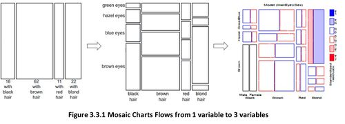
Similar to the treemaps, Mosaic charts (or Mosaic Plots) belongs to a category of visualization that emphasis part-to-whole relationship (Few, 2014). Mosaic charts were first introduced by Hartigan and Klenier in 1981 which was to be used in statistical graphics (Friendly, 2001). Subsequently, Friendly in 1994, made a slight modification which allow for colour and shade intensity within each rectangle to represent the pattern of association between each rectangle. As such an important feature of Mosaic chart is that it can allow for visualization of data which has beyond 2 variables as seen in Figure below
Wilcoxon Test
Wilcoxon test is a non-parametric statistical hypothesis test that allows for a comparison between two samples to be conducted. A non-parametric test is also known as a distribution-free test where assumptions on the distribution of data is not assumed. In the analysis, time-spent-per-chapter is heavily skewed towards the left where accesses were only for brief moments hence a Wilcoxon test is more appropriate than other parametric tests. While Wilcoxon test is similar to a dependent sample t-test, Wilcoxon test is more robust when distributions has a significant number of outliners or heavy tail distributions.


