Difference between revisions of "ANLY482 AY2017-18T2 Group19 Methodology"
| Line 1: | Line 1: | ||
<!--Logo--> | <!--Logo--> | ||
| − | + | [[Image:G19_Logo.png|center|800x150px]]<br> | |
<!--Navbar Start--> | <!--Navbar Start--> | ||
Revision as of 13:15, 24 February 2018
The usage of proxy browser by the users records their individual action as they search for the online course reserves they require. The usage of printed course reserves is recorded as the users borrow and return the books. Also, in-house usage of the books are recorded as the users return the books to the library counter instead of the book shelves.
These information will be provided by by the client.
The data will need to be transformed into the required formats using various techniques, such as rules and patterns technique, in order for us to perform the necessary processing later. Duplicates and irrelevant data will be removed.
JMP, Tableau and Javascript will be used for data exploration and visualization. We set out to design a dashboard that aims to answer the following questions:
- What proportion of the school is using the course reserve materials?
- Are all the course reserve materials fully utilized?
- When are the course reserve materials being utilized?
- Are we acquiring course materials that students are not using?
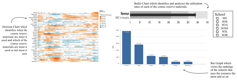
To start off, we would like a graph that is capable of visualizing usage over time. Given the immense number of course reserve materials available, we settled on horizon graphs which utilizes position and color to reduce vertical space while still fulfilling functionalities exhibited by a simple line graph. A horizon graph displays metric behavior over time in relation to a baseline. Ideally, with this graph, we will be able to identify when the course reserve materials are most in used and which of the course reserve materials are most in used or not most in used.
In addition, we require a graph that allows the users to easily identify if the single measure of interest pits well against a target value, and hence, we chose to visualize with bullet graphs. Bullet graphs are able to display those information like a bar graph without compromising on the amount of space required. The following picture demonstrates how the bullet graphs can be read:
With this, ideally, we will be able to identify and analyze the utilization rates of each of the course reserve materials.
On top of these, we will need the respective information on student users to supplement the analysis. The main fields of classifications of students remains in the schools they belong to. As such, for each course reserve material, we would like to visualize the background information on the students using these materials. Thereby, answering the first question of who is using these resources. To answer this question, we have chosen the simple bar graph, where we can easily see the rankings of the schools that uses the resource the most and so on.
Coupling above mentioned graphs with interactive filters and functionalities onto a dashboard, we aim to use the following dashboard to answer the above mentioned questions:


