Difference between revisions of "ANLY482 AY2016-17 T2 Group13 - Initial Visualizations & Findings"
Sfchua.2013 (talk | contribs) |
|||
| Line 100: | Line 100: | ||
<b>Overview of UK Imports to Singapore</b><br> | <b>Overview of UK Imports to Singapore</b><br> | ||
| − | [[File: | + | [[File:UK_Overview.png|500px]] |
The visualisation above shows us the overview of UK imports into Singapore. Both visualisations allow the user to look at UK imports. However, one looks at imports based on sector, and one looks at UK imports based on commodity. Under the hierarchy, sector is one aggregation level above commodity. On both treemaps, each quadrilateral represents a commodity/sector. The colour represents the percentage of market share of a particular commodity/sector with respect to the world while the size of the quadrilateral represents the market share of the commodity with respect to UK’s total exports to Singapore. The user can filter the treemap by year to see the change in exports by UK into Singapore and change in market share of Singapore’s imports from UK. | The visualisation above shows us the overview of UK imports into Singapore. Both visualisations allow the user to look at UK imports. However, one looks at imports based on sector, and one looks at UK imports based on commodity. Under the hierarchy, sector is one aggregation level above commodity. On both treemaps, each quadrilateral represents a commodity/sector. The colour represents the percentage of market share of a particular commodity/sector with respect to the world while the size of the quadrilateral represents the market share of the commodity with respect to UK’s total exports to Singapore. The user can filter the treemap by year to see the change in exports by UK into Singapore and change in market share of Singapore’s imports from UK. | ||
| Line 106: | Line 106: | ||
<b>Overview of World Imports to Singapore</b><br> | <b>Overview of World Imports to Singapore</b><br> | ||
| − | [[File: | + | [[File:World_Overview.png|500px]] |
The user can use the treemaps above show us the imports from all parts of the world into Singapore. Both visualisations allow the user to look at imports into Singapore. However, one treemap looks at it from the sector level while the other looks at it from the commodity level, where sector is one aggregation level above commodity in a hierarchy. Each quadrilateral represents a single sector/commodity of Singapore’s imports. The colour represents the trade value of a particular import into Singapore in US$ million while the size represents the number of countries that import a particular sector/commodity into Singapore. The user can filter the treemap by year to see that changes in number of countries importing a particular sector/commodity and the trade value of each sector/commodity. | The user can use the treemaps above show us the imports from all parts of the world into Singapore. Both visualisations allow the user to look at imports into Singapore. However, one treemap looks at it from the sector level while the other looks at it from the commodity level, where sector is one aggregation level above commodity in a hierarchy. Each quadrilateral represents a single sector/commodity of Singapore’s imports. The colour represents the trade value of a particular import into Singapore in US$ million while the size represents the number of countries that import a particular sector/commodity into Singapore. The user can filter the treemap by year to see that changes in number of countries importing a particular sector/commodity and the trade value of each sector/commodity. | ||
| Line 123: | Line 123: | ||
<div style="background: #dce6f9; line-height: 0.3em; font-family:Century Gothic; border-left: #003464 solid 15px;"><div style="border-left: #FFFFFF solid 5px; padding:15px;font-size:15px;"><font color= "#000000"><strong>Analysis by Selected Sector/Commodity</strong></font></div></div> | <div style="background: #dce6f9; line-height: 0.3em; font-family:Century Gothic; border-left: #003464 solid 15px;"><div style="border-left: #FFFFFF solid 5px; padding:15px;font-size:15px;"><font color= "#000000"><strong>Analysis by Selected Sector/Commodity</strong></font></div></div> | ||
| − | [[File:3. | + | [[File:3.2_Analysis_of_Country.png|500px]] |
*Country Market Share = Country Commodity / World Commodity | *Country Market Share = Country Commodity / World Commodity | ||
Revision as of 00:57, 23 February 2017
To create a set of initial visualisations of the data set, our group used Tableau. In the final product, we aim to reproduce a more seamless application through R, with the support capabilities of R Shiny.
Before creating individual visualisations, we first have to determine the navigation layout for the application. When considering this, we followed a single simple rule: start high and enable drill down. The goal would be to have an initial overview that is intuitive for a first time user to quickly determine what’s next in the dashboard, but let an experienced user can quickly determine if anything significant has changed since their last view. A seamless flow should also be established when navigating from one visualisation to another. To achieve this, a few iterations were created before reaching the final iteration.
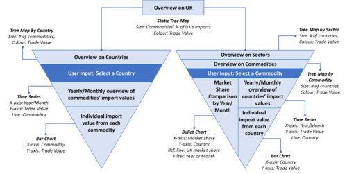
The first model we created focused providing a single initial overview of the UK as well as creating separate overviews on all commodities as well as all countries. Users then will be able to select a view of a single country or a single commodity.
The main weakness of this model was that it excluded details that would have encouraged further analysis. One example was that a slope graph could have been included in the overview to provide a high-level view of changes in country positions.
Furthermore, the separate views interrupted the flow of navigation of the dashboard, preventing a seamless flow.
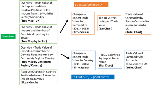
The next model created included more information in the main overview (green section), and still allowed users to dive deeper into a single sector/commodity (orange section) or a single country (blue section). The overview included separate treemaps which highlighted the performance of UK’s imports relative to the world imports, an overview of the imports by sectors as well as by countries. Furthermore, the absolute changes in position of each country by their import trade value was also included in the overview.
However, a flow between the UK overview and the other overviews still could not be established. This was because there was no link between the UK overview, which divided the imports by sectors, to the overview of imports by countries, which divided the imports by countries. Furthermore, the absolute changes in position of each country pertained to the total import trade value of every country, while the starting overview was only of the UK.
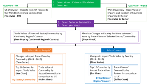
The final model was established in the 3rd iteration, where users will start either with an overview of UK’s imports and its performance relative to the world or with an overview of all imports from the world (green section). The imports will be divided into both sectors and commodities in these views.
Users can then dive deeper into what specific countries are importing a particular selected sector/commodity (purple section). This will also include a view of the changes in position of countries based on their import trade value of that particular sector/commodity.
Lastly, users are able to conduct further analysis based on that particular sector/commodity (orange section) or proceed to select a specific country to analyse (blue section).
There is a more discernible flow of navigation in this model. At each screen, users are able to make intuitive decisions on what variable they would like to focus on, and each decision made will lead to a screen that would answer their questions.
Overview of UK Imports to Singapore
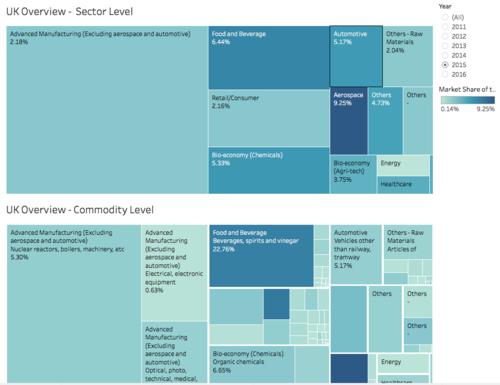
The visualisation above shows us the overview of UK imports into Singapore. Both visualisations allow the user to look at UK imports. However, one looks at imports based on sector, and one looks at UK imports based on commodity. Under the hierarchy, sector is one aggregation level above commodity. On both treemaps, each quadrilateral represents a commodity/sector. The colour represents the percentage of market share of a particular commodity/sector with respect to the world while the size of the quadrilateral represents the market share of the commodity with respect to UK’s total exports to Singapore. The user can filter the treemap by year to see the change in exports by UK into Singapore and change in market share of Singapore’s imports from UK.
Overview of World Imports to Singapore
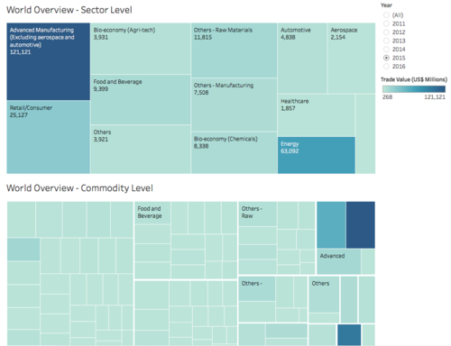
The user can use the treemaps above show us the imports from all parts of the world into Singapore. Both visualisations allow the user to look at imports into Singapore. However, one treemap looks at it from the sector level while the other looks at it from the commodity level, where sector is one aggregation level above commodity in a hierarchy. Each quadrilateral represents a single sector/commodity of Singapore’s imports. The colour represents the trade value of a particular import into Singapore in US$ million while the size represents the number of countries that import a particular sector/commodity into Singapore. The user can filter the treemap by year to see that changes in number of countries importing a particular sector/commodity and the trade value of each sector/commodity.
Selection of sector or commodity will lead to a view of all countries within the selected sector/commodity.
After choosing a particular commodity, the user will be able to view how the position of certain countries have changed with regards to their imports into Singapore. From the visualisation above, we can see a treemap on the left. The purpose of this treemap is to view the number of transactions in a particular year a country imports into Singapore based on the size of the quadrilateral. The colour of each quadrilateral on the treemap shows us the import value, in US$ millions, of the commodity in question.
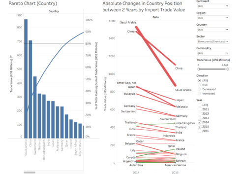
From there, the user can view the slop graph on the right to compare how each country’s imports, of a particular commodity, has changed between two years. The year filter allows the user to select any two years to see how a country’s position has changed. The commodity and sector filters allow the user to choose a particular sector/commodity that they want to analyse.
- Country Market Share = Country Commodity / World Commodity
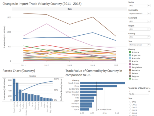
After filtering the dataset by sector and/or by commodity, we can look at the time-series graph above. This will allow us to look at the change in US$ trade value in millions of the sector/commodity into Singapore over the past five years.
From there we can use the bar graph in the bottom left corner to see top N countries that are importing a particular sector/commodity into Singapore. N can be determined by the filter on the right.
Then at the bottom right, the user will be able to see the top N countries that import the sector/commodity into Singapore based on market share. The user will also be able to compare the market share of that particular country to the market share of UK. N in this scenario can also be changed from the filter to the right.
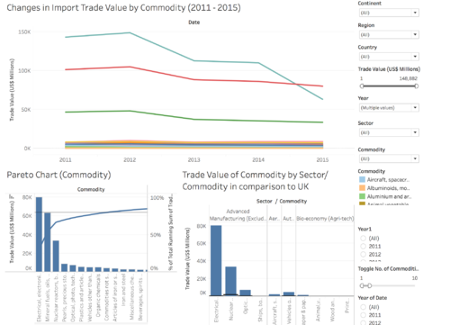
After looking at market shares of other countries in comparison to the UK, the user would want to see the other commodities the country is importing into Singapore. This can be done by looking at the visualisation above. The time series-graph allows the user to look at the change in imports of a particular commodity over the past five years for one particular country.
From there, the user can look at the bar graph on the bottom left to see the top 10 sectors based on US$ trade value(millions).
The bar graph on the bottom right shows the user the top N commodities imported into Singapore based on US$ trade value (millions).
