Difference between revisions of "ANLY482 AY2016-17 T2 Group19 Documentation"
| Line 43: | Line 43: | ||
</div><br> | </div><br> | ||
| − | =<div style="background: #4d4d4d; padding: 20px; line-height: 0.1em; text-indent: 10px; font-size:20px; font-family: Trajan Pro; border-radius: 7px; border-bottom:3px solid #ba3749"><font color= #ffffff> | + | =<div style="background: #4d4d4d; padding: 20px; line-height: 0.1em; text-indent: 10px; font-size:20px; font-family: Trajan Pro; border-radius: 7px; border-bottom:3px solid #ba3749"><font color= #ffffff>Interactive Visual Analytical Dashboard</font></div>= |
<div style="margin:0px; padding: 10px; background: #f2f4f4; font-family: Arial, sans-serif; border-radius: 7px; "> | <div style="margin:0px; padding: 10px; background: #f2f4f4; font-family: Arial, sans-serif; border-radius: 7px; "> | ||
1. User Interface Design | 1. User Interface Design | ||
| + | |||
| + | [[File:1st.png]] | ||
| + | Figure 1 | ||
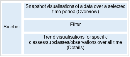
The Interactive Visual Analytical Dashboard (IVAD) presents transactional data in 3 main perspectives to provide a holistic view of the data: Geospatial, Product, Customer Type. This approach was based off the 5 Ws of information gathering, with geospatial relating to Where, product relating to What, Customer Type, relating to Who. Alongside with these 3 perspectives, a consistent underlying philosophy was taken to the UI design, following the Schneiderman’s Mantra: overview, zoom and filter, details on demand. This was implemented by creating 3 distinct portions in every perspective view: Snapshot, Filter, Trend. | The Interactive Visual Analytical Dashboard (IVAD) presents transactional data in 3 main perspectives to provide a holistic view of the data: Geospatial, Product, Customer Type. This approach was based off the 5 Ws of information gathering, with geospatial relating to Where, product relating to What, Customer Type, relating to Who. Alongside with these 3 perspectives, a consistent underlying philosophy was taken to the UI design, following the Schneiderman’s Mantra: overview, zoom and filter, details on demand. This was implemented by creating 3 distinct portions in every perspective view: Snapshot, Filter, Trend. | ||
Revision as of 14:10, 23 April 2017
Key Deliverables
Reports and Minutes will not be available due to client confidentiality
Interactive Visual Analytical Dashboard
1. User Interface Design
The Interactive Visual Analytical Dashboard (IVAD) presents transactional data in 3 main perspectives to provide a holistic view of the data: Geospatial, Product, Customer Type. This approach was based off the 5 Ws of information gathering, with geospatial relating to Where, product relating to What, Customer Type, relating to Who. Alongside with these 3 perspectives, a consistent underlying philosophy was taken to the UI design, following the Schneiderman’s Mantra: overview, zoom and filter, details on demand. This was implemented by creating 3 distinct portions in every perspective view: Snapshot, Filter, Trend. The Snapshot portion acts as an overview/navigation panel that takes the form of either a web-map or a tree-map, alongside with a simple bar chart/heatmap. The Snapshot portion utilises data from a selected time frame with two levels of data visualisations: a snapshot level relating to a certain time frame that is selected in the sidebar (overview) and displayed alongside trend information (detail) in the form as shown in Figure 1. This would be further elaborated below with regards to the various perspectives.

