Difference between revisions of "Twitter Analytics: Findings"
| (5 intermediate revisions by the same user not shown) | |||
| Line 104: | Line 104: | ||
In order to come up with this analysis, all the words are sorted in decreasing order and the top 20 words are chosen. Some of the most frequent words are mentioning IPhone and Iphone6 news. However as this is the raw data, words are not cleaned yet. To investigate words further, topic creation analysis will be explored in the next section | In order to come up with this analysis, all the words are sorted in decreasing order and the top 20 words are chosen. Some of the most frequent words are mentioning IPhone and Iphone6 news. However as this is the raw data, words are not cleaned yet. To investigate words further, topic creation analysis will be explored in the next section | ||
| − | + | </font></div> | |
==<div style="background: #000033; padding: 13px; font-weight: bold; text-align:center; line-height: 0.3em; text-indent: 20px;font-size:26px; font-family:Britannic Bold"><font color= #ffffff>Topic Creation</font></div>== | ==<div style="background: #000033; padding: 13px; font-weight: bold; text-align:center; line-height: 0.3em; text-indent: 20px;font-size:26px; font-family:Britannic Bold"><font color= #ffffff>Topic Creation</font></div>== | ||
<div style="margin:20px; padding: 10px; background: #ffffff; font-family: Trebuchet MS, sans-serif; font-size: 95%;-webkit-border-radius: 15px;-webkit-box-shadow: 7px 4px 14px rgba(176, 155, 121, 0.96); -moz-box-shadow: 7px 4px 14px rgba(176, 155, 121, 0.96);box-shadow: 7px 4px 14px rgba(176, 155, 121, 0.96);"> | <div style="margin:20px; padding: 10px; background: #ffffff; font-family: Trebuchet MS, sans-serif; font-size: 95%;-webkit-border-radius: 15px;-webkit-box-shadow: 7px 4px 14px rgba(176, 155, 121, 0.96); -moz-box-shadow: 7px 4px 14px rgba(176, 155, 121, 0.96);box-shadow: 7px 4px 14px rgba(176, 155, 121, 0.96);"> | ||
| Line 129: | Line 129: | ||
Based on 5 topics, there seem to be distinct topics emerging: | Based on 5 topics, there seem to be distinct topics emerging: | ||
<div align="center"> | <div align="center"> | ||
| − | [[Image: | + | [[Image:fap118a.png|500px]] |
</div> | </div> | ||
<h3> 4 Topics </h3> | <h3> 4 Topics </h3> | ||
<div align="center"> | <div align="center"> | ||
| − | [[Image: | + | [[Image:fap118.png|450px]] |
[[Image:fap119.png|500px]] | [[Image:fap119.png|500px]] | ||
</div> | </div> | ||
| Line 144: | Line 144: | ||
[[Image:fap121.png|500px]] | [[Image:fap121.png|500px]] | ||
</div> | </div> | ||
| + | |||
| + | If 6 topics are created, there seems to be a repeat in topic 3 and 5. Hence, 5 topics is deemed to be the best option to continue for the analysis | ||
| + | </font></div> | ||
| + | |||
| + | |||
| + | ==<div style="background: #000033; padding: 13px; font-weight: bold; text-align:center; line-height: 0.3em; text-indent: 20px;font-size:26px; font-family:Britannic Bold"><font color= #ffffff>Topic Comparison and Contrast</font></div>== | ||
| + | <div style="margin:20px; padding: 10px; background: #ffffff; font-family: Trebuchet MS, sans-serif; font-size: 95%;-webkit-border-radius: 15px;-webkit-box-shadow: 7px 4px 14px rgba(176, 155, 121, 0.96); -moz-box-shadow: 7px 4px 14px rgba(176, 155, 121, 0.96);box-shadow: 7px 4px 14px rgba(176, 155, 121, 0.96);"> | ||
| + | <font size =3 face=Georgia > | ||
| + | <h2> How does iPhone Tweets differ from Samsung Tweets?</h2> | ||
| + | <div align="center"> | ||
| + | [[Image:fap122.png|300px]] | ||
| + | </div> | ||
| + | Based on the analysis, Samsung tends to mentions about the Galaxy product and its price as compare to iPhone which talks about apps available for users to download. | ||
| + | |||
| + | <h2> How does iPhone Tweets similar to Samsung Tweets?</h2> | ||
| + | <div align="center"> | ||
| + | [[Image:fap123.png|300px]] | ||
| + | </div> | ||
| + | It seems that the common tweets are talking about the “new” product and also the available accessories for purchase such as “leather”, “case’, “ebay”. | ||
| + | If we clean the data further by removing the keywords of “leather”, “case”, “ebay”, “new”, the commonality cloud will change accordingly as below | ||
| + | |||
| + | <div align="center"> | ||
| + | [[Image:fap124.png|300px]] | ||
| + | </div> | ||
| + | In this, the common topics seem to be the chance of winning iPhone and the price surrounding the two brands. | ||
| + | </font></div> | ||
| + | ==<div style="background: #000033; padding: 13px; font-weight: bold; text-align:center; line-height: 0.3em; text-indent: 20px;font-size:26px; font-family:Britannic Bold"><font color= #ffffff>Time Series Analysis</font></div>== | ||
| + | <div style="margin:20px; padding: 10px; background: #ffffff; font-family: Trebuchet MS, sans-serif; font-size: 95%;-webkit-border-radius: 15px;-webkit-box-shadow: 7px 4px 14px rgba(176, 155, 121, 0.96); -moz-box-shadow: 7px 4px 14px rgba(176, 155, 121, 0.96);box-shadow: 7px 4px 14px rgba(176, 155, 121, 0.96);"> | ||
| + | <font size =3 face=Georgia > | ||
| + | In oder to understand tweets progress over time, time series analysis is explored to find insightful tweet’s pattern. | ||
| + | <h2> How does the Tweet volume varies overtime? </h2> | ||
| + | '''Iteration1:''' | ||
| + | <div align="center"> | ||
| + | [[Image:fap125.png|450px]] | ||
| + | </div> | ||
| + | |||
| + | Problem: | ||
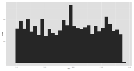
| + | * Chart difficult to see due to the proportion of the black graph. | ||
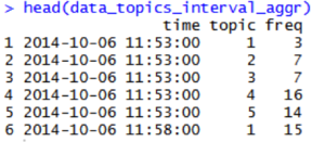
| + | * Aggregate time is unknown and default by R. | ||
| + | * Does not tell us about each topic evolution | ||
| + | |||
| + | <h2> How does the Tweet volume varies overtime? </h2> | ||
| + | '''Iteration2:''' | ||
| + | <div align="center"> | ||
| + | [[Image:fap126.png|300px]] | ||
| + | [[Image:fap127.png|650px]] | ||
| + | </div> | ||
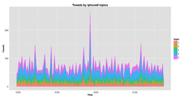
| + | We are able to see the proportion of each topic in the overall volume of tweets and in comparison with other topics. Topic 4 (“accessories”) tend to dominate the tweet volume. | ||
| + | |||
| + | Problem: | ||
| + | * What is shown is not absolute value. Hence it is difficult to deduce | ||
| + | * Unable to see whether there is a common pattern of tweet volume between topics | ||
| + | |||
| + | <h2> What is the volume of tweets for each topic over time? </h2> | ||
| + | '''Iteration3:''' | ||
| + | <div align="center"> | ||
| + | [[Image:fap128.png|650px]] | ||
| + | </div> | ||
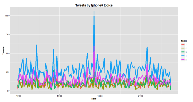
| + | The graph above shows us the absolute value of each topic over time. Topic 4 (“accessories”) tend to have a large volume of tweet follow by topic 5 (“App”) while the lowest is topic 2 (“Apple review”) | ||
| + | |||
| + | |||
| + | <h2> Is there any pattern of tweet volume among the topics?</h2> | ||
| + | <div align="center"> | ||
| + | [[Image:fap129.png|650px]] | ||
| + | </div> | ||
| + | The graph shows us the percentage of each tweet with the total volume. This gives us a clearer picture on the proportion of each topic with the tweet volume. It is again apparent that topic 4 (“accessories”) has the majority of the tweets. But it is interesting to see that most of the time, the topics follow a certain pattern and the proportion remains almost the same over time. | ||
| + | </font></div> | ||
| + | ==<div style="background: #000033; padding: 13px; font-weight: bold; text-align:center; line-height: 0.3em; text-indent: 20px;font-size:26px; font-family:Britannic Bold"><font color= #ffffff>Sentiment Analysis</font></div>== | ||
| + | <div style="margin:20px; padding: 10px; background: #ffffff; font-family: Trebuchet MS, sans-serif; font-size: 95%;-webkit-border-radius: 15px;-webkit-box-shadow: 7px 4px 14px rgba(176, 155, 121, 0.96); -moz-box-shadow: 7px 4px 14px rgba(176, 155, 121, 0.96);box-shadow: 7px 4px 14px rgba(176, 155, 121, 0.96);"> | ||
| + | <font size =3 face=Georgia > | ||
| + | <div align="center"> | ||
| + | [[Image:fap130.png|550px]] | ||
| + | |||
| + | </div> | ||
| + | '''Sentiment word list''' | ||
| + | |||
| + | Hu &Liu have published “opinion lexicon” which categorizes 6800 words into positive and negative and which can be downloaded | ||
| + | Positive: ''cool, great, good, amazing'' | ||
| + | Negative: ''sucks, awful, worst, nightmare'' | ||
| + | Add a few industry specific and/or especially emphatic terms | ||
| + | <div align="center"> | ||
| + | [[Image:fap131.png|350px]] | ||
| + | </div> | ||
| + | |||
| + | '''Score sentiment for each tweet''' | ||
| + | The scoring uses an algorithm which assigns a simple counting of the number of occurrences of “positive” and “negative” words in tweet. | ||
| + | To score all the brand, we just need to feed into score.sentiment() | ||
| + | <div align="center"> | ||
| + | [[Image:fap132.png|350px]] | ||
| + | </div> | ||
| + | |||
| + | '''Plot Histogram''' | ||
| + | <div align="center"> | ||
| + | [[Image:fap133.png|400px]] | ||
| + | </div> | ||
| + | Repeat the same procedure for Samsung and plot the histogram: | ||
| + | <div align="center"> | ||
| + | [[Image:fap134.png|400px]] | ||
| + | </div> | ||
| + | |||
| + | <h2> What about the extreme value? </h2> | ||
| + | Extreme value is defined as very positive (>2) and very negative (<-2) tweets: | ||
| + | <div align="center"> | ||
| + | [[Image:fap135.png|350px]] | ||
| + | </div> | ||
| + | Combine all the scores in one frame indicating their scores: | ||
| + | <div align="center"> | ||
| + | [[Image:fap136.png|350px]] | ||
| + | </div> | ||
| + | For each brand + code, let’s use the ratio of very positive to very negative tweets as the overall sentiment score for each brand | ||
| + | |||
| + | <div align="center"> | ||
| + | [[Image:fap137.png|350px]] | ||
| + | [[Image:fap138.png|350px]] | ||
| + | </div> | ||
| + | Based on the result, it seems that iPhone has better sentiment than Samsung | ||
| + | |||
| + | <div align="center"> | ||
| + | [[Image:fap139.png|400px]] | ||
| + | </div> | ||
| + | |||
| + | <h2> Is the analysis accurate? </h2> | ||
| + | To get a better understanding about the accuracy of the algorithm, the real customer satisfaction is compared. The data can be found in ACSI (America Customer Satisfaction Index) website. The data provides us the products from the both Samsung and iPhone. The average is taken to calculate the actual satisfaction index for the purpose of comparison. | ||
| + | <div align="center"> | ||
| + | [[Image:fap140.png|400px]] | ||
| + | </div> | ||
| + | '''Average:''' | ||
| + | Samsung = 80 | ||
| + | Iphone= 81 | ||
| + | |||
| + | Hence, iPhone has a better satisfaction index than Samsung which supports the findings in the algorithm. Although the difference between the two brands is small in ACSI as compared the algorithm, the ACSI data is reflects in May which differs from our tweeter data which targets the recent iPhone 6 launch. | ||
| + | |||
| + | </font></div> | ||
| + | ==<div style="background: #000033; padding: 13px; font-weight: bold; text-align:center; line-height: 0.3em; text-indent: 20px;font-size:26px; font-family:Britannic Bold"><font color= #ffffff>Social Network Analysis</font></div>== | ||
| + | <div style="margin:20px; padding: 10px; background: #ffffff; font-family: Trebuchet MS, sans-serif; font-size: 95%;-webkit-border-radius: 15px;-webkit-box-shadow: 7px 4px 14px rgba(176, 155, 121, 0.96); -moz-box-shadow: 7px 4px 14px rgba(176, 155, 121, 0.96);box-shadow: 7px 4px 14px rgba(176, 155, 121, 0.96);"> | ||
| + | <font size =3 face=Georgia > | ||
| + | In order to understand the how users interact with one another; a social network analysis is done with NodeXL as a free software. | ||
| + | |||
| + | <h2>Data Collection</h2> | ||
| + | Data is collected from NodeXL from with 8159 Twitter users (edges) and 19055 connections (vertices) from 5th November 2014 15:52:50 to 6th November 2014 01:36:01 (GMT 0). This is a different set of data used in the previous analysis. This is to validate whether there is similar pattern between the post on 6th October and 5th November (1 month apart) | ||
| + | |||
| + | <h2>Data Cleansing I</h2> | ||
| + | Data is cleaned to remove people who do not mention anyone or retweeted anyone in the group. Hence they are classified as disconnected. | ||
| + | |||
| + | After the first round of cleaning, 4556 vertices left for analysis which is suitable in terms of the data size for analysis. | ||
| + | |||
| + | <h2> Findings I </h2> | ||
| + | Tweets that contain brands often generated a network structure that differs from Polarized Crowd or Tight Crowd network communities. This cluster usually has low density and involves many isolated participants. Moreover, people who are likely to mention the brand will have no connection to other people who also mentions the brand. Public events, advertised products and also major news events are more likely to adopt this structure. | ||
| + | |||
| + | MNCs with certain products will have distinctive structure of conversation among people who mention them. The following Brand Cluster Twitter network features people with little connection to others who are tweeting about the same topic. In the iphone6 brand cluster in figure below, most of the users do not follow, reply to or mention any other users who tweeted the same topic about iphone6. There are a large proportion of them who share common attribute which mentions iphone6 in their tweet but they have little connection to one another. | ||
| + | |||
| + | <div align="center"> | ||
| + | [[Image:fap200.png|600px]] | ||
| + | </div> | ||
| + | # Iphone 6 has large number of disconnected groups and individuals who mention ‘iphone6’ but do not link to one | ||
| + | # Subgroups have limited interconnection between each other | ||
| + | # Some small interconnected groups of users form around Brands. | ||
| + | |||
| + | The network structure is common when a topic or term is widely known. Some smaller groups are visible in the network as seen in the right hand corner in the map above. These groups consist of users who discuss features and new releases of iphone6 with one another. | ||
| + | |||
| + | <h2>Data Cleansing II </h2> | ||
| + | In order to understand the network better, the data is cleaned further to include individuals that have total connection of in and out degree of more than 20. This is to ensure that only high traffic individuals are displayed. The number is derived by various iterations to find the optimal number of cut off as suggested in various NodeXl forums. | ||
| + | |||
| + | After the second round of cleaning, 27 vertices left. Moreover, further filtering is done to focus on the top 8 clusters from G1 to G8. | ||
| + | |||
| + | |||
| + | <h2> Findings II </h2> | ||
| + | By doing this, the interaction between the network are much more obvious for further analysis as shown in figure x below. | ||
| + | |||
| + | <div align="center"> | ||
| + | [[Image:fap201.png|600px]] | ||
| + | </div> | ||
| + | |||
| + | In this network, there is a small number of interaction between users and little commonality in terms of the material that is shared or even the resources attached to the tweets. | ||
| + | |||
| + | None of the URLs mentioned frequently in the largest groups in iphone6 network were mentioned in more than one group. The lack of repeating URL across groups suggest that these groups are distinct and focus on different aspects of the iphone6 experience as shown in the table below. | ||
| + | |||
| + | <div align="center"> | ||
| + | [[Image:fap202.png|600px]] | ||
| + | </div> | ||
| + | |||
| + | Users in the group also used differing hashtag in their conversation. Users in each group also made use of different hashtags in their tweets. The table below displays the frequently mentioned hashtags in the G1 and G6 groups in the iphone6 network. | ||
| + | |||
| + | <div align="center"> | ||
| + | [[Image:fap203.png|600px]] | ||
| + | </div> | ||
| + | |||
| + | This differing use of hashtags suggests that each group is devoted to a different conversation. Some discuss winning iphone6 contest while some talking about iphone6 as a holiday gift. | ||
| + | |||
| + | Interestingly although some groups are obviously a competition to win iphone either by retweeting or mentioning them in the tweet posts, these contests seem to target different group of users as we hardly see users cross tweeting to different contests. This suggests that users are not aware of similar tweets available. Moreover, users tend to be independent of each other as there are little interactions between nodes. | ||
| + | |||
| + | Influencers can also be found by accessing the “bridge” individuals. For example in G7, there is @omarsy who tweet an iphone 6 videos and soon be retweeted by others. Based on the figure below, the red dot shoes the first tweet between @omarsy and his friends which soon be replicated by others. Omarsy has 620,000 followers which explain his influence in the topic. | ||
| + | |||
| + | <div align="center"> | ||
| + | [[Image:fap204.png|400px]] | ||
| + | </div> | ||
| + | |||
| + | One of the prominent groups that emerged is G8 as the link shows an instagram address instead of other typical advertisement website. Upon investigation, the main interaction comes from @kayeofficial who is a youtube personality. A total of 84 retweets emerges from his announcement that he bought a new iphone6. The instagram posts itself generated 23.3k likes from his followers. | ||
| + | |||
| + | Comparing to the analysis earlier on using the wordcloud in R, similar topic emerges such as the winning of iphone and contest. However, there is no evidence on the new apps emerging or ebay seller indicated. | ||
| + | |||
| + | <h2> Further Refinement Using Smaller Data Sets </h2> | ||
| + | |||
| + | Another method to analyze the data is by breaking the data into smaller data sets to ensure that analysis can be done more efficiently in NodeXL. In this case, we are using 700 tweets. | ||
| + | |||
| + | The same data cleansing method is used such as removing the self-loop is done in the data for cleaner visualization. | ||
| + | |||
| + | In order to find user who are more active in tweeting, the outdegree (the number of outdegree edges from the node) values will be investigated. | ||
| + | |||
| + | The vertex opacity is based on the outdegree value to see the influencers. | ||
| + | |||
| + | <div align="center"> | ||
| + | [[Image:fap205.png|600px]] | ||
| + | </div> | ||
| + | |||
| + | Based on the analysis, @babagrlshell seems to have the most post in terms of outdegree. Hence, it is important to check the type of post that is generated by the user which is shown below. | ||
| + | |||
| + | <div align="center"> | ||
| + | [[Image:fap206.png|600px]] | ||
| + | </div> | ||
| + | |||
| + | Upon investigation, it seems that the user is spamming on promoting the contest that it owns. Hence, it is not a legit influencer user. | ||
| + | |||
| + | The next step is to look at the value of indegree (the number of incoming edges to the node) which can help us distinguish popular users who gets retweeted or mentioned often. | ||
| + | The opacity is set based on the indegree values. | ||
| + | |||
| + | <div align="center"> | ||
| + | [[Image:fap207.png|400px]] | ||
| + | </div> | ||
| + | |||
| + | Based on the analysis, @aizatabd seems to have the most post in terms of indegree. Hence, it is important to check the type of post that is generated by the user which is shown below. | ||
| + | |||
| + | It seems that the tweets are legit as the retweeted posts seems to ask others on whether they want to buy new iphone6 as it launched or asking people on the winner of the iphone6 contest which seems to be happening. | ||
| + | |||
| + | <div align="center"> | ||
| + | [[Image:fap208.png|600px]] | ||
| + | </div> | ||
| + | |||
| + | The second user who seems to be prominent is @dopezilla. Based on the tweet content, it seems that many users seem to resonate his idea of the type of iphone6 that they wish to see. | ||
| + | <div align="center"> | ||
| + | [[Image:fap209.png|600px]] | ||
| + | </div> | ||
| + | |||
| + | <h2> Words Linkage </h2> | ||
| + | The next step is to find the relationship between words to figure out the type of words that is being used. The vertexes of words are generated based on the original tweets sentences. | ||
| + | |||
| + | <div align="center"> | ||
| + | [[Image:fap210.png|300px]] | ||
| + | </div> | ||
| + | |||
| + | With groupings and vertex label shown, the following graphs are generated: | ||
| + | |||
| + | <div align="center"> | ||
| + | [[Image:fap211.png|600px]] | ||
| + | </div> | ||
| + | |||
| + | Based on the result, the words are clustered by the language of the tweets such as Malay, English and Japanese. The results shows high interconnectedness among the words as there is a lot of edges in the graph. By doing this, we can identify which countries are actually participating in the conversation and probably proceed for further analysis. | ||
| + | |||
| + | Using the sugiyama clustering method, we are able to see the outlier topics which appear but with little correlation with other words. | ||
| + | |||
| + | <div align="center"> | ||
| + | [[Image:fap212.png|600px]] | ||
| + | </div> | ||
| + | |||
| + | In this example, there is a line of selfie style that appears on the right hand corner. Upon investigation, the original tweet is the below: | ||
| + | |||
| + | <div align="center"> | ||
| + | [[Image:fap213.png|400px]] | ||
| + | </div> | ||
| + | |||
| + | By knowing this outlier, company can know if any interesting topics emerge or potential negative comments starts to emerge. We can also see that there are 2 clusters that emerge from the topics. At the right was mostly English and Malay word which shows that they are interconnection while the Japanese tend to not use English. This knowledge will help companies who want to target different market with the appropriate language that they are comfortable with. In this case, Japanese market should use only Japanese words, while Malaysia or Indonesia can be mixed with English in terms of their wordings. Hence, a more targeted marketing will save cost and relate more to the customers. | ||
| + | |||
| + | </font></div> | ||
| + | ==<div style="background: #000033; padding: 13px; font-weight: bold; text-align:center; line-height: 0.3em; text-indent: 20px;font-size:26px; font-family:Britannic Bold"><font color= #ffffff>Suggestions</font></div>== | ||
| + | <div style="margin:20px; padding: 10px; background: #ffffff; font-family: Trebuchet MS, sans-serif; font-size: 95%;-webkit-border-radius: 15px;-webkit-box-shadow: 7px 4px 14px rgba(176, 155, 121, 0.96); -moz-box-shadow: 7px 4px 14px rgba(176, 155, 121, 0.96);box-shadow: 7px 4px 14px rgba(176, 155, 121, 0.96);"> | ||
| + | <font size =3 face=Georgia > | ||
| + | |||
| + | The client can suggests to the company on the same method of sharing which is by tagging and sharing. However, when a company is using social media to create viral content, it is advisable to set the requirement for the users to tag their friends. By doing this, the network will be larger and ripple effect can take place | ||
| + | |||
| + | Using the outdegree and indegree method, different type of users can be identified such as: | ||
| + | |||
| + | * Spammers: people who are contest owner or seller who tag users randomly and hence has high outdegree | ||
| + | * Influencers: people who have high indegree as their content are being shared. They are typically people who advertise such as celebrity or blogger. They are usually have high followers | ||
| + | * Brand advocates: may have the same characteristics as influencers but the content of their sharing is due to their satisfaction. They may have small followers. | ||
| + | |||
| + | According to Nielsen research, people who fall into Brand Advocates have 92% trust to their brand and more likely to recommend the product genuinely in long term. While influencers only have 18% of trust according to Forester Research Inc and they tend to be only in short term. | ||
| + | After users are identified, companies can strategize based on the followings: | ||
| + | * Spammers: Do nothing. Their presence is good to the brand as they are creating high desirability of the products to the customers. | ||
| + | * Influencers: Consider engaging their services. However, campaign management is needed to make sure the long term effect of the campaign. In engaging them, there is a need to carefully manage these stakeholders as bad experience can be detrimental due to their large size of followers | ||
| + | * Brand Advocates: Award them with small token or note to add more positive impression to the brand. Putting them in VIP group for events may be good as it is a small cost to the company and usually they are not motivated by monetary reward. | ||
| + | Coupled with the earlier sentiment analysis, we can target users who have negative reviews by pleasing them according to their needs. These unhappy customers will be a good brand advocates once their needs are met. | ||
| + | |||
| + | </font></div> | ||
| + | ==<div style="background: #000033; padding: 13px; font-weight: bold; text-align:center; line-height: 0.3em; text-indent: 20px;font-size:26px; font-family:Britannic Bold"><font color= #ffffff>Limitation</font></div>== | ||
| + | <div style="margin:20px; padding: 10px; background: #ffffff; font-family: Trebuchet MS, sans-serif; font-size: 95%;-webkit-border-radius: 15px;-webkit-box-shadow: 7px 4px 14px rgba(176, 155, 121, 0.96); -moz-box-shadow: 7px 4px 14px rgba(176, 155, 121, 0.96);box-shadow: 7px 4px 14px rgba(176, 155, 121, 0.96);"> | ||
| + | <font size =3 face=Georgia > | ||
| + | * The analysis is done using past data for analysis, the analysis needs to be reworked if new data is used. | ||
| + | * Difficult to find which one is the true influencer vs “noise” network especially the network looks the same and disconnected. | ||
| + | * Influencers and brand advocates are also difficult to identify depending on their content | ||
| + | * Small network may be important as it may goes bigger over time. Unfortunately, nodeXL is difficult to monitor over time | ||
Latest revision as of 12:47, 28 November 2014
Descriptive analysis
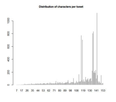
Characters per tweet
The mean and median of the character of the Tweet is around 120 characters while the maximum is 208 characters.
Based on research done by Buddy Media and Track Social, engagement rate is optimum at 100 characters in a tweet. Hence, companies should look into not only maximizing their tweet characters post but also the optimum of it.
http://blog.bufferapp.com/the-ideal-length-of-everything-online-according-to-science
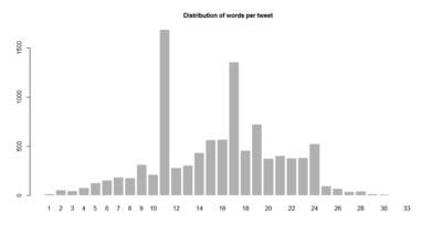
Words per Tweet
From the graph above, most users tend to tweet 11 words or 17 words. As this is the “usual” number of words of tweet, companies may want to look into following the same pattern.
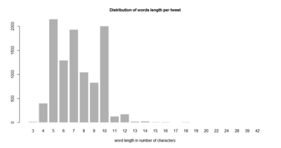
Length of Words per tweet
In each word, users tend to tweet words with five, seven and ten characters for their tweet.
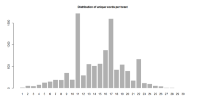
Unique Words per tweet
Users tend to tweet 11 or 17 unique words per tweet. If we compare with the distribution of words in a tweet, users tend to tweet 11 or 17 words. Hence, majority of them did not repeat any words in their tweet which resulted in high similarity. However, users also tend to have 22 unique words as compared to their 24 posted words. This may happened as the longer the tweet, the harder it is not to repeat any words, resulting in shorter unique words.
Distribution of Hashtag per tweet
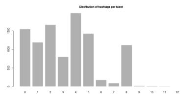
It is interesting to note of the hashtag popularity in twitter. From the figure above, we can observe that majority of the users have used at least one hashtag and as long as 8 hashtags in their post. Hence, it is important for companies to realize the importance of hashtag in ensuring that their posts can be grouped to increase the eyeball reach.
Mentions per tweet
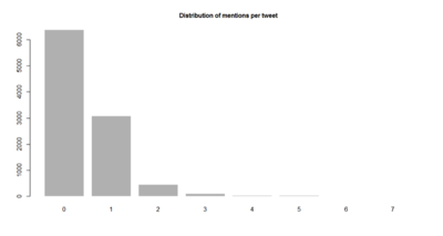
Although the users tend to use hashtag, retweet may not be popular in this particular Iphone tweets. Apple may want to promote a new marketing line in Twitter that will encourage people to retweet their posts which will increase their popularity.
Links per tweet
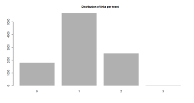
Users tend to have 1 link in their tweet. This may be due to the character limitations of Twitter and hence users tend to redirect their readers to another website to share more about their posts.
No of words vs Characters
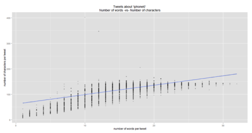
Data frame is used to create the relationship and plot in the graph using ggplot(). Based on the graph, we can see that there is a relationship between the number of words and the number of characters. However, the correlation value is 0.73 which may not be significant enough. This may due to people are using more words in their tweet to convey their message rather than lengthening their individual words. In order to verify the claim, we will investigate the number of words in tweet vs the length of the tweets
No of words vs Length of Words
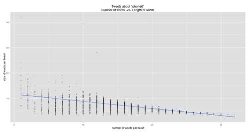
Based on the graph, there is a slight correlation (-0.624) between the number of words and the length. Hence, the longer the tweet, the shorter the words in it will be.
Lexical Diversity
Lexical diversity reflects the range of diversity in vocabulary used by the user in twitter. The insight can tell us how much word variety is there in the iphone tweet pattern. Lexical diversity is measured by the number of unique tokens/ number of total tokens.
Based on the result, there seems to be low lexical diversity in the iPhone tweets which may suggest that the topic of interest is highly common
20 Most Used Words
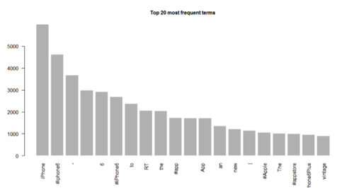
In order to come up with this analysis, all the words are sorted in decreasing order and the top 20 words are chosen. Some of the most frequent words are mentioning IPhone and Iphone6 news. However as this is the raw data, words are not cleaned yet. To investigate words further, topic creation analysis will be explored in the next section
Topic Creation
Frequent Terms
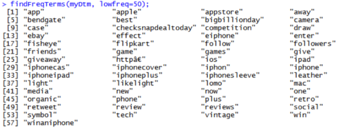
As the data has already been properly cleaned, frequent terms can be analyzed further. Firstly, the lowfreq is set into 50 which indicate the words that appear at least 50 times. The result is as below:
If we increase the rule to freq is at least 500, we are able to concentrate on a few words that may lead to topic creation of different topic such as “app”, “win”, and camera”
Topic Groupings
Topic creation is done using the algorithm to detect each word and grouped in based on the cluster that it belongs to. Various number of cluster (k) are tried to get the optimum number. Thereafter, the top 10 words in each topic are listed for analysis.
5 Topics
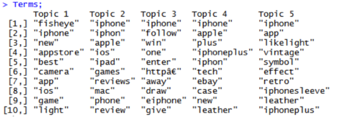
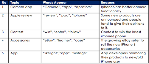
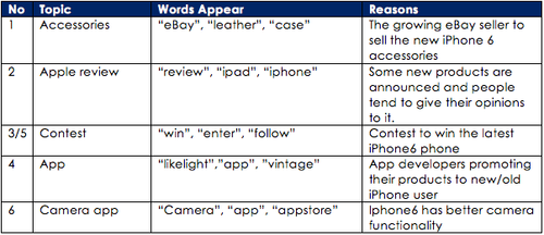
Based on 5 topics, there seem to be distinct topics emerging:
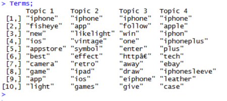
4 Topics
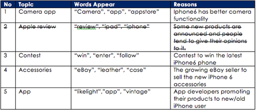
Most of the topic remains except the topic with Apple review. Since it is a fairly important independent topic, 5 topics are deemed to be more suitable and give more insight to the users. We will use 5 topics in for further analysis.
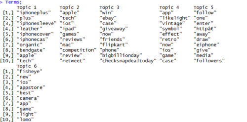
6 Topics
If 6 topics are created, there seems to be a repeat in topic 3 and 5. Hence, 5 topics is deemed to be the best option to continue for the analysis
Topic Comparison and Contrast
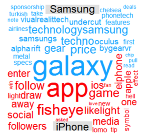
How does iPhone Tweets differ from Samsung Tweets?
Based on the analysis, Samsung tends to mentions about the Galaxy product and its price as compare to iPhone which talks about apps available for users to download.
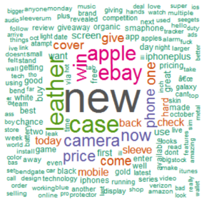
How does iPhone Tweets similar to Samsung Tweets?
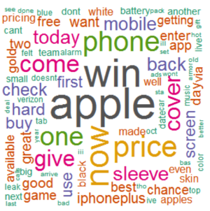
It seems that the common tweets are talking about the “new” product and also the available accessories for purchase such as “leather”, “case’, “ebay”. If we clean the data further by removing the keywords of “leather”, “case”, “ebay”, “new”, the commonality cloud will change accordingly as below
In this, the common topics seem to be the chance of winning iPhone and the price surrounding the two brands.
Time Series Analysis
In oder to understand tweets progress over time, time series analysis is explored to find insightful tweet’s pattern.
How does the Tweet volume varies overtime?
Iteration1:
Problem:
- Chart difficult to see due to the proportion of the black graph.
- Aggregate time is unknown and default by R.
- Does not tell us about each topic evolution
How does the Tweet volume varies overtime?
Iteration2:
We are able to see the proportion of each topic in the overall volume of tweets and in comparison with other topics. Topic 4 (“accessories”) tend to dominate the tweet volume.
Problem:
- What is shown is not absolute value. Hence it is difficult to deduce
- Unable to see whether there is a common pattern of tweet volume between topics
What is the volume of tweets for each topic over time?
Iteration3:
The graph above shows us the absolute value of each topic over time. Topic 4 (“accessories”) tend to have a large volume of tweet follow by topic 5 (“App”) while the lowest is topic 2 (“Apple review”)
Is there any pattern of tweet volume among the topics?
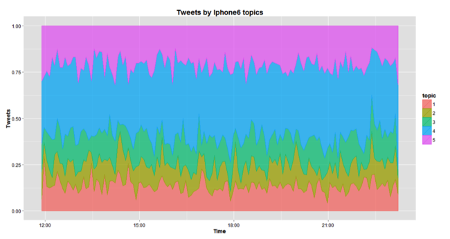
The graph shows us the percentage of each tweet with the total volume. This gives us a clearer picture on the proportion of each topic with the tweet volume. It is again apparent that topic 4 (“accessories”) has the majority of the tweets. But it is interesting to see that most of the time, the topics follow a certain pattern and the proportion remains almost the same over time.
Sentiment Analysis
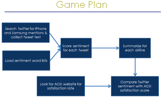
Sentiment word list
Hu &Liu have published “opinion lexicon” which categorizes 6800 words into positive and negative and which can be downloaded Positive: cool, great, good, amazing Negative: sucks, awful, worst, nightmare Add a few industry specific and/or especially emphatic terms
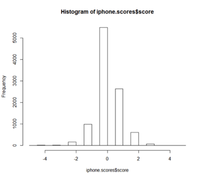
Score sentiment for each tweet The scoring uses an algorithm which assigns a simple counting of the number of occurrences of “positive” and “negative” words in tweet. To score all the brand, we just need to feed into score.sentiment()
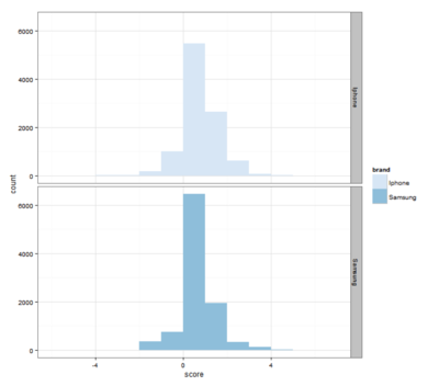
Plot Histogram
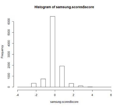
Repeat the same procedure for Samsung and plot the histogram:
What about the extreme value?
Extreme value is defined as very positive (>2) and very negative (<-2) tweets:
Combine all the scores in one frame indicating their scores:
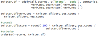
For each brand + code, let’s use the ratio of very positive to very negative tweets as the overall sentiment score for each brand
Based on the result, it seems that iPhone has better sentiment than Samsung
Is the analysis accurate?
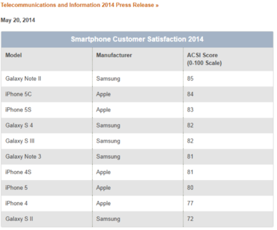
To get a better understanding about the accuracy of the algorithm, the real customer satisfaction is compared. The data can be found in ACSI (America Customer Satisfaction Index) website. The data provides us the products from the both Samsung and iPhone. The average is taken to calculate the actual satisfaction index for the purpose of comparison.
Average: Samsung = 80 Iphone= 81
Hence, iPhone has a better satisfaction index than Samsung which supports the findings in the algorithm. Although the difference between the two brands is small in ACSI as compared the algorithm, the ACSI data is reflects in May which differs from our tweeter data which targets the recent iPhone 6 launch.
Social Network Analysis
In order to understand the how users interact with one another; a social network analysis is done with NodeXL as a free software.
Data Collection
Data is collected from NodeXL from with 8159 Twitter users (edges) and 19055 connections (vertices) from 5th November 2014 15:52:50 to 6th November 2014 01:36:01 (GMT 0). This is a different set of data used in the previous analysis. This is to validate whether there is similar pattern between the post on 6th October and 5th November (1 month apart)
Data Cleansing I
Data is cleaned to remove people who do not mention anyone or retweeted anyone in the group. Hence they are classified as disconnected.
After the first round of cleaning, 4556 vertices left for analysis which is suitable in terms of the data size for analysis.
Findings I
Tweets that contain brands often generated a network structure that differs from Polarized Crowd or Tight Crowd network communities. This cluster usually has low density and involves many isolated participants. Moreover, people who are likely to mention the brand will have no connection to other people who also mentions the brand. Public events, advertised products and also major news events are more likely to adopt this structure.
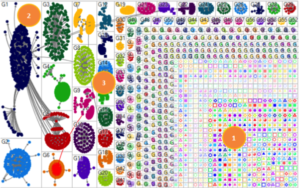
MNCs with certain products will have distinctive structure of conversation among people who mention them. The following Brand Cluster Twitter network features people with little connection to others who are tweeting about the same topic. In the iphone6 brand cluster in figure below, most of the users do not follow, reply to or mention any other users who tweeted the same topic about iphone6. There are a large proportion of them who share common attribute which mentions iphone6 in their tweet but they have little connection to one another.
- Iphone 6 has large number of disconnected groups and individuals who mention ‘iphone6’ but do not link to one
- Subgroups have limited interconnection between each other
- Some small interconnected groups of users form around Brands.
The network structure is common when a topic or term is widely known. Some smaller groups are visible in the network as seen in the right hand corner in the map above. These groups consist of users who discuss features and new releases of iphone6 with one another.
Data Cleansing II
In order to understand the network better, the data is cleaned further to include individuals that have total connection of in and out degree of more than 20. This is to ensure that only high traffic individuals are displayed. The number is derived by various iterations to find the optimal number of cut off as suggested in various NodeXl forums.
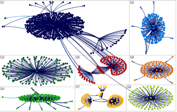
After the second round of cleaning, 27 vertices left. Moreover, further filtering is done to focus on the top 8 clusters from G1 to G8.
Findings II
By doing this, the interaction between the network are much more obvious for further analysis as shown in figure x below.
In this network, there is a small number of interaction between users and little commonality in terms of the material that is shared or even the resources attached to the tweets.
None of the URLs mentioned frequently in the largest groups in iphone6 network were mentioned in more than one group. The lack of repeating URL across groups suggest that these groups are distinct and focus on different aspects of the iphone6 experience as shown in the table below.
Users in the group also used differing hashtag in their conversation. Users in each group also made use of different hashtags in their tweets. The table below displays the frequently mentioned hashtags in the G1 and G6 groups in the iphone6 network.
This differing use of hashtags suggests that each group is devoted to a different conversation. Some discuss winning iphone6 contest while some talking about iphone6 as a holiday gift.
Interestingly although some groups are obviously a competition to win iphone either by retweeting or mentioning them in the tweet posts, these contests seem to target different group of users as we hardly see users cross tweeting to different contests. This suggests that users are not aware of similar tweets available. Moreover, users tend to be independent of each other as there are little interactions between nodes.
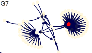
Influencers can also be found by accessing the “bridge” individuals. For example in G7, there is @omarsy who tweet an iphone 6 videos and soon be retweeted by others. Based on the figure below, the red dot shoes the first tweet between @omarsy and his friends which soon be replicated by others. Omarsy has 620,000 followers which explain his influence in the topic.
One of the prominent groups that emerged is G8 as the link shows an instagram address instead of other typical advertisement website. Upon investigation, the main interaction comes from @kayeofficial who is a youtube personality. A total of 84 retweets emerges from his announcement that he bought a new iphone6. The instagram posts itself generated 23.3k likes from his followers.
Comparing to the analysis earlier on using the wordcloud in R, similar topic emerges such as the winning of iphone and contest. However, there is no evidence on the new apps emerging or ebay seller indicated.
Further Refinement Using Smaller Data Sets
Another method to analyze the data is by breaking the data into smaller data sets to ensure that analysis can be done more efficiently in NodeXL. In this case, we are using 700 tweets.
The same data cleansing method is used such as removing the self-loop is done in the data for cleaner visualization.
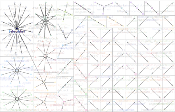
In order to find user who are more active in tweeting, the outdegree (the number of outdegree edges from the node) values will be investigated.
The vertex opacity is based on the outdegree value to see the influencers.
Based on the analysis, @babagrlshell seems to have the most post in terms of outdegree. Hence, it is important to check the type of post that is generated by the user which is shown below.
Upon investigation, it seems that the user is spamming on promoting the contest that it owns. Hence, it is not a legit influencer user.
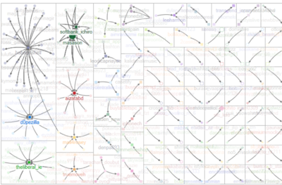
The next step is to look at the value of indegree (the number of incoming edges to the node) which can help us distinguish popular users who gets retweeted or mentioned often. The opacity is set based on the indegree values.
Based on the analysis, @aizatabd seems to have the most post in terms of indegree. Hence, it is important to check the type of post that is generated by the user which is shown below.
It seems that the tweets are legit as the retweeted posts seems to ask others on whether they want to buy new iphone6 as it launched or asking people on the winner of the iphone6 contest which seems to be happening.
The second user who seems to be prominent is @dopezilla. Based on the tweet content, it seems that many users seem to resonate his idea of the type of iphone6 that they wish to see.
Words Linkage
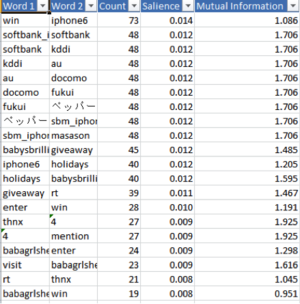
The next step is to find the relationship between words to figure out the type of words that is being used. The vertexes of words are generated based on the original tweets sentences.
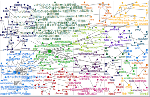
With groupings and vertex label shown, the following graphs are generated:
Based on the result, the words are clustered by the language of the tweets such as Malay, English and Japanese. The results shows high interconnectedness among the words as there is a lot of edges in the graph. By doing this, we can identify which countries are actually participating in the conversation and probably proceed for further analysis.
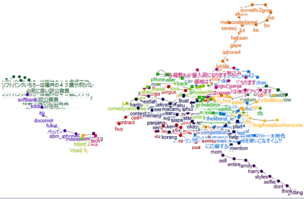
Using the sugiyama clustering method, we are able to see the outlier topics which appear but with little correlation with other words.
In this example, there is a line of selfie style that appears on the right hand corner. Upon investigation, the original tweet is the below:
By knowing this outlier, company can know if any interesting topics emerge or potential negative comments starts to emerge. We can also see that there are 2 clusters that emerge from the topics. At the right was mostly English and Malay word which shows that they are interconnection while the Japanese tend to not use English. This knowledge will help companies who want to target different market with the appropriate language that they are comfortable with. In this case, Japanese market should use only Japanese words, while Malaysia or Indonesia can be mixed with English in terms of their wordings. Hence, a more targeted marketing will save cost and relate more to the customers.
Suggestions
The client can suggests to the company on the same method of sharing which is by tagging and sharing. However, when a company is using social media to create viral content, it is advisable to set the requirement for the users to tag their friends. By doing this, the network will be larger and ripple effect can take place
Using the outdegree and indegree method, different type of users can be identified such as:
- Spammers: people who are contest owner or seller who tag users randomly and hence has high outdegree
- Influencers: people who have high indegree as their content are being shared. They are typically people who advertise such as celebrity or blogger. They are usually have high followers
- Brand advocates: may have the same characteristics as influencers but the content of their sharing is due to their satisfaction. They may have small followers.
According to Nielsen research, people who fall into Brand Advocates have 92% trust to their brand and more likely to recommend the product genuinely in long term. While influencers only have 18% of trust according to Forester Research Inc and they tend to be only in short term. After users are identified, companies can strategize based on the followings:
- Spammers: Do nothing. Their presence is good to the brand as they are creating high desirability of the products to the customers.
- Influencers: Consider engaging their services. However, campaign management is needed to make sure the long term effect of the campaign. In engaging them, there is a need to carefully manage these stakeholders as bad experience can be detrimental due to their large size of followers
- Brand Advocates: Award them with small token or note to add more positive impression to the brand. Putting them in VIP group for events may be good as it is a small cost to the company and usually they are not motivated by monetary reward.
Coupled with the earlier sentiment analysis, we can target users who have negative reviews by pleasing them according to their needs. These unhappy customers will be a good brand advocates once their needs are met.
Limitation
- The analysis is done using past data for analysis, the analysis needs to be reworked if new data is used.
- Difficult to find which one is the true influencer vs “noise” network especially the network looks the same and disconnected.
- Influencers and brand advocates are also difficult to identify depending on their content
- Small network may be important as it may goes bigger over time. Unfortunately, nodeXL is difficult to monitor over time
