Difference between revisions of "Improved Decisions for Ocean FreightsAnalysis"
Mmphang.2012 (talk | contribs) |
|||
| (13 intermediate revisions by 3 users not shown) | |||
| Line 48: | Line 48: | ||
|} | |} | ||
| − | |||
<br /> | <br /> | ||
| Line 55: | Line 54: | ||
[[Improved_Decisions_for_Ocean_Freights|<span style="color:#ffffff"><strong>Underutilization could possibly be due to danger of goods involved</strong></span>]] | [[Improved_Decisions_for_Ocean_Freights|<span style="color:#ffffff"><strong>Underutilization could possibly be due to danger of goods involved</strong></span>]] | ||
|- | |- | ||
| − | |<br><center>[[File:UtilizationRatesByDangerOfGoods.jpg| | + | |<br><center>[[File:UtilizationRatesByDangerOfGoods.jpg|600px]]</center> |
We attempted to analyse if the danger level of the goods affected the choice of container. <br> | We attempted to analyse if the danger level of the goods affected the choice of container. <br> | ||
| − | The areas we looked into | + | The areas we looked into were: |
| − | :Percentage utilization by industry | + | :<li>Percentage utilization by industry |
| − | :Sum of transactions by industry, company to determine the significance of this factor<br> | + | :<li>Sum of transactions by industry, company to determine the significance of this factor<br> |
We can see from the graph above that 5 out of 6 industries underutilize the containers when dangerous goods are involved. However, we also realized that there are only 142 records of dangerous goods available, as compared to 82,649 records of non-dangerous goods. Due to the vast difference in numbers, we are not able to say with certainty that the danger level of the goods affects the ultimate container choice. | We can see from the graph above that 5 out of 6 industries underutilize the containers when dangerous goods are involved. However, we also realized that there are only 142 records of dangerous goods available, as compared to 82,649 records of non-dangerous goods. Due to the vast difference in numbers, we are not able to say with certainty that the danger level of the goods affects the ultimate container choice. | ||
| + | |} | ||
| + | |||
| + | <br /> | ||
| + | {| style="background-color:#ffffff; width:80%; font-family:Century Gothic; font-size:15px; margin: 3px auto 0 auto;" | | ||
| + | | style="background-color:#006600; ; color:#ffffff; text-align: center; border-top:solid #ffffff; border-bottom:solid #ffffff; width:50%; " | | ||
| + | [[Improved_Decisions_for_Ocean_Freights|<span style="color:#ffffff"><strong>Breakdown of average utilization by Industries for FCL and LCL</strong></span>]] | ||
| + | |- | ||
| + | |<br><center>[[File:AverageUtilizationByIndustry.jpg|600px]]</center> | ||
| + | |||
| + | <br>In the first part of our dashboard we provide first of all, an overall control via the use of an overview based on Industry. This analysis aims to help narrow down the focus to specific industries instead of tackling all of them at once. The impact of which might not be as large now because of the number of companies that we have, however in the event of more than a few companies, this drill down will provide more clarity in analysis. | ||
| + | |||
| + | Out of the 6 industries, it becomes apparent that, in the order of lowest utilization of FCL are: | ||
| + | :<li>Engineering | ||
| + | :<li>Technology | ||
| + | :<li>Energy | ||
| + | |||
| + | As such, we would suggest focusing on Engineering companies first. | ||
| + | |||
| + | |} | ||
| + | |||
| + | <br /> | ||
| + | {| style="background-color:#ffffff; width:80%; font-family:Century Gothic; font-size:15px; margin: 3px auto 0 auto;" | | ||
| + | | style="background-color:#006600; ; color:#ffffff; text-align: center; border-top:solid #ffffff; border-bottom:solid #ffffff; width:50%; " | | ||
| + | [[Improved_Decisions_for_Ocean_Freights|<span style="color:#ffffff"><strong>Percentage of total transactions against average percentage utilization of Engineering Companies using FCL</strong></span>]] | ||
| + | |- | ||
| + | |<br><center>[[File:TotalTransactionsAverageUtilizationEngineeringFCL.png|600px]]</center> | ||
| + | |||
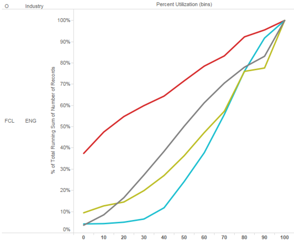
| + | <br>The second part of our analysis is the cumulative distribution graph. With this analysis, we want to help identify which company is the one that should be of greatest concern here. | ||
| + | |||
| + | The cumulative distribution graph shows us the percentage of transactions of a company that is below a certain utilization rate. For example in the above graph, the red company is of greater concern as a high proportion of their transactions have low utilization rates. | ||
| + | |||
| + | |} | ||
| + | |||
| + | <br /> | ||
| + | {| style="background-color:#ffffff; width:80%; font-family:Century Gothic; font-size:15px; margin: 3px auto 0 auto;" | | ||
| + | | style="background-color:#006600; ; color:#ffffff; text-align: center; border-top:solid #ffffff; border-bottom:solid #ffffff; width:50%; " | | ||
| + | [[Improved_Decisions_for_Ocean_Freights|<span style="color:#ffffff"><strong>Time Series Percent Utilization</strong></span>]] | ||
| + | |- | ||
| + | |<br><center>[[File:RemovedAnomalies.png|800px]]</center> | ||
| + | |||
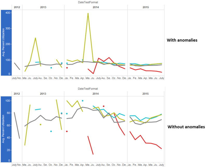
| + | For the top graph, some anomalies in the data are revealed and also implies wrong data around the month of June in 2013 and 2014 where percentage reached 400%, 3 times more than the limit of percentage utilization. During interims, to remove that dataset, we put a constraint on the axis such that only percentages between 0% and 100%, as can be seen in the bottom graph. For finals, we do not remove any datasets. Instead, we replace the anomalous data with the average percentage utilization of the whole dataset, so that we can keep the row of data. | ||
| + | |} | ||
| + | |||
| + | <br /> | ||
| + | {| style="background-color:#ffffff; width:80%; font-family:Century Gothic; font-size:15px; margin: 3px auto 0 auto;" | | ||
| + | | style="background-color:#006600; ; color:#ffffff; text-align: center; border-top:solid #ffffff; border-bottom:solid #ffffff; width:50%; " | | ||
| + | [[Improved_Decisions_for_Ocean_Freights|<span style="color:#ffffff"><strong>Carbon Emissions</strong></span>]] | ||
| + | |- | ||
| + | |<br><center>[[File:Carbon1.PNG|800px]]</center> | ||
| + | |||
| + | In this treemap, the larger boxes indicate higher total carbon emissions. There are different boxes for the same company for emissions in different years. | ||
| + | |||
| + | <br><center>[[File:Carbon2.PNG|600px]]</center> | ||
| + | |||
| + | Over here, we plot the carbon emissions against the number of transactions. In addition, there is a straight line that represents the function y=f(x) where y is the average amount of carbon emitted for the selected industry for x number of transactions. In this visualization, users can clearly see that companies AUTO-1 and AUTO-4 are polluting higher than the average, regardless of the number of transactions they have while companies DAIMLR and GOODYR are polluting less than average. | ||
| + | |||
| + | |} | ||
| + | |||
| + | <br /> | ||
| + | {| style="background-color:#ffffff; width:80%; font-family:Century Gothic; font-size:15px; margin: 3px auto 0 auto;" | | ||
| + | | style="background-color:#006600; ; color:#ffffff; text-align: center; border-top:solid #ffffff; border-bottom:solid #ffffff; width:50%; " | | ||
| + | [[Improved_Decisions_for_Ocean_Freights|<span style="color:#ffffff"><strong>Trade Lanes Profiling</strong></span>]] | ||
| + | |- | ||
| + | |<br><center>[[File:Tradelanes.PNG|800px]]</center> | ||
| + | |||
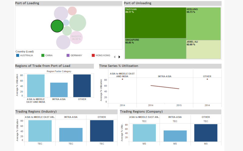
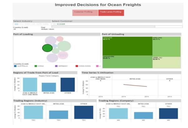
| + | In Trade Lanes Profiling, the ports, trading lanes and regions become the main focus of analysis. In this visualization, the larger the bubble, the more times that port has records of low percentage utilization of FCL containers. For chosen trade regions, the charts below are used to display information of the trade regions in terms of average percentage utilization at a very high level. The overall average utilization is shown on the top left and the time series is shown on the top right. We then provide another level of breakdown for the trade regions with a drill down by Industries in that region and the companies within those industries. This added layer again gives another angle to Customer Profiling as well, by identifying customers through the trade lanes they employ. | ||
| + | |||
| + | |} | ||
| + | |||
| + | <br /> | ||
| + | {| style="background-color:#ffffff; width:80%; font-family:Century Gothic; font-size:15px; margin: 3px auto 0 auto;" | | ||
| + | | style="background-color:#006600; ; color:#ffffff; text-align: center; border-top:solid #ffffff; border-bottom:solid #ffffff; width:50%; " | | ||
| + | [[Improved_Decisions_for_Ocean_Freights|<span style="color:#ffffff"><strong>Percent Groups</strong></span>]] | ||
| + | |- | ||
| + | |<br><center>[[File:Percentgroups.PNG|800px]]</center> | ||
| + | |||
| + | The charts here separate the data into quartiles for more in-depth analysis. For example, the stacked bar charts give more information that can otherwise be hard to read from the cumulative graph in the customer profiling dashboard. | ||
| + | |||
| + | |||
| + | |} | ||
| + | <br /> | ||
| + | {| style="background-color:#ffffff; width:80%; font-family:Century Gothic; font-size:15px; margin: 3px auto 0 auto;" | | ||
| + | | style="background-color:#006600; ; color:#ffffff; text-align: center; border-top:solid #ffffff; border-bottom:solid #ffffff; width:50%; " | | ||
| + | [[Improved_Decisions_for_Ocean_Freights|<span style="color:#ffffff"><strong>Boxplots</strong></span>]] | ||
| + | |- | ||
| + | |<br><center>[[File:Boxplots.PNG|400px]]</center> | ||
| + | |||
| + | We also provide box plots to complement the cumulative distribution graphs so that the distribution can be better understood. | ||
| + | |||
| + | |||
| + | |} | ||
| + | |||
| + | <br /> | ||
| + | {| style="background-color:#ffffff; width:80%; font-family:Century Gothic; font-size:15px; margin: 3px auto 0 auto;" | | ||
| + | | style="background-color:#006600; ; color:#ffffff; text-align: center; border-top:solid #ffffff; border-bottom:solid #ffffff; width:50%; " | | ||
| + | [[Improved_Decisions_for_Ocean_Freights|<span style="color:#ffffff"><strong>Cost Treemap</strong></span>]] | ||
| + | |- | ||
| + | |<br><center>[[File:Cost1.PNG|800px]]</center> | ||
| + | |||
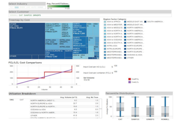
| + | In this visualization, the different colours represent the different trade routes and the size of the boxes indicate the total cost of all the transactions in that trade route for a specific company. | ||
| + | |||
| + | |||
| + | |} | ||
| + | |||
| + | <br /> | ||
| + | {| style="background-color:#ffffff; width:80%; font-family:Century Gothic; font-size:15px; margin: 3px auto 0 auto;" | | ||
| + | | style="background-color:#006600; ; color:#ffffff; text-align: center; border-top:solid #ffffff; border-bottom:solid #ffffff; width:50%; " | | ||
| + | [[Improved_Decisions_for_Ocean_Freights|<span style="color:#ffffff"><strong>FCL/LCL Cost Comparison</strong></span>]] | ||
| + | |- | ||
| + | |<br><center>[[File:Costwhatif.PNG|800px]]</center> | ||
| + | |||
| + | In order to convince companies to switch from FCL to LCL, one of the factors to consider is cost. For FCL transactions, the cost is calculated based on the number of TEUs purchased by the customer. On the other hand, the cost of LCL transactions is determined based on the volume. As such, it is important to determine the breakeven volume where LCL starts becoming more expensive than FCL. Unfortunately, we do not have cost data from DHL. To circumvent this issue, we allow users to input the cost per cubic metre for LCL transactions, and the cost per TEU for FCL transactions, by themselves before producing the analysis. | ||
| + | |||
| + | |||
| + | |||
| + | |} | ||
| + | |||
| + | <br /> | ||
| + | {| style="background-color:#ffffff; width:80%; font-family:Century Gothic; font-size:15px; margin: 3px auto 0 auto;" | | ||
| + | | style="background-color:#006600; ; color:#ffffff; text-align: center; border-top:solid #ffffff; border-bottom:solid #ffffff; width:50%; " | | ||
| + | [[Improved_Decisions_for_Ocean_Freights|<span style="color:#ffffff"><strong>Dashboard Design</strong></span>]] | ||
| + | |- | ||
| + | |<br><center>[[File:DashboardDesign.png|800px]]</center> | ||
| + | |||
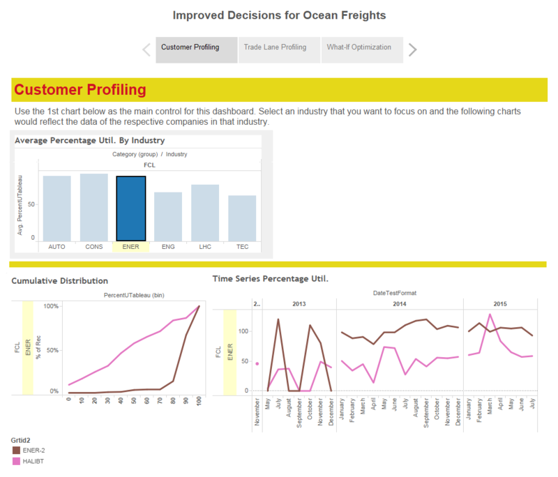
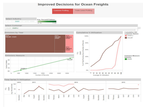
| + | This is the screenshot of our dashboard for the interims. During the interims, we imagined the dashboard to be in the form of a set of questions where each page will provide a suggestion for the answer to each question, then there would be three pages to the dashboard: | ||
| + | :<li>Customer Profiling | ||
| + | :<li>Trade Lanes Analysis | ||
| + | :<li>What-If Analysis | ||
| + | On each page of the dashboard, there will be a series of visualisations which will each provide a unique insight that are interrelated to provide the answer to the question. The above diagram depicts how we visualize how the various insights (Customer Profile) are interrelated. | ||
| + | |||
| + | Our final dashboard still has the same philosophy, just that we have removed the What-If Analysis page as we felt it would not provide effective insights. Here are screenshots of our final dashboards: <br/> | ||
| + | <br><center>[[File:Dashboard1.PNG|600px]]</center> | ||
| + | <br><center>[[File:Dashboard22.PNG|600px]]</center> | ||
| + | <br><center>[[File:Dashboard3.PNG|600px]]</center> | ||
| + | |} | ||
| + | |||
| + | <br /> | ||
| + | {| style="background-color:#ffffff; width:80%; font-family:Century Gothic; font-size:15px; margin: 3px auto 0 auto;" | | ||
| + | | style="background-color:#006600; ; color:#ffffff; text-align: center; border-top:solid #ffffff; border-bottom:solid #ffffff; width:50%; " | | ||
| + | [[Improved_Decisions_for_Ocean_Freights|<span style="color:#ffffff"><strong>Extra visualization</strong></span>]] | ||
| + | |- | ||
| + | |<br><center>[[File:Extra1.jpg|600px]]</center> | ||
| + | |||
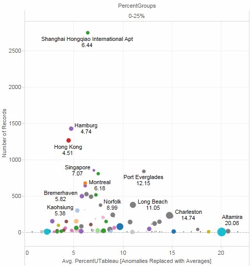
| + | After our final presentation, we had some feedback from our client and we made this visualization to address the feedback. In this visualization, different bubbles indicate different ports of load and the size of the bubbles indicate the amount of carbon emitted from transactions originating from that port. In addition, users can also look at the average percentage utilizations of transactions originating from that port as well as the total number of transactions. The visualization is filterable by percent groups. In the above example, only ports with utilization rates of 0 to 25% are shown. | ||
|} | |} | ||
Latest revision as of 20:05, 16 November 2015
|
No clear relationship between shipper country and utilization rate |
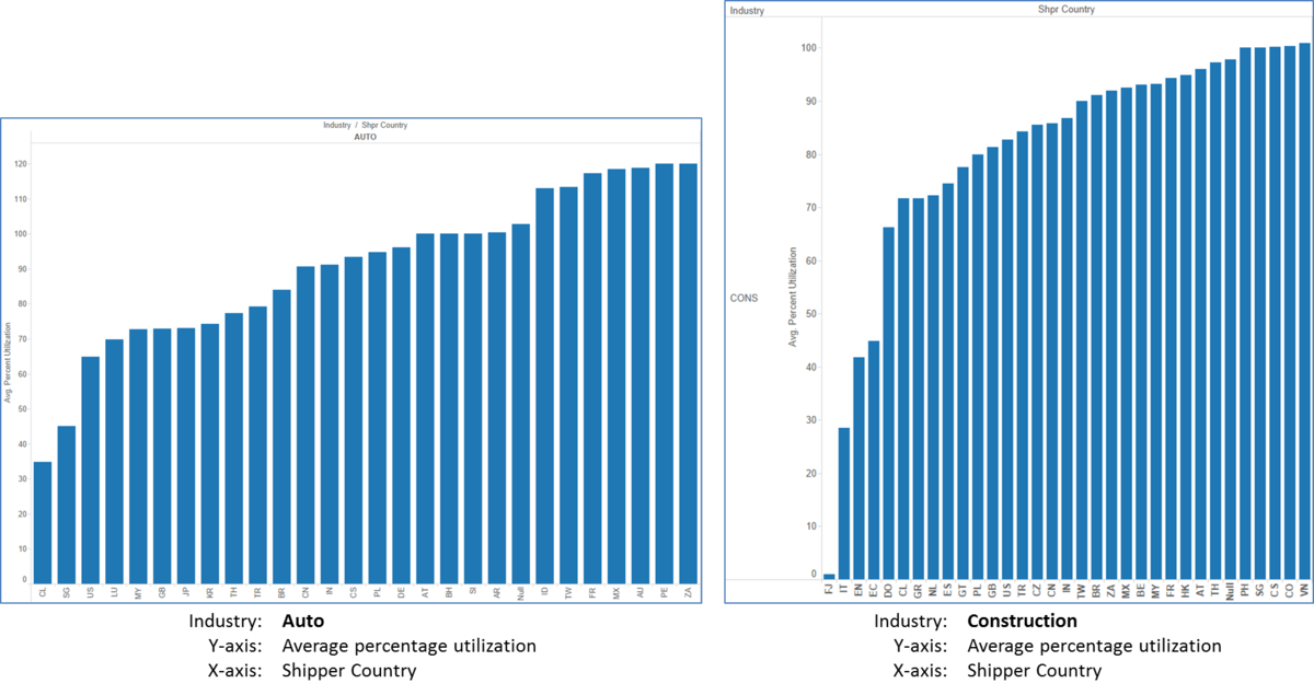 We see from the graph on the left that shipments originating from Chile, Singapore and the United States have the lowest utilization rates. However, we see from the graph on the right that shipments originating from Fiji, Italy and Estonia have the lowest utilization rates. As such, we are unable to see a clear relationship between the shipper country and utilization rates. |
|
No clear relationship between consignee country and utilization rate |
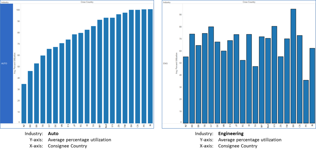 With the same X-axis and Y-axis, that is Consignee Country and Average Percentage Utilization, we realise that are no similar trends between the 2 graphs of different industries (auto industry and engineering industry).
|
|
Underutilization could possibly be due to danger of goods involved |
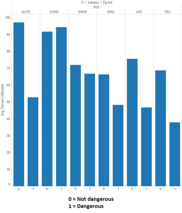 We attempted to analyse if the danger level of the goods affected the choice of container.
We can see from the graph above that 5 out of 6 industries underutilize the containers when dangerous goods are involved. However, we also realized that there are only 142 records of dangerous goods available, as compared to 82,649 records of non-dangerous goods. Due to the vast difference in numbers, we are not able to say with certainty that the danger level of the goods affects the ultimate container choice. |
|
Breakdown of average utilization by Industries for FCL and LCL |
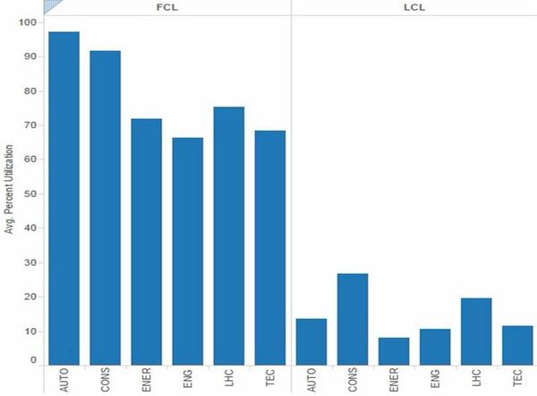
Out of the 6 industries, it becomes apparent that, in the order of lowest utilization of FCL are:
As such, we would suggest focusing on Engineering companies first. |
We also provide box plots to complement the cumulative distribution graphs so that the distribution can be better understood.
|
 In this visualization, the different colours represent the different trade routes and the size of the boxes indicate the total cost of all the transactions in that trade route for a specific company.
|
