Difference between revisions of "Hiryuu Analysis"
| Line 120: | Line 120: | ||
<center>Fig: Japan Percentage Pass</center> | <center>Fig: Japan Percentage Pass</center> | ||
| − | We observed that when a city had a high Percentage Pass rate of shipments, the neighbouring cities around it tended to have a higher Percentage Passing rate as well. To investisgate this further and determine if there indeed is a spatial correlation between patterns, we utilised Moran I. This spatial measure was more prominent in Australia and the results showed that there indeed was a spatial correlation between cities and their Percentage Passes as the | + | We observed that when a city had a high Percentage Pass rate of shipments, the neighbouring cities around it tended to have a higher Percentage Passing rate as well. To investisgate this further and determine if there indeed is a spatial correlation between patterns, we utilised Moran I. This spatial measure was more prominent in Australia and the results showed that there indeed was a spatial correlation between cities and their Percentage Passes as the Moran I statistic is above 0 (0.209107260475405). |
[[File:Moran au.JPG|300px|center]] | [[File:Moran au.JPG|300px|center]] | ||
Latest revision as of 12:27, 23 April 2017
|
|
|
|
|
|
|
| Data Preparation | Analysis |
|---|
Contents
Preliminary
Prior to the dashboard design, we got ourselves familiar with the data by performing basic exploratory analysis. This would help give us a clearer image as to the end product, the dashboard.
1. TAT across different countries
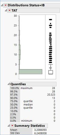
Although there are some datasets where the 90 percentile of the TAT is less than 3 days, there are some data sets where there were a huge proportion of failures.
One example is the dataset below which has a high value of 13 days for its TAT at the 90th percentile. This is an alarming number and should be flagged out for further in-depth analyis on the factors for failure.
2. Ending day of shipments
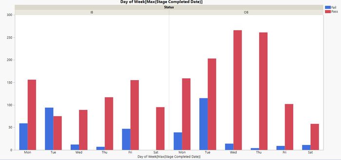
We have observed similar trends across various datasets in the failure rates for shipments ending on Monday and Tuesday.
An example of the distribution is shown below:
For outbound data, the reason for the higher failure rate might be the inavailability of customers over the weekends.
However, for inbound data, there is no conclusive reason as of now, and we will be clarifying with our sponsors.
Dashboard Design
In this section, we will explain our application design of the dashboard we have created to best fit the shipment data given to us by our sponsor. In this project, we have used R Shiny to create a dashboard to integrate the different insights we have gathered.
R Shiny is a web application framework for R, which allows us to turn our analyses done in R into interactive web applications that can be hosted on a server for easy access by our sponsors. Our choice of using R Shiny is because of its ease of use, and flexibility in integrating different types of charts, as well as it being open-sourced and free. Compared to other commercial platforms available, R Shiny would serve to be a more sustainable platform for our sponsors to use for that it is free and that no web development skills are required, making it easier for them to make changes to fit their situation. An interactive application would best fit the needs of the sponsors, for the easy usage with controls fit to their specifications would suit the needs of the sales team.
The full dashboard consists of the main body and the sidebar. The sidebar consists of filters and the navigation tabs for the main body. The main body displays the different data visualizations available, such as the graphs, the data tables and the geospatial map. We will explain the 4 main parts to our dashboard below, namely, the Filters, Summary and Graphs, Data table and Geospatial Map.
Filters
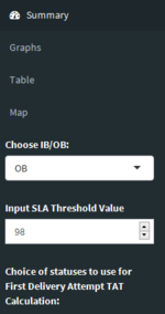
To capture the flexibility in determining the start and ending points of a shipment, filters in the form of a check box have been created to allow our sponsors to set the start and end statuses according to their specifications to be taken into the calculation for the turnaround time. Additionally, an Inbound/Outbound (IB/OB) filter has been created to allow our sponsors to easily filter to those categories of shipments so that they can understand the situation of the shipments respectively.
Graphs
Summary - Understanding of the Overall Situation
On the summary tab, 2 graphs are created to show an overview of the statuses of all the shipments for each country. These graphs have been filtered to either Inbound or Outbound shipments for clearer understanding of the shipment progress.
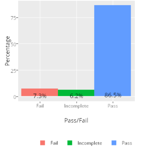
Figure 8 shows the distribution of all the shipments with regards to its status being “Pass”, “Fail” or “Incomplete”. The term “Pass” is referred to as having a turnaround time lesser than or equal to the stated SLA in our project. On the other hand, “Fail” would refer to having a turnaround time exceeding the SLA, and “Incomplete” refers to a shipment having a starting point but without any ending points hence cannot have its turnaround time calculated. This graph would allow our sponsors to easily understand the overall situation in a particular country, and to easily delve into shipments which have failed or are incomplete.
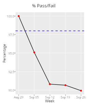
Figure 9 shows the percentage of shipments which have “Passed” for each working week. The x-axis shows the starting date of each week included in the data. The SLA threshold level is taken from an input, which allows our sponsors to tweak and adjust to the value desired instead of taking a static value. This graph thus gives a time series breakdown of the situation in each country.
Deeper Understanding of the Situation
The second tab of graphs provide a deeper understanding of the shipments in a specific country in providing more details on the shipment distribution performance.
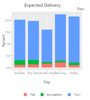
Figure 10 shows the distribution of shipments for each working day denoted by the day of the week. This graph represents the expected first delivery day for each shipment. The expected arrival day is calculated by adding the starting date and the SLA number of days. If a shipment is labelled as “Pass”, this suggests that shipments have either arrived before the expected working day or arrived punctually on that day. On the other hand, if a shipment is labelled as “Fail”, it suggests that the shipment have arrived later than that day, and “Incomplete” suggesting that the shipment has yet to be completed. This graph allows our sponsors to expect and determine the shipments which should have arrived on a particular day but have failed, and thus delving deeper into the reasons for failure.
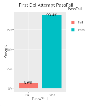
Figure 11 allows our sponsors to understand if shipments which have failed their first delivery attempt had completed the delivery eventually within the SLA. This allows our sponsors to easily identify shipments which have not completed their deliveries within the stipulated SLA.
To prepare the data for visualisation, numerous packages in R have been used. Firstly, ggplot2 which is a popular plotting system used in Python and R for making professional looking plots have been used to create and display different graphs. Additionally, plotly R allows for making interactive quality graphs which have helped to create tooltips upon hover as well as create drilldown charts and tables for further insights.
Table
The data columns used in this data table were chosen for their relevance to the performance measurements used by the sponsors. The key data recorded in the systems were included in the data table, along with new data columns computed.
The calculation of the turnaround time (TAT) which allows for flexibility with the sponsors in the selection of endpoints and delivery statuses to be taken into account is the distinguishing factor of our data table compared to other methods currently employed by our sponsors. The data table recalculates the TAT based on the selections of the statuses by the sponsors, and also shows the corresponding SLA for each tracking number based on the data the sponsors have provided for us. We have also included two types of TAT calculations, one for the first delivery attempt which is used to assess the performance of vendors, another is the Final TAT which calculates the total TAT from the start to the end point. Some shipments may see a first attempt delivery TAT within the SLA, however saw a rather long total TAT. By identifying such shipments, the sponsors may look into the data for more details such as the reason codes to see if there is a potential issue that may affect future shipments, or is it an isolated case relating to the individual consumer.
The data table also shows whether a shipment has passed or failed its SLA requirement, making it easy for the sales manager to check the details with a simple filter instead of having to compute and compare the data themselves to find out whether it passed or failed. Data pertaining to the geolocation of the different shipments have also been added on the data table, for that some locations that may not be easily accessed may see longer TAT, which might be a point for the sponsors to explain to the client that they might not be able to account for.
Map
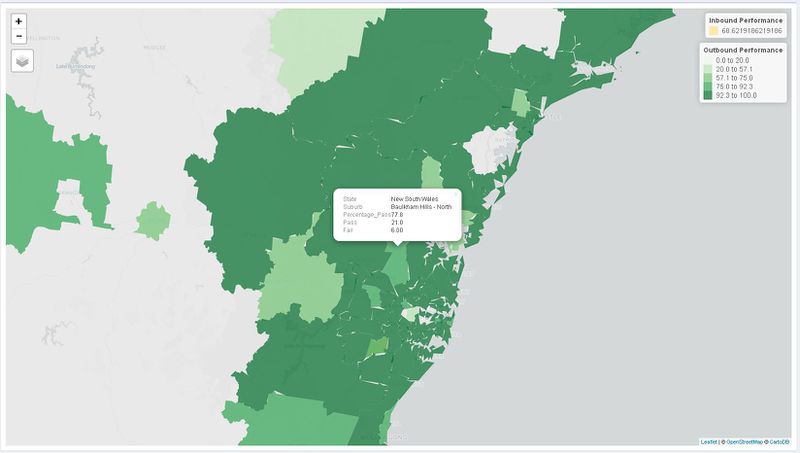
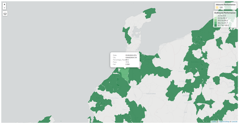
We performed a simple choropleth map based on the percentage rate of passes for both inbound and outbound shipments across both countries. Doing so allows us the user to easily point out problem areas and find out specifically the number of failed or successful shipments.
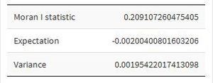
We observed that when a city had a high Percentage Pass rate of shipments, the neighbouring cities around it tended to have a higher Percentage Passing rate as well. To investisgate this further and determine if there indeed is a spatial correlation between patterns, we utilised Moran I. This spatial measure was more prominent in Australia and the results showed that there indeed was a spatial correlation between cities and their Percentage Passes as the Moran I statistic is above 0 (0.209107260475405).
Possible explanations for the spatial correlation could be the transport mode, or the couriers assigned to handle these areas.

