Difference between revisions of "ANLY482 AY2016-17 T1 Group6/Final Progress"
Sitihah.2012 (talk | contribs) |
Sitihah.2012 (talk | contribs) |
||
| (12 intermediate revisions by the same user not shown) | |||
| Line 299: | Line 299: | ||
<b>(a.iv) Failed Prospects</b><br> | <b>(a.iv) Failed Prospects</b><br> | ||
[[file:fig10_9.jpg|600px]] | [[file:fig10_9.jpg|600px]] | ||
| − | <p>A considerable amount of external relationships of associates are failed prospects | + | <p>A considerable amount of external relationships of associates are failed prospects i.e. pitch emails sent out to a prospective client that were either not responded to or were responded to in the negative. Failed prospects are drastically more for associates in the India team. </p> |
| Line 313: | Line 313: | ||
#<u>Proactively Engage Clients</u> – A recent Gallup report found that inaction on the part of B2B Sales teams in engaging a client has deteriorating effects on the client’s willingness to purchase. In fact, in many B2B industries, much of the share of business belongs to actively engaged customers . TrustSphere should produce content such as blog articles, infographics, commentary videos of industry specific relationship analytics trends that could be sent to prospective and existing clients to engage and re-engage them, making them interested in the product and respond positively to a sales pitch. | #<u>Proactively Engage Clients</u> – A recent Gallup report found that inaction on the part of B2B Sales teams in engaging a client has deteriorating effects on the client’s willingness to purchase. In fact, in many B2B industries, much of the share of business belongs to actively engaged customers . TrustSphere should produce content such as blog articles, infographics, commentary videos of industry specific relationship analytics trends that could be sent to prospective and existing clients to engage and re-engage them, making them interested in the product and respond positively to a sales pitch. | ||
</font></div> | </font></div> | ||
| − | + | <br> | |
| Line 431: | Line 431: | ||
'''3.Analysis of External Network & Recommendations''' | '''3.Analysis of External Network & Recommendations''' | ||
| − | + | <b>(a)Management handles partners more than clients</b> | |
| − | <p>In general, seasoned Associates tend to have significantly higher degree centrality with clients than Management. In contrast, we see that Management tends to steward relationships with Partners.</p> | + | :<p>In general, seasoned Associates tend to have significantly higher degree centrality with clients than Management. In contrast, we see that Management tends to steward relationships with Partners.</p> |
| − | + | <b>(b)Collaboration and database for knowledge-sharing, especially on client overlaps</b> | |
| − | <p>In alignment with Section | + | :<p>In alignment with Section Strength of Relationships, more inter-office collaboration should be encouraged. The India office appears to work in a silo, which means its salespeople will not benefit from the various advantages previously mentioned that collaboration can bring about.</p> |
<p>No overlaps on specific client point-of-contacts were found. This is positive as information becomes redundant when actors all have ties with one another (Prell, 2012). Redundancies represent a lack of diverse and unique information, resulting in inefficiencies in company performance. </p> | <p>No overlaps on specific client point-of-contacts were found. This is positive as information becomes redundant when actors all have ties with one another (Prell, 2012). Redundancies represent a lack of diverse and unique information, resulting in inefficiencies in company performance. </p> | ||
<p>However, we do see overlaps in TrustSphere’s client companies. It is possible salespeople from different offices are connecting with the same client companies but in their home countries. </p> | <p>However, we do see overlaps in TrustSphere’s client companies. It is possible salespeople from different offices are connecting with the same client companies but in their home countries. </p> | ||
| Line 444: | Line 444: | ||
<p>Knowing which colleague to reach out to and leveraging on their connections and expertise should significantly improve TrustSphere’s salespeople performance.</p> | <p>Knowing which colleague to reach out to and leveraging on their connections and expertise should significantly improve TrustSphere’s salespeople performance.</p> | ||
</font></div> | </font></div> | ||
| − | <br> | + | <br> |
| + | |||
<div style="border-style: solid; border-width:0; background: #3CB371; padding: 7px; font-weight: bold; text-align:left; line-height: wrap_content; text-indent: 20px; font-size:20px; font-family:Century Gothic;border-bottom:5px solid white; border-top:5px solid black"><font color= #ffffff>Clients & Stages</font></div> | <div style="border-style: solid; border-width:0; background: #3CB371; padding: 7px; font-weight: bold; text-align:left; line-height: wrap_content; text-indent: 20px; font-size:20px; font-family:Century Gothic;border-bottom:5px solid white; border-top:5px solid black"><font color= #ffffff>Clients & Stages</font></div> | ||
<div style="background: #ffffff; text-align:left; line-height: wrap_content; text-indent: 0px; font-size:16px; font-family:Century Gothic"><font color= #000000> | <div style="background: #ffffff; text-align:left; line-height: wrap_content; text-indent: 0px; font-size:16px; font-family:Century Gothic"><font color= #000000> | ||
| + | |||
| + | '''1.Methodology''' | ||
| + | <p>This dataset contains information about the unique email threads between TrustSphere’s salespeople and its clients.</p> | ||
| + | [[file:fig12_1.jpg|600px]] | ||
| + | <p>Most significantly, we calculated the average response time for a salesperson replying to an email and the total amount of time lapsed from the beginning of an email thread to its latest correspondence. As TrustSphere does not use standardized email headers, we manually categorized email threads into the different phases with help of our TrustSphere point-of-contact. </p> | ||
| + | [[file:fig12_2.jpg|600px]] | ||
| + | '''2.Analysis''' | ||
| + | <p>We wanted to look at the amount of time TrustSphere’s salespeople spend on each stage of the sales cycle. This was examined in terms of:</p> | ||
| + | *the share of number of emails threads | ||
| + | *the share of total correspondence time in minutes | ||
| + | [[file:fig12_3.jpg|600px]] | ||
| + | <p>Both show similar patterns. In general, as the sales cycle progresses, the stage takes up a lesser share of the salesperson’s resources. This makes sense intuitively due to the nature of sales. More resources are expected to be spent trying to acquire new clients in the Prospecting stage. Of these prospects, a subset will be converted into Meetings. Of the meetings acquired, only a portion will move on to POC sessions. We see that TrustSphere’s sales department spends over 70% of its resources on Prospecting and Meetings.</p> | ||
| + | [[file:fig12_4.jpg|600px]] | ||
| + | <p>On average from 1st January 2016 to 31st August 2016, each salesperson engaged in unique email threads. Annabel Koh (Singapore) has the highest email thread volume. We notice also that the India and U.K. offices have low email thread counts. This is consistent with our findings in Section External Network Graphs: TrustSphere–Client, where we found that both offices operate as independent clusters and have low degree centrality i.e. possessing little client relationships.</p> | ||
| + | [[file:fig12_5.jpg|600px]] | ||
| + | <br> | ||
| + | [[file:fig12_6.jpg|600px]] | ||
| + | <p>In email thread count, Annabel Koh (Singapore) ranks first in the Meeting and After POC stages. Johnny Helmberger (U.S.) engages in the most Prospecting. In the POC stage, Mark Padginton (Australia) holds the highest email thread count.</p> | ||
| + | [[file:fig12_7.jpg|600px]] | ||
| + | <p>In terms of total time spent on correspondence, we can see that the Australian salespeople spend majority of their time on prospecting and on POCs. This implies a healthy balance between securing new clients and converting old existing contacts into deals.</p> | ||
| + | <p>Zooming in to India, we notice Ajay Rana spending almost all his time on prospecting, while Shams Islam handles more meetings, POCs and some after POCs. This could be because Ajay Rana only joined TrustSphere in March 2016 as an Associate. Hence Shams Islam handles more advanced stages of the sales cycle.</p> | ||
| + | <p>In Singapore, we see Annabel Koh (Associate) spending most of her time on prospecting and meetings while Dev Menon (Upper Managements) spends most of his time on meetings and POCs. This suggests a better split of responsibilities and the two salespeople focus on different stages of the sales cycle.</p> | ||
| + | <p>In U.K., we see Simon Paton spending most of his time on POCs. Although spending majority of the time on stages of higher value might be considered positive, it is also important that a salesperson continues reaching out to new prospects and expanding the client pool. We can see from Section External Network Graphs: TrustSphere–Client, that Simon Paton possesses only 2 client relationships. However, we must also consider that his email thread count is extremely low for an 8-month period. This could be an anomaly and should be investigated further by TrustSphere.</p> | ||
| + | <p>Lastly, in the U.S. office, we see that Brian Lebahn and Johnny Helmberger spend almost all their time prospecting. In contrast, Michael Knight spends most of his time on meetings and the remainder on POC. </p> | ||
</font></div> | </font></div> | ||
| + | <br> | ||
| + | |||
| − | <div style="border-style: solid; border-width:0; background: #3CB371; padding: 7px; font-weight: bold; text-align:left; line-height: wrap_content; text-indent: 20px; font-size:20px; font-family:Century Gothic;border-bottom:5px solid white; border-top:5px solid black"><font color= #ffffff> | + | <div style="border-style: solid; border-width:0; background: #3CB371; padding: 7px; font-weight: bold; text-align:left; line-height: wrap_content; text-indent: 20px; font-size:20px; font-family:Century Gothic;border-bottom:5px solid white; border-top:5px solid black"><font color= #ffffff>Reporting Model (Dashboard)</font></div> |
<div style="background: #ffffff; text-align:left; line-height: wrap_content; text-indent: 0px; font-size:16px; font-family:Century Gothic"><font color= #000000> | <div style="background: #ffffff; text-align:left; line-height: wrap_content; text-indent: 0px; font-size:16px; font-family:Century Gothic"><font color= #000000> | ||
| + | <p>Several opensource javascript libraries are used in the creation of our sales dashboard. These libraries allow for efficient manipulation of data in several document format such as csv, txt and tsv. This feature removes the need for a server-side database for data retrieval and processing, thus simplifying the dashboard creation process. They follow web standards such as HTML, SVG, and CSS. Large datasets can be concurrently processed and visualized dynamically on different charts. As the client is looking for a clear visualization of salespeople metrics, rather than comprehensive data modeling, the use of Javascript and HTML5 are sufficient.</p> | ||
| + | <br> | ||
| + | |||
| + | <b>The following metrics are visualized in our sales dashboard:</b> | ||
| + | <br>1. Time spent per sales stage | ||
| + | <br>2. Number of clients per sales stage (over month) | ||
| + | <br>3. Overall change in relationship | ||
| + | <br>4. Percentage of failed prospects per month | ||
| + | <br>5. Hot and cold relationships | ||
| + | <br>6. Strong and weak relationships | ||
| + | <br>7. Relationship health | ||
| + | <br>8. Company's activity across different months | ||
| + | <br>9. Company's email activities | ||
| + | |||
| + | <br> | ||
| + | [[file:fig13_1.jpg|900px]] | ||
| + | <br> | ||
| + | '''1.Time spent per sales stage''' | ||
| + | <p>An overlapping bar chart is used to show the time spent (in hours) the sales team spent on each stage, in comparison to the previous stage. The overlapping bar chart is suitable for this metric as it enables easy comparison of data.</p> | ||
| + | <br> | ||
| − | </ | + | '''2.Number of clients''' |
| + | <p>A multiple line graph is used with each line represent each sales stage.</p> | ||
| + | <br> | ||
| + | |||
| + | '''3.Overall change in relationships''' | ||
| + | <p>A simple bar chart is sufficient to visualize this metric. The chart shows the change in relationship of both hot/cold and strong/weak. The comparison is based on the current month to the previous month. Since the latest data obtained is in August, the chart is comparing change in relationship between the month of July and August.</p> | ||
| + | <br> | ||
| + | |||
| + | '''4.Percentage of failed prospects per month''' | ||
| + | <p>Sparkline with mouseover functionality is used to visualize this metric.</p> | ||
| + | <br> | ||
| + | |||
| + | [[file:fig13_2.jpg|600px]] | ||
| + | [[file:fig13_3.jpg|600px]]<br> | ||
| + | '''5.Hot and cold relationships &''' | ||
| + | '''6.Strong and weak relationships''' | ||
| + | <p> Both hot/cold and strong/weak graphs are visualized using stacked bar charts. Contrasting and meaningful color are used to make the chart intuitive for the user - red to represent hot and strong while blue is used to represent cold and weak. The absolute number of relationships each salesperson has is indicated beside their name on the y-axis. This value will provide more insights as it is more justifiable for a salesperson to have higher percentage of weak and cold relationships because of the greater number of relationships they possess. | ||
| + | <br><br> | ||
| + | Both charts are sorted and placed in different tabs so that user can easily toggle between tabs to make data comparisons.</p> | ||
| + | <br> | ||
| + | |||
| + | '''7. Relationship health''' | ||
| + | <p>A scatter plot is used to plot the relationship health of salesperson for the latest month (August). Mean reference line for both x-axis and y-axis are plotted using a dashed line. </p> | ||
| + | [[file:fig13_4.jpg|900px]]<br><br> | ||
| + | |||
| + | '''8. Company's activity across different months''' | ||
| + | <p>A data table is used to visualize this. This table allows our sponsor company to monitor the change in their client's activity status (active or inactive) across different months.</p> | ||
| + | [[file:fig13_5.jpg|900px]]<br><br> | ||
| − | |||
| − | < | + | '''9. Company's email activities''' |
| + | <p>This page allows detailed view of each company email activities. For each company, the latest sales stage, number of emails sent/received and start/end date of communication can be seen. All salesperson communicating with that company can also be determined. A multiple line chart is used to show a summary of change in emails sent/received over time. | ||
| + | <br> | ||
| + | For company with more than 1 salesperson, the graph will update and visualize data specific to the selected salesperson when he/her is name is clicked on.The data table at the bottom separates active and inactive clients, with active clients defined as those with emails sent/received in the past 30 days.</p> | ||
| + | [[file:fig13_6.jpg|600px]]<br><br> | ||
| + | <br> | ||
| + | <p>The metrics are arranged in a manner that provides quick data comparison and reduce scrolling by the user. Our team's sales dashboard can be found at [https://anly-ce2e0.firebaseapp.com/ here]. Please allow some time for the data to be loaded.</p> | ||
</font></div> | </font></div> | ||
Latest revision as of 00:16, 3 December 2016
| Home | Team | Project Overview | Midterm Progress | Final Progress | Project Management | Documentation |
Communications data, such as the emails exchanged by employees, can be of rich insight when analyzing and predicting business performance.
For a B2B company such as Trustphere, communicational efficiency from their sales team is essential for increase in revenue and growth. Acknowledging that sales numbers in dollars are not adequate by themselves to gauge the potential and performance of the sales team, our team has analyzed emails exchanged by salespeople, to report specific insights that enable the senior management to monitor individual salesperson’s progress in the sales cycle and identify bottlenecks in the sales process.
These insights include, but are not limited to, the salesperson’s internal and external network, response time and communications promptness when communicating with a client, progress in current sales accounts and a postmortem of failed accounts. Our attempt is to make sales performance based on communications efficiency as visible and measurable as possible, hoping that it will not only reform the commission structure to motivate employees to hone their communication skills but also give the management a bird’s eye view of the real time sales progress, instead of knowledge of just the successful accounts.
TrustSphere, a software-as-a-service company, delivers Relationship Analytics solutions to organizations enabling them to unlock the value of their networks. This set of analytics surfaces insights that help clients across the globe improve key business issues including sales force effectiveness, enterprise-wide collaboration and corporate governance. Solutions are delivered through leading technology and business partners such as IBM, Salesforce.com and SugarCRM.
Being a B2B company, TrustSphere has a dedicated Sales team of 19 people (as of 31st August 2016) around the world. The team’s responsibility is to approach prospective clients with TrustSphere’s product, persuade them to agree to a meeting and to commission a proof of concept (POC). Once a salesperson gets a client to agree to a meeting or a POC, he/she qualifies for a sales commission. The team is also tasked with seeking out partners and maintaining partnerships for the company.
Apart from sales and commission dollars, the company has little information about the sales process, how efficiently salespeople communicate with clients and the extent of internal collaboration with other TrustSphere departments. Our team was therefore engaged to use their existing email communications data to evaluate communicational efficiency of each individual salesperson and develop a reporting model (dashboard) for the Sales Director to have a bird’s eye view of real-time sales progress.
While much has been explored in the field of Sales Analytics, a recent study reveals that few companies have delved into the area of Sales People Analytics. Deloitte found that almost 70% of companies felt they were weak in using HR data to predict workforce performance and improvement.
Conventional wisdom tells us there are several ways to evaluate a salesperson’s performance, such as the size of his external network and his sales figures. New research says this is an oversimplification of sales practices . Steward et al. (2010) found that higher-performing salespeople regularly activated their internal company networks to coordinate a team of experts tailored to serve a particular customer. Purely focusing on sales figures as an indicator of performance also neglects the time aspect. Sometimes long-term projects take months to realize revenues. Harvard Business Review also found that spending time with both internal and external connections contributed to success in selling.
Overwhelming research evidence pointing at the inadequacy of looking purely at sales figures. Further, the importance of ‘People Data’ re-emphasizes the criticality of communicational efficiency. Currently TrustSphere’s approach to assessing performance in this regard is self-reporting and review meetings with the Sales team. The team functions largely independently and management has little understanding of communicational effort and hardly any insight into opportunities for improvement in the sales process other than feedback from salespeople.
We intend to use TrustSphere’s data of their salespeople’s email communications to measure outreach, relationships, clients, responsiveness, collaboration and sales progress of the Sales team by adding a layer of mathematical and data-supported insights. Furthermore, we intend to provide actionable recommendations on better data collection so that future analysis becomes easier for TrustSphere. Lastly, we aim to develop a reporting model (dashboard) prototype that TrustSphere can adopt and develop for tracking performance in future. We foresee that with continuous and real time insight into salespeople communications, senior management will be able to employ better decision making capabilities with regards to the sales process and overhaul training and commission structures for the Sales team.
Our project began with the primary objective of making the sales process and communicational efficiency as visible and measurable as possible. Thus, our team interviewed sales associates and discussed the possibilities with our point-of-contact at the company to gain insight into what information would be useful and most critical to them when it came to evaluating sales performance. With that, we explored the range of possible questions and areas of analysis we could delve into. After repeated meetings with the client and consultations with our advisor, we narrowed our scope down to:
1. Relationship Report
- Analyse the volume and strength of Internal and External Relationships salespeople have developed over the analysis period
- Consider the frequency and recency of emails exchanged by and with the salesperson to highlight their communication and collaboration efforts
2. Clients and Sales Stages
- Report the sales progress for each account up-till 31st August i.e. how many accounts are active and what stage of the sales cycle they are in
- Evaluate the performance of each salesperson depending on how many accounts they have in each stage, their response trends in each stage, progress from historical communication indications etc.
- Provide a post-mortem on inactive accounts, reporting on how long communications with a client lasted, in what stage communications ended and which salespeople were responsible
3. Social Network Analysis
- Analyse collaboration trends e.g. which departments salespeople interact with more, whether there lies a communication gap between teams
- Examine overlap trends, to see if multiple salespeople interact with the same client, and whether abnormalities exist within the overlap
Data was provided to us by the client in Week 3. They provided us with 1 main dataset of email communications of sales employees and a supplementary staff list to aid our analysis with details of departments and hierarchy in the organization.
1. Daily Email Communication Dataset
This dataset contained year-to-date (up till 31 August 2016) records of daily email communication data of all 19 TrustSphere sales people across the globe. This data includes the following 6 variables. (109,771 Records)
- Date: Includes the date and time of a particular email being sent
- Originator address: Sender email address
- Recipient address: Receiver email address
- Direction: Nature of communication (internal, inbound or outbound)
- MsgID: Unique message ID of emails sent
- Email Subject: Email subject header
2. Staff List
The dataset lists all of TrustSphere staff (57) with the following 5 variables.
- Name
- Hierarchy
- Department
- Position
- Location
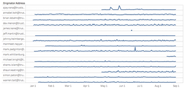
Our first step was to check confirm that salespeople have been actively communicating through email, as appointment and exit dates were not made available to us, we had to confirm that all sales employees were in fact active and employed with TrustSphere during our Analysis period.
1. Summary of Findings
- No records were found for 3 Salespeople
- 1 Salesperson had only sent one email over the course of 7 months
- 1 Salesperson sent an abnormally low number of emails, leading to an assumption that he has a secondary work email
- 3 were new hires made in the analysis period of 1st January to 31st August 2016
2. Implication
After deliberation of the results with TrustSphere, the 3 salespeople with no records and the 1 with a single record were to be removed from our analysis under the assumption that they were no longer employed by TrustSphere. The salesperson with a low number of emails and the 3 new hires were to be included in the report but filtered out as and when they were likely to skew results. Therefore analysis was carried out with 14 active salespeople.
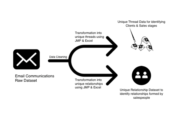
The data had to be cleaned and transformed in order for us to compute and visualize our desired metrics and attributes. Email communications contain a lot of junk and irrelevant emails that need to be cleared out as well. We cleaned and transformed the Initial dataset into two separate datasets to better address the needs of our scope.
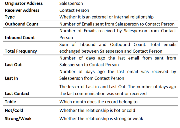
Details of the Data cleaning and transformation process can be found in our Mid-Term Proposal. The variables for the datasets are as follows:
1. Classification of Metrics
Following our exploratory analysis and during the transformation process of the data and repeated meetings with the client, we established certain classifications and metrics that ease reporting of sales performance.
1.1 Clients & Stages
- Sales Stages
- Prospecting Stage: When a prospecting email is sent out to a prospective client, they may or may not respond
- Meeting Stage: When the client has responded favourably to the prospecting stage and TrustSphere has a scheduled pitch meeting with the client
- POC Stage: When the client has agreed to commission a product trial
- After POC Stage: Follow ups, quotations, contracts etc
- Active and Inactive Clients
- Active Client: Contact has taken place within the past 30 days
- Inactive Client: No contact has taken place in the past 30 days
- Failed Prospects
- “Failed Prospect” is a classification that indicates what percentage of prospecting emails sent out failed to progress onto the meeting stage
1.2 Hot & Cold Relationships
- Hot Relationship: Last contact was made less than 3 days ago
- Cold Relationship: Last Contact was made more than 3 days ago
1.3 Strong & Weak Relationships
- Strong Relationship: Above average number of emails exchanged AND is a hot relationship
- Weak Relationship: Below average number of emails exchanged AND/OR is a Cold Relationship
2. Data Dictionary
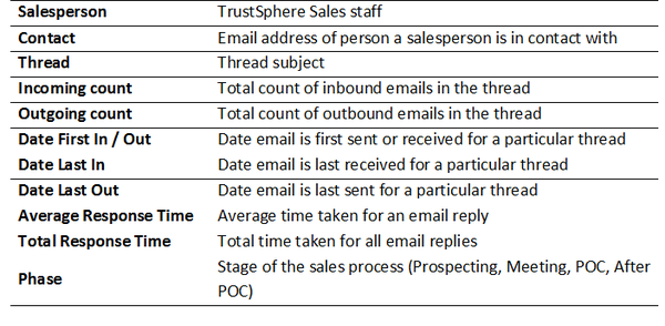
2.1 Unique Thread Dataset (For Clients and Stages)
Two things to note:
- Each Record is a unique thread of emails exchanged between a salesperson and an external contact.
- This data focuses solely on client relationships therefore internal and partner communications were filtered out.
2.2 Unique Relationship Dataset
- Each record is unique relationship between the Salesperson and a Contact.
- The relationship may be Internal or External.
1. Motivation & Purpose
The success of B2B sales is relationship building. It is necessary for any Sales team to sustain positive, consistent, and frequent communications with the customer to secure a sale . Similarly, or even more so in the B2B sphere, it is necessary for a salesperson to have frequent and active communications with a client (although this does not warrant spamming clients with unwanted emails). This builds rapport, propelling a salesperson to the client’s top of mind recall for a product and increases the likelihood of securing a deal.
As we do not have access to email content data, we are not able to assess how well salespeople communicate with the client in terms of communication, research and writing skills. However, we do have information regarding the timeline of communications through which we can determine whether salespeople communications are active/dormant or frequent/infrequent. Therefore, we use the frequency and activeness of a communication as a proxy for a strong relationship both in external and internal networks of a salesperson.
2. Specifying the Factors of Analysis
- Hot & Cold Relationships
The recency factor defines whether a relationship is hot or cold, i.e. whether the communication between two people is active or inactive. This was fuelled by the rationale that most business people are prompt in replying to emails relating to a service they are interested in, or a person they hold a strong rapport with. In other words a person is less likely to reply promptly to a chain they deem irrelevant.
We recommended Hot and Cold to be a binary variable. Internal communications responded to within 3 days are considered “Hot” and older than 3 days old classified as “Cold”, this figure was recommended to us by TrustSphere. For external relationships, we kept the benchmark at 10 days.
- Strong & Weak Relationships
Strong and weak relationships are a binary classification as well. The motivation for this factor comes from the requirement for constant and frequent communication to build a strong relationship.
A Strong External relationship is defined by:
- Greater than 3 Outbound Emails (3 is the rounded average of External Outbound Emails)
- Greater than 2 Inbound Emails (2 is the rounded average of External Inbound Emails)
- Hot External Relationship (Last Communication within 10 days from 31st August)
A Strong Internal relationship is defined by:
- Greater than 22 Outbound Emails (22 is the rounded average of Internal Outbound Emails)
- Greater than 12 Inbound Emails (12 is the rounded average of Internal Inbound Emails)
- Hot Internal Relationship (Last Communication within 3 days from 31st August)
3.Internal Network
- Visualization
The data was visualized and analysed using Tableau, although we are using d3.js for our dashboard where we will report external relationships. For insights and recommendations regarding internal relationships, we utilized Tableau to be more time and resource efficient.
- Number of Internal Relationships
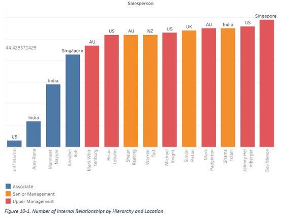
Salespeople have an average of 44 Internal Relationships over the analysis period. We observe that people of higher hierarchy have larger number of internal relationships as they manage teams and communicate more with internal parties. Associates have the lowest number of internal relationships as their main task is to seek out external prospective clients.
Salespeople have an average of 44 Internal Relationships over the analysis period. We observe that people of higher hierarchy have larger number of internal relationships as they manage teams and communicate more with internal parties. Associates have the lowest number of internal relationships as their main task is to seek out external prospective clients.
- Recency-Frequency Matrix
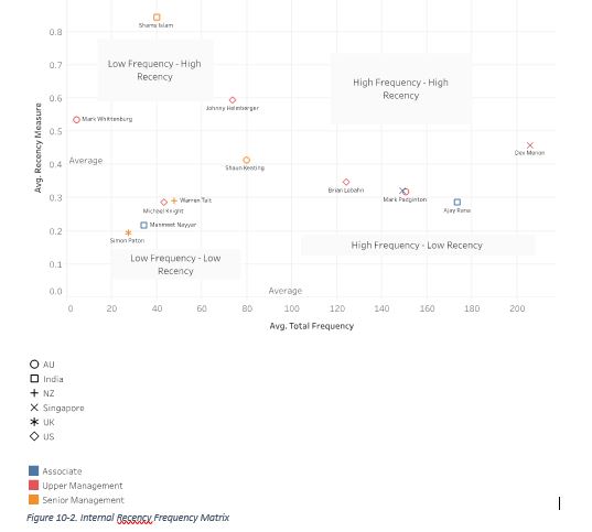
Salespeople are put on a Recency-Frequency Matrix. The matrix has Average Recency on the X axis and Average Frequency of a Salespersons relationships on the Y axis.
Average Frequency of a Salesperson = Σ(Total Frequency)/Number of Relationships
Total Frequency – The Total Number of Emails Exchanged by the Salesperson and the Internal Contact Person in the Relationship
Average Recency of a Salesperson = 1 / Σ (Last Contact)/Number of Relationships
Total Recency – The Total Number of Days since 31st August since the last contact was made between the Salesperson and Internal Contact Person in the Relationship
Point to note – Average recency plotted is divided by 1, as the higher the number of days since last contact the lower the average recency will be, i.e the average days since last contact and recency have an inverse relationship therefore the figure needs to be inversed.
As people move left to right on the plot, it signifies that they have more email exchanges per Internal relationship (High Average Email Exchange Frequency). As they move up on the plot, it signifies they have more active Internal relationships (The Average Number of Days since the last communication in a relationship are low).
For example, Dev holds the strongest position in Internal relationships by having frequent and ongoing interactions with internal parties.
What’s interesting to note is that although Senior Management has a higher number of Internal relationships, their average communications within each relationship is generally low, i.e. they do not interact much with their internal contacts.
- Strengths of Relationships
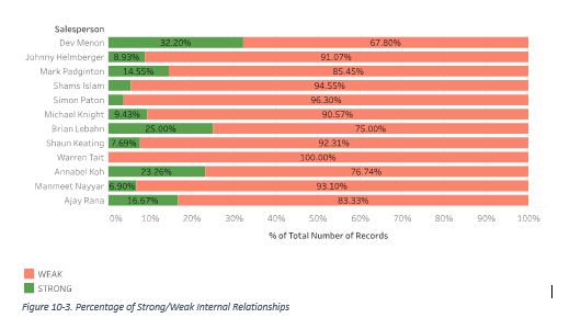
The above graph highlights the percentage of Strong and Weak Internal Relationships each Salesperson has. The bar chart validates the results of the Matrix showing that Senior Management Simon, Warren, Shaun and Shams (Senior Management) have a very low percentage of Strong Internal Relationships due to below average interaction with their internal parties.
We noticed that Warren has 100% weak relationships. We considered the possibility of him being on leave from 28th to 31st August 2016 – however his email activity reflected that he did send out and receive emails on said dates, just not to or from any internal parties.
Associates have less number of Internal Relationships however on an average these relationships are stronger than those of the Senior or Upper Management due to high and frequent interactivity, furthermore apart from Shams all other Senior Management sales employees fall under in the low frequency – low recency quadrant implying that many internal relationships have stagnated over the past 7 months.
Point to Note – Mark Whittenburg was removed from this analysis as he only joined a month before the end of our analysis period and therefore would not have many high frequency relationships that could qualify as “Strong”.
4.External Network
(a)Visualizations
(a.i) Number of External Relationships
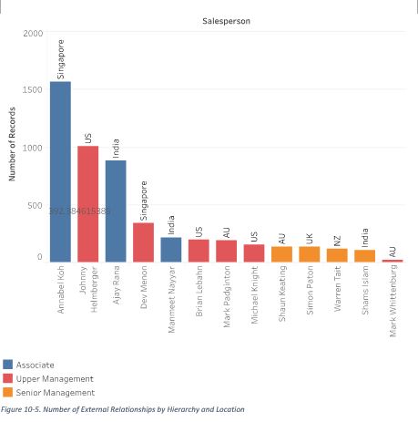
Salespeople have an average of 392 External Relationships over the analysis period. As expected a stark difference from Internal Relationships, people higher up in the hierarchy have lower number of external relationships than associates, as the latter are tasked with constantly reaching out to prospective clients. A lower number of External relationships for any associate could mean that they are not reaching out to enough prospective clients.
(a.ii) Recency-Frequency Matrix
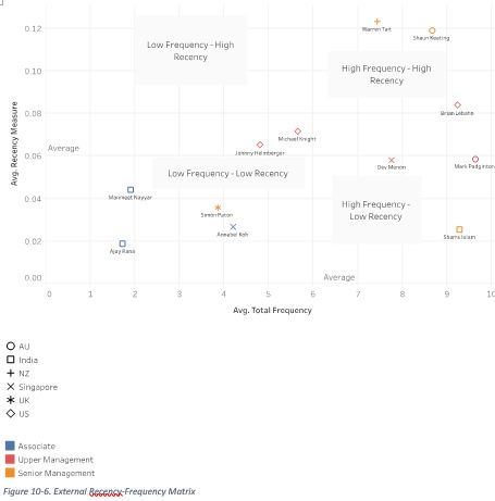
The External Recency–Frequency Matrix is computed and plotted using the same calculations as the Internal Matrix.
As people move left to right on the plot it signifies that they have more email exchanges per External relationship (High Average Email Exchange Frequency). As they move up on the plot, it signifies they have more active External relationships (the Average Number of Days since the last communication in a relationship are low)
Senior Management shows evidence of stronger, more established external relationships, this is because senior personnel do not send out prospecting emails and maintain contact with mostly existing and high profile clients and partners. A senior management employee in the Low Frequency – Low Recency quadrant could indicate inadequate effort in maintaining and establishing important external relationships.
Associates show below average interaction and stagnant relationships. Primarily because they are in-charge of reaching out to prospective clients, in many cases those clients may not respond to them or their communications may not pass initial stages. Therefore, although they have a high number of external relationships, these relationships are mostly weak.
(a.iii) Strength of Relationships
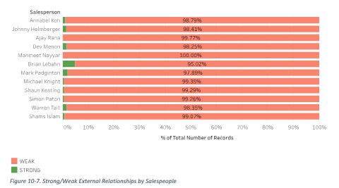
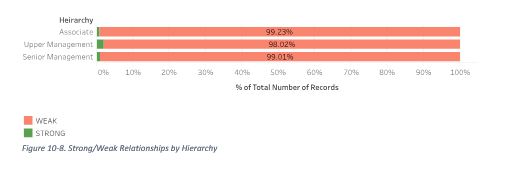
Many external relationships remain weak, this is presumably due to a lot of irrelevant/short term external communications that exist in an individual’s mailbox (apart from spam, advertisements, and newsletters that we have removed from the dataset). However, if we observe trends in comparison, we see that associates have little or no strong external relationships where as Senior and Upper Management have quite a few.
A considerable amount of external relationships of associates are failed prospects i.e. pitch emails sent out to a prospective client that were either not responded to or were responded to in the negative. Failed prospects are drastically more for associates in the India team.
5.Discussions of Insights
Relationship analysis plays an important role is observing hierarchical trends in internal and external relationships, and it acts as a useful monitoring device to assess if salespeople display poor or unusual communication and interactivity.
The Internal Relationships of the Sales team do not represent an ideal dynamic. However the insights into hierarchical differences in Internal Relationships are reflective of common business practices and assumptions, i.e. it is common for senior management to have stronger external than internal relationships, as they are in-charge of business development for the company and therefore are likely to spend more time communicating with external parties. In further sections of the report, through SNA, we aim to delve deeper into the internal network of the Sales team to provide more actionable recommendations with respect to collaboration and inter-department communication.
In External relationships however, we observed a large scope for improvement in TrustSphere’s Sales team. External relationships are critical to acquire and maintain a sizeable pool of clients and partners. Our analysis shows that most salespeople have weak external relationships, especially the prospecting ones. To tackle this problem, we recommend that TrustSphere employ the following strategies to increase visibility and gain more mindshare of prospective and current clients.
(a) Recommendations for Improvements
- Personalize Prospecting Emails – Currently TrustSphere sends out industry specific emails to its prospective clients, for example a hospital may receive a prospecting email titled “How Relationship Analytics can increase productivity in healthcare”. But in today’s competitive business landscape, it isn’t enough to make industry-specific pitches. According to an Aberdeen report in 2015, personalized email messages improve click-through rates by an average of 14% and conversions by 10%. Majority of marketers across the globe attest to the fact that personalization plays a huge role in increasing recall and engagement . TrustSphere, using their analytical capabilities, should set up an automated process wherein a company name could be inserted into the subject header and email content by a salesperson. Personalization will improve the chance of an email being viewed or responded to. For instance, a prospecting email subject header sent to SMU could be “How Relationship Analytics can help SMU better monitor its educators”.
- Proactively Engage Clients – A recent Gallup report found that inaction on the part of B2B Sales teams in engaging a client has deteriorating effects on the client’s willingness to purchase. In fact, in many B2B industries, much of the share of business belongs to actively engaged customers . TrustSphere should produce content such as blog articles, infographics, commentary videos of industry specific relationship analytics trends that could be sent to prospective and existing clients to engage and re-engage them, making them interested in the product and respond positively to a sales pitch.
SNA helps visualize complex networks and identify gaps in communication and highlight redundancies. In organizations, SNA can help diagnose collaboration lapses (Novak, Rennaker and Turner, 2011). It reveals the true underlying networks in which colleagues collaborate and highlight interdependencies and redundancies across departments and hierarchies.
We will be exploring the social networks of TrustSphere’s salespeople in two parts: their internal network and their external network.
1.Salespeople's Internal Network
Contrary to popular belief, customer-directed behaviour only explains 10-20% of a salesperson’s performance (Ryals & Humphries, 2007). In fact, Bolander, Satornino, Hughes and Ferris (2015) found that 26.6% of the variance in salespeople performance can be explained by relationships within the company. Upon deeper thought, this should come as no surprise.
Well-connected individuals in an organization have access to more resources and expertise, improving the likelihood of their success. The leverage afforded by being connected to the right people directly affects a salesperson’s performance. Hence, by using established methods of internal social network analysis, we want to uncover the story behind TrustSphere’s salespeople performance.
(a)Methodology
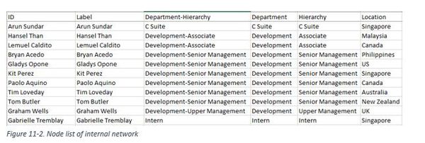
We extracted only emails exchanged between TrustSphere salespeople and other TrustSphere staff. It is important to note that the master dataset we have drawn from only includes emails from salespeople. Hence, this internal network data consists only of connections involving salespeople and does not cover the entire organization’s network.
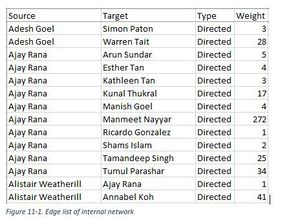
Email outbound count was assigned as Weight.
Each node was match to its department, hierarchy, and location. The general hierarchy, from highest to lowest, is:
- 1.C Suite
- 2.Upper Management
- 3.Senior Management
- 4.Manager
- 5.Associate
- 6.Operational
- 7.Intern
As Gephi cannot visualize more than 2 categorical characteristics, we created a new column “Department-Hierarchy”.
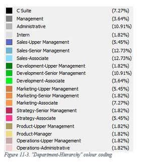
In analyses where we examined the “Department-Hierarchy”, nodes of the same department (e.g. Sales) were coded with the same parent colour (e.g. blue). Within department, nodes were coded from a darker to lighter colour (e.g. dark blue to light blue), from the highest hierarchy to the lowest.
The data was visualized Gephi to obtain the following graphs.
(b)Internal Network Graphs
Internal Network by Department-Hierarchy & Eigenvector Centrality
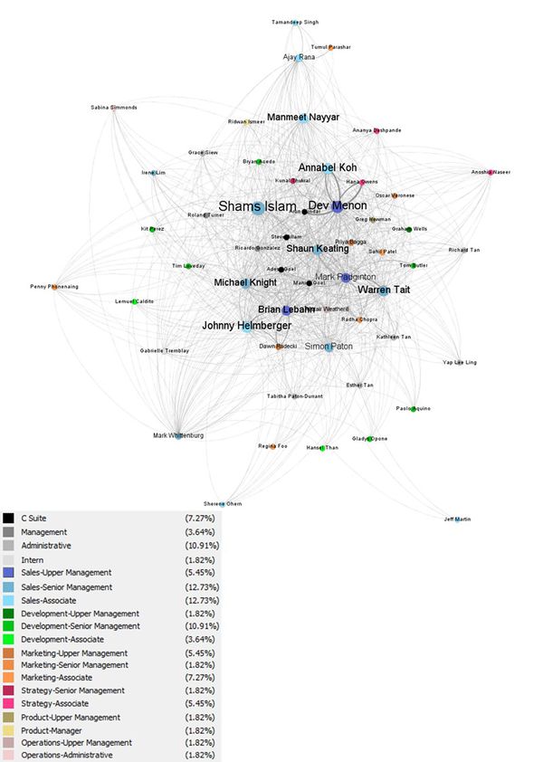
In this graph, the colours of the nodes represent their “Department-Hierarchy” and the size of the nodes correspond to their eigenvector centrality.
Eigenvector centrality is a good measure of influence because it scores a node in a network based on the number of ties to other high-scoring nodes (Prell, 2012). An actor connected to many nodes, i.e. having high degree centrality, might still have a high eigenvector centrality score. However, it might be outperformed by a node which has lesser connections but are connected to other nodes with high degree centralities. It is important to consider both direct and indirect ties because they “provide access both to people who can themselves provide support and to the resources those people can mobilize through their own network ties” (Adler & Kwon, 2002). Thus, Mehra, Dixon, Brass and Robertson (2006) argue that eigenvector centrality are a useful measure of the “availability of information and potential for influence”.
From this graph, we see that salespeople possess relatively high eigenvector centralities. Many Sales Associates have higher eigenvector centrality scores than even C Suite or Management level employees, implying that salespeople in TrustSphere are likely to enjoy an availability of resources and have significant influence in the company.
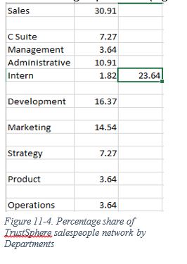
Salespeople are in closest contact with higher Management and Administrative staff, further enforcing the idea that they hold influential network positions in the company. TrustSphere’s salespeople also collaborate almost equally as much with the Development department as the Marketing department (Figure below).
Ideally, we would not want to see salespeople on the periphery of the network. However, we realized that some of these salespeople are new to the company (Ajay Rana, joined March 2016; Mark Whittenburg, joined August 2016; Sherene Ohern, joined 2016). Others, such as Jeff Martin, lie on the periphery because they has left TrustSphere.
Internal Network by Location & Eigenvector Centrality
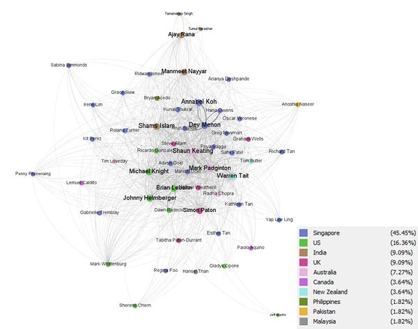
In this case, the colours represent geographical location, while the sizes still represent eigenvector centrality. It is important to note that there are only salespeople in the Australia, India, New Zealand, Singapore, U.S. and U.K. offices.
We notice that salespeople from Australia, New Zealand, Singapore, U.S. and U.K. tend to work together, forming a large cluster in the middle of the graph.
The India office is clearly removed from TrustSphere’s internal network, except for Shams Islam (Sales, Senior Management). Shams Islam also possesses relatively high eigenvector centrality. There is a possibility he is in a unique position to control the flow of resources to his colleagues in India, making him a gatekeeper of information and a powerful actor with high influence.
Internal Network by Modularity & Betweenness
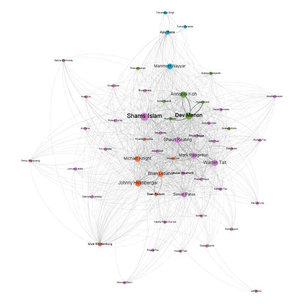
In this graph, the colours represents the different informal communities TrustSphere employees are engaged in. Many employees can be expected to form their own informal relationships outside of formal corporate structure, much as people do in real life. These informal ties are much more informative of the way work is done in an organization (Cross, Borgatti & Parker, 2002) and could offer insights into improving organizational design (Novak, Rennaker and Turner, 2011). Communities were identified using Gephi’s “Modularity” function , which helps detect groups in networks and assigns them a “modularity class”, or group, which is represented by the different colours.
The community in orange corresponds to the US office and the blue corresponds to the India office. In this respect, we see that these offices are distinctly separate from the rest of the company. This might hinder knowledge-sharing and collaboration between offices. The most notable community highlighted in green consists mostly of a subset of employees from the Singapore office and one employee from the UK. Their functions span across departments such as Sales, Management, Strategy, and Development. Interestingly, their hierarchies range from Associate up to C Suite. The rest of the network belongs in the largest community in purple. It is likely they are not a part of any significant cluster that communicates particularly frequently.
The size of the nodes corresponds to betweenness centrality. Betweenness centrality considers how often an actor sits on the shortest path between two other nodes (Prell, 2012). Nodes with high betweenness centralities act like brokers or gatekeepers positioned between disconnected actors. These actors are powerful because without them, the two nodes they connect might never be able to pass information along to each other. Thus, even without being connected to many other nodes, a broker holds great influence over the flow of information and resources in the network.
In this network, we see that employees with high betweenness centrality are Annabel Koh & Dev Menon (Singapore), Shams Islam (India), Shaun Keating (Australia), Warren Tait (NZ), Michael Knight, Brian Lebahn & Johnny Helmberger (US). These employees possess powerful positions as brokers in TrustSphere’s internal network. They are the gatekeepers of information and resources for their respective home offices. Interestingly, we see that Annabel Koh also possesses high betweenness despite being an Associate. We also notice that smaller offices such as those in Malaysia, Pakistan, Canada and Philippines do not have any gatekeepers, but it is also possible their brokers are not captured in this network since we have only focused on salespeople ties (emails).
(c) Analysis of Internal Network Recommendations
- In general, Sales team are performing well based on centrality measures.
We have consistently seen salespeople from the Singapore, US, UK, Australia and New Zealand offices exhibiting high eigenvector centralities and betweenness centralities regardless of hierarchy. Together, employees from these offices make up 80% of the network we are examining. Salespeople from these locations hold strategic positions in the network, maintaining high influence over resource flow in the company’s network.
- The India Sales team does not perform well based on centrality measures.
In contrast, we find that the India office lack influential actors. This stems resource flow and might hinder the capabilities, and therefore sales growth, of the salespeople in India. If TrustSphere wants to expand its business in India, it would be advisable to offer more opportunities for salespeople to expand their internal network.
- Encourage more inter-office collaboration
This ties in with the previous point. The India, Malaysia, Pakistan, Canada and Philippines offices appear separated from the main TrustSphere network. These are structural holes, where actors do not have ties to one another, resulting in knowledge being unable to flow across the entire network (Prell, 2012).
With a connected network of salespeople, employees can easily exchange best practices and easily leverage on one another’s expertise. Having established that a healthy internal network will significantly improve sales performance, more could be done to bridge the communication gap between international colleagues. One possibility is to conduct “exchange programs” for employees, where staff can fly to a different office for a week to find out how work is done in another country. New hires can also be assigned an overseas mentor or “buddy” who helps welcome him into the company.
2.Salespeople's External Network
We differentiate TrustSphere’s external contacts into two categories: clients and partners. TrustSphere works closely with partners, such as Salesforce, to deliver solutions on their platforms but do not receive any revenue from these partners. However, their partners can also sometimes be their clients.
(a)Methodology
Clients and partners were consolidated into the companies they worked for, with outbound email count used as weight.
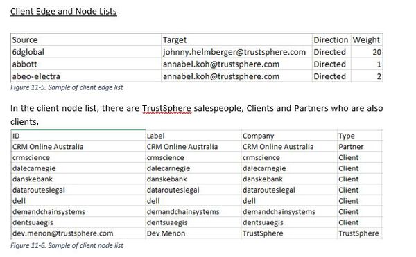
(b)External Network Graphs: TrustSphere-Client
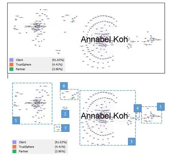
The colours represent the type of actor and the size of nodes represent degree centrality i.e. the number of ties a node has.
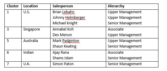
Immediately, we notice distinct geographical clusters in TrustSphere’s connections with clients.
In Cluster 1, we see that Johnny Helmberger has the highest degree centrality. In other words, he has the most contact with clients among the U.S. salespeople.
We see also that Johnny and Annabel share an overlap in a client relationship with Medtronic.
However, if we take a closer look we can see that they are talking to different members of the same client company. Johnny Helmberger appears to have achieved a closer relationship with Medtronic, judging from the volume of emails exchanged.
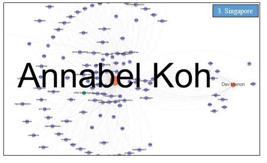
In Cluster 3, we have the salespeople based in Singapore. Interestingly, despite being an associate, Annabel also has a significantly higher degree centrality score than Dev Menon.
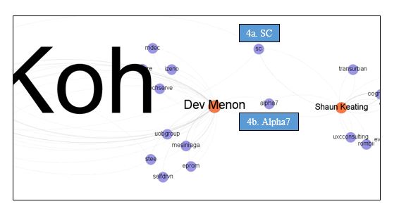
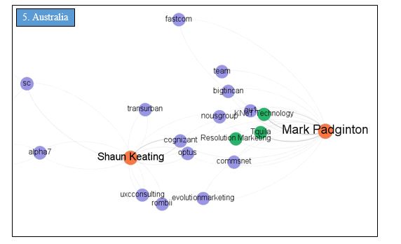
Both Annabel Koh and Dev Menon also share overlaps in client relationships with Shaun Keating from the Australian office.
For client company SC, Annabel Koh and Shaun Keating are in contact with different members of the same firm. Judging from the number of emails exchanged, Shaun Keating achieved a closer relationship with SC than Annabel Koh.
For Alpha7, we notice that Dev Menon and Shaun Keating are both in contact with client, James Wong. Dev Menon also has a few email exchanges with Eric Desmars of the client company.
In Cluster 5, we have the only two salespeople from the Australia office.
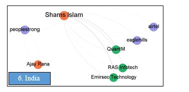
In Cluster 6, we have salespeople from the Indian office. We see Ajay Rana with a much lower degree centrality than Shams Islam but that might be attributed to the fact Ajay Rana only joined TrustSphere in March 2016.
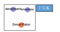
For the U.K. office, we see only Simon Paton with a low degree centrality despite being in Senior Management.
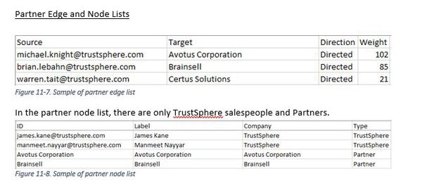
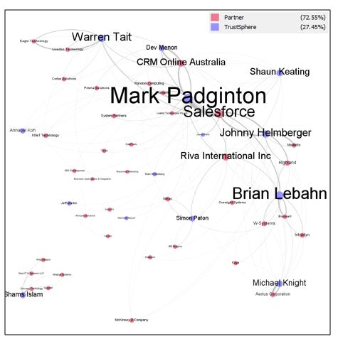
(c) External Network Graphs: TrustSphere-Partner
The colours represent the type of actor and the size of the nodes represent degree centrality.
We see that the following salespeople hold the most connections to partners:
All of them hold high management in the company. Prominent salespeople who have strong relationships with clients (Annabel Koh, Dev Menon) seem to play a smaller role in partnership management.
We also see a new addition, Shams Islam (Senior Management, India), appearing on the TrustSphere-Partner network. He is part of a detached cluster from the main network, possibly indicating that the India office and its partners operate entirely separately from other TrustSphere sales teams.
3.Analysis of External Network & Recommendations
(a)Management handles partners more than clients
In general, seasoned Associates tend to have significantly higher degree centrality with clients than Management. In contrast, we see that Management tends to steward relationships with Partners.
(b)Collaboration and database for knowledge-sharing, especially on client overlaps
In alignment with Section Strength of Relationships, more inter-office collaboration should be encouraged. The India office appears to work in a silo, which means its salespeople will not benefit from the various advantages previously mentioned that collaboration can bring about.
No overlaps on specific client point-of-contacts were found. This is positive as information becomes redundant when actors all have ties with one another (Prell, 2012). Redundancies represent a lack of diverse and unique information, resulting in inefficiencies in company performance.
However, we do see overlaps in TrustSphere’s client companies. It is possible salespeople from different offices are connecting with the same client companies but in their home countries.
Take the example of a client company, Medtronic. Both Johnny Helmberger and Annabel Koh have reached out to different people in that same company. It is possible Johnny Helmberger is in contact with Medtronic U.S. employees, while Annabel Koh is reaching out to Medtronic Singapore employees.
We have also seen that certain salespeople have formed stronger relationships with the same company, as compared to their overseas colleagues. For instance, Johnny Helmberger exchanged many more emails with Medtronic than Annabel Koh.
In these instances, cross-office collaboration and a shared database of Sales information is crucial. Had there been a common database detailing which salesperson had contacted what client, Annabel might have noticed that Johnny had a strong relationship with Medtronic. If cross-office collaboration was strong in TrustSphere, Annabel might also be able to reach out to Johnny asking him to set up an introduction with Medtronic.
Knowing which colleague to reach out to and leveraging on their connections and expertise should significantly improve TrustSphere’s salespeople performance.
1.Methodology
This dataset contains information about the unique email threads between TrustSphere’s salespeople and its clients.
Most significantly, we calculated the average response time for a salesperson replying to an email and the total amount of time lapsed from the beginning of an email thread to its latest correspondence. As TrustSphere does not use standardized email headers, we manually categorized email threads into the different phases with help of our TrustSphere point-of-contact.
2.Analysis
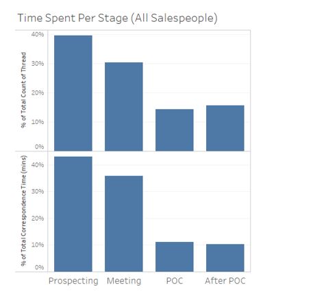
We wanted to look at the amount of time TrustSphere’s salespeople spend on each stage of the sales cycle. This was examined in terms of:
- the share of number of emails threads
- the share of total correspondence time in minutes
Both show similar patterns. In general, as the sales cycle progresses, the stage takes up a lesser share of the salesperson’s resources. This makes sense intuitively due to the nature of sales. More resources are expected to be spent trying to acquire new clients in the Prospecting stage. Of these prospects, a subset will be converted into Meetings. Of the meetings acquired, only a portion will move on to POC sessions. We see that TrustSphere’s sales department spends over 70% of its resources on Prospecting and Meetings.
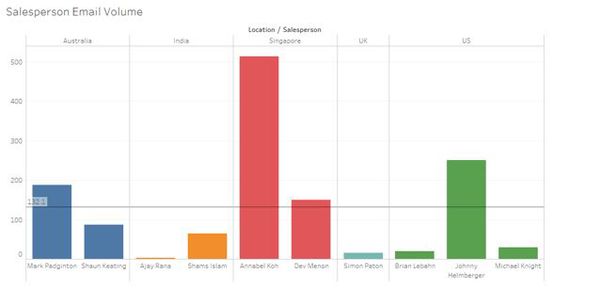
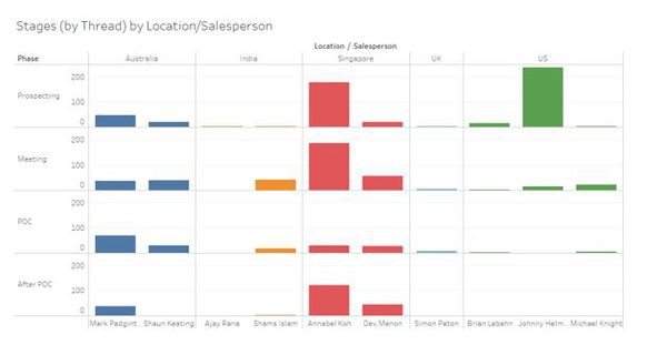
On average from 1st January 2016 to 31st August 2016, each salesperson engaged in unique email threads. Annabel Koh (Singapore) has the highest email thread volume. We notice also that the India and U.K. offices have low email thread counts. This is consistent with our findings in Section External Network Graphs: TrustSphere–Client, where we found that both offices operate as independent clusters and have low degree centrality i.e. possessing little client relationships.
In email thread count, Annabel Koh (Singapore) ranks first in the Meeting and After POC stages. Johnny Helmberger (U.S.) engages in the most Prospecting. In the POC stage, Mark Padginton (Australia) holds the highest email thread count.
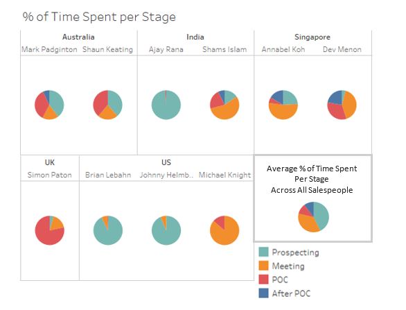
In terms of total time spent on correspondence, we can see that the Australian salespeople spend majority of their time on prospecting and on POCs. This implies a healthy balance between securing new clients and converting old existing contacts into deals.
Zooming in to India, we notice Ajay Rana spending almost all his time on prospecting, while Shams Islam handles more meetings, POCs and some after POCs. This could be because Ajay Rana only joined TrustSphere in March 2016 as an Associate. Hence Shams Islam handles more advanced stages of the sales cycle.
In Singapore, we see Annabel Koh (Associate) spending most of her time on prospecting and meetings while Dev Menon (Upper Managements) spends most of his time on meetings and POCs. This suggests a better split of responsibilities and the two salespeople focus on different stages of the sales cycle.
In U.K., we see Simon Paton spending most of his time on POCs. Although spending majority of the time on stages of higher value might be considered positive, it is also important that a salesperson continues reaching out to new prospects and expanding the client pool. We can see from Section External Network Graphs: TrustSphere–Client, that Simon Paton possesses only 2 client relationships. However, we must also consider that his email thread count is extremely low for an 8-month period. This could be an anomaly and should be investigated further by TrustSphere.
Lastly, in the U.S. office, we see that Brian Lebahn and Johnny Helmberger spend almost all their time prospecting. In contrast, Michael Knight spends most of his time on meetings and the remainder on POC.
Several opensource javascript libraries are used in the creation of our sales dashboard. These libraries allow for efficient manipulation of data in several document format such as csv, txt and tsv. This feature removes the need for a server-side database for data retrieval and processing, thus simplifying the dashboard creation process. They follow web standards such as HTML, SVG, and CSS. Large datasets can be concurrently processed and visualized dynamically on different charts. As the client is looking for a clear visualization of salespeople metrics, rather than comprehensive data modeling, the use of Javascript and HTML5 are sufficient.
The following metrics are visualized in our sales dashboard:
1. Time spent per sales stage
2. Number of clients per sales stage (over month)
3. Overall change in relationship
4. Percentage of failed prospects per month
5. Hot and cold relationships
6. Strong and weak relationships
7. Relationship health
8. Company's activity across different months
9. Company's email activities
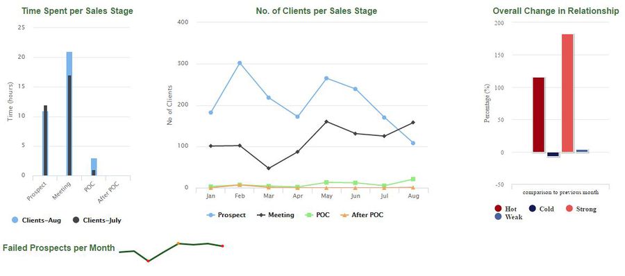
An overlapping bar chart is used to show the time spent (in hours) the sales team spent on each stage, in comparison to the previous stage. The overlapping bar chart is suitable for this metric as it enables easy comparison of data.
2.Number of clients
A multiple line graph is used with each line represent each sales stage.
3.Overall change in relationships
A simple bar chart is sufficient to visualize this metric. The chart shows the change in relationship of both hot/cold and strong/weak. The comparison is based on the current month to the previous month. Since the latest data obtained is in August, the chart is comparing change in relationship between the month of July and August.
4.Percentage of failed prospects per month
Sparkline with mouseover functionality is used to visualize this metric.
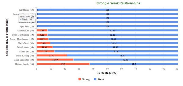
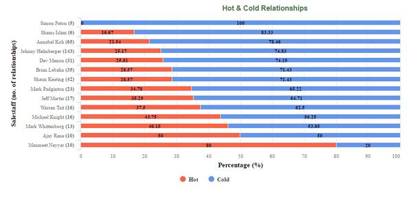
5.Hot and cold relationships &
6.Strong and weak relationships
Both hot/cold and strong/weak graphs are visualized using stacked bar charts. Contrasting and meaningful color are used to make the chart intuitive for the user - red to represent hot and strong while blue is used to represent cold and weak. The absolute number of relationships each salesperson has is indicated beside their name on the y-axis. This value will provide more insights as it is more justifiable for a salesperson to have higher percentage of weak and cold relationships because of the greater number of relationships they possess.
Both charts are sorted and placed in different tabs so that user can easily toggle between tabs to make data comparisons.
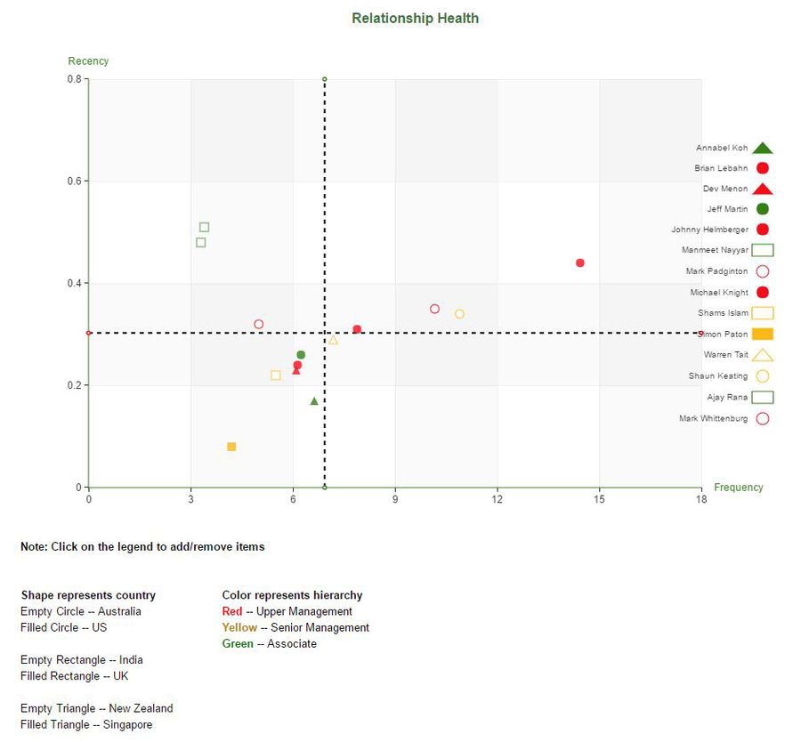
7. Relationship health
A scatter plot is used to plot the relationship health of salesperson for the latest month (August). Mean reference line for both x-axis and y-axis are plotted using a dashed line.
8. Company's activity across different months
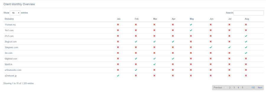
A data table is used to visualize this. This table allows our sponsor company to monitor the change in their client's activity status (active or inactive) across different months.
9. Company's email activities
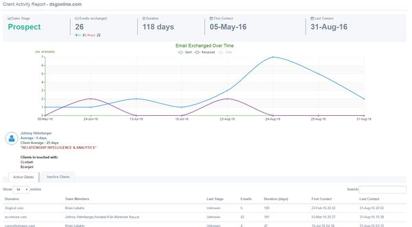
This page allows detailed view of each company email activities. For each company, the latest sales stage, number of emails sent/received and start/end date of communication can be seen. All salesperson communicating with that company can also be determined. A multiple line chart is used to show a summary of change in emails sent/received over time.
For company with more than 1 salesperson, the graph will update and visualize data specific to the selected salesperson when he/her is name is clicked on.The data table at the bottom separates active and inactive clients, with active clients defined as those with emails sent/received in the past 30 days.
The metrics are arranged in a manner that provides quick data comparison and reduce scrolling by the user. Our team's sales dashboard can be found at here. Please allow some time for the data to be loaded.


