Difference between revisions of "Visualisation of Economies & Consumption Patterns"
Kr.tan.2011 (talk | contribs) (Created page with "<center> {|style="border-collapse: separate; border-spacing: 0; border-width: 1px; border-style: solid; border-color: #000000; padding: 0; cellspacing="0" cellpadding="0" vali...") |
(change home link) |
||
| (3 intermediate revisions by 2 users not shown) | |||
| Line 2: | Line 2: | ||
{|style="border-collapse: separate; border-spacing: 0; border-width: 1px; border-style: solid; border-color: #000000; padding: 0; cellspacing="0" cellpadding="0" valign="top" border="0"" | {|style="border-collapse: separate; border-spacing: 0; border-width: 1px; border-style: solid; border-color: #000000; padding: 0; cellspacing="0" cellpadding="0" valign="top" border="0"" | ||
|- | |- | ||
| − | ! style=""border-style: solid; border-width: 0; border-color: #000000; width: | + | ! style=""border-style: solid; border-width: 0; border-color: #000000; width: 70px; height: 70px;"| [[Image:Appannalogo.png|70px]] |
| − | ! style="width: 250px; background-color:# | + | ! style="width: 250px; background-color:#ffffff"| <span style="color:#000000;">Project Proposal</span> |
| − | ! style="width: 250px; background-color:#000000"| [[ | + | ! style="width: 250px; background-color:#000000"| [[Visualisation_of_Economies_%26_Consumption_Patterns_Project_Management | <span style="color:#ffffff;">Project Management</span>]] |
| − | ! style="width: 250px; background-color:#000000"| [[ | + | ! style="width: 250px; background-color:#000000"| [[Visualisation_of_Economies_%26_Consumption_Patterns_Poster| <span style="color:#ffffff;">Poster</span>]] |
| − | ! style="width: 250px; background-color:#000000"| [[ | + | ! style="width: 250px; background-color:#000000"| [[Visualisation_of_Economies_%26_Consumption_Patterns_Application | <span style="color:#ffffff;">Application</span>]] |
| − | ! style="width: 250px; background-color:#000000"| [[ | + | ! style="width: 250px; background-color:#000000"| [[Visualisation_of_Economies_%26_Consumption_Patterns_Research_paper| <span style="color:#ffffff;">Final Report</span>]] |
|} | |} | ||
| − | </center><br/>< | + | </center><br> |
| + | <div style="background: #fee5d9; padding: 5px; font-weight: bold; line-height: 1em; text-indent: 15px; border-left: #cb181d solid 32px; font-size: 20px"><font color="#333333">OUR</font> <font color="#cb181d"> SPONSOR INTRODUCTION</font></div> | ||
| − | + | Arisaig Partners (Asia) Pte Ltd is an independent investment management company established since 1996. With Singapore as their head office, they have expanded their presence into Hong Kong, Mumbai, United Kingdom and many more. Since establishment, Arisaig investment focuses exclusively on consumer sector.<br> | |
| − | |||
| − | <div style="background: #fee5d9; padding: 5px; font-weight: bold; line-height: 1em; text-indent: 15px; border-left: #cb181d solid 32px; font-size: 20px"><font color="#333333"> | + | <div style="background: #fee5d9; padding: 5px; font-weight: bold; line-height: 1em; text-indent: 15px; border-left: #cb181d solid 32px; font-size: 20px"><font color="#333333">BUSINESS</font> <font color="#cb181d"> PROBLEMS</font></div> |
| − | + | Yearly, Arisaig Partners holds a Consumer Symposium for potential clients around the globe. However, year after year they have been using the similar presentation format - powerpoint snapshots with excel charts. Using only tools meant for static visualisation they faced problems such as: | |
| + | # Cluttered visualisation display | ||
| + | # Visualisations are static and cannot show the impact of changing variables in forecasts | ||
| + | # Disjointed visualisation that are unable to provide overview and comparison | ||
| + | # Lack of dynamic visualisation to showcase how variables affect each other | ||
| + | # Clients are unable to interact with their charts and figures | ||
| − | + | Arisaig Partners would like to increase the effectiveness of their presentation by allowing their clients to interact with the visualisations. Additionally, Arisaig Partners thinks that time is not utilised efficiently when much of the investment analyst time are spent teaching clienteles on how to read the charts. | |
| − | + | <br> | |
| − | + | <div style="background: #fee5d9; padding: 5px; font-weight: bold; line-height: 1em; text-indent: 15px; border-left: #cb181d solid 32px; font-size: 20px"><font color="#333333">PROJECT </font> <font color="#cb181d"> OBJECTIVE</font></div><br> | |
| + | Taking into consideration the problems that Arisaig Partners face, as well as the fact that most of their clienteles are highly-educated individuals from large institutes, the aim of the project is: To build a dashboard that allows clients to derive information without much guidance from Arisaig Partners investment analysts. The objectives of the project are: | ||
| + | * To create an integrated dashboard for clients to both understand both macro & micro factors in consumer trends | ||
| + | * To allow users to interact with and understand relationships between charts | ||
| + | * To develop creative visualisations that are different from the usual approaches (e.g. Hans Rosling moving bubbles chart on population) | ||
| + | * To enable users to see how changes in factors affect the forecast (e.g. scale factor) | ||
| + | * To allow clients to view the visualisations easily on their mobile device (i.e. tablets) | ||
| − | <div style="background: #fee5d9; padding: 5px; font-weight: bold; line-height: 1em; text-indent: 15px; border-left: #cb181d solid 32px; font-size: 20px"><font color="#333333">PROJECT</font> <font color="#cb181d"> | + | To achieve the project objectives, we will create a dashboard which integrates visualisations of both the macro & micro factors in consumer trends. Besides interacting with the data such as narrowing in on specific regions or product categories, users will also be able to change the forecasted charts dynamically with their own inputs. The dashboard will feature a simplistic interface which is also mobile-friendly, so clients can access the site with their tablets during the symposium. |
| − | <div style="background: # | + | <br/><br/> |
| − | Considering | + | |
| − | + | <div style="background: #fee5d9; padding: 5px; font-weight: bold; line-height: 1em; text-indent: 15px; border-left: #cb181d solid 32px; font-size: 20px"><font color="#333333">PROJECT </font> <font color="#cb181d"> MOTIVATIONS</font></div><br> | |
| − | * | + | |
| − | * | + | The motivation behind this project is to allow both the service provider (Arisaig Partners) and the service users (potential clienteles) to use their time more efficiently, on things that truly matter. Arisaig wishes to better impress and illustrate the trends they have observed, and allow their clients to ask ‘what if?’ questions by tweaking forecast assumptions. For potential clienteles of Arisaig Partners, they benefit from being able to make better and well-informed decisions. With better visualisations tools and techniques, users could focus on the perception of the data without being distracted by the cognition aspect during the presentation. As for Arisaig Partners, they benefit from better time usage where clients could perform their own analysis and judgments with the dashboard. |
| − | * | + | <br/><br/> |
| − | * | + | |
| − | * | + | <div style="background: #fee5d9; padding: 5px; font-weight: bold; line-height: 1em; text-indent: 15px; border-left: #cb181d solid 32px; font-size: 20px"><font color="#333333">PROJECT </font> <font color="#cb181d"> SCOPE</font></div><br> |
| − | * | + | |
| + | The project covers two main research areas: | ||
| + | # Macro: Demographics & Economic indicators | ||
| + | # Micro: Individual sector matrices | ||
| + | |||
| + | Considering the research areas and sample data, the project is to be as followed: | ||
| + | # Macro Visualisation #1: Exploration of Demographic Data Relationship | ||
| + | * Birth rate per women | ||
| + | * Average age of country/region | ||
| + | * Income | ||
| + | * Household size & Household Income<br/> | ||
| + | # Macro Visualisation #2: Exploration of Economic Data | ||
| + | *GDP, GDP growth rate | ||
| + | * Debt to GDP ratios, Savings rate | ||
| + | * Capital Market Size<br/> | ||
| + | # Micro Visualisations: Exploration of Consumption per Capita | ||
| + | Two visualizations will be created. The first measures consumption in monetary value and the second in volume quantity. Both visualisations will explore the same categorical data. | ||
| + | * Modern Retail | ||
| + | * Fast Food | ||
| + | * Beer | ||
| + | * Oral Care | ||
| + | * Packaged Food | ||
| + | * E-Commerce<br/> | ||
| + | |||
| + | Additionally, the project has to also be sure to satisfy & produce the following deliverables: | ||
| + | # Provision of use case scenarios | ||
| + | # Dynamic and scalable solution that allows end user to modify specific fields (e.g. GDP growth rate predictions) | ||
| + | <br/> | ||
| + | |||
| + | <div style="background: #fee5d9; padding: 5px; font-weight: bold; line-height: 1em; text-indent: 15px; border-left: #cb181d solid 32px; font-size: 20px"><font color="#333333">PROJECT </font> <font color="#cb181d"> METHODOLOGY</font></div><br> | ||
| + | <div style="background: #ffffff; padding: 5px; font-weight: bold; line-height: 1em; text-indent: 15px; border-bottom: #cb181d solid 2px; font-size: 20px"><font color="#333333">Consumer Consumption Patterns</font></div><br/> | ||
| + | This section allows users to understand how consumption patterns have changed over the years, and understand the patterns by regions and countries. <br/><br/> | ||
| + | |||
| + | {|style="border-collapse: separate; border-spacing: 0; border-width: 0px; border-style: solid; border-color: #000000; padding: 0; cellspacing="0" cellpadding="0" valign="top" border="0"" | ||
| + | |- | ||
| + | ! style="width: 650px; background-color:#fee5d9"| <span style="color:#000000;">Chart Chosen</span> | ||
| + | ! style="width: 350px; background-color:#fee5d9"| <span style="color:#000000;">Considerations</span> | ||
| + | |- valign="top" '''Sunburst Chart'''<br> | ||
| + | |[[File:Arisaig_Sunburst.png|600px]] | ||
| + | | | ||
| + | * A sunburst chart provides a quick overview on categorical consumption data. | ||
| + | * It allows our viewers to understand and compare proportions at a glance. | ||
| + | * Sunburst charts also show patterns across hierarchical regions and countries at a glance. | ||
| + | * We will place 2 sunburst charts of data from different years side by side so users can make comparisons on the change in patterns over the years. | ||
| + | |- valign="top"'''Time Series Line Graph'''<br> | ||
| + | |[[File:Arisaig_TimeSeries.png|600px]] | ||
| + | | | ||
| + | * A sunburst chart provides an overview whereas the time series line chart allows the user to narrow down on a particular region or country. So it can be used together with the sunburst chart. | ||
| + | * The line chart will highlight the trends in absolute numbers and allow users to dynamically adjust the forecasted portion according to their own assumptions. | ||
| + | |- | ||
| + | |} | ||
| + | <br/><br/> | ||
| + | |||
| + | <div style="background: #ffffff; padding: 5px; font-weight: bold; line-height: 1em; text-indent: 15px; border-bottom: #cb181d solid 2px; font-size: 20px"><font color="#333333">Economic Data</font></div><br/> | ||
| + | This section allows users to see the GDP, changes in GDP and the debt of each country, grouped together by regions and countries. <br/><br/> | ||
| + | |||
| + | {|style="border-collapse: separate; border-spacing: 0; border-width: 0px; border-style: solid; border-color: #000000; padding: 0; cellspacing="0" cellpadding="0" valign="top" border="0"" | ||
| + | |- | ||
| + | ! style="width: 650px; background-color:#fee5d9"| <span style="color:#000000;">Treemap</span> | ||
| + | ! style="width: 350px; background-color:#fee5d9"| <span style="color:#000000;">Considerations</span> | ||
| + | |- valign="top" | ||
| + | |[[File:ArisaigTreeMap1.png|600px]] | ||
| + | | | ||
| + | * A treemap can convey our hierarchical data with 2 additional attributes via color and size, allowing us to dissect the relationship between the two. | ||
| + | * The size of each block represents the GDP, and we can allow the user to fill in the colors with other economic indicators - savings rate, capital market size to grasp patterns in the data. | ||
| + | |- | ||
| + | |} | ||
| + | <br/><br/> | ||
| + | |||
| + | <div style="background: #ffffff; padding: 5px; font-weight: bold; line-height: 1em; text-indent: 15px; border-bottom: #cb181d solid 2px; font-size: 20px"><font color="#333333">Human Development Data</font></div><br/> | ||
| + | This section allows users to see how human development indicators have changed over the years. <br/><br/> | ||
| + | |||
| + | {|style="border-collapse: separate; border-spacing: 0; border-width: 0px; border-style: solid; border-color: #000000; padding: 0; cellspacing="0" cellpadding="0" valign="top" border="0"" | ||
| + | |- | ||
| + | ! style="width: 650px; background-color:#fee5d9"| <span style="color:#000000;">Motion Charts</span> | ||
| + | ! style="width: 350px; background-color:#fee5d9"| <span style="color:#000000;">Considerations</span> | ||
| + | |- valign="top" | ||
| + | |[[File:Arisaig_MotionChart.png|600px]] | ||
| + | | | ||
| + | * The motion charts will be animated according to time dimension and emphasise the growth of our 2 macro indicators relative to each other, and divulge patterns in their correlation | ||
| + | * A motion chart is able to display 4 different information simultaneously, using the 2 axes, size and colour. | ||
| + | * An animated chart will allow users to visually see how the change took place over the years. | ||
| + | |- | ||
| + | |} | ||
| + | <br/><br/> | ||
| + | <br> | ||
| + | |||
| + | <div style="background: #fee5d9; padding: 5px; font-weight: bold; line-height: 1em; text-indent: 15px; border-left: #cb181d solid 32px; font-size: 20px"><font color="#333333">FUTURE</font> <font color="#cb181d"> DEVELOPMENT POSSIBILITIES</font></div><br> | ||
| + | With further collaboration with the presenters from Arisaig Partners to better understand their presentation flow for the Consumer Symposium, the deliverable could be made “tablet-friendly”. This improves the mobility of the investment analysts on the ground as well as delivering a better user-experience for the clienteles as they could surf it using their personal devices. | ||
| + | |||
| + | <br> | ||
| + | <div style="background: #fee5d9; padding: 5px; font-weight: bold; line-height: 1em; text-indent: 15px; border-left: #cb181d solid 32px; font-size: 20px"><font color="#333333">OUR</font> <font color="#cb181d"> STORYBOARD</font></div> | ||
| + | |||
| + | <center>[[File:ArisaigTreeMap1.png|600px]]</center> | ||
Latest revision as of 16:33, 23 January 2015

|
Project Proposal | Project Management | Poster | Application | Final Report |
|---|
Arisaig Partners (Asia) Pte Ltd is an independent investment management company established since 1996. With Singapore as their head office, they have expanded their presence into Hong Kong, Mumbai, United Kingdom and many more. Since establishment, Arisaig investment focuses exclusively on consumer sector.
Yearly, Arisaig Partners holds a Consumer Symposium for potential clients around the globe. However, year after year they have been using the similar presentation format - powerpoint snapshots with excel charts. Using only tools meant for static visualisation they faced problems such as:
- Cluttered visualisation display
- Visualisations are static and cannot show the impact of changing variables in forecasts
- Disjointed visualisation that are unable to provide overview and comparison
- Lack of dynamic visualisation to showcase how variables affect each other
- Clients are unable to interact with their charts and figures
Arisaig Partners would like to increase the effectiveness of their presentation by allowing their clients to interact with the visualisations. Additionally, Arisaig Partners thinks that time is not utilised efficiently when much of the investment analyst time are spent teaching clienteles on how to read the charts.
Taking into consideration the problems that Arisaig Partners face, as well as the fact that most of their clienteles are highly-educated individuals from large institutes, the aim of the project is: To build a dashboard that allows clients to derive information without much guidance from Arisaig Partners investment analysts. The objectives of the project are:
- To create an integrated dashboard for clients to both understand both macro & micro factors in consumer trends
- To allow users to interact with and understand relationships between charts
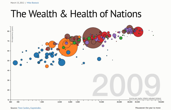
- To develop creative visualisations that are different from the usual approaches (e.g. Hans Rosling moving bubbles chart on population)
- To enable users to see how changes in factors affect the forecast (e.g. scale factor)
- To allow clients to view the visualisations easily on their mobile device (i.e. tablets)
To achieve the project objectives, we will create a dashboard which integrates visualisations of both the macro & micro factors in consumer trends. Besides interacting with the data such as narrowing in on specific regions or product categories, users will also be able to change the forecasted charts dynamically with their own inputs. The dashboard will feature a simplistic interface which is also mobile-friendly, so clients can access the site with their tablets during the symposium.
The motivation behind this project is to allow both the service provider (Arisaig Partners) and the service users (potential clienteles) to use their time more efficiently, on things that truly matter. Arisaig wishes to better impress and illustrate the trends they have observed, and allow their clients to ask ‘what if?’ questions by tweaking forecast assumptions. For potential clienteles of Arisaig Partners, they benefit from being able to make better and well-informed decisions. With better visualisations tools and techniques, users could focus on the perception of the data without being distracted by the cognition aspect during the presentation. As for Arisaig Partners, they benefit from better time usage where clients could perform their own analysis and judgments with the dashboard.
The project covers two main research areas:
- Macro: Demographics & Economic indicators
- Micro: Individual sector matrices
Considering the research areas and sample data, the project is to be as followed:
- Macro Visualisation #1: Exploration of Demographic Data Relationship
- Birth rate per women
- Average age of country/region
- Income
- Household size & Household Income
- Macro Visualisation #2: Exploration of Economic Data
- GDP, GDP growth rate
- Debt to GDP ratios, Savings rate
- Capital Market Size
- Micro Visualisations: Exploration of Consumption per Capita
Two visualizations will be created. The first measures consumption in monetary value and the second in volume quantity. Both visualisations will explore the same categorical data.
- Modern Retail
- Fast Food
- Beer
- Oral Care
- Packaged Food
- E-Commerce
Additionally, the project has to also be sure to satisfy & produce the following deliverables:
- Provision of use case scenarios
- Dynamic and scalable solution that allows end user to modify specific fields (e.g. GDP growth rate predictions)
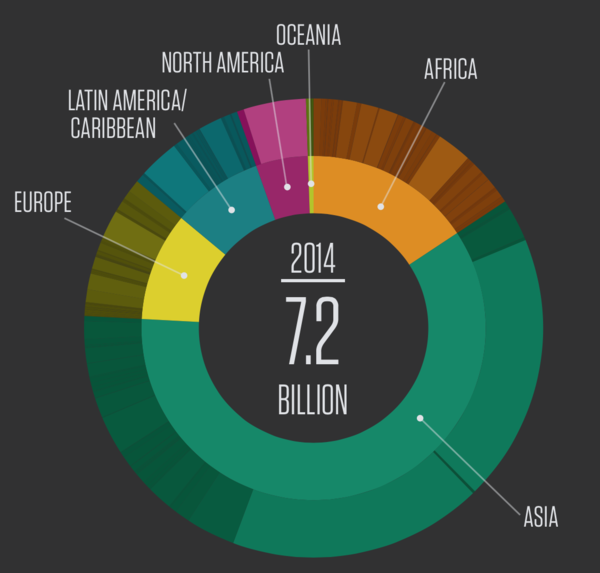
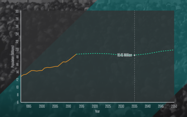
This section allows users to understand how consumption patterns have changed over the years, and understand the patterns by regions and countries.
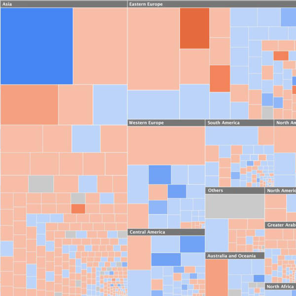
This section allows users to see the GDP, changes in GDP and the debt of each country, grouped together by regions and countries.
This section allows users to see how human development indicators have changed over the years.
With further collaboration with the presenters from Arisaig Partners to better understand their presentation flow for the Consumer Symposium, the deliverable could be made “tablet-friendly”. This improves the mobility of the investment analysts on the ground as well as delivering a better user-experience for the clienteles as they could surf it using their personal devices.


