Difference between revisions of "Griffins Proposal"
| Line 30: | Line 30: | ||
These functions aim to allow HPB staff to identify blocks with limited accessibility and plan for more healthy living amenities in the vicinity. | These functions aim to allow HPB staff to identify blocks with limited accessibility and plan for more healthy living amenities in the vicinity. | ||
| − | + | <br> | |
| − | <div style="background: #0081a1; padding: 5px; font-weight: bold; line-height: 1em; text-indent: 15px; border-left: #FF8819 solid 32px; font-size: 16px"><font color="#fff"> | + | <div style="background: #0081a1; padding: 5px; font-weight: bold; line-height: 1em; text-indent: 15px; border-left: #FF8819 solid 32px; font-size: 16px"><font color="#fff">Features and Methodology</font></div> |
| − | + | <p> | |
| − | <br><br> | + | <div style="background: #FF8819; padding: 4px; font-weight: bold; line-height: 1em; text-indent: 15px; font-size: 14px"><font color="#fff">Feature 1: Calculate number and percentage of units with access to amenities</font></div> |
| − | < | + | |
| − | + | HPB requires an application that allows the user to set the minimum number of amenity needed within a set distance from the HDB. The user will be allowed to vary the minimum number and distance for each amenity. The application will then check if the conditions is met for every HDB block, and return the number and percentage of HDB blocks and the dwelling units (within each HDB block), that meets the criteria set. | |
| + | |||
| + | Healthy360 provides the interface to do the above. Users are able to select from a dropdown list, the minimum number of amenities needed within a fixed buffer distance. | ||
| + | [[File:criteria-setting.png|500px|frameless|center|Pop-up window for user to set criteria for calculating the KPI]] | ||
| + | |||
| + | On backend, without a localhost, all calculations are done on the fly. The application loops through each individual HDB Block in the .js file, and for each individual block, it loops through each type of the amenity, and each of the point from each amenity type. Each individual point is retrieved from the .js using .eachlayer, a leaflet.js function. | ||
| + | |||
| + | It then computes the distance between each point to each HDB block, and compares the distance to the user’s selection. Distance is calculated using .distanceTo, another leaflet.js function. If it is smaller or equals to the distance selected, it adds one to counter of that amenity type, and loops until all the points have been exhausted. | ||
| + | |||
| + | For healthier dining options, it is slightly more complex, for it has three types of dining amenities, restaurant or fast food, food court and coffeeshop, under the same layer, i.e. within the same js file. When checking for healthier dining options, an additional check is placed at the end to check if the type of healthier dining matches the user’s selection, before adding one to the counter. | ||
| + | |||
| + | [[File:Kpi-codes.png|900px|center|Function that iterates through every point in the HDB layer, and then subsequently every point in healthier dining layer]] | ||
| + | |||
| + | <center><small>''Function that iterates through every point in the HDB layer, and then subsequently every point in healthier dining layer''</small></center> | ||
| + | <br> | ||
| + | |||
| + | The counter for each individual amenity is then compared to the user's selection, if it is greater than or equal to what the user chose, the number of dwelling units in that HDB block would be added to the counter for total dwelling units. | ||
| + | |||
| + | [[File:Kpi-counter-codes.png|700px|center|if else condition to check which amenities’ conditions are met]] | ||
| + | <center><small>''if else condition to check which amenities’ conditions are met''</small></center> | ||
| + | <br> | ||
| + | |||
| + | After looping through all the HDB blocks, the number stored in the dwelling units counter would be divided by the total number of dwelling units and a percentage will be returned to the user. A .csv file of the blocks that fulfils the criteria set can also be generated and downloaded. | ||
| + | |||
| + | [[File:KPI-display.png|900px|center|Number and percentage of the households are displayed on the sidebar. User can specify the name of the .csv file to be download]] | ||
| + | <center><small>''Number and percentage of the households are displayed on the sidebar. User can specify the name of the .csv file to be download''</small></center> | ||
| + | <br> | ||
| + | |||
| + | [[File:Csv-sample.png|900px|center|Sample of CSV file, data here is merely a mock sample due to confidentiality of the data]] | ||
| + | <center><small>''Sample of CSV file, data here is merely a mock sample due to confidentiality of the data''</small></center> | ||
| + | <br> | ||
| + | |||
| + | <div style="background: #FF8819; padding: 4px; font-weight: bold; line-height: 1em; text-indent: 15px; font-size: 14px"><font color="#fff">Feature 2: Identify number of amenities around a single HDB block </font></div> | ||
| + | |||
| + | This feature allows the user to search for an address, done using GoogleMaps API, set the buffer distance and query for the number of amenities around it. Healthy360 allows users to drag the marker as well, should GoogleMaps be unable to return a result or if they are unsure of the address. | ||
| + | |||
| + | The user also has the option to set a standard buffer distance for all the amenities, or vary the distance per amenity. | ||
| + | |||
| + | [[File:Block-buffer.png|900px|center|Search box for address is located on the sidebar. Dropdown list located just below it allows user to set a fixed buffer distance for all amenities, and this is reflected on the map as a red buffer zone. Else, users can click on "Modify Individual Buffer Distance" to set varying buffer distances for each amenity]] | ||
| + | <center><small>''Search box for address is located on the sidebar. Dropdown list located just below it allows user to set a fixed buffer distance for all amenities, and this is reflected on the map as a red buffer zone. Else, users can click on "Modify Individual Buffer Distance" to set varying buffer distances for each amenity. The results are then displayed on the side bar as well''</small></center> | ||
| + | <br> | ||
| + | |||
| + | [[File:Block-buffer-criteria.png|500px|center|Pop up box when user clicks on "Modify Individual Buffer Distance]] | ||
| + | <center><small>''Pop up box when user clicks on "Modify Individual Buffer Distance''</small></center> | ||
| + | <br> | ||
| + | |||
| + | Once selected, the application loads the amenities’ layers on backend and loops through each point. The distance between the point and the selected HDB block is then calculated and compared to the user’s selection. This process is the same as the KPI calculation. | ||
| + | <p> | ||
| + | <div style="background: #FF8819; padding: 4px; font-weight: bold; line-height: 1em; text-indent: 15px; font-size: 14px"><font color="#fff">Feature 3: Identifying and displaying risk levels of the HDB blocks </font></div> | ||
| + | In categorising the risk level of the HDB blocks, HPB has set a criteria that observes 3 categories. | ||
| − | + | *Obesity: Nutrition (Healthier dining options) | |
| − | + | **Restaurants or fastfood | |
| + | **Food court | ||
| + | **Coffeshops | ||
| + | *Obesity: Physical Activity | ||
| + | **Health promoting malls | ||
| + | **Sundays at the park | ||
| + | *Tobacco Control | ||
| + | **Smoking cessation areas | ||
| − | + | A HDB block is classified under low risk, if fulfils the conditions set in 2 of the 3 categories. It is classified under medium risk, if it fulfils the conditions set in 1 of the 3 categories. It is classified under high risk, if it does not fulfil any of the conditions set in all the categories. | |
| − | [[File: | + | This function is linked with the KPI calculation function in the web application. The conditions for each layer is taken to be the same conditions used to calculate the KPI, i.e. the minimum number of amenities that should exist within the selected buffer distance. As long as at least one layer from each category is selected, the risk level will be computed at the end of each loop through the HDB layer. A geojson object is then created and plotted to the map. Each HDB point is a single geojson object. |
| − | + | ||
| − | </center | + | [[File:Block-buffer-criteria.png|500px|center|Pop up box when user clicks on "Modify Individual Buffer Distance]] |
| + | <center><small>''Pop up box when user clicks on "Modify Individual Buffer Distance''</small></center> | ||
<br> | <br> | ||
| − | |||
| − | |||
| − | |||
| − | |||
| − | |||
| − | |||
| − | |||
| − | |||
| − | |||
| − | |||
| − | |||
| − | |||
| − | |||
| − | + | ||
| − | + | ||
| − | + | ||
<div style="background: #0081a1; padding: 5px; font-weight: bold; line-height: 1em; text-indent: 15px; border-left: #FF8819 solid 32px; font-size: 16px"><font color="#fff">Data</font></div> | <div style="background: #0081a1; padding: 5px; font-weight: bold; line-height: 1em; text-indent: 15px; border-left: #FF8819 solid 32px; font-size: 16px"><font color="#fff">Data</font></div> | ||
Revision as of 11:42, 16 April 2016
| Home | Project Report | Project Management | Deliverables |
|---|
The Health Promotion Board (HPB) was established as a statutory board under the Ministry of Health in 2001 with a vision to build a nation of healthy people. HPB organises many Health Promotion programmes and requires many tools to assist them in planning to ensure efficient outreach and maximize public resources. HPB is also tasked under the Healthy Living Master Plan, to enable Singaporeans to have access to healthy living at the “doorstep” of every home, workplace and school, by 2020.
Currently, the process to calculate the accessibility of healthy living amenities at HPB is highly manual. The HPB staff are required to do perform analysis within selected areas for their outreach programmes, and this is largely done on excel spreadsheets. In addition, new colleagues typically have difficulties picking up technical skills related to GIS (such as using QGIS), and hence, are very reliant on a small group of staff that with the technical skills, to perform geospatial queries.
Our project aims to provide a custom GIS platform, named Healthy360, that will reduce manual data entry, is easy to use, and will enable the staff to gain greater insights into the data they currently possess.
Healthy360 will be in the form of an interactive and visual web application that utilises GIS functions for geospatial planning and analysis and will allow the user to do the following:
- Check HPB’s KPI, i.e. obtain the percentage of dwelling units that has access to x number of amenities at x buffer distance
- Obtain the number of amenities surrounding each HDB block at a set buffer distance or at varying distance for each amenity
- Identify HDB blocks that are classified under high, medium and low risk
These functions aim to allow HPB staff to identify blocks with limited accessibility and plan for more healthy living amenities in the vicinity.
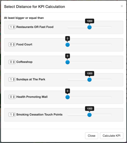
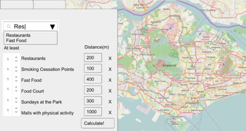
HPB requires an application that allows the user to set the minimum number of amenity needed within a set distance from the HDB. The user will be allowed to vary the minimum number and distance for each amenity. The application will then check if the conditions is met for every HDB block, and return the number and percentage of HDB blocks and the dwelling units (within each HDB block), that meets the criteria set.
Healthy360 provides the interface to do the above. Users are able to select from a dropdown list, the minimum number of amenities needed within a fixed buffer distance.
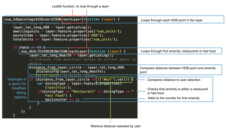
On backend, without a localhost, all calculations are done on the fly. The application loops through each individual HDB Block in the .js file, and for each individual block, it loops through each type of the amenity, and each of the point from each amenity type. Each individual point is retrieved from the .js using .eachlayer, a leaflet.js function.
It then computes the distance between each point to each HDB block, and compares the distance to the user’s selection. Distance is calculated using .distanceTo, another leaflet.js function. If it is smaller or equals to the distance selected, it adds one to counter of that amenity type, and loops until all the points have been exhausted.
For healthier dining options, it is slightly more complex, for it has three types of dining amenities, restaurant or fast food, food court and coffeeshop, under the same layer, i.e. within the same js file. When checking for healthier dining options, an additional check is placed at the end to check if the type of healthier dining matches the user’s selection, before adding one to the counter.
The counter for each individual amenity is then compared to the user's selection, if it is greater than or equal to what the user chose, the number of dwelling units in that HDB block would be added to the counter for total dwelling units.
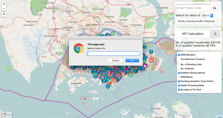
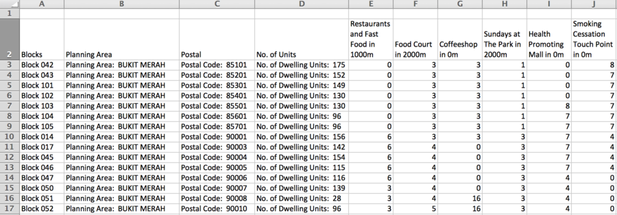
After looping through all the HDB blocks, the number stored in the dwelling units counter would be divided by the total number of dwelling units and a percentage will be returned to the user. A .csv file of the blocks that fulfils the criteria set can also be generated and downloaded.
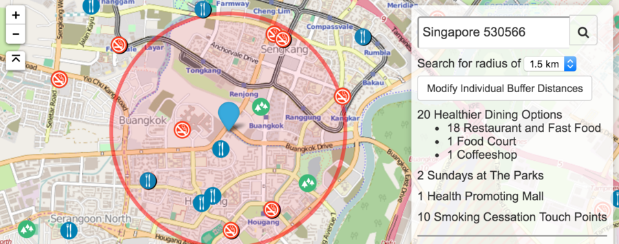
This feature allows the user to search for an address, done using GoogleMaps API, set the buffer distance and query for the number of amenities around it. Healthy360 allows users to drag the marker as well, should GoogleMaps be unable to return a result or if they are unsure of the address.
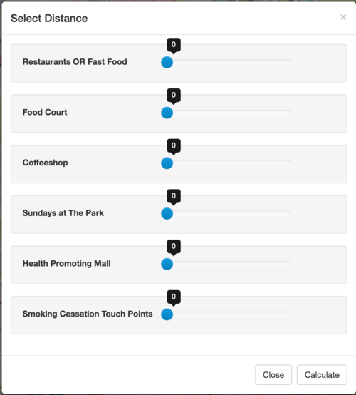
The user also has the option to set a standard buffer distance for all the amenities, or vary the distance per amenity.
Once selected, the application loads the amenities’ layers on backend and loops through each point. The distance between the point and the selected HDB block is then calculated and compared to the user’s selection. This process is the same as the KPI calculation.
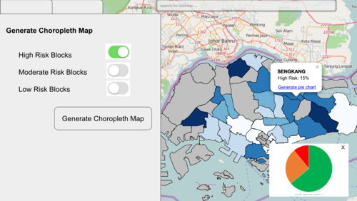
In categorising the risk level of the HDB blocks, HPB has set a criteria that observes 3 categories.
- Obesity: Nutrition (Healthier dining options)
- Restaurants or fastfood
- Food court
- Coffeshops
- Obesity: Physical Activity
- Health promoting malls
- Sundays at the park
- Tobacco Control
- Smoking cessation areas
A HDB block is classified under low risk, if fulfils the conditions set in 2 of the 3 categories. It is classified under medium risk, if it fulfils the conditions set in 1 of the 3 categories. It is classified under high risk, if it does not fulfil any of the conditions set in all the categories.
This function is linked with the KPI calculation function in the web application. The conditions for each layer is taken to be the same conditions used to calculate the KPI, i.e. the minimum number of amenities that should exist within the selected buffer distance. As long as at least one layer from each category is selected, the risk level will be computed at the end of each loop through the HDB layer. A geojson object is then created and plotted to the map. Each HDB point is a single geojson object.
The following datasets would be required for this project
- Living dwellings (List of HDB Blocks and number of dwelling units per block)
- Healthier dining options(Restaurants, Fast Food Food Court, Coffeeshop)
- Sundays at the Park
- Physical Activity Malls
- Smoking Cessation Touchpoints
- GRC zones
The above datasets would all be represented in point form, with the exception of the GRC zones.
Datasets would have to be converted to .shp or geoJSON and JSON formats. Shapefiles would allow us to explore the data on QGIS while geoJSON and JSON formats allow integration with javascript libraries like leaflet.js and d3.js.
Examples of Data
Healthier Dining.json
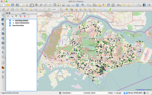
The original dataset for healthier dining was in csv format. It was geocoded and uploaded on QGIS, before being converted to geoJSON format using the QGIS2Leaflet plugin, to allow leaflet.js to display the map on the front end.
Before building the web application, we have to first process the data obtained. Datasets are in the form of .csv, and most of the datasets only have postal codes for locational details. These datasets will be geocoded using the OneMap API.
The geocoded data will be plotted on QGIS. Within QGIS, a plugin, QGIS2Leaflet, would then be used to generate a basic javascript web application, and the layers are saved in json format.
With the basic application in place, Bootstrap will be used to construct input fields for the user to select the relevant layers and the buffer distance for each of the layers. The user will also be able to key in the criteria that has to be met by each block, I.e. How many points from each layer should a buffer around each block contain.
The web application would then buffer around each individual HDB block and calculate the number of points, of each amenity, that falls within the buffer. This data would be store in geoJSON format for now.
The KPI currently used by HPB looks at the percentage of dwelling units that meets the criteria set by the user. We would then need to compare the number of each amenity found in the buffer, to the criteria keyed in by the user. On backend, this process, will be iterated through each HDB block. The amenities that meets or fails the criteria will be record as TRUE/FALSE on backend.
After iterating through all the HDB blocks, the HDB blocks that meet the criteria set will be retrieved and dwelling of these HDB blocks, will be summed up and divided against the total number of dwelling units in Singapore to obtain the percentage.
The process to classify the HDB blocks under high, medium or low risk follows a similar process. But instead of only considering the amenities selected by the user, all amenities under the three priority area will be used. Each HDB block will be checked by priority area and likewise, boolean will be used to record whether criteria(s) in each priority area is met. The number of priority areas with criteria(s) met, will be summed and classified into the different risk levels accordingly.
Users can then select the risk level and generate the choropleth map. Grouped bar charts can also be used to display the number of amenities in each planning area, or the number of HDB blocks, of the 3 categories, in each planning area, to provide a macro view for the user.
New layers can be added on the fly to display on the map for users to add to their analysis computation. This is done using leaflet’s fileLayerLoad plugin. Users can upload their file and sidebar to toggle layers, as well as the the list of layers available for the user to calculate the KPI, will be updated accordingly.
The data in the json files for the default layers can also be updated as needed.
To further aid visualization of the data, d3.js will be used to generate and display data in the form of charts and graphs.
| Technology | Description |
|---|---|
| Bootstrap | An open-source framework for front-end development to add aesthetics to our web application. |
| D3.js | Manipulate data using HTML, SVG, and CSS to allow interaction and animation for our map. |
| GeoJSON | An open standard format designed for construction of simple geographical features with their non-spatial attributes based on JSON. |
| Leaflet.js | An open-source JavaScript library for interactive maps to help us add in the needed interactions. |
| OpenStreetMap.org | A free to use map of the world under an open licence which will be used for our mapping in our web application. |
| QGIS | A free and open sourced geographic information system to create, edit, visualise, analyse and edit geospatial information. |
A lightweight, portable web application that can be easily brought over to different machines without installation. The interactive web application should show the Singapore map with many attributes for filtering to assist in HPB’s daily planning needs. The user would be able to use the web application for presentations and also export the generated results into various file formats.
We have to make the application portable and usable without any installation of programs due to the policy restrictions of our clients. In addition, the database cannot be hosted online due to the confidentiality of data which eliminates the use of Structured Query Language (SQL). The dataset will be kept in local drives and the queries must be done on the fly without the usage of database and SQL queries.
This leads to further difficulties in computing the KPI without a space to store, query and retrieve the data necessary to compute the KPI. This problem is also further complicated by the option to allow user to upload new layers and set different criterion.
In working around this limitation, we have explored the option of a portable database, Spatialite, and am currently trying out javascript libraries like, turf.js.
