Difference between revisions of "ANLY482 AY2016-17 T2 Group19 Documentation"
| Line 56: | Line 56: | ||
'''Geospatial Perspective''' | '''Geospatial Perspective''' | ||
| + | |||
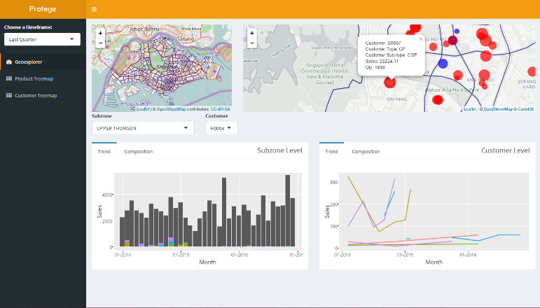
A geospatial overview is provided at the initialisation of data with a snapshot of the past quarter’s customers displayed as a proportional symbol map next to a synced control map that is zoomed out to give an overview of the entire map. This acts an overview of the data with the proportional symbol also acting as a navigation panel with clicks leading to a reactive filtering of data and the generation of trend charts on subzone performance alongside specific individual customer performance over time as seen in Figure 2. | A geospatial overview is provided at the initialisation of data with a snapshot of the past quarter’s customers displayed as a proportional symbol map next to a synced control map that is zoomed out to give an overview of the entire map. This acts an overview of the data with the proportional symbol also acting as a navigation panel with clicks leading to a reactive filtering of data and the generation of trend charts on subzone performance alongside specific individual customer performance over time as seen in Figure 2. | ||
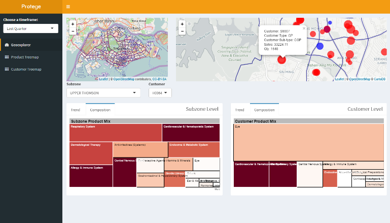
In addition, users can probe into the composition of the performance of each subzone or individual customers with a tree-map and this provides a more effective visualisation of multivariate information on both sales and quantity information with respect to different categories or specific products. This also allows for a comparison of a specific customer against its peers within the same subzone. (Figure 3) | In addition, users can probe into the composition of the performance of each subzone or individual customers with a tree-map and this provides a more effective visualisation of multivariate information on both sales and quantity information with respect to different categories or specific products. This also allows for a comparison of a specific customer against its peers within the same subzone. (Figure 3) | ||
| Line 66: | Line 67: | ||
Figure 3 | Figure 3 | ||
| + | |||
| + | '''Product Perspective''' | ||
| + | |||
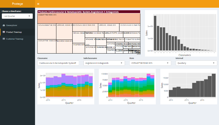
| + | In the product perspective, an interactive treemap based on data from the selected timeframe is used instead of a webmap. | ||
| + | |||
| + | [[File:4th.png]] | ||
| + | |||
| + | Figure 4 | ||
| + | |||
| + | The tree-map serves as a navigation as well as an overview as it would allow the user to drill down from a broad product category into a single product and subsequently view the sales trends of each broad product category to item with the choice of different intervals. In addition, a simple bar chart is also available next to the tree-map for a simple overview of sales of different categories over a specified timeframe. | ||
| + | |||
| + | '''Customer Perspective''' | ||
| + | |||
| + | In this perspective, a tree-map of the customer type is used with the levels being | ||
| + | 1. Broadest customer grouping | ||
| + | 2. Customer grouping | ||
| + | 3. Category of products | ||
| + | 4. Subcategories of product | ||
| + | |||
| + | [[File:5.png]] | ||
| + | |||
| + | Figure 5 | ||
| + | |||
| + | Using a tree-map as a navigation tool again allows the user to track the changes in the composition of buying patterns (in the form of reactive trend charts) for different customer types over time while at the same time providing a quick overview of buying patterns of a certain customer group over a time frame. (Fig 5). A heatmap also visualises the purchasing patterns of various customer segments and allows for quick identification of strong product categories across all customer segments. | ||
| + | |||
| + | [[File:6.png]] | ||
| + | |||
| + | Figure 6 | ||
| + | |||
| + | '''''Data Visualisation Processes''''' | ||
| + | |||
| + | The shiny app runs on a single file format and carries out the bulk of data visualisation processes, namely web-mapping, interactive treemapping, and reactive charting. | ||
| + | '''I. Generation of webmap''' | ||
| + | Using the leaflet R plugin, the web-map generated consisted of 2 main sections, a control map and a zoom in map, as shown in Fig. 7. The two maps are synced through proxies with clicks on the control map leading to a zoom onto the corresponding area on the right map. This allows for convenient navigation of the map. On the right map, proportionate symbols relating to sales within a specified timeframe are generated with colours of the symbols corresponding to different customer types. Upon clicking the selected symbol with then be highlighted in red and key details would appear in a popup (redacted for confidentiality) | ||
| + | |||
| + | [[File:7.png]] | ||
| + | |||
| + | Figure 7 | ||
| + | |||
| + | Alternatively, navigation could be done using dropdown menus that are populated with items from the corresponding time frame. This navigation is done through a series of observer events where the click input first updates the dropdown input which then navigates to a specific view and zoom on the right map. This reduces the probability of a trigger cascade. | ||
| + | '''II. Interactive treemapping''' | ||
| + | Modifications were made to the d3treeR package, an extension of the tree-map package. The tree-maps used in this app were preloaded along with the environment image due to the complexity. The d3treeR allows for interactive hover-over-to-reveal visualisations and for tracking of clicks and thus enabling use of the tree-map for reactive charting. | ||
| + | '''III. Reactive charting''' | ||
| + | By using the click inputs to both the leaflet webmap and d3treeR, dropdown inputs were populated and used as reactive inputs to filter datasets in addition to other input parameters prepared in the global script and charted using plotly in addition to ggplot. The key benefit in using plotly is that is allows for easy export of its charts as images as well as the ease of brush-zooming and provision of hover-info. These functions allow for ease in access and useability as users can brush-zoom into areas of interest and hover over interesting trends to gain greater insight. | ||
</div><br> | </div><br> | ||
Revision as of 14:25, 23 April 2017
Key Deliverables
Reports and Minutes will not be available due to client confidentiality
Interactive Visual Analytical Dashboard
1. User Interface Design
Figure 1
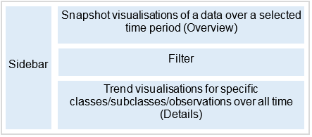
The Interactive Visual Analytical Dashboard (IVAD) presents transactional data in 3 main perspectives to provide a holistic view of the data: Geospatial, Product, Customer Type. This approach was based off the 5 Ws of information gathering, with geospatial relating to Where, product relating to What, Customer Type, relating to Who. Alongside with these 3 perspectives, a consistent underlying philosophy was taken to the UI design, following the Schneiderman’s Mantra: overview, zoom and filter, details on demand. This was implemented by creating 3 distinct portions in every perspective view: Snapshot, Filter, Trend. The Snapshot portion acts as an overview/navigation panel that takes the form of either a web-map or a tree-map, alongside with a simple bar chart/heatmap. The Snapshot portion utilises data from a selected time frame with two levels of data visualisations: a snapshot level relating to a certain time frame that is selected in the sidebar (overview) and displayed alongside trend information (detail) in the form as shown in Figure 1. This would be further elaborated below with regards to the various perspectives.
Geospatial Perspective
A geospatial overview is provided at the initialisation of data with a snapshot of the past quarter’s customers displayed as a proportional symbol map next to a synced control map that is zoomed out to give an overview of the entire map. This acts an overview of the data with the proportional symbol also acting as a navigation panel with clicks leading to a reactive filtering of data and the generation of trend charts on subzone performance alongside specific individual customer performance over time as seen in Figure 2. In addition, users can probe into the composition of the performance of each subzone or individual customers with a tree-map and this provides a more effective visualisation of multivariate information on both sales and quantity information with respect to different categories or specific products. This also allows for a comparison of a specific customer against its peers within the same subzone. (Figure 3)
Figure 2
Figure 3
Product Perspective
In the product perspective, an interactive treemap based on data from the selected timeframe is used instead of a webmap.
Figure 4
The tree-map serves as a navigation as well as an overview as it would allow the user to drill down from a broad product category into a single product and subsequently view the sales trends of each broad product category to item with the choice of different intervals. In addition, a simple bar chart is also available next to the tree-map for a simple overview of sales of different categories over a specified timeframe.
Customer Perspective
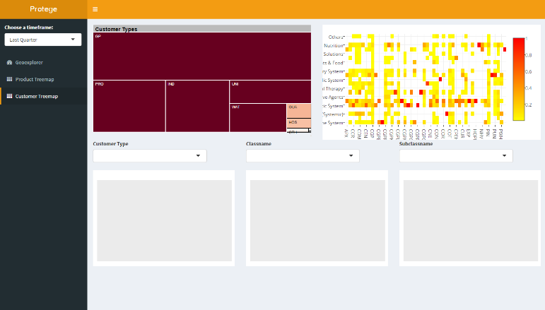
In this perspective, a tree-map of the customer type is used with the levels being 1. Broadest customer grouping 2. Customer grouping 3. Category of products 4. Subcategories of product
Figure 5
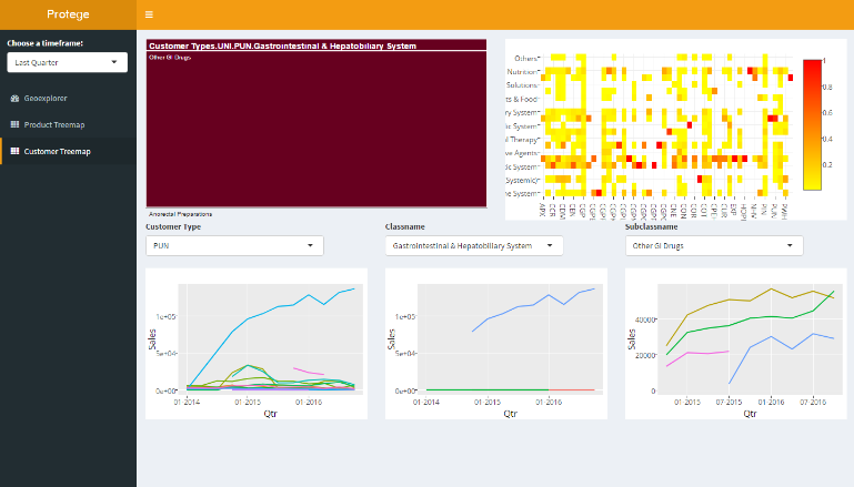
Using a tree-map as a navigation tool again allows the user to track the changes in the composition of buying patterns (in the form of reactive trend charts) for different customer types over time while at the same time providing a quick overview of buying patterns of a certain customer group over a time frame. (Fig 5). A heatmap also visualises the purchasing patterns of various customer segments and allows for quick identification of strong product categories across all customer segments.
Figure 6
Data Visualisation Processes
The shiny app runs on a single file format and carries out the bulk of data visualisation processes, namely web-mapping, interactive treemapping, and reactive charting. I. Generation of webmap Using the leaflet R plugin, the web-map generated consisted of 2 main sections, a control map and a zoom in map, as shown in Fig. 7. The two maps are synced through proxies with clicks on the control map leading to a zoom onto the corresponding area on the right map. This allows for convenient navigation of the map. On the right map, proportionate symbols relating to sales within a specified timeframe are generated with colours of the symbols corresponding to different customer types. Upon clicking the selected symbol with then be highlighted in red and key details would appear in a popup (redacted for confidentiality)
Figure 7
Alternatively, navigation could be done using dropdown menus that are populated with items from the corresponding time frame. This navigation is done through a series of observer events where the click input first updates the dropdown input which then navigates to a specific view and zoom on the right map. This reduces the probability of a trigger cascade. II. Interactive treemapping Modifications were made to the d3treeR package, an extension of the tree-map package. The tree-maps used in this app were preloaded along with the environment image due to the complexity. The d3treeR allows for interactive hover-over-to-reveal visualisations and for tracking of clicks and thus enabling use of the tree-map for reactive charting. III. Reactive charting By using the click inputs to both the leaflet webmap and d3treeR, dropdown inputs were populated and used as reactive inputs to filter datasets in addition to other input parameters prepared in the global script and charted using plotly in addition to ggplot. The key benefit in using plotly is that is allows for easy export of its charts as images as well as the ease of brush-zooming and provision of hover-info. These functions allow for ease in access and useability as users can brush-zoom into areas of interest and hover over interesting trends to gain greater insight.

