Difference between revisions of "ANLY482 AY2016-17 T2 Group16: HOME/Interim"
| (28 intermediate revisions by the same user not shown) | |||
| Line 36: | Line 36: | ||
<div><font face="Roboto"> | <div><font face="Roboto"> | ||
| − | <big>'''Overview'''</big><br/> | + | === <big>'''Overview'''</big><br/> === |
The objective of this project is to provide insights on eBook databases and their users for Li Ka Shing Library Analytics Team. The analysis is not limited to eBook databases but also studies the general traits of other databases. As much of analysis is done on proxy server request logs, data cleaning is a major component of this project. The analysis results will help Li Ka Shing Library understand the usage pattern of its users, and better serve SMU community with increasing demand for professional knowledge. | The objective of this project is to provide insights on eBook databases and their users for Li Ka Shing Library Analytics Team. The analysis is not limited to eBook databases but also studies the general traits of other databases. As much of analysis is done on proxy server request logs, data cleaning is a major component of this project. The analysis results will help Li Ka Shing Library understand the usage pattern of its users, and better serve SMU community with increasing demand for professional knowledge. | ||
| Line 45: | Line 45: | ||
There are users other than students (e.g. alumni, staff, visiting students and anonymous users), but the scope of this project is only limited to students because of the availability and insightfulness of student data. | There are users other than students (e.g. alumni, staff, visiting students and anonymous users), but the scope of this project is only limited to students because of the availability and insightfulness of student data. | ||
| − | === Exploratory Data Analysis === | + | === <big>'''Exploratory Data Analysis'''</big><br/> === |
Exploratory data analysis (EDA) was done on student data and request log data respectively. Through EDA, we hope to: | Exploratory data analysis (EDA) was done on student data and request log data respectively. Through EDA, we hope to: | ||
* understand data volume and dimensions | * understand data volume and dimensions | ||
| Line 53: | Line 53: | ||
====<big>'''Student'''</big><br/>==== | ====<big>'''Student'''</big><br/>==== | ||
| + | |||
: 1. '''Understanding the data''' : | : 1. '''Understanding the data''' : | ||
The headers of student data are not self-explanatory. We studied the values of each columns and determined the meeting for “statistical categories” as is shown in the table below. | The headers of student data are not self-explanatory. We studied the values of each columns and determined the meeting for “statistical categories” as is shown in the table below. | ||
| Line 60: | Line 61: | ||
By comparing the number of student IDs with unique number of students, we confirmed there is not duplicate identifier. Besides, there is no missing values under faculty, degree name and admission year. We filled in the missing values in graduation year “in process”. | By comparing the number of student IDs with unique number of students, we confirmed there is not duplicate identifier. Besides, there is no missing values under faculty, degree name and admission year. We filled in the missing values in graduation year “in process”. | ||
| − | : | + | : 3. '''Student program distribution''' : |
To find out the faculty distribution, we plotted bar chart Chart 1. From the bar chart, we observed that most of the students who visited the school library website for research are business students followed by “Others”. We investigated who make up the “Other” category by summarising categories in “Degree” column. | To find out the faculty distribution, we plotted bar chart Chart 1. From the bar chart, we observed that most of the students who visited the school library website for research are business students followed by “Others”. We investigated who make up the “Other” category by summarising categories in “Degree” column. | ||
| − | <br | + | <br/> |
Based on Table 2, we analysed the “Others” category and found out that most of them belong to International Exchange Programme, followed by Local Exchange Programme student and H3 Program students. | Based on Table 2, we analysed the “Others” category and found out that most of them belong to International Exchange Programme, followed by Local Exchange Programme student and H3 Program students. | ||
| + | [[File:Faculty.PNG|500px|center]] | ||
| + | |||
| + | : 4. '''Breakdown of students based on enrolment year''' : | ||
| + | The table below shows the number of students by admission and graduation year. There are no records with graduation year before Admission year. From Table 4 we learnt that most of undergraduate students graduate within 4 years, which reflect the reality. Comparing the two tables, various postgraduate and non-degree programs reduces the average duration of study. | ||
| + | [[File:Ay.PNG|500px|center]] | ||
| + | |||
| + | ====<big>'''Request Logs'''</big><br/>==== | ||
| + | The sheer volume of data posed a challenge in EDA phase. Thus, we started from samples of 1 million records and then extended to the full dataset. Many levels of data cleaning are necessary to discover database usage patterns. | ||
| + | * Dataset contains duplicate records | ||
| + | * Many requests are directed to web resources | ||
| + | * Requests created by users do not necessarily directly to a title, instead they may be created by navigating to various pages | ||
| + | * Database name is not explicitly shown in the dataset, but has to be derived from URL domains | ||
| + | * User input and requested title can only be extracted from GET request parameters. Databases use different methods to encode the request information. | ||
| + | |||
| + | : 1. '''Duplicated records''' : | ||
| + | Through observation, we discovered request records contain duplicate rows (defined as a user makes multiple identical requests with the same URL in the same time frame). This is supposedly caused by auto or manual page refresh but we cannot ascertain the actual reason. <br/> | ||
| + | By and large, the number of duplicate lines correlates with the number of lines for each database, and they amount to 5% of all requests, which is a reasonable amount to remove. To find out the relative number of duplicate lines by domain, we normalised it against the total occurrence of the domains. The result shows they are fairly distributed among most domains without one single domain owning too much proportion of duplicate records. | ||
| + | |||
| + | : 2. '''Requests to web resources''' : | ||
| + | Without duplicate records, the data would still be noisy with requests to web assets. Web assets are used for page rendering and display. The typical ones are JavaScript (.js), Cascading Style Sheets (.css) and images (.img, jpg). Such web assets are not helpful in understanding user behaviour as the requests are not generated by user but are database dependent. The queries to web assets are recognised by web assets file extensions. We came with a list of web assets extensions as exhaustive as possible. Subsequent pattern extraction also uncovered more types of web assets that should be cleaned at this stage. Sites renders pages differently, thus the pattern of requests to web assets vary. | ||
| + | [[File:No_of_requests.png|500px|center]] | ||
| + | Unsurprisingly, GIF, JavaScript, and CSS takes up a fair proportion of the overall number of requests. In reality, page rendering typically requires many web resources files, which explains the large percentage of web asset requests. This can be backed up by our experiment with Ebrary database viewing page for ebook “Singapore Perspective: Singapore Perspective 2013”. During the page rendering process, 13 CSS style sheets, 24 JS scripts, 31 images and 1 font file were captured. All these files have to go through the library proxy before downloaded and used by browser for page rendering (as the asset URLs have been rewritten to be directed to libproxy). <br/> | ||
| + | |||
| + | The requests to web assets have to be removed from analysis on two grounds: | ||
| + | * Inflation on intra-domain analysis, as the web assets indefinitely increase the number of requests within a domain | ||
| + | * Distortion on inter-domain analysis, as the number of web assets used to render pages vary from site to site. | ||
| + | |||
| + | : 3. '''Deriving database name from URL''' : | ||
| + | The database and URL domain is not a simple one-to-one relationship, and the domain names may not necessarily reflect the database names. To study the characteristics of databases, we have to transform domain names, which can be extracted from request URLs, to database names. | ||
| + | |||
| + | === <big>'''Data Analysis'''</big><br/> === | ||
| + | ====<big>'''User Group Analysis'''</big><br/>==== | ||
| + | After data has been prepared and is ready for analysis, we want to observe the patterns that will appear in a single semester. Hence we have chosen 4 months’ common log data from Aug to Nov, which is equivalent to the first semester of annual year 2016/2017.<br/> | ||
| + | Before diving into the analysis, we first have verified in the diagram below that the number of sessions requested by students from all faculty are indeed aligned with the exploratory analysis that law school and business school have the most active user groups. Apart from that, breaking down the requesters by admission year will help us identify students in different years of studies, and graduation year tells us whether the student is still a current student or a graduates. | ||
| + | [[File:User_profile.png|500px|center]] | ||
| + | |||
| + | ====<big>'''Domain Trend Line'''</big><br/>==== | ||
| + | The next step is to identify the most popular domains visited. With a simple plot of total number of sessions as the vertical axis and date time as the horizontal axis, a very skewed line is shown in the diagram below. The huge spike in recess week period triggered our interest in discovering the cause of it. However, with the current diagram, we are unable to answer such behaviour pattern. Thus we want to constructed a dashboard that can allow users to interactively observe the pattern and discover underlying reasons of such occurrences. | ||
| + | [[File:Domain_trend_line.PNG|500px|center]] | ||
| + | |||
| + | To better observe the trend line pattern of each domain, we temporarily exclude Factiva from the trend line graph. However, what the diagram below shows is still too messy to observe and too difficult to gain information. Thus we decided to explore new ways of representing the data. | ||
| + | [[File:Modified.png|500px|center]] | ||
| + | |||
| + | ====<big>'''Horizon chart analysis'''</big><br/>==== | ||
| + | After researching on the possible visualisation method, we decided to utilise “horizon chart” as an improvement for simple trend lines, as it is a powerful tool for comparing data over time among many items within a category. <br/> | ||
| + | |||
| + | How we employ this technique is to compare the “daily usage rate” of each domain to its own “yearly average usage rate”, and represent them in terms of the percentage difference by two colour schemes. The bluish colour shows the less proportionate daily usages rate to its yearly average and on the other hand, the reddish colour shows the more proportionate end. Deeper the colour the higher in their differences. <br/> | ||
| + | |||
| + | To derive the horizon band, which is the cutting point of the density of each colour, the formula 1 is being used in construct the calculated field. | ||
| + | [[File:If_then.PNG|500px|center]] | ||
| + | |||
| + | Following this pattern, we are able to derive different level of colouring to plot the final horizon chart below. | ||
| + | [[File:Horizon_chart.png|500px|center]] | ||
| + | |||
| + | : 1. '''Undergraduates Pattern''' : | ||
| + | To prove that we have correctly reflect the data through horizon chart, a very obvious pattern shown in Diagram 6 is that by the end of week 7, a sudden “cool down” in the usage of library e-resources which is reflective of real life, as students are all taking a break after the midterm exams. | ||
| + | [[File:Undergrad.png|500px|center]] | ||
| + | |||
| + | Furthermore, we found that in week 11 - beginning of presentation week, there is a spike in the usage of library e-resources for research purposes. This a natural phenomenon as students typically do some last-minute research for presentations. This is shown in the diagram above with the reddest portion. | ||
| + | |||
| + | : 2. '''Findings on “the surge of Factiva”''' : | ||
| + | Now we can dive into the question we raised previously - who are the actual requestors to the large amount of sessions on “Factiva”. Through various steps of filtering and selection, we discovered that the surge of the requests all come from a single user. This also applies to the next few days of the large amount of requests. Hence we suspect that it might gone through some data crawling incidences. | ||
| + | [[File:Factiva.png|500px|center]] | ||
| + | Interestingly, from the library databases list, under Factiva description, there is an additional reminder (in red) on not programmatically download resources from Factiva. We suspect the incidence may be noticed by the librarians and the warning points to the aforementioned incident. | ||
| + | [[File:Red.png|500px|center]] | ||
| + | |||
| + | : 3. '''Comparison among different user groups''' : | ||
| + | This interactive dashboard also allows us to do close comparison between different group of students on the usage pattern of the selected domains. One aspect of our sponsor’s interest is the usage patterns of ebooks. Hence, we delved into one of the most popular ebooks platform - ebrary. For that, we can pinpoint the differences on the usage pattern of ebrary by students from Social Science, Law and Business faculties. The results are shown in the diagram below. | ||
| + | [[File:Diagram8.png|500px|center]] | ||
| + | The diagram above only shows the general usage pattern of ebrary (one of the more popular library e-resources). The line chart (domain popularity) shows the general trend of the ebrary usage. It shows the most usage occur in week 3 and week 4. The User's profile indicates the demographics of students using ebrary. | ||
| + | [[File:Comparison.PNG|500px|center]] | ||
| + | <br/> | ||
| + | [[File:T2G16Table.PNG|500px|center]] | ||
| + | <br/> | ||
| + | [[File:Diagram10.png|500px|center]] | ||
| − | + | Based on at the diagram above, here are a few interesting findings: | |
| + | # SOSS students tend to do their research near the start of the semester. | ||
| + | # The majority of ebrary student users come from School of Social Sciences, followed by LKSC and School of Law. | ||
| + | # On August 24 in particular, we can see that the largest population is School of Social Sciences students and there is an exceptional spike in access rate. We assume that it may be due to a workshop held for SOSS students to use ebrary for their research. It makes sense because their admission year is 2016 who are the freshmen. | ||
<!--/Content--> | <!--/Content--> | ||
Latest revision as of 00:51, 23 April 2017
Contents
Overview
The objective of this project is to provide insights on eBook databases and their users for Li Ka Shing Library Analytics Team. The analysis is not limited to eBook databases but also studies the general traits of other databases. As much of analysis is done on proxy server request logs, data cleaning is a major component of this project. The analysis results will help Li Ka Shing Library understand the usage pattern of its users, and better serve SMU community with increasing demand for professional knowledge.
Data Overview
The data we will work with is request log data (a.k.a. digital trace) and student data. Request log is a NCSA Common Log Format (CLF) data with billions of record captured by the library’s URL rewriting proxy server. This dataset captures all user request to external databases. The record attributes are user ID, request time, http request line (method, URL, and protocol), response time, and user agent. The student data, specifying faculty, admission year, graduation year, and degree program, is also provided in csv format for the team. For non-disclosure reason, the user identifier - emails - are obfuscated by hashing to a 64-digit long hexadecimal numbers. The hashed ID will be used to link up two tables. Please refer to appendix for the complete data dimensions and samples. The request log records are filed by months. The monthly numbers of records in request log data vary from 3 million to 6 million and the file sizes around 2 GB. Student dataset contains 22,427 records for students not only limited to full-time but also postgraduates and exchange students. There are users other than students (e.g. alumni, staff, visiting students and anonymous users), but the scope of this project is only limited to students because of the availability and insightfulness of student data.
Exploratory Data Analysis
Exploratory data analysis (EDA) was done on student data and request log data respectively. Through EDA, we hope to:
- understand data volume and dimensions
- assess data quality, including completeness, validity, consistency and accuracy
- formulate hypotheses for analysis and
- determine proper analysis approaches
Student
- 1. Understanding the data :
The headers of student data are not self-explanatory. We studied the values of each columns and determined the meeting for “statistical categories” as is shown in the table below.
- 2. Data quality :
By comparing the number of student IDs with unique number of students, we confirmed there is not duplicate identifier. Besides, there is no missing values under faculty, degree name and admission year. We filled in the missing values in graduation year “in process”.
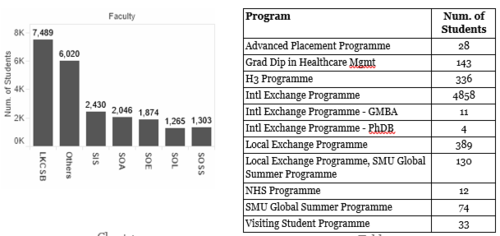
- 3. Student program distribution :
To find out the faculty distribution, we plotted bar chart Chart 1. From the bar chart, we observed that most of the students who visited the school library website for research are business students followed by “Others”. We investigated who make up the “Other” category by summarising categories in “Degree” column.
Based on Table 2, we analysed the “Others” category and found out that most of them belong to International Exchange Programme, followed by Local Exchange Programme student and H3 Program students.
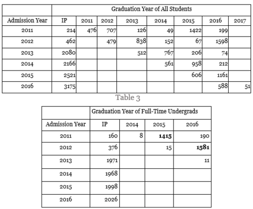
- 4. Breakdown of students based on enrolment year :
The table below shows the number of students by admission and graduation year. There are no records with graduation year before Admission year. From Table 4 we learnt that most of undergraduate students graduate within 4 years, which reflect the reality. Comparing the two tables, various postgraduate and non-degree programs reduces the average duration of study.
Request Logs
The sheer volume of data posed a challenge in EDA phase. Thus, we started from samples of 1 million records and then extended to the full dataset. Many levels of data cleaning are necessary to discover database usage patterns.
- Dataset contains duplicate records
- Many requests are directed to web resources
- Requests created by users do not necessarily directly to a title, instead they may be created by navigating to various pages
- Database name is not explicitly shown in the dataset, but has to be derived from URL domains
- User input and requested title can only be extracted from GET request parameters. Databases use different methods to encode the request information.
- 1. Duplicated records :
Through observation, we discovered request records contain duplicate rows (defined as a user makes multiple identical requests with the same URL in the same time frame). This is supposedly caused by auto or manual page refresh but we cannot ascertain the actual reason.
By and large, the number of duplicate lines correlates with the number of lines for each database, and they amount to 5% of all requests, which is a reasonable amount to remove. To find out the relative number of duplicate lines by domain, we normalised it against the total occurrence of the domains. The result shows they are fairly distributed among most domains without one single domain owning too much proportion of duplicate records.
- 2. Requests to web resources :
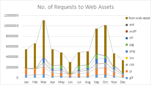
Without duplicate records, the data would still be noisy with requests to web assets. Web assets are used for page rendering and display. The typical ones are JavaScript (.js), Cascading Style Sheets (.css) and images (.img, jpg). Such web assets are not helpful in understanding user behaviour as the requests are not generated by user but are database dependent. The queries to web assets are recognised by web assets file extensions. We came with a list of web assets extensions as exhaustive as possible. Subsequent pattern extraction also uncovered more types of web assets that should be cleaned at this stage. Sites renders pages differently, thus the pattern of requests to web assets vary.
Unsurprisingly, GIF, JavaScript, and CSS takes up a fair proportion of the overall number of requests. In reality, page rendering typically requires many web resources files, which explains the large percentage of web asset requests. This can be backed up by our experiment with Ebrary database viewing page for ebook “Singapore Perspective: Singapore Perspective 2013”. During the page rendering process, 13 CSS style sheets, 24 JS scripts, 31 images and 1 font file were captured. All these files have to go through the library proxy before downloaded and used by browser for page rendering (as the asset URLs have been rewritten to be directed to libproxy).
The requests to web assets have to be removed from analysis on two grounds:
- Inflation on intra-domain analysis, as the web assets indefinitely increase the number of requests within a domain
- Distortion on inter-domain analysis, as the number of web assets used to render pages vary from site to site.
- 3. Deriving database name from URL :
The database and URL domain is not a simple one-to-one relationship, and the domain names may not necessarily reflect the database names. To study the characteristics of databases, we have to transform domain names, which can be extracted from request URLs, to database names.
Data Analysis
User Group Analysis
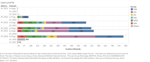
After data has been prepared and is ready for analysis, we want to observe the patterns that will appear in a single semester. Hence we have chosen 4 months’ common log data from Aug to Nov, which is equivalent to the first semester of annual year 2016/2017.
Before diving into the analysis, we first have verified in the diagram below that the number of sessions requested by students from all faculty are indeed aligned with the exploratory analysis that law school and business school have the most active user groups. Apart from that, breaking down the requesters by admission year will help us identify students in different years of studies, and graduation year tells us whether the student is still a current student or a graduates.
Domain Trend Line
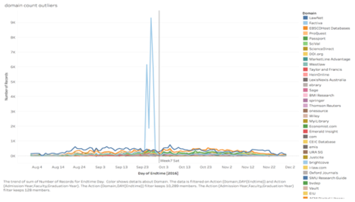
The next step is to identify the most popular domains visited. With a simple plot of total number of sessions as the vertical axis and date time as the horizontal axis, a very skewed line is shown in the diagram below. The huge spike in recess week period triggered our interest in discovering the cause of it. However, with the current diagram, we are unable to answer such behaviour pattern. Thus we want to constructed a dashboard that can allow users to interactively observe the pattern and discover underlying reasons of such occurrences.
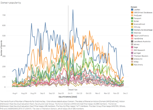
To better observe the trend line pattern of each domain, we temporarily exclude Factiva from the trend line graph. However, what the diagram below shows is still too messy to observe and too difficult to gain information. Thus we decided to explore new ways of representing the data.
Horizon chart analysis
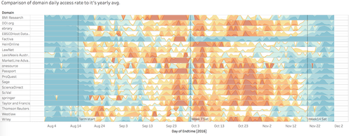
After researching on the possible visualisation method, we decided to utilise “horizon chart” as an improvement for simple trend lines, as it is a powerful tool for comparing data over time among many items within a category.
How we employ this technique is to compare the “daily usage rate” of each domain to its own “yearly average usage rate”, and represent them in terms of the percentage difference by two colour schemes. The bluish colour shows the less proportionate daily usages rate to its yearly average and on the other hand, the reddish colour shows the more proportionate end. Deeper the colour the higher in their differences.
To derive the horizon band, which is the cutting point of the density of each colour, the formula 1 is being used in construct the calculated field.
Following this pattern, we are able to derive different level of colouring to plot the final horizon chart below.
- 1. Undergraduates Pattern :
To prove that we have correctly reflect the data through horizon chart, a very obvious pattern shown in Diagram 6 is that by the end of week 7, a sudden “cool down” in the usage of library e-resources which is reflective of real life, as students are all taking a break after the midterm exams.
Furthermore, we found that in week 11 - beginning of presentation week, there is a spike in the usage of library e-resources for research purposes. This a natural phenomenon as students typically do some last-minute research for presentations. This is shown in the diagram above with the reddest portion.
- 2. Findings on “the surge of Factiva” :
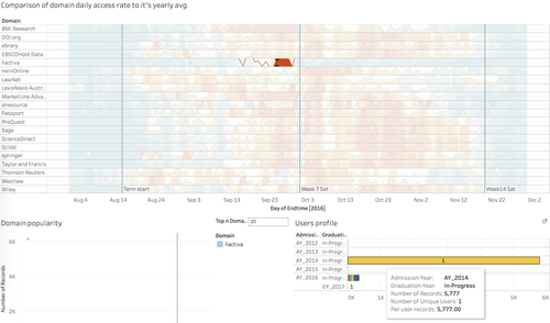
Now we can dive into the question we raised previously - who are the actual requestors to the large amount of sessions on “Factiva”. Through various steps of filtering and selection, we discovered that the surge of the requests all come from a single user. This also applies to the next few days of the large amount of requests. Hence we suspect that it might gone through some data crawling incidences.
Interestingly, from the library databases list, under Factiva description, there is an additional reminder (in red) on not programmatically download resources from Factiva. We suspect the incidence may be noticed by the librarians and the warning points to the aforementioned incident.
- 3. Comparison among different user groups :
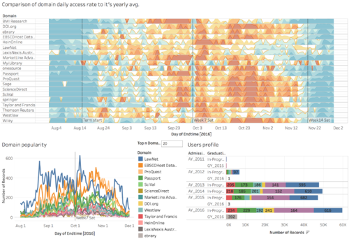
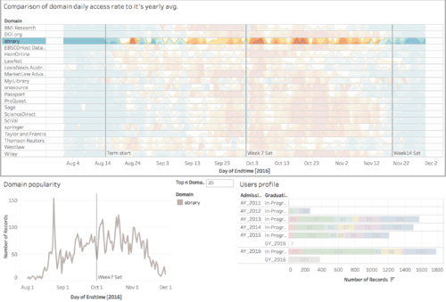
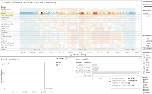
This interactive dashboard also allows us to do close comparison between different group of students on the usage pattern of the selected domains. One aspect of our sponsor’s interest is the usage patterns of ebooks. Hence, we delved into one of the most popular ebooks platform - ebrary. For that, we can pinpoint the differences on the usage pattern of ebrary by students from Social Science, Law and Business faculties. The results are shown in the diagram below.
The diagram above only shows the general usage pattern of ebrary (one of the more popular library e-resources). The line chart (domain popularity) shows the general trend of the ebrary usage. It shows the most usage occur in week 3 and week 4. The User's profile indicates the demographics of students using ebrary.
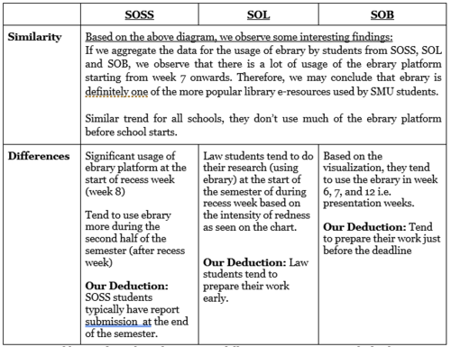
Based on at the diagram above, here are a few interesting findings:
- SOSS students tend to do their research near the start of the semester.
- The majority of ebrary student users come from School of Social Sciences, followed by LKSC and School of Law.
- On August 24 in particular, we can see that the largest population is School of Social Sciences students and there is an exceptional spike in access rate. We assume that it may be due to a workshop held for SOSS students to use ebrary for their research. It makes sense because their admission year is 2016 who are the freshmen.
