Difference between revisions of "Hiryuu Analysis"
| Line 58: | Line 58: | ||
<h3>Choropleth Plot</h3> | <h3>Choropleth Plot</h3> | ||
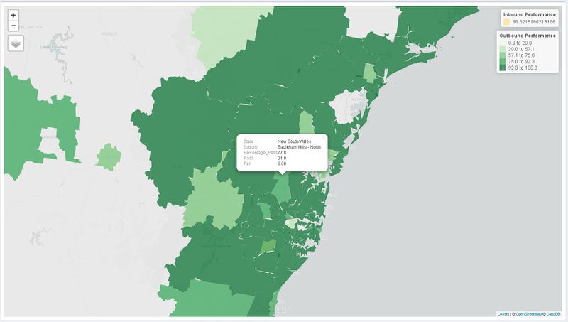
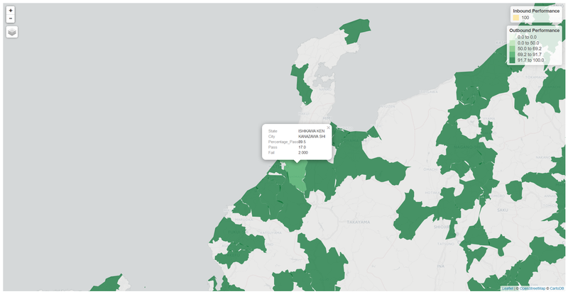
| − | We performed a simple choropleth map based on the | + | We performed a simple choropleth map based on the percentage rate of passes for both inbound and outbound shipments across both countries. Doing so allows us the user to easily point out problem areas and find out specifically the number of failed or successful shipments. |
| − | [[File: | + | |
| + | [[File:Au map info.JPG|800px|center]] | ||
| + | <center>Fig. Australia Percentage Pass</center> | ||
| + | |||
| + | [[File:Japan map info.JPG|800px|center]] | ||
| + | <center>Fig. Japan Percentage Pass</center> | ||
<h3>Neighbouring Polygons Patterns</h3> | <h3>Neighbouring Polygons Patterns</h3> | ||
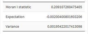
We observed that when a city had a high Percentage Pass rate of shipments, the neighbouring cities around it tended to have a higher Percentage Passing rate as well. To investisgate this further and determine if there indeed is a spatial correlation between patterns, we utilised Moran I. This spatial measure was more prominent in Australia and the results showed that there indeed was a spatial correlation between cities and their Percentage Passes as the Mora I statistic is above 0. | We observed that when a city had a high Percentage Pass rate of shipments, the neighbouring cities around it tended to have a higher Percentage Passing rate as well. To investisgate this further and determine if there indeed is a spatial correlation between patterns, we utilised Moran I. This spatial measure was more prominent in Australia and the results showed that there indeed was a spatial correlation between cities and their Percentage Passes as the Mora I statistic is above 0. | ||
| − | |||
| − | |||
| − | |||
| − | |||
[[File:Moran au.JPG|300px|center]] | [[File:Moran au.JPG|300px|center]] | ||
| Line 75: | Line 76: | ||
We decided to investigate for Japan's side as well. However, the limited time span of the data (3 months) ended up with all of Japan having a 100% passing rate. So the Moran I statistic returned a null value. | We decided to investigate for Japan's side as well. However, the limited time span of the data (3 months) ended up with all of Japan having a 100% passing rate. So the Moran I statistic returned a null value. | ||
| − | + | ||
| − | |||
[[File:Moran jpn.JPG|300px|center]] | [[File:Moran jpn.JPG|300px|center]] | ||
<center>Fig. Moran I measure for Japan</center> | <center>Fig. Moran I measure for Japan</center> | ||
Revision as of 11:18, 22 April 2017
|
|
|
|
|
|
|
| Data Preparation | Analysis |
|---|
Contents
Exploratory
1. TAT across different countries
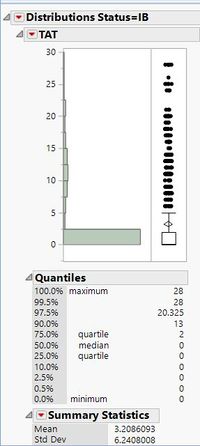
Although there are some datasets where the 90 percentile of the TAT is less than 3 days, there are some data sets where there were a huge proportion of failures.
One example is the dataset below which has a high value of 13 days for its TAT at the 90th percentile. This is an alarming number and should be flagged out for further in-depth analyis on the factors for failure.
2. Ending day of shipments
We have observed similar trends across various datasets in the failure rates for shipments ending on Monday and Tuesday.
An example of the distribution is shown below:
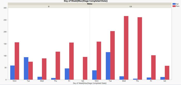
For OB data, the reason for the higher failure rate might be the inavailability of customers over the weekends.
However, for IB data, there is no conclusive reason as of now, and we will be clarifying with our sponsors.
Time-Series
Geospatial
Choropleth Plot
We performed a simple choropleth map based on the percentage rate of passes for both inbound and outbound shipments across both countries. Doing so allows us the user to easily point out problem areas and find out specifically the number of failed or successful shipments.
Neighbouring Polygons Patterns
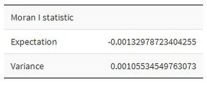
We observed that when a city had a high Percentage Pass rate of shipments, the neighbouring cities around it tended to have a higher Percentage Passing rate as well. To investisgate this further and determine if there indeed is a spatial correlation between patterns, we utilised Moran I. This spatial measure was more prominent in Australia and the results showed that there indeed was a spatial correlation between cities and their Percentage Passes as the Mora I statistic is above 0.
Possible explanations for the spatial correlation could be the transport mode, or the couriers assigned to handle these areas.
We decided to investigate for Japan's side as well. However, the limited time span of the data (3 months) ended up with all of Japan having a 100% passing rate. So the Moran I statistic returned a null value.

