Difference between revisions of "Group04 UserGuide"
Jump to navigation
Jump to search
Yang.xu.2019 (talk | contribs) |
Yang.xu.2019 (talk | contribs) |
||
| Line 29: | Line 29: | ||
<br/> | <br/> | ||
| + | |||
| + | == '''''To Download Full User Guide here: | ||
| + | [[File:ISSS608 G4 UserGuide.pdf|thumb]]''''' == | ||
==Menu== | ==Menu== | ||
Latest revision as of 23:07, 26 April 2020

CHINA HAPPINESS SURVEY
|
|
|
|
|
|
== To Download Full User Guide here: File:ISSS608 G4 UserGuide.pdf ==
Contents
Menu
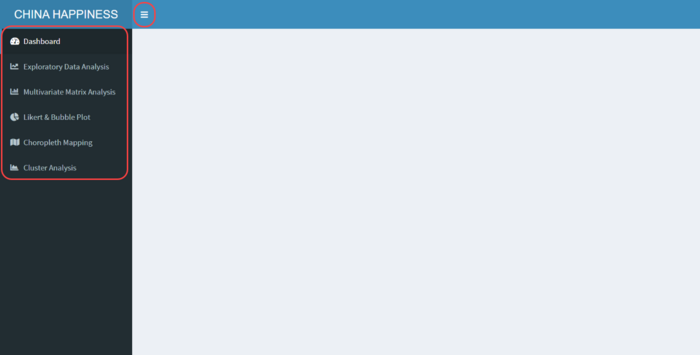
Our application provides 6 main features as following:
- Dashboard
- Exploratory Data Analysis
- Multivariate Matrix Analysis
- Likert & Bubble Plot
- Choropleth Mapping
- Cluster Analysis
Menu button is used to hide or show side menu bar.

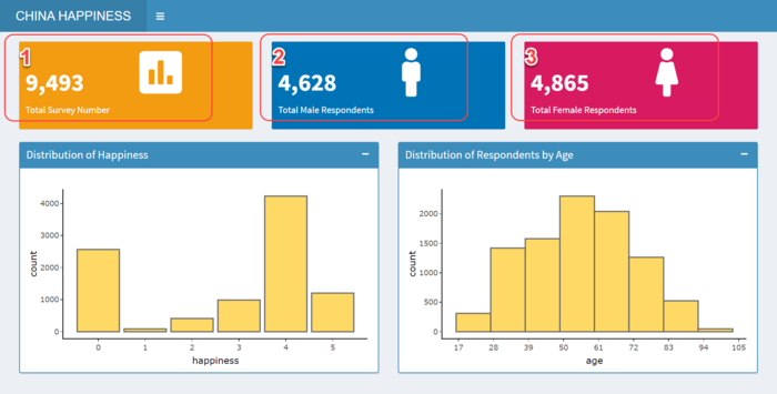
Dashboard
- Total Survey Number
Inside the box shows the total number of our survey, click the icon to view distribution of happiness and respondents by age. - Total Male Respondents
Inside the box shows the total number of male respondents, click the icon to view distribution of happiness and respondents by age for male respondents only. - Total Female Respondents
Inside the box shows the total number of female respondents, click the icon to view distribution of happiness and respondents by age for female respondents only. - Distribution of Happiness
As shown in below bar chart, happiness levels are divided into 1 to 5. - Distribution of Respondents by Age
As shown in below histogram chart, the distribution of respondents by age.

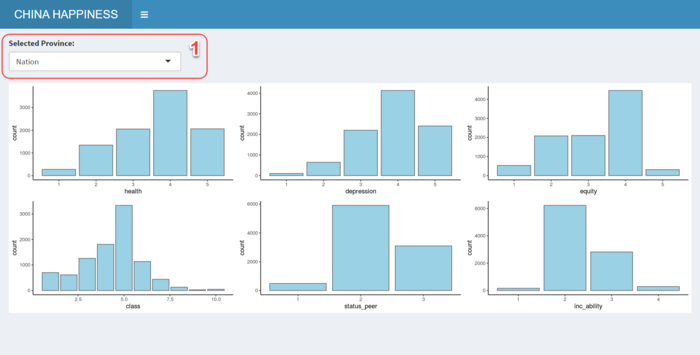
Exploratory Data Analysis
- Control – Selected Province
Change the selected province from the dropdown list, distribution of Health, Depression, Equity, Class, Peer Status and Income Ability will change accordingly by selected province, default it is showing the national level.

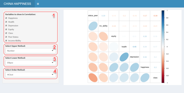
Multivariate Matrix Analysis
- Control – Correlation Variables
Change the variables from the dropdown list to show selected variables in correlation matrix. - Control – Upper Method
Default selected Number as upper method, user can change to following methods: Circle, Square, Ellipse, Number, Shade, Color or Pie. - Control – Lower Method
Default selected Ellipse as lower method, user can change to following methods: Circle, Square, Ellipse, Number, Shade, Color or Pie. - Control – Order Method
Default selected AOE as order method, user can change to following methods: AOE, FPC, HClust or Alphabet. - Correlation Matrix
The correlation matrix shows the correlation between each selected variable.

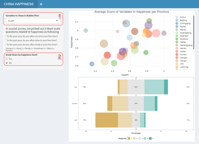
Likert Scale & Bubble Plot
- Control – Variables Show in Bubble Plot
Select variable to show in the average score of it in happiness per province. - Control – Breakdown Happiness Level
Select Yes to breakdown the stacked bar chart into happiness level, default selected No. - Stacked Barchart
Likert Scale is used to view the distribution of answers of same scale questions. - Bubble Plot
Bubble Plot is used to view the average score of happiness and all factors in every province.

Choropleth Mapping
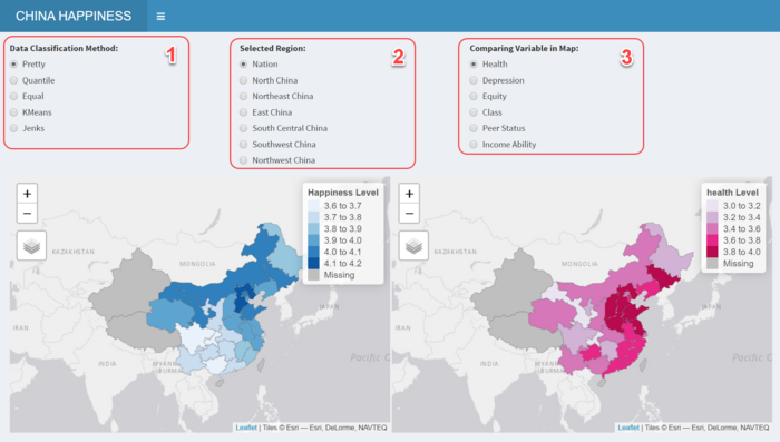
- Control – Classification Method
The controller is used to change different classification method. - Control – Selected Region
The controller is used to select different region to view the distribution within specified region. - Control – Comparing Variable
Select different variables to view the distribution compared to Happiness as show in left map. - Choropleth Map
Left map shows the distribution of happiness level among China, right Map will show according to selected variable.

Cluster Analysis
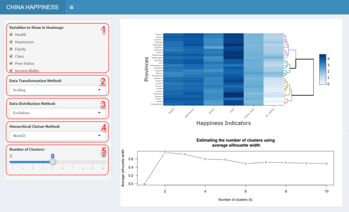
- Control – Heatmap Variable
The controller is used to select variables to show in heatmap. - Control – Transformation Method
Default selected Scaling as data transformation method, user can change to following methods: Scaling, Normalising or Percentising. - Control – Distribution Method
Default selected Euclidean as distribution method, user can change to following methods: Euclidean, Maximum, Manhattan or Canberra. - Control – Hierarchical Cluster Method
Default selected Ward.D as hierarchical cluster method, user can change to following methods: Ward.D, Single, Complete, Average or Median. - Control – Number of Clusters
The controller is used to change the number of clusters from heatmap. - Heatmap
Heatmaps are good for showing variance across multiple variables, revealing any patterns, displaying whether any variables are similar to each other, and for detecting if any correlations exist in-between them. - Number of Cluster
The line chart shows the optimal number of clusters, user can determine the number of clusters accordingly.
