Difference between revisions of "Group14 proposal"
| Line 54: | Line 54: | ||
4 'Best' | 4 'Best' | ||
| − | {| class="wikitable" style="width: | + | {| class="wikitable" style="width: 60%; height: 10em;" |
|- | |- | ||
! Data Fields !! Description !! Datatype | ! Data Fields !! Description !! Datatype | ||
Revision as of 02:11, 26 April 2020
Contents
Motivation and Objectives
Nowadays, all industries in the world are facing fierce competition. With the development of telecom technology and social media, the Telco companies play more and more important role in the society. There are growing number of wireless carriers in the world. The U.S has four main wireless carriers and lots of little wireless carriers. It is no surprise that the companies in this industry face very fierce competition. Since this condition, the most significant problem for these organizations are customer remaining. As we know, companies from these industries often have customer service department. Their target is that winning back clients who is churn. Because it is generally acknowledged that recovering long-term customers can be worth much more to a company than acquiring new customers.
In order to understand more directly the main factors that affect customer churn and better maintain the relationship with customers, relevant models will be built so as to select and visualize important variables. Lastly, we will present the comparison among models towards Recall, Accuracy, Precision and F1 score and evaluate the performances of different models.
Critique of Existing Visualization
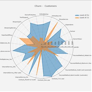
This radar chart has all the variables from the dataset to be presented in a single graph. We can acknowledge that by different series (“0” as “No”, “1” as “Yes”), each variable their number of customers. However, even though this visualization has revealed plenty of valuable information, such as unbalanced data in several variables with a fair enough graph, some questions can be spotted from the graph. For instance, too many variables have presented on the chart at the same time. The best way to solve this problem is to use feature engineering, then to draw a new graph to visualize better the influence of different factors to churn or not churn.
Data Description
The data set is from IBM Community. There are 1471 entity instances in total with 30 attributes. Some of the information from the data set are recorded as numbers, we need to identify them as categorical variables.
PerformanceRating 1 'Low' 2 'Good' 3 'Excellent' 4 'Outstanding'
RelationshipSatisfaction 1 'Low' 2 'Medium' 3 'High' 4 'Very High'
WorkLifeBalance 1 'Bad' 2 'Good' 3 'Better' 4 'Best'
| Data Fields | Description | Datatype |
|---|---|---|
| Age | The age of employee | Numerical |
| Attrition | Turnover status of employee, stored as "Yes" or "No" | Binary |
| BusinessTravel | Whether the employee travel frequently or not | Categorical |
| DailyRate | The daily rate of employee | Numerical |
| Department | Which department does this employee belongs to | Categorical |
| DistanceFromHome | Distance from home to office | Numerical |
| Education | Education level of employee, 1 as 'Below College', 2 as 'College', 3 as 'Bachelor', 4
as 'Master', 5 as 'Doctor' || Categorical | |
| EducationField | Field of Education of employee | Categorical |
| EnvironmentSatisfication | The satisfication level of one employee in working environment, 1 as 'Low', 2 as 'Medium', 3 as 'High', 4 as 'Very High' | Categorical |
| Gender | Gender of employee | Binary |
| JobInvolvement | Job involvement of employee, 1 as 'Low', 2 as 'Medium', 3 as 'High', 4 as 'Very High' | Categorical |
| JobLevel | Job level of employee | Numerical |
| JobRole | Job role of employee | Categorical |
| JobSatisfaction | Job satisfaction of employee, 1 as 'Low', 2 as 'Medium', 3 as 'High', 4 as 'Very High' | Categorical |
| MaritalStatus | Marital status of employee | Categorical |
| MonthlyIncome | Monthly income of employee | Categorical |
| NumCompaniesWorked | The customer’s payment method (Electronic check, Mailed check, Bank transfer (automatic), Credit card (automatic)) | Categorical |
| OverTime | The amount charged to the customer monthly | Numerical |
| PercentSalaryHike | The total amount charged to the customer | Numerical |
| Churn | Whether the customer churned or not (Yes or No) | Binary |
| Churn | Whether the customer churned or not (Yes or No) | Binary |
| Churn | Whether the customer churned or not (Yes or No) | Binary |
| Churn | Whether the customer churned or not (Yes or No) | Binary |
| Churn | Whether the customer churned or not (Yes or No) | Binary |
| Churn | Whether the customer churned or not (Yes or No) | Binary |
Methodology and Approach
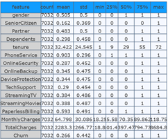
In Feature engineering, we will generate variables from the previous ones and compose multiple features together, after which we will separate churn and not churn customer and separate categorical and numerical columns. The main point of this is selecting effective variables which would result in customer attrition. Apart from that, we may transform multi value variables to the dummy variable in the last step of this stage, we can obtain the variable summary like below:
Secondly, a correlation matrix of this model will be visualized to present the relationship among different variables and primarily understand the influence of each variables.
Models
We intend to build four different models and visualize them and their performances: (1) In Logistic regression model performance, confusion matrix and receiver operating characteristic will be visualized to evaluate the performance of the Logistic regression model. Besides, we can get the variable importance while comparing all variables by bar chart. Furthermore, obtaining the appropriate threshold for logistic regression will also be visualized to understand what is beneath the model. (2) Synthetic minority oversampling Technique will be applied to build the advanced logistic regression, and we will try to form user portrait using the most important features which are selected from the model. (3) The decision tree will be generated refer to the results of the feature score and compare the GINI coefficient to measure the degree of inequality of the distribution. And we intend to use high-score categorical features to make a ternary plot to visualize the distribution of two groups. (4) In order to control over-fitting and improve the predictive accuracy, we will also build and visualize Random Forest Classifier and compare different trees. Lastly, we will visualize the comparison among four models towards Recall, Accuracy, Precision and F1 score and compare the performances of different models.
Proposed R Packages
| Package Name | Description |
|---|---|
| shiny | Make the interactive web applications for data visualization |
| reshape | Give new shapes to an array without changing its data |
| plotly | Create interactive bar graphs and scatter plots |
| tidyverse | A set of packages to plot out various visualizations and EDA |
| readr | To read rectangular data |
| recharts | Create interactive radar chart |
| DT | Create data table |
| ggraph | An extension of ggplot2 to build plots layer by layer |
| corrgram | Create correlation matrix |
| ggthemes | To apply themes to Shiny applications |
| ggcorrplot | Visualize correlation matrix using ggplot2 |
| plotrix | Create plot with two ordinates |


