Difference between revisions of "Group12 proposal"
| Line 108: | Line 108: | ||
# Auto Regressive Integrated Moving Average(ARIMA):a class of models that ‘explains’ a given time series based on its own past values, that is, its own lags and the lagged forecast errors, so that equation can be used to forecast future values and it is very suitable for non-seasonal time series. | # Auto Regressive Integrated Moving Average(ARIMA):a class of models that ‘explains’ a given time series based on its own past values, that is, its own lags and the lagged forecast errors, so that equation can be used to forecast future values and it is very suitable for non-seasonal time series. | ||
| − | + | After making a prediction using both models, compare the results of which model is better. | |
| − | + | <br><br> | |
| − | |||
| − | |||
| − | |||
| − | |||
| − | |||
== Critics of Existing Works == | == Critics of Existing Works == | ||
Revision as of 00:41, 27 April 2020
Contents
Introduction
Global warming is an ongoing problem, and for a long time scientists have sounded the alarm about taking action to slow it down. Meanwhile, the situation continues to deteriorate. Rising temperatures have led to rising sea levels, changing rainfall patterns and more frequent extreme weather. Recent severe fires in Australia and locust plagues in Africa have been linked to droughts caused by warming temperatures.
It is well known that the main cause of global warming is the massive use of fossil fuels (such as coal, oil, etc.) for nearly a century, which emits a large amount of CO2 and other greenhouse gases. These greenhouse gases absorb infrared light from the radiation emitted by the earth, causing the earth's temperature to rise. This project aims to let everyone know the trend of global warming and the emission of carbon dioxide in various countries, so that everyone can attach importance to this problem.
Objective
In order to warn people and alert the world to face crisis that global warming have caused, we intend to:
- Employ simple visualization and describe the historical data of carbon emission, temperature anomaly, glacier volume, and sea level change in the past years.
- Forecast the future global average CO2 emissions and temperature anomaly and to see how they will change in the next 10 years by using various prediction models.
- Evaluate and compare the results generated from different models and identify which of them are most accurate with least deviation.
Besides, a lot of developing countries think that emissions right is equal to development right, and it’s not fair for them to pay the price for the developed countries and set emission limit simply based on their annual carbon emission in recent years. To test this view, we decide to
- Draw a map to show not only the total CO2 emission, but also the emission per capita and GDP for each country.
- Apply clustering analysis to classify countries into different groups based on these categories and to check the correlation between carbon emission, population and GDP.
Performance Data
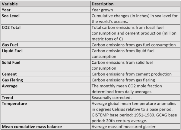
This dataset is the main dataset: According to our research process, we need to use the factors that affect CO2 emissions, the total amount of CO2, the global average temperature, and the number of melting glaciers. The table below shows the main variables that we will be using for our analysis:
National Data
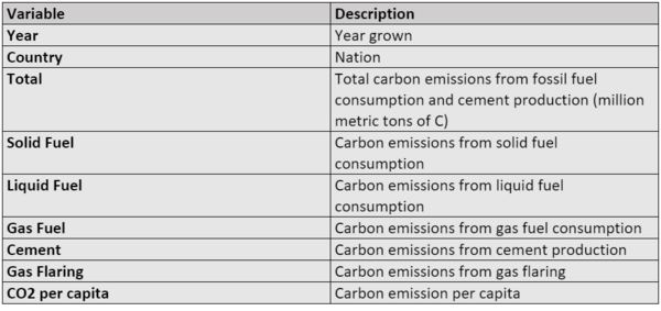
This dataset is the supporting dataset: This is a table of carbon dioxide emissions by country. Through this table we will show a map of carbon dioxide emissions by country. It also shows the impact of each different fossil fuel in this country separately, while making global comparisons.
Methodology
- EDA:Use the line graphs to show the trend of temperature anomalies over years. And the scatterplots will be used to test the correlation between temperature and sea level/glacier mass.
- World Map: Use the data to create a distribution map by country, showing the carbon dioxide emission levels of each country.The color of each country on the map is assigned according to the size of the value. The larger the value, the darker the color.
- Cluster Analysis: Use cluster methods to explore the features of each country and group the countries with similar characteristics.This allows users to know the emission levels of the countries they are interested in.
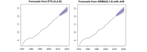
- Forcast Models:Two forecast algorithms will be used to forecast the value of global CO2 emissions and temperature in the next years. Since our data sets are time series, but not seasonal, ETS and ARIMA models are better suited for forecasting.
- Automatic Exponential Smoothing algorithm(ETS):a rule of thumb for smoothing time series data using an exponential window function. In a simple moving average, past observations are weighted equally, and the exponential function is used to assign weights that decrease exponentially with time.
- Auto Regressive Integrated Moving Average(ARIMA):a class of models that ‘explains’ a given time series based on its own past values, that is, its own lags and the lagged forecast errors, so that equation can be used to forecast future values and it is very suitable for non-seasonal time series.
After making a prediction using both models, compare the results of which model is better.
Critics of Existing Works
This notebook firstly reviews the history data of the global CO2 emission from 1751 to 2017 and visualizes it with a line chart by applying the time series analysis revealed how the global CO2 emission changed during different time period. Then, a world map was created to indicate the CO2 emission in each country. And audiences can compare the values between different country or continent by easily observing their color. Even though the visualization has successfully showed a plenty of important information that author trying to tell, there are still some drawbacks. For example, both graphs have no unit of measurement, which makes operators difficult to know the accurate implication of axis labels. And the lack of title and annotation might make people hard to catch the most important aspects of the chart and identify what is relevant. Besides, the world map is not completely interactive to user. Audiences are not free to view the regional CO2 emission in any single year they want but in year 2017 only.
After diagnosing and validating, this notebook forecasts the future global CO2 emission caused by the natural gas consumption in the future 10 years since 2016 by employing the Seasonal Autoregressive Integrated Moving Average (SARIMA) model with grid search method. Consequently, a time series line graph is generated, and readers can observe the next ten years' predicted CO2 emissions with lower and upper bound. Generally, the whole visualization has been done extremely well, but it lacks some clarity such as the missing title and unit of measurement. In terms of aesthetics, the color coding is not very distinguishable, and the graph can be modified longer to show the change of line more clearly. On the other hand, as a further extension, we are going to use those values to forecast the future global temperature, which will be applied to obtain the anticipated sea level eventually. And an extra time series line graph will be created to reveal how exactly it changes.
Data Scource
The data from the“Climate Change Data”and“Population, total”.


