Difference between revisions of "Group15 application&user-guide"
| Line 57: | Line 57: | ||
</tr> | </tr> | ||
<tr> | <tr> | ||
| − | < | + | <b>2.Descriptive Page</b> |
The main purpose of this page is to observe the changes in the number of confirmed and healed cases in each province. | The main purpose of this page is to observe the changes in the number of confirmed and healed cases in each province. | ||
Revision as of 22:40, 26 April 2020
Our Application
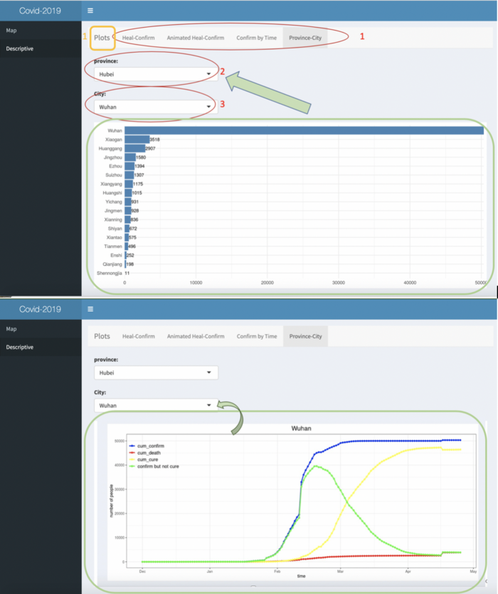
Similar to the map page, in the yellow box in the upper left corner is the title "Plots" of this page, and in the red circle is the navigation bar of this page, which has four tabs: “Heal-Confirm”, “Animates Heal-Confirm”, “Confirm by Time” and “Province-City”.
The first two tabs are scatter plots of each province, the “confirm by time” tab is the line chart of each province, the “Province-City” page includes bar charts and line graphs. These charts/ plots are basic forms of visualization work. Users can choose different pages to view according to their needs and preferences.
In particular, the "Province-City" page allows users to select the name of the province and city they want to see from the two drop-down boxes shown as 2 and 3, and then they can get the bar chart of the confirmed number of all cities in the corresponding province. sliding down the page, they can also see the line chart of the corresponding city, including the confirmed number, the number of deaths, the number of cured people, and the number of people who have not been cured (i.e. are under treatment).
| Design Concepts | Dashboard |
|---|---|
| 1.Default Page / Map Page
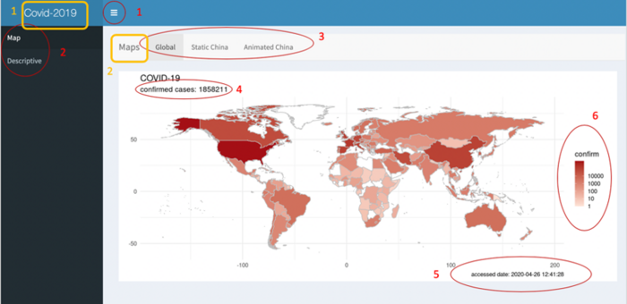
This is the default page that goes in from the application.
|
|


