Difference between revisions of "Group08 application"
| Line 141: | Line 141: | ||
|| '''COMPONENTS OF USER INPUTS PANEL''' | || '''COMPONENTS OF USER INPUTS PANEL''' | ||
| − | Lastly, we did some testing using Durbin Watson test to detect the presence of auto correlation in the residuals | + | Lastly, we did some testing using Durbin Watson test to detect the presence of auto correlation in the residuals of the regression model. |
[1] Users can select the level of confidence and also the independent variables for the regression model. | [1] Users can select the level of confidence and also the independent variables for the regression model. | ||
Revision as of 18:33, 26 April 2020
Rshiny application: [Click here]
Github: [Click here]
User Guide
| Home Page | Instructions |
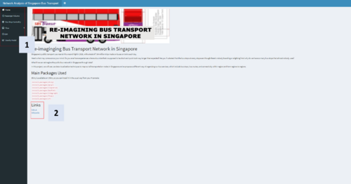
| The Home tab is the landing page of the app. It gives us a brief overview of the product, as well as the packages used and link to Github and Wikipedia.
[1] On the left, you can find the navigator panel. There are 6 tabs in total, the Flow tab can be expanded to reveal 4 more tabs.
[2] The links to the project Github repo and wikipage can be found here. You can find the codes to the R Shiny app on the Github link, and the Project Proposal, Research Paper, User Guide, and Poster in the Wiki link. | |
| Exploratory Tab | Instructions |
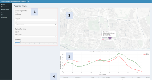
| Sub tab 1: Line graph | This tab shows the passenger flow by Bus Stop, across Region (Singapore / Planning Area / Subzone), Weekday/Weekend, and Time of the Day. User view either Tap Ins or Tap Outs as the size of the node on the app.
[1] There are 4 filters in this visualization, Region, Tap Ins/ Tap Outs, Weekday / Weekend, and Time of the day from top to bottom respectively. The Region filter is a nested filter, first choose which granularity of region filter (Singapore/Planning Area/Subzone), and after, choose the region you want. Data will be filtered to the input stated in the filters, and the maps and line graph below will change accordingly. [2] The size and color intensity of the node represents the number of Tap Ins or Tap Outs at the chosen region, weekday/weekend, or time of the day. Interactivity is embedded into the map visualization, by brushing across the node, the name of the bus stop will appear. Full details, including name of the bus stop, planning area, subzone name, and tap in and tap out volume will appear when clicked on. [3] The line chart below the map shows the passenger volume at the selected region by time of the day. The line chart is interactive, by hovering your mouse over the line, details on the number of tap ins / tap outs will show. [4] The table below the line chart shows the data used to create the map and line chart. The table is sorted according to number of Taps Ins to show the highest passenger volume bus stop of from the selected data. |
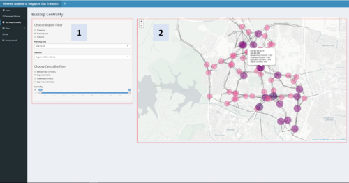
| Sub tab 2: Scatter plot | This tab shows the Bus Stop Centrality, across Region (Singapore / Planning Area / Subzone). There are four centrality measures that we have used in this visualization, namely Betweenness Centrality, Degree Centrality, Closeness Centrality, and Eigenvalue Centrality.
Definition: Betweenness Centrality – Defined as the average proportion of paths between as two nodes within the network that transverse the node in question, out of the total number of possible paths between these two nodes. Degree Centrality – Defined as the proportion of nodes directly connected to the node in question out of the totality of nodes within the network. Closeness Centrality – Defined as the inverse average distance between node in question and all other nodes within the network. Eigenvalue Centrality – Defined as the measure of the influence of a node in a network. Relative scores are assignment to all nodes in the network based on its connections, the more important the connections, the higher the score. [1] There are 2 filters in this visualization, Region and centrality. The Region filter is a nested filter, first choose which granularity of region filter (Singapore/Planning Area / Subzone), and after, choose the region you want. The centrality filter consist of a radio button and a scroll bar. Use the radio button to select the centrality measure you want to be displayed as the size of the nodes on the map, and the scroll bar to filter to a specific centrality range. Data will be filtered to the input stated in the filters, and the maps will change accordingly. [2] The size and color intensity of the node represents the selected centrality measure . Interactivity is embedded into the map visualization, by clicking on the node, full details including name of the bus stop, road name, and all four centrality measures will appear. |
| FLOW graph | Instructions |
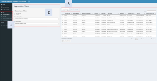
| Sub tab 1: Aggregation Filter | This tab shows and analyze the Flow of passenger from region to region. The first sub tab ‘Aggregation Filters’ filters, aggregate and prepare the data for later analysis.
[1] After clicking on the Flow tab, 4 sub tabs will appear. Important Note: ‘Aggregation Filters’ is the first step to further flow analysis, it should first be filled before proceeding to the other tabs under Flow. [2] Since we are looking at the flow of passenger from region to region, first we have to choose which the Source and Destination of the flow. The filters consist of a radio button for ‘Planning Area’ / ‘Subzone’ and a selector for ‘From Planning Area’ (Source) and ‘To Planning Area’ (Destination). You can input multiple regions in both ‘From Planning Area’ and ‘To Planning Area’ filter. [3] A data table here shows your selected Source Busstop and Destination Busstop. There is also a download button below the table to download the table if the user want to see the input data for further analysis in tabular form. |
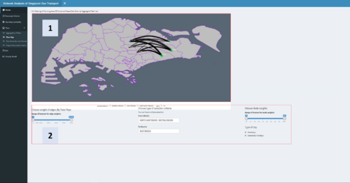
| Sub tab 2: Treemap | Next, after filling in the inputs at Aggregation Filter, the map on Flow Map will be populated on the second tab of Flow.
[1] The flow map shows the movement of people from region to region. The nodes are colored blue for Source and Green for Destination, the size of the nodes represents the number of people traveling to/from the regions. The thickness of the line corresponds to the volume of travel between the regions. [2] Below the map there are filters for edge weights, node weights, type of day, and from/to district. Especially when the user choose many source to many destination which will create a noisy map, the filters would be helpful providing clarity. |
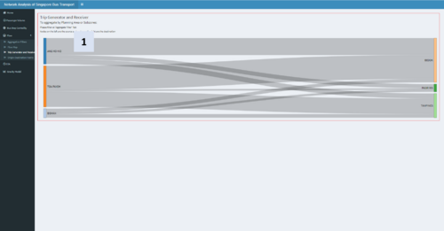
| Sub tab 3: Sankey diagram | This third tab of Flow shows a Sankey diagram of the selected Source and Destination from the Aggregation Filters tab.
[1] The Sankey Diagram shows the flow of passengers from Source to Destination, with the width of the flow being the proportion of volume of passengers traveling from Source to Destination. This diagram is interactive, you can drag both the source or destination staring point up and down to rearrange the diagram. |
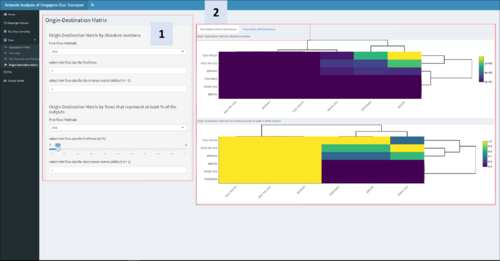
| Sub tab 4: Origin Destination Matrix (Flow Select without dominance) | COMPONENTS OF USER INPUTS PANEL
In the final tab of flow, we have the origin destination matrix. [1] On the left you can find filters relating to First Flow methods, minimun flow size for first flow, and select minimun flow size for dominance matrix. [2] On the right you can find two |
| GW REGRESSION TAB | Instructions |
| Sub tab 1: Regression Model |
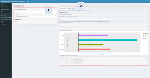
The Gravity Model plots a regression analysis of Centrality measures (X, Dependent Variable) against Tap in or Tap out (Y, Independent Variable). [1] On the filter, user can choose the X variable, Y variables, and the confidence level. [2] On the top of the result panel, user can toggle between Regression Model and Model Assumptions. Based on the confidence level chosen, the model will show if the model is statistically significant. The coefficient of the model can also be found below. Since we normalized all centrality measures, the weight of the coefficient can tell us the importance of the centrality measure to the overall passenger flow. In the case above, we can see that degree centrality is the most important centrality measure. |
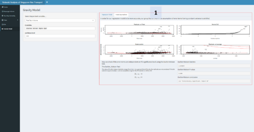
| Sub tab 2: Model Assumption | COMPONENTS OF USER INPUTS PANEL
Lastly, we did some testing using Durbin Watson test to detect the presence of auto correlation in the residuals of the regression model. [1] Users can select the level of confidence and also the independent variables for the regression model. [2] |
| Exploratory Data Analysis | Instructions |
| Sub tab 1: Histogram |
[1] Distribution of betweenness centrality, closeness centrality, degree centrality, eigenvector centrality by Bus Stop, across Region (Singapore / Planning Area / Subzone) [2] On the sidebar, users can select to view the data on the aggregate level of Singapore or by planning area or by subzone. |
| Sub tab 2: Correlation Matrix |
[1] [2] On the sidebar, users can select to view the data on the aggregate level of Singapore or by planning area or by subzone. |
| Sub tab 3: Interactive Scatterplot |
[1] Distribution of betweenness centrality, closeness centrality, degree centrality, eigenvector centrality, number of tap ins and tap outs by Bus Stop [2] On the sidebar, users can select to view the data on the aggregate level of Singapore or by planning area or by subzone. |
| Sub tab 4: Parallel Coordinates Plot |
[1] One can filter along the respective vertical lines to see what are the coordinates of the selected lines for the other variables [2] On the sidebar, users can select to view the data on the aggregate level of Singapore or by planning area or by subzone. |

