Difference between revisions of "Group03 proposal"
| (59 intermediate revisions by 3 users not shown) | |||
| Line 1: | Line 1: | ||
| + | [[File:Gateway to the Future Icon.jpg|frameless|1293px|center|Gateway to the Future]] | ||
| + | <div> | ||
| + | {|style="background-color:#f2d08e;" width="100%" cellspacing="0" cellpadding="0" valign="top" border="0" | | ||
| + | | style="font-family:Arial; font-size:100%; solid #103080; background:#C69200; text-align:center;" width="20%" | | ||
| + | ; | ||
| + | [[Group03_proposal| <font color="#151C55">Proposal</font>]] | ||
| − | + | | style="font-family:Arial; font-size:100%; solid #103080; background:#151C55; text-align:center;" width="20%" | | |
| − | |||
| − | |||
| − | | style="font-family: | ||
; | ; | ||
| − | [[ | + | [[Group03_poster| <font color="#C69200">Poster</font>]] |
| − | | style="font-family: | + | | style="font-family:Arial; font-size:100%; solid #103080; background:#151C55; text-align:center;" width="20%" | |
; | ; | ||
| − | [[ | + | [[Group03_application| <font color="#C69200">Application</font>]] |
| − | | style="font-family: | + | | style="font-family:Arial; font-size:100%; solid #103080; background:#151C55; text-align:center;" width="20%" | |
; | ; | ||
| − | [[ | + | [[Group03_user_guide| <font color="#C69200">User Guide</font>]] |
| − | | style="font-family: | + | | style="font-family:Arial; font-size:100%; solid #103080; background:#151C55; text-align:center;" width="20%" | |
; | ; | ||
| − | [[ | + | [[Group03_research_paper| <font color="#C69200">Research Paper</font>]] |
|} | |} | ||
| Line 25: | Line 28: | ||
== Overview/Motivation == | == Overview/Motivation == | ||
| − | + | Traditionally, libraries have used surveys to obtain information regarding their users, in terms of their demographic information, behaviour and experiences in consuming library services [1], and is increasing being used as part of evaluation of the performance of libraries in terms of service delivery [2][3]. Internationally, the Association of Research Libraries have created the LIBQUAL+ survey tool which measures library users’ perceptions of service quality in three dimensions: ‘Affect of Service’, ‘Information Control’, and ‘Library as Place’ [4]. | |
| − | + | In Singapore Management University, which has two physical libraries (the Li-Ka Shing Library and Kwa Geok Choo Law Library), the LIBQUAL+ survey tool was used for its 2015 library service quality survey. Subsequently, implementation of the survey was by Insync™ Surveys [5] in February 2018 and February 2020. Based on the SMU February 2018 Library Survey results [6], the information being collected are of three components: | |
| − | + | (i) demographic information (consisting of the role of respondents in the university, major area of study/research, the frequency of use of campus, library and online library resources by survey respondents), | |
| − | + | ||
| − | + | (ii) the physical library which the respondent visited more frequently, and | |
| − | |||
| − | |||
| − | + | (iii) the largest proportion of data collected related to user rating of importance and performance of the library in a Likert Scale from 1 (low) to 7 (high) on 26 items in the Library Survey. These 26 items were based on four dimensions: ‘Communication’, ‘Service Delivery’, ‘Facilities and Equipment’, and ‘Information Resources’. Respondents were also asked, on a scale of 1 (least likely) to 10 (most likely), how likely they will recommend the library service to other students. | |
| − | + | The 2018 SMU Library Survey was implemented through an internet portal, and also allowed for free text comments to be provided by respondents. The results from the 2018 library survey were published in a 155-page document [7], with breakdown of survey information and findings in data visualisation such statistical tables, bar graphs, line charts, and gap grids. Aggregate information and information broken down based on major area of study/research were documented on individual pages of the report. | |
| − | |||
== Project Objectives == | == Project Objectives == | ||
| − | + | We have embarked on this research as we believe we can tap deeper into the rich raw data available from the SMU 2018 Library Survey compared to current survey results. This can be done incorporating techniques not previous used in traditional survey data to derive meaningful information for action, and this can be done through use of numerical inputs from respondents to form data visualisation as described in the literature review above, instead of statistical means and gap grids which have been captured in current survey results. Furthermore, statistical means in aggregated format may not accurately capture the sentiment meaning from ordinal Likert scales. | |
| + | |||
| + | While the published February 2018 Library Survey report calculates the gap between performance scores and importance scores for different items, each individual sub-category of respondents taking up a single page, leadings to iterations of similar information across different pages which make it difficult to make comparisons. Using an interactive computer interface could allow for clearly visualisation, make use of human computing interaction and increase user engagement with the survey results. The following are the specific analytical outcomes we hope to achieve using the application, with SMU’s February 2018 Library Survey as a case study: | ||
| + | |||
| + | 1) To be able to display descriptive visualisation of the demographic profile of library Survey respondents, | ||
| + | |||
| + | 2) To create visualisations of Likert scale results through divergent stacked bar charts, to show sentiments of respondents, | ||
| + | |||
| + | 3) To be able to compare importance and performance score for each survey questionnaire line items to review the performance of the library in different service quality items to guide future strategy, | ||
| + | |||
| + | 4) To generate new insights from data using novel visualisation techniques with appropriate data transformation, | ||
| + | |||
| + | 5) To incorporate statistic modelling techniques to support data visualisation, | ||
| + | |||
| + | 6) To allow for details to be displayed on-demand through the use of interactivity such as tooltips and user selections, | ||
| + | |||
| + | 7) To optimise human-computing interaction as users engage the application user to view data transformation and facilitate new information discovery. | ||
| − | |||
| − | |||
| − | |||
== Data Source & Inspiration References == | == Data Source & Inspiration References == | ||
| − | + | The SMU Library Survey 2018 data was obtained courtesy of the SMU library management and staff. Survey responses were obtained from a total of 2639 participants, including staff, faculty and students, capturing their demographics, as well as ratings of the importance of pre-defined factors and indicators, and their assessment of the performance library on them. Free text information in the form of comments were also collected to supplement their assessment of the library through pre-determined matrices and suggest recommendations for improvement of the library. | |
| − | + | For survey data, it is imperative for display of information regarding the demographic profile of survey respondents. [8] Beyond that, given that our survey data has focus on Likert scale data with importance and performance ratings, relevant data visualisation techniques would be the divergent stacked bar chart, Lollipop chart or dot plots with lines (otherwise known as Dumbbell plots) for sentiment analyses and comparison of importance vs satisfaction scores.[8][9]. | |
== Proposed Story/Dashboard == | == Proposed Story/Dashboard == | ||
| − | Libraries typically develop surveys for 3 reasons: to gauge user satisfaction, to assess users' needs (usage), or to learn more about | + | Libraries typically develop surveys for 3 reasons: to gauge user satisfaction, to assess users' needs (usage), or to learn more about whether the library has met the outcomes of visiting the library. Our project application is designed for Singapore Management University's management and library staff as use cases in mind to derive insights into their performance so that they can invest resources into meeting the library users' needs in the future, through strategy or changes in operation. |
| − | + | Specifically, the following information should be uncovered: | |
| + | - Breakdown of the survey respondents by their background through the Complex UpSet Plot | ||
| + | - Understanding the sentiments of respondents using Diverging Stacked Bar Charts | ||
| + | - Assessing whether the rated performance by library users have met with their expectations and which sectors the library can improve through Dumbbell plot | ||
| + | - Analyzing possible relationships and explanations for survey item ratings through Principal Components Analysis | ||
| − | '''Analysis of Survey''' - | + | Our storyboard drafts below shows the design thinking and user journey through each page of the application where the user gradually gets fuller understand of trends in the survey data. |
| + | |||
| + | [[File:Storyboard 1 - JL.jpg|thumb|center|Storyboard - Picture 1]] | ||
| + | [[File:Storyboard 2 - JL.jpg|thumb|center|Storyboard - Picture 2]] | ||
| + | |||
| + | Through the journey, we hope to answer these questions which come up in the SMU library staff/management's mind. | ||
| + | |||
| + | * Who are the survey respondents, and where are they from? | ||
| + | * What is their general sentiment for different survey items? | ||
| + | * How is the library performing (based on ratings by users) for the different categories which the library is assessed to perform? | ||
| + | * Are there any relationship between factors which can lead me to develop new insights to improve the operation and strategy for running the library? | ||
| + | |||
| + | '''Data Preparation''' | ||
| + | * Data was analysed and deemed to be adequately clean for use in the R Shiny application. | ||
| + | * Data manipulation for use in the Shiny application is written into code and this allows future loading of survey results for year 2020 to be uploaded directly for instance analysis of data. | ||
| + | |||
| + | '''Analysis of Survey''' | ||
| + | * This will be through the use of diverging stacked bar charts, UpSet plots, Dumbbell plots, heats maps and principal components analysis. | ||
| + | * We are also considering use of topic modelling and/or sentiment analysis for free-text survey comments data. | ||
| − | + | '''Visualizations''' | |
| − | + | ||
| − | + | The following are sample visualizations for the R Shiny application: | |
| + | [[File:Capture1.JPG|thumb|center|Sample Visualization - Heat Map Plot]] | ||
| + | [[File:Sample Visualisation 1 - JL.jpg|thumb|center|Sample Visualization - Dumbbell Plot]][[File:Sample Visualisation 2 - JL.jpg|thumb|center|Sample Visualization - UpSet Plot]] | ||
| + | |||
| + | '''Implementation''' | ||
| + | |||
| + | Implementation of data visualization and analysis tool is through the use of R Shiny application to provide vizualisations based on user options on subsets of data which they would like to look into. | ||
| + | |||
| + | == Project Timeline == | ||
| + | |||
| + | Please refer to the Gantt chart for the detailed breakdown of work and tentative planned schedule to achieve the project milestone. | ||
| + | |||
| + | [[File:Project Milestone Planning-Group 3.png|600px|left|Group 03]] | ||
| + | |||
| + | |||
| + | |||
| + | |||
| + | |||
| + | |||
| + | |||
| + | |||
| + | |||
| + | |||
| + | |||
| + | |||
| + | |||
| + | |||
| + | |||
| + | |||
| + | |||
| + | |||
| − | |||
| − | |||
| − | |||
| − | |||
| − | |||
== Data Description == | == Data Description == | ||
| Line 81: | Line 141: | ||
{| class="wikitable" | {| class="wikitable" | ||
|- | |- | ||
| − | ! Data Field !! Description !! Data Type | + | ! S.No. !! Data Field !! Description !! Data Type |
| + | |- | ||
| + | | 1 || ResponseID || Identity of the respondent || Numeric | ||
|- | |- | ||
| − | | | + | | 2 || Campus || Name of the Library which survey respondent visits more frequently || Categorical |
|- | |- | ||
| − | | | + | | 3 || Position || Designation of respondent (e.g. undergraduate student or faculty)|| Categorical |
|- | |- | ||
| − | | | + | | 4 || StudyArea || Major area of study, research or teaching || Categorical |
|- | |- | ||
| − | | | + | | 5 || ID || Whether the surveyor is on international exchange || Categorical |
|- | |- | ||
| − | | | + | | 6 || I01-I26 || Survey Questions asking for respondents to rate the importance of individual items || Ordinal |
|- | |- | ||
| − | | | + | | 7 || P01-P26 || Survey Questions asking for respondents to rate the performance of the library of corresponding items || Ordinal |
|- | |- | ||
| − | | | + | | 8 || Comment1 || Suggestions for improvement or any other comments about library services || String |
|- | |- | ||
| − | | | + | | 9 || HowOftenL || How frequently the library is visited by respondent (e.g. daily, weekly, monthly) || Ordinal |
|- | |- | ||
| − | | | + | | 10 || HowOftenC || How frequently the campus is visited by respondent (e.g. daily, weekly, monthly) || Ordinal |
|- | |- | ||
| − | | | + | | 11 || HowOftenW || How frequently the library resources are accessed (e.g. daily, weekly, monthly) || Ordinal |
|- | |- | ||
| − | | | + | | 12 || NA01-NA26 || Data obtained where responses captured were that items were 'Not Applicable' for them || Ordinal |
|- | |- | ||
| − | | | + | | 13 || NPS1 || The likelihood that the respondent will recommend the library's services to others || Ordinal |
|- | |- | ||
| − | | | + | | 14 || PS27 || Overall satisfaction of the respondent with the library's services || Ordinal |
|} | |} | ||
| − | |||
| − | |||
| − | |||
== Tools & Packages == | == Tools & Packages == | ||
| − | + | <b>Tools used - Rstudio: https://rstudio.com/ </b> | |
{| class="wikitable" | {| class="wikitable" | ||
|- | |- | ||
| − | ! Packages !! Purpose | + | ! S.No. !! Packages !! Purpose |
| + | |- | ||
| + | | 1 || shiny() || Package for creating the R shiny interface | ||
| + | |- | ||
| + | | 2 || tidyverse() || Collection of R packages designed for data science | ||
| + | |- | ||
| + | | 3 || ggplot2() || Package for creating the Charts & Visualization | ||
| + | |- | ||
| + | | 4 || dplyr() || Package for Data Manipulation | ||
| + | |- | ||
| + | | 5 || FactoMineR() || Package for Performing Principle Component Analysis | ||
| + | |- | ||
| + | | 6 || corrplot() || Package for plotting correlation matrix | ||
|- | |- | ||
| − | | | + | | 7 || UpSetR() || Package for Visualizing Intersecting Sets. |
|- | |- | ||
| − | | | + | | 8 || sunburstR() || Package for plotting Sunburst chart |
|- | |- | ||
| − | | | + | | 9 || heatmaply() || Package for plotting interactive heatmap |
|- | |- | ||
| − | | | + | | 10 || shinydashboard() || Package for building the shiny UI |
|- | |- | ||
| − | | | + | | 11 || rsconnect() || Package used to upload the shiny app in shiny.io |
|- | |- | ||
| − | | | + | | 12 || factoextra() || Package for plot the loading plot |
|} | |} | ||
| − | |||
| − | == Members | + | == Group Members == |
| + | |||
| + | *[https://www.linkedin.com/in/joshualamjf/ Joshua LAM] | ||
| − | + | *[https://www.linkedin.com/in/karthiknityanand/ Karthik NITYANAND] | |
| − | * | + | *[https://www.linkedin.com/in/shreyansh-shivam/ Shreyansh SHIVAM] |
| − | |||
| − | |||
| − | + | == References == | |
| − | + | [1] Hiller, S., & Self, J. (2004). From Measurement to Management: Using Data Wisely for Planning and Decision-Making. Library Trends, 53(1), 129–155. | |
| − | + | [2] Using key performance indicators to measure library performance. Leo Appleton. Library Connect. 4th April 2018. Available: https://libraryconnect.elsevier.com/articles/using-key-performance-indicators-measure-library-performance | |
| − | + | [3] Assessing Library Performance: New Measure, Methods and Models. Julia C. Blixrud. Proceedings of the IATUL Conferences. Paper 9. Available: https://docs.lib.purdue.edu/iatul/2003/papers/9 | |
| − | |||
| − | |||
| − | + | [4] LibQUAL+: Charting Library Service Quality. Available: http://www.libqual.org/about/about_lq/general_info | |
| − | + | [5] InSync Surveys. Available: https://insync.com.au/ | |
| − | + | [6] Library Service Quality Survey Results for 2018 Available: https://library.smu.edu.sg/about/about-us/library-service-quality-survey/2018-survey-results | |
| − | + | [7] Singapore Management University Library Survey Report – Scope: All Respondents, February 2018. Available: https://library.smu.edu.sg/sites/library.smu.edu.sg/files/library/pdf/SMULibraries_BeHeardSurvey_FullReport.pdf | |
| − | + | [8] Tableau - White Paper on Visualizing Survey Data. Version 2.0 June 2016. Steve Wexler. | |
| − | + | [9] How to Visualize Importance vs. Satisfaction Survey Responses. Data Revelations. May 10th, 2017. Available: https://www.datarevelations.com/resources/importancesatisfaction/ | |
| − | |||
| − | |||
Latest revision as of 18:25, 6 May 2020
Contents
Overview/Motivation
Traditionally, libraries have used surveys to obtain information regarding their users, in terms of their demographic information, behaviour and experiences in consuming library services [1], and is increasing being used as part of evaluation of the performance of libraries in terms of service delivery [2][3]. Internationally, the Association of Research Libraries have created the LIBQUAL+ survey tool which measures library users’ perceptions of service quality in three dimensions: ‘Affect of Service’, ‘Information Control’, and ‘Library as Place’ [4].
In Singapore Management University, which has two physical libraries (the Li-Ka Shing Library and Kwa Geok Choo Law Library), the LIBQUAL+ survey tool was used for its 2015 library service quality survey. Subsequently, implementation of the survey was by Insync™ Surveys [5] in February 2018 and February 2020. Based on the SMU February 2018 Library Survey results [6], the information being collected are of three components:
(i) demographic information (consisting of the role of respondents in the university, major area of study/research, the frequency of use of campus, library and online library resources by survey respondents),
(ii) the physical library which the respondent visited more frequently, and
(iii) the largest proportion of data collected related to user rating of importance and performance of the library in a Likert Scale from 1 (low) to 7 (high) on 26 items in the Library Survey. These 26 items were based on four dimensions: ‘Communication’, ‘Service Delivery’, ‘Facilities and Equipment’, and ‘Information Resources’. Respondents were also asked, on a scale of 1 (least likely) to 10 (most likely), how likely they will recommend the library service to other students.
The 2018 SMU Library Survey was implemented through an internet portal, and also allowed for free text comments to be provided by respondents. The results from the 2018 library survey were published in a 155-page document [7], with breakdown of survey information and findings in data visualisation such statistical tables, bar graphs, line charts, and gap grids. Aggregate information and information broken down based on major area of study/research were documented on individual pages of the report.
Project Objectives
We have embarked on this research as we believe we can tap deeper into the rich raw data available from the SMU 2018 Library Survey compared to current survey results. This can be done incorporating techniques not previous used in traditional survey data to derive meaningful information for action, and this can be done through use of numerical inputs from respondents to form data visualisation as described in the literature review above, instead of statistical means and gap grids which have been captured in current survey results. Furthermore, statistical means in aggregated format may not accurately capture the sentiment meaning from ordinal Likert scales.
While the published February 2018 Library Survey report calculates the gap between performance scores and importance scores for different items, each individual sub-category of respondents taking up a single page, leadings to iterations of similar information across different pages which make it difficult to make comparisons. Using an interactive computer interface could allow for clearly visualisation, make use of human computing interaction and increase user engagement with the survey results. The following are the specific analytical outcomes we hope to achieve using the application, with SMU’s February 2018 Library Survey as a case study:
1) To be able to display descriptive visualisation of the demographic profile of library Survey respondents,
2) To create visualisations of Likert scale results through divergent stacked bar charts, to show sentiments of respondents,
3) To be able to compare importance and performance score for each survey questionnaire line items to review the performance of the library in different service quality items to guide future strategy,
4) To generate new insights from data using novel visualisation techniques with appropriate data transformation,
5) To incorporate statistic modelling techniques to support data visualisation,
6) To allow for details to be displayed on-demand through the use of interactivity such as tooltips and user selections,
7) To optimise human-computing interaction as users engage the application user to view data transformation and facilitate new information discovery.
Data Source & Inspiration References
The SMU Library Survey 2018 data was obtained courtesy of the SMU library management and staff. Survey responses were obtained from a total of 2639 participants, including staff, faculty and students, capturing their demographics, as well as ratings of the importance of pre-defined factors and indicators, and their assessment of the performance library on them. Free text information in the form of comments were also collected to supplement their assessment of the library through pre-determined matrices and suggest recommendations for improvement of the library.
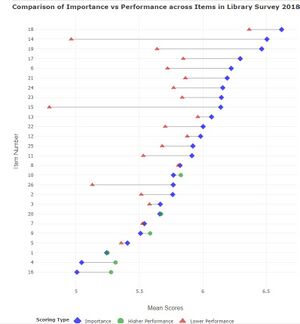
For survey data, it is imperative for display of information regarding the demographic profile of survey respondents. [8] Beyond that, given that our survey data has focus on Likert scale data with importance and performance ratings, relevant data visualisation techniques would be the divergent stacked bar chart, Lollipop chart or dot plots with lines (otherwise known as Dumbbell plots) for sentiment analyses and comparison of importance vs satisfaction scores.[8][9].
Proposed Story/Dashboard
Libraries typically develop surveys for 3 reasons: to gauge user satisfaction, to assess users' needs (usage), or to learn more about whether the library has met the outcomes of visiting the library. Our project application is designed for Singapore Management University's management and library staff as use cases in mind to derive insights into their performance so that they can invest resources into meeting the library users' needs in the future, through strategy or changes in operation.
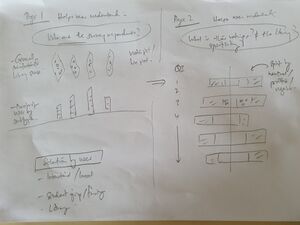
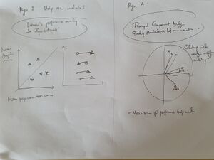
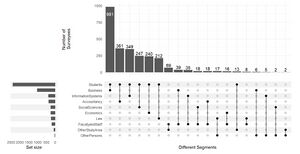
Specifically, the following information should be uncovered: - Breakdown of the survey respondents by their background through the Complex UpSet Plot - Understanding the sentiments of respondents using Diverging Stacked Bar Charts - Assessing whether the rated performance by library users have met with their expectations and which sectors the library can improve through Dumbbell plot - Analyzing possible relationships and explanations for survey item ratings through Principal Components Analysis
Our storyboard drafts below shows the design thinking and user journey through each page of the application where the user gradually gets fuller understand of trends in the survey data.
Through the journey, we hope to answer these questions which come up in the SMU library staff/management's mind.
- Who are the survey respondents, and where are they from?
- What is their general sentiment for different survey items?
- How is the library performing (based on ratings by users) for the different categories which the library is assessed to perform?
- Are there any relationship between factors which can lead me to develop new insights to improve the operation and strategy for running the library?
Data Preparation
- Data was analysed and deemed to be adequately clean for use in the R Shiny application.
- Data manipulation for use in the Shiny application is written into code and this allows future loading of survey results for year 2020 to be uploaded directly for instance analysis of data.
Analysis of Survey
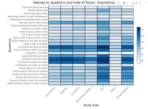
- This will be through the use of diverging stacked bar charts, UpSet plots, Dumbbell plots, heats maps and principal components analysis.
- We are also considering use of topic modelling and/or sentiment analysis for free-text survey comments data.
Visualizations
The following are sample visualizations for the R Shiny application:
Implementation
Implementation of data visualization and analysis tool is through the use of R Shiny application to provide vizualisations based on user options on subsets of data which they would like to look into.
Project Timeline
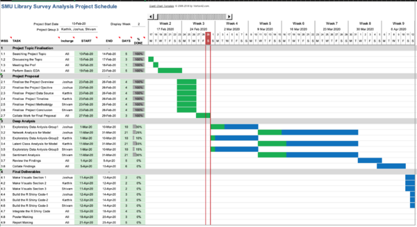
Please refer to the Gantt chart for the detailed breakdown of work and tentative planned schedule to achieve the project milestone.
Data Description
| S.No. | Data Field | Description | Data Type |
|---|---|---|---|
| 1 | ResponseID | Identity of the respondent | Numeric |
| 2 | Campus | Name of the Library which survey respondent visits more frequently | Categorical |
| 3 | Position | Designation of respondent (e.g. undergraduate student or faculty) | Categorical |
| 4 | StudyArea | Major area of study, research or teaching | Categorical |
| 5 | ID | Whether the surveyor is on international exchange | Categorical |
| 6 | I01-I26 | Survey Questions asking for respondents to rate the importance of individual items | Ordinal |
| 7 | P01-P26 | Survey Questions asking for respondents to rate the performance of the library of corresponding items | Ordinal |
| 8 | Comment1 | Suggestions for improvement or any other comments about library services | String |
| 9 | HowOftenL | How frequently the library is visited by respondent (e.g. daily, weekly, monthly) | Ordinal |
| 10 | HowOftenC | How frequently the campus is visited by respondent (e.g. daily, weekly, monthly) | Ordinal |
| 11 | HowOftenW | How frequently the library resources are accessed (e.g. daily, weekly, monthly) | Ordinal |
| 12 | NA01-NA26 | Data obtained where responses captured were that items were 'Not Applicable' for them | Ordinal |
| 13 | NPS1 | The likelihood that the respondent will recommend the library's services to others | Ordinal |
| 14 | PS27 | Overall satisfaction of the respondent with the library's services | Ordinal |
Tools & Packages
Tools used - Rstudio: https://rstudio.com/
| S.No. | Packages | Purpose |
|---|---|---|
| 1 | shiny() | Package for creating the R shiny interface |
| 2 | tidyverse() | Collection of R packages designed for data science |
| 3 | ggplot2() | Package for creating the Charts & Visualization |
| 4 | dplyr() | Package for Data Manipulation |
| 5 | FactoMineR() | Package for Performing Principle Component Analysis |
| 6 | corrplot() | Package for plotting correlation matrix |
| 7 | UpSetR() | Package for Visualizing Intersecting Sets. |
| 8 | sunburstR() | Package for plotting Sunburst chart |
| 9 | heatmaply() | Package for plotting interactive heatmap |
| 10 | shinydashboard() | Package for building the shiny UI |
| 11 | rsconnect() | Package used to upload the shiny app in shiny.io |
| 12 | factoextra() | Package for plot the loading plot |
Group Members
References
[1] Hiller, S., & Self, J. (2004). From Measurement to Management: Using Data Wisely for Planning and Decision-Making. Library Trends, 53(1), 129–155.
[2] Using key performance indicators to measure library performance. Leo Appleton. Library Connect. 4th April 2018. Available: https://libraryconnect.elsevier.com/articles/using-key-performance-indicators-measure-library-performance
[3] Assessing Library Performance: New Measure, Methods and Models. Julia C. Blixrud. Proceedings of the IATUL Conferences. Paper 9. Available: https://docs.lib.purdue.edu/iatul/2003/papers/9
[4] LibQUAL+: Charting Library Service Quality. Available: http://www.libqual.org/about/about_lq/general_info
[5] InSync Surveys. Available: https://insync.com.au/
[6] Library Service Quality Survey Results for 2018 Available: https://library.smu.edu.sg/about/about-us/library-service-quality-survey/2018-survey-results
[7] Singapore Management University Library Survey Report – Scope: All Respondents, February 2018. Available: https://library.smu.edu.sg/sites/library.smu.edu.sg/files/library/pdf/SMULibraries_BeHeardSurvey_FullReport.pdf
[8] Tableau - White Paper on Visualizing Survey Data. Version 2.0 June 2016. Steve Wexler.
[9] How to Visualize Importance vs. Satisfaction Survey Responses. Data Revelations. May 10th, 2017. Available: https://www.datarevelations.com/resources/importancesatisfaction/
