Difference between revisions of "Group14 proposal"
| (53 intermediate revisions by 2 users not shown) | |||
| Line 1: | Line 1: | ||
| − | [[File: | + | [[File:HeaderPictureTeam14.jpg|center|800px]] |
<div> | <div> | ||
{|style="background-color:#000000;" width="100%" cellspacing="0" cellpadding="0" valign="top" border="0" | | {|style="background-color:#000000;" width="100%" cellspacing="0" cellpadding="0" valign="top" border="0" | | ||
| − | | style="font-family:Gungsuh; font-size:100%; solid #FFFFFF; background:# | + | | style="font-family:Gungsuh; font-size:100%; solid #FFFFFF; background:#A3ACBF; text-align:center;" width="20%" | |
; | ; | ||
| − | [[Group14_Proposal| <font color="## | + | [[Group14_Proposal| <font color="white">Proposal</font>]] |
| − | + | | style="font-family:Gungsuh; font-size:100%; solid #FFFFFF; background:#A3ACBF; text-align:center;" width="20%" | | |
| − | | style="font-family:Gungsuh; font-size:100%; solid #FFFFFF; background:# | + | ; |
| + | [[Group14_Poster| <font color="white">Poster</font>]] | ||
| + | | style="font-family:Gungsuh; font-size:100%; solid #FFFFFF; background:#A3ACBF; text-align:center;" width="20%" | | ||
; | ; | ||
| − | [[ | + | [[Group14_User_Guide &_Application| <font color="white">User Guide & Application</font>]] |
| − | + | | style="font-family:Gungsuh; font-size:100%; solid #FFFFFF; background:#A3ACBF; text-align:center;" width="20%" | | |
| − | | style="font-family:Gungsuh; font-size:100%; solid #FFFFFF; background:# | ||
; | ; | ||
| − | [[ | + | [[Group14_Research_paper| <font color="white">Research Paper</font>]] |
| + | | style="font-family:Gungsuh; font-size:100%; solid #FFFFFF; background:#A3ACBF; text-align:center;" width="20%" | | ||
| − | | style="font-family:Gungsuh; font-size:100%; solid #FFFFFF; background:# | + | [[Project Groups| <font color="white">Back to Main Page</font>]] |
| − | + | | style="font-family:Gungsuh; font-size:100%; solid #FFFFFF; background:#A3ACBF; text-align:center;" width="20%" | | |
| − | |||
|} | |} | ||
| Line 23: | Line 24: | ||
== <big>Motivation and Objectives</big> == | == <big>Motivation and Objectives</big> == | ||
| − | <p> | + | <p> What HRs are facing is how well they can retain their talent and better control the employee turnover. Among all the employee-related problems for businesses around the world, attrition is one of the significant problems regardless of the changes in the external working environment. Because of today’s competitive job market, high employee attrition is one of the most pressing issues businesses face. By 2023, voluntary employee turnover is expected to rise to nearly 30%. Some major impacts on employee attrition, including lack of employee continuity and possible high costs involved in the induction and training of new staff will result in issues of organizational productivity. |
| − | <p> | + | <p> Hence, it really matters what will affect the employee and analyze what we can do to reduce as well as adjust the structure of personnel in order to achieve higher work efficiency; therefore, to improve the control of attrition. By creating different models, we are interested to see what caused employees from IBM to leave? To achieve this purpose, the executives and managers will be able to understand the current condition of the employees and take action to remedy controllable factors that can prevent attrition. Therefore, we intend to design an application which can help the Human Resource Department to further understand the structure of the employees who choose to leave and who stayed, and the attrition patterns regarding all features. From which can help not only to predict unwanted attrition, but to have proven action plans at your fingertips to help you reduce it, based on the organization's unique attributes. |
| − | |||
| − | |||
| − | |||
| − | |||
| − | |||
| − | |||
== <big>Data Description</big> == | == <big>Data Description</big> == | ||
| − | + | <p>The data set is from IBM Community. There are 1471 entity instances in total with 30 attributes. | |
| − | + | Some of the information from the data set are recorded as numbers, we need to identify them as categorical variables and will be explained in details below. | |
| − | |||
| − | |||
| − | |||
| − | There are | ||
| − | |||
| − | |||
| − | |||
| − | {| class="wikitable" style="width: 100%; height: | + | {| class="wikitable" style="width: 100%; height: 50em;" |
|- | |- | ||
| − | ! Data Fields !! Description | + | ! Data Fields !! Description !! Datatype |
|- | |- | ||
| − | | | + | | Attrition || Turnover status of employee, stored as "Yes" or "No" || Binary |
|- | |- | ||
| − | | | + | | BusinessTravel || Whether the employee travel frequently or not || Categorical |
|- | |- | ||
| − | | | + | | DailyRate || The daily rate of employee || Numerical |
|- | |- | ||
| − | | | + | | Education || Education level of employee, 1 as 'Below College', 2 as 'College', 3 as 'Bachelor', 4 as 'Master', 5 as 'Doctor' || Categorical |
|- | |- | ||
| − | | | + | | EnvironmentSatisfication || The satisfication level of one employee in working environment, 1 as 'Low', 2 as 'Medium', 3 as 'High', 4 as 'Very High' || Categorical |
|- | |- | ||
| − | | | + | | JobInvolvement || Job involvement of employee, 1 as 'Low', 2 as 'Medium', 3 as 'High', 4 as 'Very High' || Categorical |
|- | |- | ||
| − | | | + | | JobLevel || Job level of employee || Numerical |
|- | |- | ||
| − | | | + | | JobSatisfaction || Job satisfaction of employee, 1 as 'Low', 2 as 'Medium', 3 as 'High', 4 as 'Very High' || Categorical |
|- | |- | ||
| − | | | + | | NumCompaniesWorked || Total number of companies the employee worked for || Numerical |
|- | |- | ||
| − | | | + | | OverTime || Work overtime or not || Binary |
|- | |- | ||
| − | | | + | | PercentSalaryHike || The rate of increase in income from last year to this year || Numerical |
|- | |- | ||
| − | | | + | | PerformanceRating || Rate of performance for employee, 1 as 'Low', 2 as 'Good', 3 as 'Excellent', 4 as 'Outstanding' || Categorical |
|- | |- | ||
| − | | | + | | RelationshipSatisfaction || Relationship satisfaction of employee, 1 as 'Low', 2 as 'Medium', 3 as 'High', 4 as 'Very High'|| Categorical |
|- | |- | ||
| − | | | + | | StockOptionLevel || The number of stock employee hold || Numerical |
|- | |- | ||
| − | | | + | | TrainingTimesLastYear || Total training time for employee last year || Numerical |
| − | |||
| − | |||
| − | |||
| − | |||
| − | |||
| − | |||
| − | |||
| − | |||
| − | |||
| − | |||
|- | |- | ||
| + | | WorkLifeBalance || Does employee feel balance between work and life, 1 as 'Bad', 2 as 'Good', 3 as 'Better', 4 as 'Best'|| Categorical | ||
| + | |||
|} | |} | ||
| − | == <big> | + | == <big>Critique of Existing Visualization</big> == |
| + | |||
| + | [[File:Group 14 critique pic.png|400px|none]] | ||
| + | |||
| + | <p> This radar chart above shows the performance and satisfaction level of employees in attrition or stay. It has revealed plenty of valuable information and is an excellent way to visualize data; however, only five features were evaluated consisting of ranges from 1 to 4. Though it might be easier to prepare, this chart might bring users wondering how other features compare these five. Therefore, a more precise way should be introduced to select elements constituting this chart. The best way to solve this problem is to use feature engineering, then to draw a new graph to visualize better the influence of different factors to attrition. | ||
| − | + | == <big>Visualization</big> == | |
| + | <p> Basic EDA Analytics will be used to preliminarily understand the pairwise relationship between two or three features and their effects on attrition. Based on the overall relations between all features, the Network Graph will be applied to understand the structural characteristics of the features as a whole and to select features which are fed for the further model. We also plan to use three methods including Decision Tree, Random Forest and XGBoost to build the attrition analytics model. Lastly, the User Portrait Analysis will be applied to understand the differences among groups more intuitively based on the most important features that are generated from the model result. We hope our users will have a clearer understanding of the distribution of employee attrition in different dimensions and get hints of how to improve their attrition management. | ||
| − | [[File: | + | === Dashboard Sketch === |
| + | [[File:Pre-sketch_1.jpg|300px|Sketch_1]] | ||
| + | [[File:Pre_sketch_2.jpg|300px|Sketch_2]] | ||
| + | [[File:Pre_sketch_3.jpg|300px|Sketch_3]] | ||
| − | + | == <big>Methodology and Approach</big> == | |
| + | <p>The basic EDA Analytics is used to preliminarily understand the pairwise relationship between two or three features and their effects on attrition. Based on the overall relations between all features, the Network Graph is applied to understand the structural characteristics of the features as a whole and to select features which are fed for the further model. Three methods: Decision Tree, Random Forest and XGBoost are utilized for building the attrition analytics model and predict the probabilities of employee attrition. Lastly, the User Portrait Analysis is applied to understand the differences among groups more intuitively based on the most important features that are generated from the model result. In short, users will have a clearer understanding of the distribution of employee attrition in different dimensions and get hints of how to improve their attrition management. | ||
== <big>Models</big> == | == <big>Models</big> == | ||
| + | <p> Three different models will be applied for attrition analysis and their results and performances will be compared. | ||
| + | <p> The algorithm of the decision tree model works by repeatedly partitioning the data into multiple sub-spaces so that the outcomes in each final sub-space is as homogeneous as possible. The ROC curve plots will help to display the model’s performance intuitively. At last, we can get the most importance features based on the model’s result. The more often the features are chosen to split the tree, the more important the features are. | ||
| + | <p> Random Forest is one of the ensemble models and built by a collection of decision trees. Each decision tree in the forest considers a random subset of features when forming questions and only has access to a random set of the training data points. But as the Decision Tree, Random Forest model is easy to be overfitting. Besides, Random Forest has a serious drawback: for the attributes with different values, the attributes with more values divided will have a greater impact on the model. So, the attributes score by the random forest on such data is not trusted. | ||
| + | XGBoost is a gradient model while random forest is a bagging model, it is an implementation of gradient boosted decision trees designed for speed and performance. It is very useful to achieve Sparsity Aware Split Finding and improve the model performance. | ||
| − | + | == <big>Proposed R Packages</big> == | |
| − | + | ||
| − | + | {| class="wikitable" | |
| + | |- | ||
| + | ! Package Name !! Description | ||
| + | |- | ||
| + | | shinydashboard || Enable the usage and design of shiny dashboard | ||
| + | |- | ||
| + | | shiny || Make the interactive web applications for data visualization | ||
| + | |- | ||
| + | | reshape || Give new shapes to an array without changing its data | ||
| + | |- | ||
| + | | plotly || Create interactive bar graphs and scatter plots | ||
| + | |- | ||
| + | | tidyverse || A set of packages to plot out various visualizations and EDA | ||
| + | |- | ||
| + | | readr || To read rectangular data | ||
| + | |- | ||
| + | | recharts || Create interactive radar chart | ||
| + | |- | ||
| + | | DT || Create data table | ||
| + | |- | ||
| + | | ggraph || An extension of ggplot2 to build plots layer by layer | ||
| + | |- | ||
| + | | corrgram || Create correlation matrix | ||
| + | |- | ||
| + | | ggthemes || To apply themes to Shiny applications | ||
| + | |- | ||
| + | | ggcorrplot || Visualize correlation matrix using ggplot2 | ||
| + | |- | ||
| + | | plotrix || Create plot with two ordinates | ||
| + | |} | ||
== <big>Team Members</big> == | == <big>Team Members</big> == | ||
| Line 107: | Line 129: | ||
* [https://www.linkedin.com/in/yawen-shi-0046/ Shi Yawen] | * [https://www.linkedin.com/in/yawen-shi-0046/ Shi Yawen] | ||
* [https://www.linkedin.com/in/bridgitzhu/ Zhu Keyu] | * [https://www.linkedin.com/in/bridgitzhu/ Zhu Keyu] | ||
| + | |||
| + | == <big>References</big> == | ||
| + | *[https://info.workinstitute.com/hubfs/2019%20Retention%20Report/Work%20Institute%202019%20Retention%20Report%20final-1.pdf#page=7 Work Institute 2019 Retention Report final] | ||
| + | *[https://www.tinypulse.com/blog/7-common-causes-of-high-employee-turnover 7 Common (but Fixable) Causes of Employee Turnover] | ||
| + | *[http://thecontextofthings.com/2017/01/06/employee-attrition/ Employee attrition has a “quick fix”] | ||
| + | *[https://www.data-imaginist.com/2017/ggraph-introduction-layouts/ Introduction to ggraph: Layouts] | ||
Latest revision as of 05:34, 27 April 2020
Contents
Motivation and Objectives
What HRs are facing is how well they can retain their talent and better control the employee turnover. Among all the employee-related problems for businesses around the world, attrition is one of the significant problems regardless of the changes in the external working environment. Because of today’s competitive job market, high employee attrition is one of the most pressing issues businesses face. By 2023, voluntary employee turnover is expected to rise to nearly 30%. Some major impacts on employee attrition, including lack of employee continuity and possible high costs involved in the induction and training of new staff will result in issues of organizational productivity.
Hence, it really matters what will affect the employee and analyze what we can do to reduce as well as adjust the structure of personnel in order to achieve higher work efficiency; therefore, to improve the control of attrition. By creating different models, we are interested to see what caused employees from IBM to leave? To achieve this purpose, the executives and managers will be able to understand the current condition of the employees and take action to remedy controllable factors that can prevent attrition. Therefore, we intend to design an application which can help the Human Resource Department to further understand the structure of the employees who choose to leave and who stayed, and the attrition patterns regarding all features. From which can help not only to predict unwanted attrition, but to have proven action plans at your fingertips to help you reduce it, based on the organization's unique attributes.
Data Description
The data set is from IBM Community. There are 1471 entity instances in total with 30 attributes. Some of the information from the data set are recorded as numbers, we need to identify them as categorical variables and will be explained in details below.
| Data Fields | Description | Datatype |
|---|---|---|
| Attrition | Turnover status of employee, stored as "Yes" or "No" | Binary |
| BusinessTravel | Whether the employee travel frequently or not | Categorical |
| DailyRate | The daily rate of employee | Numerical |
| Education | Education level of employee, 1 as 'Below College', 2 as 'College', 3 as 'Bachelor', 4 as 'Master', 5 as 'Doctor' | Categorical |
| EnvironmentSatisfication | The satisfication level of one employee in working environment, 1 as 'Low', 2 as 'Medium', 3 as 'High', 4 as 'Very High' | Categorical |
| JobInvolvement | Job involvement of employee, 1 as 'Low', 2 as 'Medium', 3 as 'High', 4 as 'Very High' | Categorical |
| JobLevel | Job level of employee | Numerical |
| JobSatisfaction | Job satisfaction of employee, 1 as 'Low', 2 as 'Medium', 3 as 'High', 4 as 'Very High' | Categorical |
| NumCompaniesWorked | Total number of companies the employee worked for | Numerical |
| OverTime | Work overtime or not | Binary |
| PercentSalaryHike | The rate of increase in income from last year to this year | Numerical |
| PerformanceRating | Rate of performance for employee, 1 as 'Low', 2 as 'Good', 3 as 'Excellent', 4 as 'Outstanding' | Categorical |
| RelationshipSatisfaction | Relationship satisfaction of employee, 1 as 'Low', 2 as 'Medium', 3 as 'High', 4 as 'Very High' | Categorical |
| StockOptionLevel | The number of stock employee hold | Numerical |
| TrainingTimesLastYear | Total training time for employee last year | Numerical |
| WorkLifeBalance | Does employee feel balance between work and life, 1 as 'Bad', 2 as 'Good', 3 as 'Better', 4 as 'Best' | Categorical |
Critique of Existing Visualization
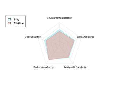
This radar chart above shows the performance and satisfaction level of employees in attrition or stay. It has revealed plenty of valuable information and is an excellent way to visualize data; however, only five features were evaluated consisting of ranges from 1 to 4. Though it might be easier to prepare, this chart might bring users wondering how other features compare these five. Therefore, a more precise way should be introduced to select elements constituting this chart. The best way to solve this problem is to use feature engineering, then to draw a new graph to visualize better the influence of different factors to attrition.
Visualization
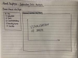
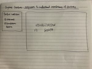
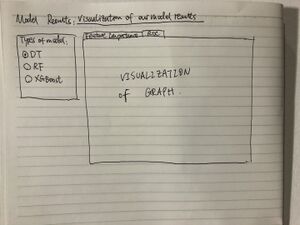
Basic EDA Analytics will be used to preliminarily understand the pairwise relationship between two or three features and their effects on attrition. Based on the overall relations between all features, the Network Graph will be applied to understand the structural characteristics of the features as a whole and to select features which are fed for the further model. We also plan to use three methods including Decision Tree, Random Forest and XGBoost to build the attrition analytics model. Lastly, the User Portrait Analysis will be applied to understand the differences among groups more intuitively based on the most important features that are generated from the model result. We hope our users will have a clearer understanding of the distribution of employee attrition in different dimensions and get hints of how to improve their attrition management.
Dashboard Sketch
Methodology and Approach
The basic EDA Analytics is used to preliminarily understand the pairwise relationship between two or three features and their effects on attrition. Based on the overall relations between all features, the Network Graph is applied to understand the structural characteristics of the features as a whole and to select features which are fed for the further model. Three methods: Decision Tree, Random Forest and XGBoost are utilized for building the attrition analytics model and predict the probabilities of employee attrition. Lastly, the User Portrait Analysis is applied to understand the differences among groups more intuitively based on the most important features that are generated from the model result. In short, users will have a clearer understanding of the distribution of employee attrition in different dimensions and get hints of how to improve their attrition management.
Models
Three different models will be applied for attrition analysis and their results and performances will be compared.
The algorithm of the decision tree model works by repeatedly partitioning the data into multiple sub-spaces so that the outcomes in each final sub-space is as homogeneous as possible. The ROC curve plots will help to display the model’s performance intuitively. At last, we can get the most importance features based on the model’s result. The more often the features are chosen to split the tree, the more important the features are.
Random Forest is one of the ensemble models and built by a collection of decision trees. Each decision tree in the forest considers a random subset of features when forming questions and only has access to a random set of the training data points. But as the Decision Tree, Random Forest model is easy to be overfitting. Besides, Random Forest has a serious drawback: for the attributes with different values, the attributes with more values divided will have a greater impact on the model. So, the attributes score by the random forest on such data is not trusted. XGBoost is a gradient model while random forest is a bagging model, it is an implementation of gradient boosted decision trees designed for speed and performance. It is very useful to achieve Sparsity Aware Split Finding and improve the model performance.
Proposed R Packages
| Package Name | Description |
|---|---|
| shinydashboard | Enable the usage and design of shiny dashboard |
| shiny | Make the interactive web applications for data visualization |
| reshape | Give new shapes to an array without changing its data |
| plotly | Create interactive bar graphs and scatter plots |
| tidyverse | A set of packages to plot out various visualizations and EDA |
| readr | To read rectangular data |
| recharts | Create interactive radar chart |
| DT | Create data table |
| ggraph | An extension of ggplot2 to build plots layer by layer |
| corrgram | Create correlation matrix |
| ggthemes | To apply themes to Shiny applications |
| ggcorrplot | Visualize correlation matrix using ggplot2 |
| plotrix | Create plot with two ordinates |


