Difference between revisions of "Group13 proposal"
Hlzhu.2019 (talk | contribs) |
|||
| (8 intermediate revisions by 2 users not shown) | |||
| Line 1: | Line 1: | ||
| − | [[File: | + | |
| + | [[File:WeChat Image 20200426215807.jpg|1000px|frameless|center]] | ||
<div> | <div> | ||
| − | {|style="background-color:# | + | {|style="background-color:#5686BF;" width="100%" cellspacing="0" cellpadding="0" valign="top" border="0" | |
| − | | style="font-family:Century Gothic; font-size:100%; solid #c0c0c0; background:# | + | | style="font-family:Century Gothic; font-size:100%; solid #c0c0c0; background:#5686BF; text-align:center;" width="20%" | |
; | ; | ||
[[Group13_proposal| <font color="#141313">Proposal</font>]] | [[Group13_proposal| <font color="#141313">Proposal</font>]] | ||
| − | | style="font-family:Century Gothic; font-size:100%; solid #103080; background:# | + | | style="font-family:Century Gothic; font-size:100%; solid #103080; background:#5686BF; text-align:center;" width="20%" | |
| + | ; | ||
| + | [[Group13_User Guide| <font color="#141313">User Guide</font>]] | ||
| + | |||
| + | | style="font-family:Century Gothic; font-size:100%; solid #103080; background:#5686BF; text-align:center;" width="20%" | | ||
; | ; | ||
[[Group13_poster| <font color="#141313">Poster</font>]] | [[Group13_poster| <font color="#141313">Poster</font>]] | ||
| − | | style="font-family:Century Gothic; font-size:100%; solid #103080; background:# | + | | style="font-family:Century Gothic; font-size:100%; solid #103080; background:#5686BF; text-align:center;" width="20%" | |
; | ; | ||
[[Group13_application| <font color="#141313">Application</font>]] | [[Group13_application| <font color="#141313">Application</font>]] | ||
| − | | style="font-family:Century Gothic; font-size:100%; solid #103080; background:# | + | | style="font-family:Century Gothic; font-size:100%; solid #103080; background:#5686BF; text-align:center;" width="20%" | |
; | ; | ||
[[Group13_research_paper| <font color="#141313">Research Paper</font>]] | [[Group13_research_paper| <font color="#141313">Research Paper</font>]] | ||
| Line 25: | Line 30: | ||
== 1. Project Focus == | == 1. Project Focus == | ||
| − | In "On the Origin of Human Inequality", Rousseau pointed out the source of "inequality" directly to private ownership and society itself. He asserted that there was no inequality in the life of primitive humans | + | In "On the Origin of Human Inequality", Rousseau pointed out the source of "inequality" directly to private ownership and society itself. He asserted that there was no inequality in the life of primitive humans, while the development of human capabilities and ideological progress incurred "inequality". With the development of modern society, inequality has become increasingly apparent. |
The project mainly tends to figure out how severe the inequality problem is, which includes gender inequality, income inequality, and education inequality. The goal of the project is to clarify all indexes related to inequality, try to make another way to demonstrate the unbalanced situation, quantify these three topics mentioned above, disclose the current situation of inequality, and to provide suggestions to authorities based on data analysis results. | The project mainly tends to figure out how severe the inequality problem is, which includes gender inequality, income inequality, and education inequality. The goal of the project is to clarify all indexes related to inequality, try to make another way to demonstrate the unbalanced situation, quantify these three topics mentioned above, disclose the current situation of inequality, and to provide suggestions to authorities based on data analysis results. | ||
| Line 33: | Line 38: | ||
== 2. Issues and Problems == | == 2. Issues and Problems == | ||
| − | The affluent dataset from the United Nations Development Program (UNDP)on the populations of countries around the world empowers us to explore multi-dimensional aspects of human development. The Human Development Report | + | The affluent dataset from the United Nations Development Program (UNDP)on the populations of countries around the world empowers us to explore multi-dimensional aspects of human development. The Human Development Report, a comprehensive and extensive database compiled by UNDP, is focusing on human development across the globe from 1990. It covers 15 topics with thousands of time-series development indexes featuring 189 countries and territories. |
| − | However, the | + | However, the enormous dataset invites a huge amount of data preparation work. Due to the interconnected data, how to sort out the relationships between the data and employ appropriate visualization methods are challenges for the team. |
| + | Moreover, the data quality is so limited, such as a lot of missing data, indexation of original data, that visualization may be less straight-forward. Besides, the Human Development Data report defines a lot of indexes to qualify the unbalanced situation on gender and education, resulting in that readers may not perceive the real meaning of indexes. | ||
== 3. Motivation and Objectives == | == 3. Motivation and Objectives == | ||
| − | The statistical tables provided by | + | The statistical tables provided by (UNDP) mainly present an overview of key aspects of human development, by using rough charts and coloring clusters of countries. Such visualization not only fails to convey comprehensive insights from the dataset but also cannot display data interactively. Moreover, the information in UNDP is interconnected, but due to individual visualization, correlations between factors cannot be displayed. Furthermore, the team desire to establish a better visualization pattern to integrate and analyze the data provided by UNDP and provide the authority to draw practical decisions. |
To solve those issues, the team is motivated to better visualize the data provided by UNDP and design a dynamic and interactive dashboard to provide authority integrated and meaningful information. | To solve those issues, the team is motivated to better visualize the data provided by UNDP and design a dynamic and interactive dashboard to provide authority integrated and meaningful information. | ||
| − | R Shiny will be used as the code base, and functions available in the ggplot package will be employed to develop the visualization. In ggplot, there are abundant visualization tools can be applied. The flexibility of the package is embodied in the design of different layers, which are efficient to achieve the visualization of correlations between factors, and finally, attain the objectives of the team. | + | R Shiny will be used as the code base, and functions available in the ggplot package will be employed to develop the visualization. In ggplot, there are abundant visualization tools can be applied. The flexibility of the package is embodied in the design of different layers, which are efficient to achieve the visualization of correlations between factors, and finally, attain the objectives of the team. |
== 4. Review and Critics of Past Works == | == 4. Review and Critics of Past Works == | ||
Human Development Report 2019 | Human Development Report 2019 | ||
The official published report provides a very detailed explanation of the situation of the world at present. In the report, “Inequalities” is mentioned everywhere, and it is indeed the most important core topic of the report. Following is a figure from the Human Development Report 2019. | The official published report provides a very detailed explanation of the situation of the world at present. In the report, “Inequalities” is mentioned everywhere, and it is indeed the most important core topic of the report. Following is a figure from the Human Development Report 2019. | ||
| − | + | [[File:Loss in Human Development.png|800px|frameless|center]] | |
| + | |||
| + | |||
| + | |||
In the published report, the editor uses a lot of bar charts, bubble charts and other types of simple but easy-understanding charts. | In the published report, the editor uses a lot of bar charts, bubble charts and other types of simple but easy-understanding charts. | ||
With the use of Shiny, more interactive functions can be applied so that the team will be able to achieve interactive manipulation, which is one of the goals of the project. The users of the visualization application can easily set comparisons between the countries, grasp statistical results or categories of their interest. | With the use of Shiny, more interactive functions can be applied so that the team will be able to achieve interactive manipulation, which is one of the goals of the project. The users of the visualization application can easily set comparisons between the countries, grasp statistical results or categories of their interest. | ||
The report also reveals some statistical calculation: | The report also reveals some statistical calculation: | ||
| + | [[File:Intergenerational Mobility Income.png|800px|frameless|center]] | ||
| + | |||
| + | |||
There are also some aspects can be improved in this project. In the Human Development Report (HDR) report, the number of statistic graphs is limited due to publish requirements that the number of pages shouldn’t be too big. While in Shiny we can get rid of this restriction. Indeed, HDR also provides online interactive charts, but only with line graphs, of which utility is very primitive. It makes graphs overly messy to use nearly 200 lines to represent all the countries in the world. | There are also some aspects can be improved in this project. In the Human Development Report (HDR) report, the number of statistic graphs is limited due to publish requirements that the number of pages shouldn’t be too big. While in Shiny we can get rid of this restriction. Indeed, HDR also provides online interactive charts, but only with line graphs, of which utility is very primitive. It makes graphs overly messy to use nearly 200 lines to represent all the countries in the world. | ||
| + | [[File:Line Chart.png|800px|frameless|center]] | ||
| + | |||
| + | |||
| + | |||
== 5. Reference == | == 5. Reference == | ||
Latest revision as of 22:30, 26 April 2020
Contents
1. Project Focus
In "On the Origin of Human Inequality", Rousseau pointed out the source of "inequality" directly to private ownership and society itself. He asserted that there was no inequality in the life of primitive humans, while the development of human capabilities and ideological progress incurred "inequality". With the development of modern society, inequality has become increasingly apparent.
The project mainly tends to figure out how severe the inequality problem is, which includes gender inequality, income inequality, and education inequality. The goal of the project is to clarify all indexes related to inequality, try to make another way to demonstrate the unbalanced situation, quantify these three topics mentioned above, disclose the current situation of inequality, and to provide suggestions to authorities based on data analysis results.
2. Issues and Problems
The affluent dataset from the United Nations Development Program (UNDP)on the populations of countries around the world empowers us to explore multi-dimensional aspects of human development. The Human Development Report, a comprehensive and extensive database compiled by UNDP, is focusing on human development across the globe from 1990. It covers 15 topics with thousands of time-series development indexes featuring 189 countries and territories.
However, the enormous dataset invites a huge amount of data preparation work. Due to the interconnected data, how to sort out the relationships between the data and employ appropriate visualization methods are challenges for the team.
Moreover, the data quality is so limited, such as a lot of missing data, indexation of original data, that visualization may be less straight-forward. Besides, the Human Development Data report defines a lot of indexes to qualify the unbalanced situation on gender and education, resulting in that readers may not perceive the real meaning of indexes.
3. Motivation and Objectives
The statistical tables provided by (UNDP) mainly present an overview of key aspects of human development, by using rough charts and coloring clusters of countries. Such visualization not only fails to convey comprehensive insights from the dataset but also cannot display data interactively. Moreover, the information in UNDP is interconnected, but due to individual visualization, correlations between factors cannot be displayed. Furthermore, the team desire to establish a better visualization pattern to integrate and analyze the data provided by UNDP and provide the authority to draw practical decisions.
To solve those issues, the team is motivated to better visualize the data provided by UNDP and design a dynamic and interactive dashboard to provide authority integrated and meaningful information.
R Shiny will be used as the code base, and functions available in the ggplot package will be employed to develop the visualization. In ggplot, there are abundant visualization tools can be applied. The flexibility of the package is embodied in the design of different layers, which are efficient to achieve the visualization of correlations between factors, and finally, attain the objectives of the team.
4. Review and Critics of Past Works
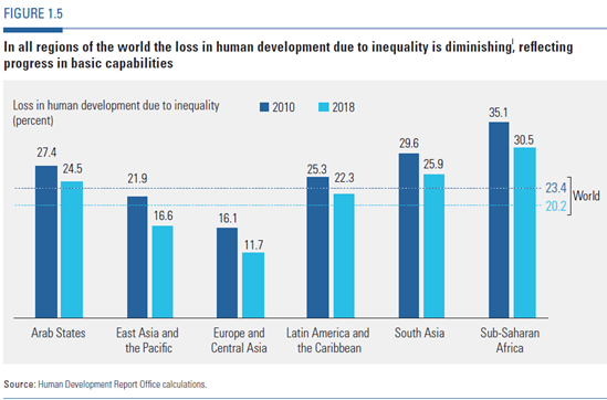
Human Development Report 2019 The official published report provides a very detailed explanation of the situation of the world at present. In the report, “Inequalities” is mentioned everywhere, and it is indeed the most important core topic of the report. Following is a figure from the Human Development Report 2019.
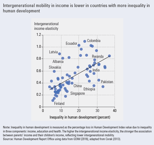
In the published report, the editor uses a lot of bar charts, bubble charts and other types of simple but easy-understanding charts. With the use of Shiny, more interactive functions can be applied so that the team will be able to achieve interactive manipulation, which is one of the goals of the project. The users of the visualization application can easily set comparisons between the countries, grasp statistical results or categories of their interest. The report also reveals some statistical calculation:
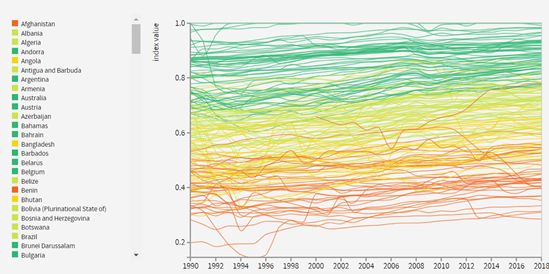
There are also some aspects can be improved in this project. In the Human Development Report (HDR) report, the number of statistic graphs is limited due to publish requirements that the number of pages shouldn’t be too big. While in Shiny we can get rid of this restriction. Indeed, HDR also provides online interactive charts, but only with line graphs, of which utility is very primitive. It makes graphs overly messy to use nearly 200 lines to represent all the countries in the world.
5. Reference
2.surprising-stats-about-gender-inequality
3.https://www.tandfonline.com/doi/full/10.1080/10852352.2019.1627079


