Difference between revisions of "Group02 proposal"
| (19 intermediate revisions by the same user not shown) | |||
| Line 3: | Line 3: | ||
<div style="background-color:#212d41; text-align:center"> | <div style="background-color:#212d41; text-align:center"> | ||
[[File:Group 02 banner.png|650px|frameless|center]] | [[File:Group 02 banner.png|650px|frameless|center]] | ||
| − | <font size = | + | <font size = 5; color = #ffffff><span style="font-family:Helvetica;"><b>A Visual Exploration of Media Consumption in Singapore</b><br></span></font> |
| − | |||
<br><br> | <br><br> | ||
</div> | </div> | ||
| Line 20: | Line 19: | ||
| style="font-family:Helvetica; font-size:100%; solid #103080; background:#a8a8a8; text-align:center;" width="20%" | | | style="font-family:Helvetica; font-size:100%; solid #103080; background:#a8a8a8; text-align:center;" width="20%" | | ||
; | ; | ||
| − | [[Group02_application| <font color="#FFFFFF">Application</font>]] | + | [[Group02_application| <font color="#FFFFFF">Application & User Guide</font>]] |
| style="font-family:Helvetica; font-size:100%; solid #103080; background:#a8a8a8; text-align:center;" width="20%" | | | style="font-family:Helvetica; font-size:100%; solid #103080; background:#a8a8a8; text-align:center;" width="20%" | | ||
| Line 36: | Line 35: | ||
==Introduction== | ==Introduction== | ||
| − | Government communicators across the world are under pressure to be more data-led to deliver on outcomes such as awareness of government policy (e.g. where to find support for specific problems), and attitudinal change (e.g. consuming healthier drinks). They compete with private sector firms in the same market for audience attention across media platforms. Thus, understanding the target audiences and where to reach them is crucial. | + | Government communicators across the world are under pressure to be more data-led <ref>https://www-warc-com.libproxy.smu.edu.sg/content/article/warc-data/global-ad-trends-the-adspend-outlook/131941</ref> to deliver on outcomes such as awareness of government policy (e.g. where to find support for specific problems), and attitudinal change (e.g. consuming healthier drinks). They compete with private sector firms in the same market for audience attention across media platforms <ref>https://gcs.civilservice.gov.uk/wp-content/uploads/2015/09/6.1048_Cabinet-Office_comms-future-document_v2_print_web.pdf</ref>. Thus, understanding the target audiences and where to reach them is crucial. |
A common approach that government communicators take to understanding audiences better is to “build your own data” through surveys. Given the resources required to conduct representative surveys, these initiatives are almost always outsourced to market research companies. In addition to data collection, these packages also include analysis of the rich survey data, with output in the form of reports and intellectual exchanges between the commissioning agency and market research company. | A common approach that government communicators take to understanding audiences better is to “build your own data” through surveys. Given the resources required to conduct representative surveys, these initiatives are almost always outsourced to market research companies. In addition to data collection, these packages also include analysis of the rich survey data, with output in the form of reports and intellectual exchanges between the commissioning agency and market research company. | ||
| Line 60: | Line 59: | ||
To help demonstrate the real-world benefit of our application, we intend to test the application with a sample of intended users to help them understand our design choices and seek feedback from a user perspective. This would be conducted through quantitative techniques (e.g. measure the length of time to answer specific questions using the application) and qualitative observations on whether the application encouraged interaction with the data through data and view specification and view manipulation. | To help demonstrate the real-world benefit of our application, we intend to test the application with a sample of intended users to help them understand our design choices and seek feedback from a user perspective. This would be conducted through quantitative techniques (e.g. measure the length of time to answer specific questions using the application) and qualitative observations on whether the application encouraged interaction with the data through data and view specification and view manipulation. | ||
| − | == | + | ==Data Description== |
| + | |||
| + | The face-to-face survey was designed to collect data on the media consumption habits of Singapore residents and Work Permit holders. Specifically, the survey collected data in three areas: | ||
| + | |||
| + | |||
| + | <ol type="1"> | ||
| + | <li>Frequency of use of media platforms at the broad category level and granular level (i.e. specific media channel)</li> | ||
| + | <li>Attention to advertising by media platform</li> | ||
| + | <li>Demographic information</li> | ||
| + | </ol> | ||
| + | |||
| + | |||
| + | Over 2,300 individuals responded to the survey. This compromised a roughly equal proportion of Singapore residents and Work Permit holders. | ||
| + | |||
| + | Most of the data is categorical in nature. The application will be further scoped to focus on the consumption behaviours of media platforms with the widest relevance to the Singapore audience, based on the reported usage habits. | ||
==Critique of Existing Visualisations== | ==Critique of Existing Visualisations== | ||
| − | == | + | Media Research Consultants Pte Ltd, a market research consultancy in Singapore, was commissioned to conduct the Media Consumption Study in 2018. Throughout the consultant’s report the theme of visualisation was consistent and below lists the common visualisations used and their critiques. |
| + | |||
| + | {| class="wikitable" | ||
| + | |- | ||
| + | ! Existing Visualisation !! Critique | ||
| + | |- | ||
| + | | | ||
| + | [[File:Group 02 critique 1.png|600px|frameless|right]] | ||
| + | |||
| + | |||
| + | || | ||
| + | In this visualisation, the use of icons are distracting and the percentages do not add up to 100%, it only shows what is the majority of responses and it ignores that minority which does not make this a meaningful visualisation for comparison and visualisation. | ||
| + | |||
| + | |- | ||
| + | | | ||
| + | [[File:Group 02 critique 2.png|600px|frameless|right]] | ||
| + | |||
| + | |||
| + | || | ||
| + | In this visualisation, these bar charts represent the percentages of responses across the different options but there is a leak of errors bars or confidence intervals to visualise uncertainty. Also, there were some questions with a small sample size of respondents (i.e. below 50), hence it would be better to include some confidence intervals to ensure that the results are representative. | ||
| + | |||
| + | |||
| + | |- | ||
| + | | | ||
| + | [[File:Group 02 critique 3.png|600px|frameless|right]] | ||
| + | |||
| + | || | ||
| + | In this visualisation, the bars represent the aggregate percentage for each time period and the lines represent the percentages in each time period for each individual radio station. The lines are cluttered and messy. As a reader it makes it difficult for one to grasp at first glance what are the numbers and lines are representing hence it does not make a compelling and informative visualisation. | ||
| + | |} | ||
| + | |||
| + | ==Methodology and Approach== | ||
| + | |||
| + | Below are some of the proposed visualisation approaches that we would be applying in our application. | ||
| + | |||
| + | ===Geospatial visualisations=== | ||
| + | |||
| + | [[File:Group 02 approach 1.png|500px|frameless]] | ||
| + | <br><br><i>Figure 1: Example of a choropleth map</i></br></br> | ||
| + | |||
| + | Albeit small in terms of geographical area, the vast demographic range of the population coupled with the pace of change in the age of the internet asserts that we pay attention to how the results vary from region to region within the country. A choropleth map provides us with an easy way to visualise such metrics. A good way to combat the issue of varying populations in different regions is to normalise the results and hence derive the “density” of the results in any particular area. | ||
| + | |||
| + | ===Visualising uncertainty in population survey data=== | ||
| + | |||
| + | [[File:Group 02 approach 2.png|650px|frameless]] | ||
| + | <br><br><i>Figure 2: Example of error bars to visualise uncertainty</i></br></br> | ||
| + | |||
| + | Because Singapore has a population of 5.6m people distributed across different demographic groups, there is a definite amount of uncertainty to be expected from the survey results. Visualising this uncertainty will provide further insights to the decision makers as to how to much of their resources they need to allocate towards any one particular category of media consumption. In our visualization, we make it a point to incorporate this level of uncertainty with the help of error bars and confidence intervals. Histograms can also complement the error bars by showing the spread of the response values along with showing the variations in a sample so that the decision makers can have a more educated judgement about whether a particular result from a sample is trustworthy or requires further investigation. | ||
| + | |||
| + | ===Stacked Bar Charts=== | ||
| + | |||
| + | [[File:Group 02 approach 3.png|500px|frameless]] | ||
| + | <br><br><i>Figure 3: Example of Stacked Bar Charts</i></br></br> | ||
| + | |||
| + | The survey questionnaire consists of five-point options “At least once a day”, “Several days a week“, “Once a week”, “Once every 2 weeks” and “Once a month”. Since these options cannot be quantified as “Negative”, “Neutral” and “Positive”, to visualise this likert scale data, we make use of a stacked bar chart. | ||
| + | |||
| + | ===Analysis of variance (ANOVA) Analysis=== | ||
| + | |||
| + | [[File:Group 02 approach 4.png|500px|frameless]] | ||
| + | <br><br><i>Figure 4: Example of ANOVA test with ggstatsplot</i></br></br> | ||
| + | |||
| + | ANOVA analysis can help in comparing the means of responses, this can help make key decisions when targeting audiences. Significantly different means between various communication channels can help answer how to address the audience and how to allocate budget towards marketing. | ||
| + | |||
| + | ===Mosaic chart / Contingency Table=== | ||
| + | |||
| + | Since the survey data mostly comprises categorical variables, a mosaic plot stands out as a good way of visualizing the relationship between two categorical variables. A chi-square test can be conducted on the contingency table to test whether a relationship exists between the two variables. This can also help narrow down and quicken decision making when allocating budget towards one means of communication, etc. | ||
| + | |||
| + | ===Latent Class Analysis (LCA)=== | ||
| + | |||
| + | [[File:Group 02 approach 5.png|600px|frameless]] | ||
| + | <br><br><i>Figure 5: Example of LCA Visualisation</i></br></br> | ||
| + | |||
| + | LCA is an unsupervised clustering algorithm used for identifying class memberships based on categorical variables. A good LCA classification can answer a lot of questions within one visualisation and can lead to quicker and more robust decision making. We aim to classify the respondents based on their means and patterns of consuming media. Since the survey consists of multiple parameters, at times it be a challenge to identify the parameters that should be looked into while carrying out targeted media marketing. LCA, inherently unsupervised, helps solve this problem by creating patterns of association and calculation based on their maximum likelihoods. | ||
==Proposed R Packages== | ==Proposed R Packages== | ||
| Line 74: | Line 158: | ||
| Shiny & Shiny dashboard || Interactive web applications for data visualization | | Shiny & Shiny dashboard || Interactive web applications for data visualization | ||
|- | |- | ||
| − | | | + | | Shinythemes || To apply themes to Shiny applications |
|- | |- | ||
| leaflet || To create maps within the application | | leaflet || To create maps within the application | ||
| Line 91: | Line 175: | ||
|} | |} | ||
| − | ==Project | + | ==Project Timeline== |
[[File:Group 02 timeline.png|850px|frameless]] | [[File:Group 02 timeline.png|850px|frameless]] | ||
| Line 100: | Line 184: | ||
==References== | ==References== | ||
| − | + | <ol type="1"> | |
| − | + | <li>[https://www-warc-com.libproxy.smu.edu.sg/content/article/warc-data/global-ad-trends-the-adspend-outlook/131941 Global Ad Trends: The Adspend Outlook]</li> | |
| + | <li>[https://gcs.civilservice.gov.uk/wp-content/uploads/2015/09/6.1048_Cabinet-Office_comms-future-document_v2_print_web.pdf The Government Communication Service The Future of Public Service Communications Report and Findings]</li> | ||
| + | </ol> | ||
Latest revision as of 20:58, 26 April 2020
Contents
Introduction
Government communicators across the world are under pressure to be more data-led [1] to deliver on outcomes such as awareness of government policy (e.g. where to find support for specific problems), and attitudinal change (e.g. consuming healthier drinks). They compete with private sector firms in the same market for audience attention across media platforms [2]. Thus, understanding the target audiences and where to reach them is crucial.
A common approach that government communicators take to understanding audiences better is to “build your own data” through surveys. Given the resources required to conduct representative surveys, these initiatives are almost always outsourced to market research companies. In addition to data collection, these packages also include analysis of the rich survey data, with output in the form of reports and intellectual exchanges between the commissioning agency and market research company.
The real-world experience falls short of the ambition. The majority of the survey data is untapped for insights. Market researchers over-emphasise delivering information (rather than insights) through static platforms such as powerpoint slides. Further, these reports adhere to generic templates and forego many of the best practices in statistical analysis and data visualisation. This may be partly explained by a gap in the quality of analytics expertise in the market research firms, shortcomings in the initial project scoping stage between market researcher and a lack of confidence in the ability of non-analytics professionals to engage with data.
Motivation and Objectives
We are motivated by the lack of web-enabled visual analytics applications to help government communicators discover the truth about their audience from their rich survey data.
This project aims to provide government communicators with a user-friendly web-enabled application to visually discover the media consumption patterns and behaviours of major audiences in Singapore. Specifically, the application should help the user to interact with the data to:
- Efficiently visualise the survey responses at different levels of aggregation, and with full recognition of the uncertainty in the inferences made from samples.
- Visualise the similarities in the data, such the results of cluster or latent class analysis models.
- Visualise how related responses can explain a given key observation through the use of contingency tables and Mosaic charts.
To help demonstrate the real-world benefit of our application, we intend to test the application with a sample of intended users to help them understand our design choices and seek feedback from a user perspective. This would be conducted through quantitative techniques (e.g. measure the length of time to answer specific questions using the application) and qualitative observations on whether the application encouraged interaction with the data through data and view specification and view manipulation.
Data Description
The face-to-face survey was designed to collect data on the media consumption habits of Singapore residents and Work Permit holders. Specifically, the survey collected data in three areas:
- Frequency of use of media platforms at the broad category level and granular level (i.e. specific media channel)
- Attention to advertising by media platform
- Demographic information
Over 2,300 individuals responded to the survey. This compromised a roughly equal proportion of Singapore residents and Work Permit holders.
Most of the data is categorical in nature. The application will be further scoped to focus on the consumption behaviours of media platforms with the widest relevance to the Singapore audience, based on the reported usage habits.
Critique of Existing Visualisations
Media Research Consultants Pte Ltd, a market research consultancy in Singapore, was commissioned to conduct the Media Consumption Study in 2018. Throughout the consultant’s report the theme of visualisation was consistent and below lists the common visualisations used and their critiques.
| Existing Visualisation | Critique |
|---|---|
|
|
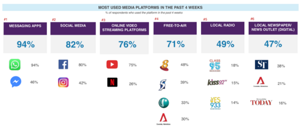
In this visualisation, the use of icons are distracting and the percentages do not add up to 100%, it only shows what is the majority of responses and it ignores that minority which does not make this a meaningful visualisation for comparison and visualisation. |
|
|
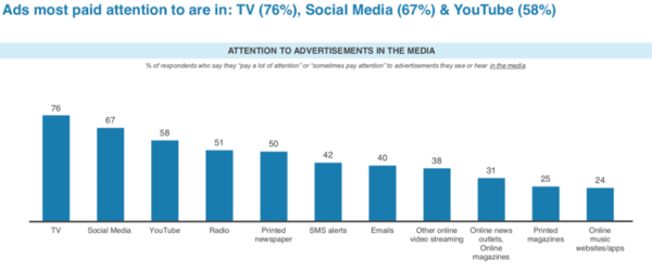
In this visualisation, these bar charts represent the percentages of responses across the different options but there is a leak of errors bars or confidence intervals to visualise uncertainty. Also, there were some questions with a small sample size of respondents (i.e. below 50), hence it would be better to include some confidence intervals to ensure that the results are representative.
|
|
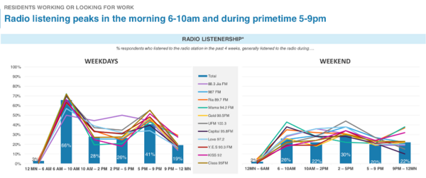
In this visualisation, the bars represent the aggregate percentage for each time period and the lines represent the percentages in each time period for each individual radio station. The lines are cluttered and messy. As a reader it makes it difficult for one to grasp at first glance what are the numbers and lines are representing hence it does not make a compelling and informative visualisation. |
Methodology and Approach
Below are some of the proposed visualisation approaches that we would be applying in our application.
Geospatial visualisations
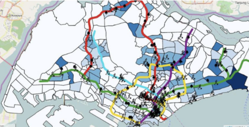
Figure 1: Example of a choropleth map
Albeit small in terms of geographical area, the vast demographic range of the population coupled with the pace of change in the age of the internet asserts that we pay attention to how the results vary from region to region within the country. A choropleth map provides us with an easy way to visualise such metrics. A good way to combat the issue of varying populations in different regions is to normalise the results and hence derive the “density” of the results in any particular area.
Visualising uncertainty in population survey data

Figure 2: Example of error bars to visualise uncertainty
Because Singapore has a population of 5.6m people distributed across different demographic groups, there is a definite amount of uncertainty to be expected from the survey results. Visualising this uncertainty will provide further insights to the decision makers as to how to much of their resources they need to allocate towards any one particular category of media consumption. In our visualization, we make it a point to incorporate this level of uncertainty with the help of error bars and confidence intervals. Histograms can also complement the error bars by showing the spread of the response values along with showing the variations in a sample so that the decision makers can have a more educated judgement about whether a particular result from a sample is trustworthy or requires further investigation.
Stacked Bar Charts

Figure 3: Example of Stacked Bar Charts
The survey questionnaire consists of five-point options “At least once a day”, “Several days a week“, “Once a week”, “Once every 2 weeks” and “Once a month”. Since these options cannot be quantified as “Negative”, “Neutral” and “Positive”, to visualise this likert scale data, we make use of a stacked bar chart.
Analysis of variance (ANOVA) Analysis
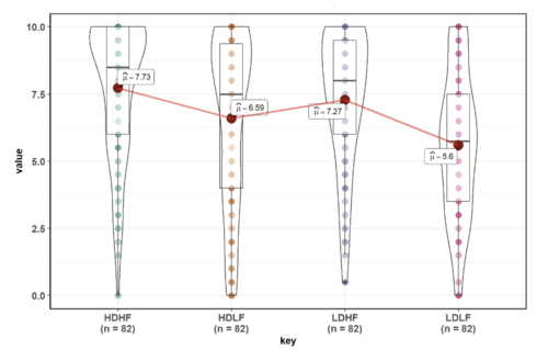
Figure 4: Example of ANOVA test with ggstatsplot
ANOVA analysis can help in comparing the means of responses, this can help make key decisions when targeting audiences. Significantly different means between various communication channels can help answer how to address the audience and how to allocate budget towards marketing.
Mosaic chart / Contingency Table
Since the survey data mostly comprises categorical variables, a mosaic plot stands out as a good way of visualizing the relationship between two categorical variables. A chi-square test can be conducted on the contingency table to test whether a relationship exists between the two variables. This can also help narrow down and quicken decision making when allocating budget towards one means of communication, etc.
Latent Class Analysis (LCA)
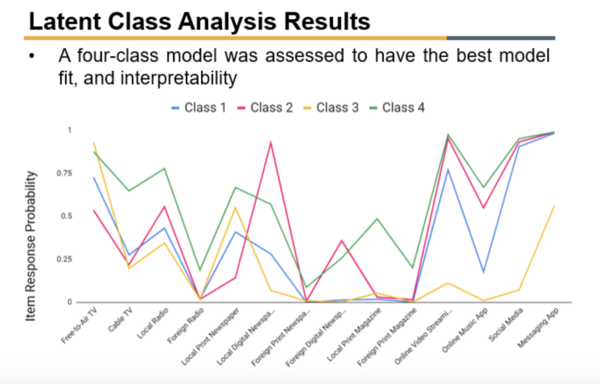
Figure 5: Example of LCA Visualisation
LCA is an unsupervised clustering algorithm used for identifying class memberships based on categorical variables. A good LCA classification can answer a lot of questions within one visualisation and can lead to quicker and more robust decision making. We aim to classify the respondents based on their means and patterns of consuming media. Since the survey consists of multiple parameters, at times it be a challenge to identify the parameters that should be looked into while carrying out targeted media marketing. LCA, inherently unsupervised, helps solve this problem by creating patterns of association and calculation based on their maximum likelihoods.
Proposed R Packages
| Package Name | Description |
|---|---|
| Shiny & Shiny dashboard | Interactive web applications for data visualization |
| Shinythemes | To apply themes to Shiny applications |
| leaflet | To create maps within the application |
| Tidyverse | To do data manipulation and exploration with dplyr() etc. |
| Plotly | To create interactive bar graphs and scatter plots |
| ggstatsplot | To create ANOVA test visualisation |
| vcd | To visualize categorical data and mosaic plots |
| poLCA | To estimate latent class models and carry out latent class regression |
| gglpot2 | To plot out various visualizations and EDA |

