IS428 AY2019-20T2 Assign TIAN. MINGZE
Contents
Overview
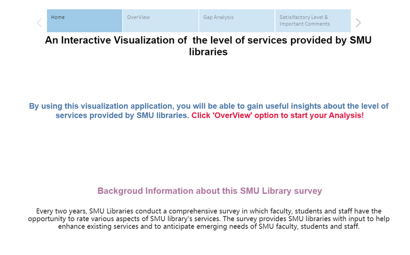
Every two years, SMU Libraries conduct a comprehensive survey in which faculty, students and staff have the opportunity to rate various aspects of SMU library's services. The survey provides SMU libraries with input to help enhance existing services and to anticipate emerging needs of SMU faculty, students and staff. The latest survey is currently on going and will be ended by 17th February 2020.
The 2018 Survey Results can be found here and the full report is available by following this link. The past reports are mainly made-up of pages of tables, which are very difficult to comprehend. In view of this, your task is to apply appropriate data visualisation to transform these tables into visual representation that allow SMU libraries to gain useful insights.
Task
In this assignment, you are required to use visual analytics approach to reveal the level of services provided by SMU libraries as perceived by:
- the undergraduate students,
- the postgraduate students,
- the faculty,
- the staff.
Data preparation
We are given 2 datasets, Raw data 2018-03-07 and SMU Library Survey Comments. Unfortunately, these two given datasets are not well structured and cannot be directly used. So, I will mainly focus on data cleaning and data preparation in this section.
Raw data 2018-03-07 SMU LCS data file
There are two worksheets in this raw data. The first worksheet record all response data from all participants. The second worksheet contains all the column name (legend) for the first worksheet.
Issue 1: When I take a closer look into the data, I realized that all the assessments are in measures format instead of dimensions.
Solution: Use tableau to pivot the selected survey assessment values.
Detail steps 1. Select column from 'I01' to the end. 2. Under the drop down menu select 'pivot'. 3. Rename the Pivot Field Name to Assessments, Pivot Filed Value to score.
Issue 2: The column name (legend) and data rows are in two separate worksheets. Without knowing about each column's name, it is impossible for us to conduct the visualization.
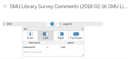
Solution: Use tableau built-in function to join these two dataset together.
Detail steps 1. Import the raw data into tableau. 2. Drag the worksheets to the connection field and choose left join (SMU on left side, Legend on right side). 3. Under left join, select Assessments = Code.
Interactive Visualization
The interactive visualization can be accessed here:https://public.tableau.com/profile/tian.mingze#!/vizhome/assignment_15840201936860/Story1?publish=yes
The followings are some of the interactive technics that being used by the application:
| Interactive Technique | Rationale | Brief Implementation Steps |
|---|---|---|
| ||
|
Dashboard
My analysis contains four visualizations and one comment field and they located in a different dashboard. So, I decided to use a storyboard. By using this storyboard, the analyst can easily navigate to between different dashboards.
Overview
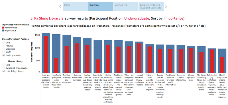
This Overview dashboard provides an overall result for all quantitative survey assessments. For this section, Instead of calculating each assessment's average score, I use the count number of promoters. Because, the average score is not a good way to measure participants' satisfaction level. I used a combined bar chart to make a comparison between importance and performance and sort the bar chart based on importance. Based on this combined bar chart, the analyst can have an overview of each service's importance and performance.
| Interactive Technique | Rationale | Brief Implementation Steps |
|---|---|---|
|
Gap between Importance and Performance & suggestions
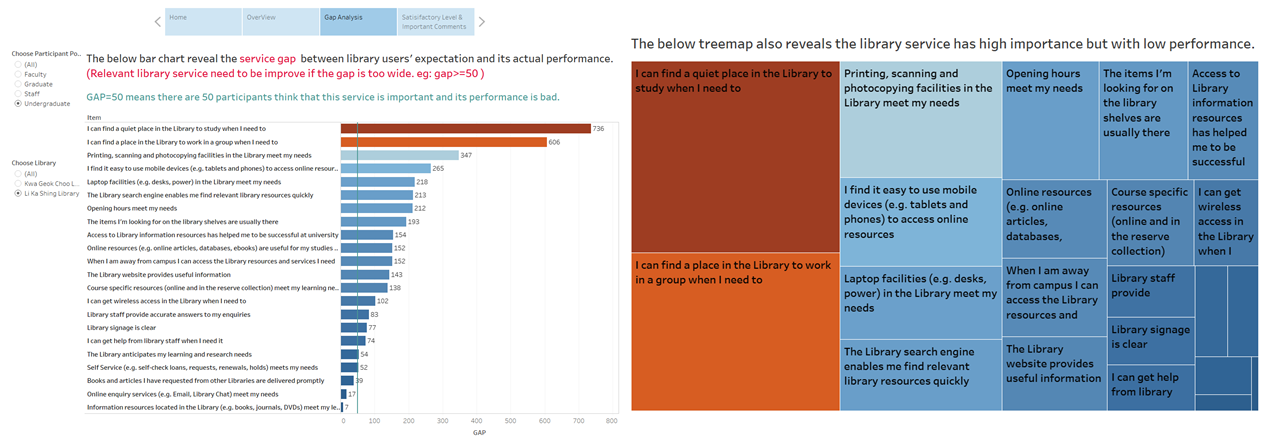
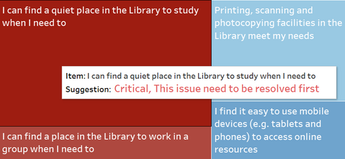
This page is mainly for us to find out the service gap between library users' expectation and its actual performance. Relevant library service needs to be improved if the gap is too wide. Gap equals to 50 means there are 50 library survey participants belive that this specific service is important to them but its performance is bad.
| Interactive Technique | Rationale | Brief Implementation Steps |
|---|---|---|
|
|
Level of Satisfaction & Comments
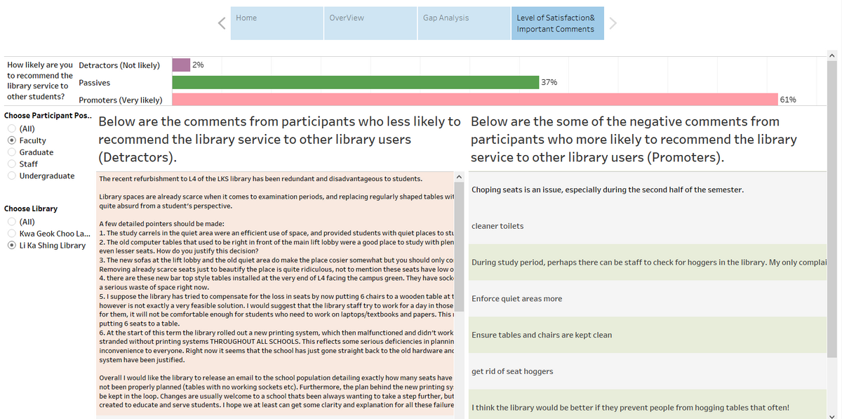
This page is mainly for the analyst to check library users' satisfaction level by detractors, passives, promoters and their comments.
Analysis & Insights
Undergraduate Students
Li Ka Shing Library
- Undergraduate students are not satisfied with the learning space and group discussion space provided by Li Ka Shing Library.
- Undergraduate students are not satisfied with the printing, scanning and photocopying facilities in the Li Ka Shing Library.
Kwa Geok Choo Library
- Undergraduate students are not satisfied with the learning space and group discussion space provided by Kwa Geok Choo library.
- Undergraduate students are not satisfied with the opening hours in Kwa Geok Choo library.
- Undergraduate students are not satisfied with the printing, scanning and photocopying facilities in the Kwa Geok Choo library.
Postgraduate Students
Li Ka Shing Library
- Postgraduate students are not satisfied with the learning space and group discussion space provided by Li Ka Shing Library.
- Postgraduate students are not satisfied with the printing, scanning and photocopying facilities in the Li Ka Shing Library.
Kwa Geok Choo Library
- Postgraduate students are not satisfied with the printing, scanning and photocopying facilities in the Kwa Geok Choo library.
- Postgraduate students are not satisfied with the opening hours in Kwa Geok Choo library.
Faculty
Staff
Reference
https://wiki.smu.edu.sg/1617t1IS428g1/IS428_2016-17_Term1_Assign3_Gwendoline_Tan_Wan_Xin


