Difference between revisions of "IS428 AY2019-20T2 Assign TANNY LAI"
| Line 113: | Line 113: | ||
| '''Navigate across dashboard pages with buttons''' <br> [[File:Nav1.jpg|400px|frameless]] || Every page in the dashboard will have this navigation buttons on the header to provide users the flexibility of moving from one dashboard to the other, with an easy and simple to use interface || Example | | '''Navigate across dashboard pages with buttons''' <br> [[File:Nav1.jpg|400px|frameless]] || Every page in the dashboard will have this navigation buttons on the header to provide users the flexibility of moving from one dashboard to the other, with an easy and simple to use interface || Example | ||
|- | |- | ||
| − | |'''Filter buttons to select interested group for each dashboard pages''' <br> [[File:Nav2.jpg|400px|frameless]] | + | |'''Filter buttons to select interested group for each dashboard pages''' <br> [[File:Nav2.jpg|400px|frameless]]|| To provide users with contextual information about the dashboard and allowing users the flexibility to filter the charts to the group that they are interested in viewing to gain insights. || |
|} | |} | ||
=== Home Page === | === Home Page === | ||
| + | The dataset given contains a substantial amount of data attributes captured in the dataset provided. As such, it will not be possible to display all the attributes for a proper analysis in a single dashboard as users will be bombarded by the amount of information and insights. Furthermore, although many of these attributes are interrelated to each other, there were no clear guidelines and orders given to how the data attributes should be analyzed. To resolve this issue, flexibility has to be provided for users to navigate between different dashboards. To do so, a homepage is created to introduce the dataset and problem that the dashboard is trying to solve along with the groups that we are interested in analyzing to gather insights. The homepage explains that the visualization will be broken down into 4 groups to be analyzed. This will allow users to understand how the dashboard will work and that they will be able to choose the analysis that they are interested to look into to gather in-depth analysis. | ||
| + | |||
| + | The following shows the home dashboard: | ||
| + | [[File:Home.jpg|800px|center|frameless]] | ||
| − | |||
| − | |||
| − | |||
| − | |||
| − | |||
| − | |||
| − | |||
| − | |||
| − | |||
| − | |||
=== Performance Vs Importance === | === Performance Vs Importance === | ||
| + | [[File:P1.png|800px|center|frameless|dashboard1]] | ||
{| class="wikitable" | {| class="wikitable" | ||
| Line 142: | Line 137: | ||
=== Overall with demographics === | === Overall with demographics === | ||
| − | + | [[File:P1.png|800px|center|frameless|dashboard1]] | |
{| class="wikitable" | {| class="wikitable" | ||
|- | |- | ||
Revision as of 13:54, 15 March 2020
Contents
Problem & Motivation
Problem
Every two years, SMU Libraries conduct a comprehensive survey in which faculty, students and staff have the opportunity to rate various aspects of SMU library's services. The survey provides SMU libraries with input to help enhance existing services and to anticipate emerging needs of SMU faculty, students and staff. However, the survey results presented by InSync lack of friendly and interactive visualization to aid the library staffs to easily understand the results and derive value-adding insights.
Motivation
In class, we have learned that we should always use a divergent stack bar chart to do analysis on Likert scales and not to find the average of the scale. Upon viewing the survey report done by Insync, I feel inspired to apply the concepts, methods, and techniques I have learned in my Visual Analytics IS428 class. Furthermore, it would be far more interesting and practical to be able to resolve real-world problems using visual analytics skills that I have learned.
The interactive visualization can reveal the level of services provided by SMU libraries as perceived by:
- The undergraduate students,
- The postgraduate students,
- The faculty,
- The staff
Dataset Analysis & Transformation Process
Understanding the dataset
Before diving in to do an in-depth analysis and creating charts, it is essential to understand the dataset given and identify the best method for data preparation by understanding the respective format and attributes(columns). The dataset provided in the assignment consists of 2 datasheets:
1. The data in codes and number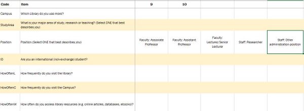
2. The legend to describe the data in layman terms.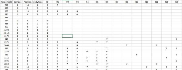
This section will elaborate on the dataset analysis and transformation process for the dataset in order to prepare the data for import and analysis on interactive visualization.
Firstly, I identified that the dataset contains three types of data - demographic, behavioral and feedback/opinions.
Under demographic data types, the dataset has surveyee's data on:
- StudyArea - Major area of study, research or teaching
- Position - Position in SMU (1 column)
- ID - International (non-exchange) student (1 column)
Under behavioral data types, the dataset has surveyee's data on:
- Campus - Library mostly used (1 column)
- HowOften- How frequently do you visit the library/campus/access library resources (3 columns)
Under feedback data types, the dataset has surveyee's data on:
- NPS - How likely surveyee is to recommend the library service to other students (1 column)
- Importance- A list of importance ratings for 26 library services (26 columns)
- Performance- A list of performance ratings for 26 library services (26 columns) and surveyee's satisfaction with the library (1 column)
- Comments - Suggestions for improvement or any other comments about the Library (1 column)
- NA - Are the services applicable to the surveyee? (1 column)
Transformation
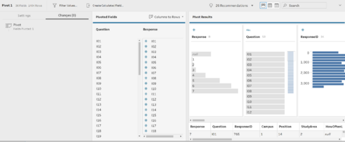
1. After understanding the dataset, it is noticeable that the data attributes HowOften, Importance, Performance, and NA needs to be pivot as they have many columns and this would make data analysis for the charts tough at the later steps.
Solution: In order to solve the issue of too many columns for the same data attribute I put the dataset with the codes into TableauPrep and pivot it three times. Firstly, I pivot the HowOften attribute. Continuously, I pivot Importance and Performance together and lastly, I pivot NA. Finally, I output it in a TDE file format.
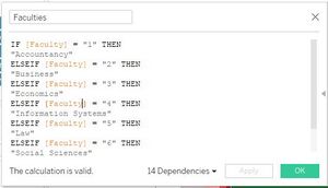
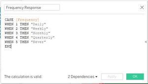
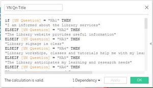
2. Despite preparing the data by using pivot, the data was still not ready for analysis as they were in code format which was hard for a user who is not familiar to understand.
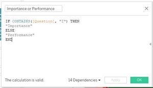
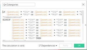
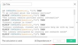
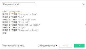
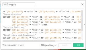
Solution: Since the dataset is in code format, to make it easier for the user who will be using the analytic dashboard, I had created calculated fields to help convert the data. I avoided using Alias although it gets the job done faster, the user will have to create their own alias every time they create a new Tableau file and it will be troublesome. By creating a calculated field, the code can be reused and the user will not be required to do alias multiple times. Overall, for the dataset, I had created calculated fields to rename the codes for the attributes: Study Area, Position, HowOften Responses, Yes No(NA) Question Title, Importance and Performance, Importance and Performance Question Categories, Importance and Performance Question Title, Response Label, and YN (NA) Question Categories.
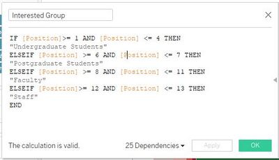
Also, as we're only interested in certain positions that fall in the groups - undergraduate students, postgraduate students, faculty, and staff. I had created a calculated field just to retrieve our interested groups.
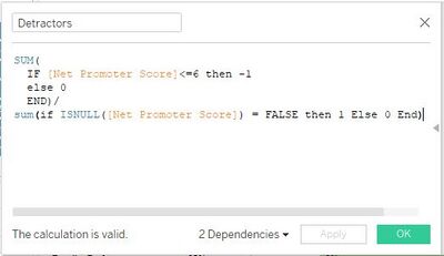
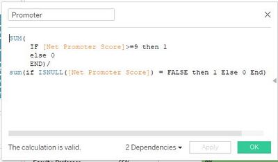
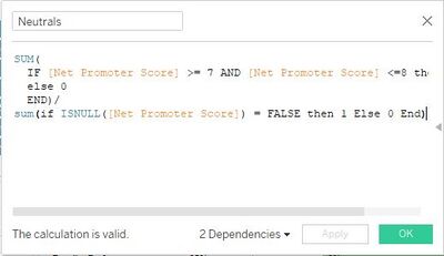
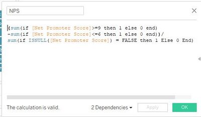
3. The survey question involves getting the net promoter score to gauge the loyalty of the library's relationships with its users but it is not possible to do the analysis without separating the results of the data attributes into the detractors, promoters, and neutrals and calculate the NPS score
Solution: In order to be able to create a visualization for the data, it is necessary to create four calculated fields to calculate the percentage of detractors, promoters, and neutrals as well as the NPS score.
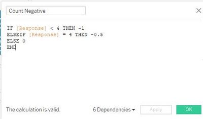
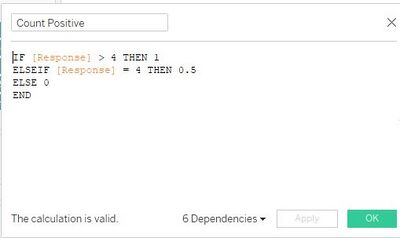
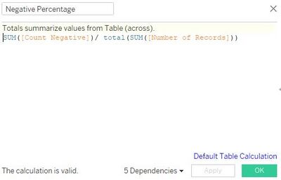
4. In the dataset, the survey questions under the data attribute for Importance and Performance are on a Likert scale format. To perform an analysis of the Likert scale data type, the survey results need to be presented in the divergent stacked bar chart format. However, the current dataset is not friendly in allowing users to create a divergent stacked bar chart.
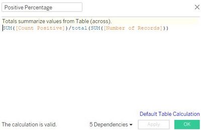
Solution: To be able to create a divergent stacked bar chart visualization for the Likert Scale data type, it is necessary to create four calculated fields. First, I created a calculated field to separate the number of positive and half of the number of neutral responses to build the right side of the chart. Second, I create another calculated field to separate the number of negative responses and half of the number of neutral responses to build the left side of the chart. Third, I created another calculated field to calculate the percentage of negative responses. Lastly, I created a calculated field to calculate the percentage of positive responses.
5. The dataset involved data on Performance(similar to satisfaction) and Importance, thus, I deemed that it is necessary to do a visualization on gap analysis for the performance compared to the Importance, however, the current dataset does not allow me to do so.
 [[File:Gap3.jpg|400px|frameless]
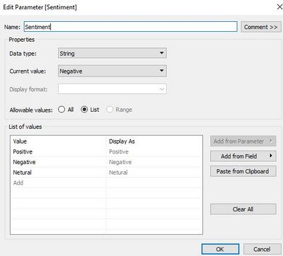
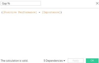
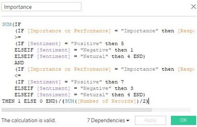
Solution: To be able to create visualization charts for gap analysis, I had to create a parameter called sentiment to act as a filter to users to select if they would like to a gap analysis for positive/neutral/negative responses. Also, I had created a calculated field to determine when the sentiment parameter is selected what falls under the Performance and a calculated field to determine when the sentiment parameter is selected what falls under the Importance. Lastly, I created a calculated field to find the gap percentage of performance and importance.
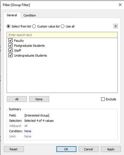
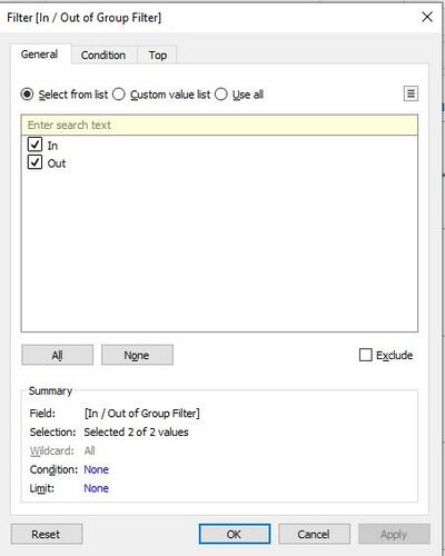
6. After all the creation of necessary dimensions and measures, we need to ensure that the visualization charts would only show the data belonging to the 4 groups mentioned earlier on, using filters and sets for excluding certain unnecessary data.
Solution: Make use of the previously created dimensions as filters to exclude out unnecessary data and create sets to ensure that only required data categories are shown.
Interactive Visualization
The interactive visualization can be accessed here:https://public.tableau.com/profile/tanny.lai#!/vizhome/TannyIS428IndividualAssignment/Story1?publish=yes
Throughout all the dashboard pages, useful guides/tips are provided to help users navigate through the different filters and actions so that their analysis can be performed smoothly. The following interactivity elements are also used throughout all the dashboards to maintain consistency:
Home Page
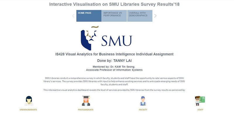
The dataset given contains a substantial amount of data attributes captured in the dataset provided. As such, it will not be possible to display all the attributes for a proper analysis in a single dashboard as users will be bombarded by the amount of information and insights. Furthermore, although many of these attributes are interrelated to each other, there were no clear guidelines and orders given to how the data attributes should be analyzed. To resolve this issue, flexibility has to be provided for users to navigate between different dashboards. To do so, a homepage is created to introduce the dataset and problem that the dashboard is trying to solve along with the groups that we are interested in analyzing to gather insights. The homepage explains that the visualization will be broken down into 4 groups to be analyzed. This will allow users to understand how the dashboard will work and that they will be able to choose the analysis that they are interested to look into to gather in-depth analysis.
The following shows the home dashboard:
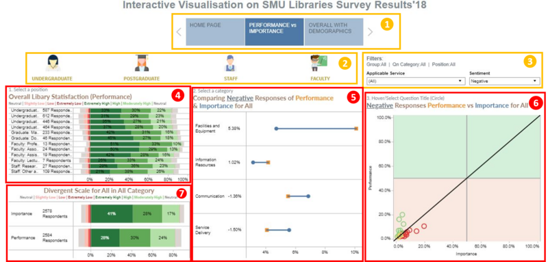
Performance Vs Importance
| Technique | Purpose | Steps |
|---|---|---|
| Example | Example | Example |
| Example | Example | Example |
| Example | Example | Example |
Overall with demographics
| Technique | Purpose | Steps |
|---|---|---|
| Example | Example | Example |
| Example | Example | Example |
| Example | Example | Example |

