IS428 AY2019-20T2 Assign TANNY LAI
Contents
Problem & Motivation
Problem
Every two years, SMU Libraries conduct a comprehensive survey in which faculty, students and staff have the opportunity to rate various aspects of SMU library's services. The survey provides SMU libraries with input to help enhance existing services and to anticipate emerging needs of SMU faculty, students and staff. However, the survey results presented by InSync lack of friendly and interactive visualization to aid the library staffs to easily understand the results and derive value-adding insights.
Motivation
In class, we have learned that we should always use a divergent stack bar chart to do analysis on Likert scales and not to find the average of the scale. Upon viewing the survey report done by Insync, I feel inspired to apply the concepts, methods, and techniques I have learned in my Visual Analytics IS428 class. Furthermore, it would be far more interesting and practical to be able to resolve real-world problems using visual analytics skills that I have learned.
The interactive visualization can reveal the level of services provided by SMU libraries as perceived by:
- The undergraduate students,
- The postgraduate students,
- The faculty,
- The staff
Dataset Analysis & Transformation Process
Understanding the dataset
Before diving in to do an in-depth analysis and creating charts, it is essential to understand the dataset given and identify the best method for data preparation by understanding the respective format and attributes(columns). The dataset provided in the assignment consists of 2 datasheets:
1. The data in codes and number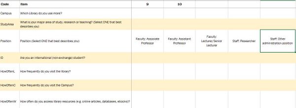
2. The legend to describe the data in layman terms.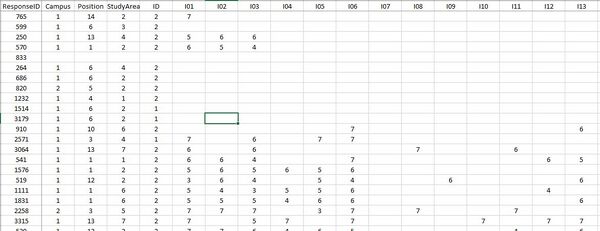
This section will elaborate on the dataset analysis and transformation process for the dataset in order to prepare the data for import and analysis on interactive visualization.
Firstly, I identified that the dataset contains three types of data - demographic, behavioral and feedback/opinions.
Under demographic data types, the dataset has surveyee's data on:
- StudyArea - Major area of study, research or teaching
- Position - Position in SMU (1 column)
- ID - International (non-exchange) student (1 column)
Under behavioral data types, the dataset has surveyee's data on:
- Campus - Library mostly used (1 column)
- HowOften- How frequently do you visit the library/campus/access library resources (3 columns)
Under feedback data types, the dataset has surveyee's data on:
- NPS - How likely surveyee is to recommend the library service to other students (1 column)
- Importance- A list of importance ratings for 26 library services (26 columns)
- Performance- A list of performance ratings for 26 library services (26 columns) and surveyee's satisfaction with the library (1 column)
- Comments - Suggestions for improvement or any other comments about the Library (1 column)
- NA - Are the services applicable to the surveyee? (1 column)
Transformation
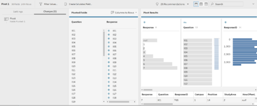
1. After understanding the dataset, it is noticeable that the data attributes HowOften, Importance, Performance, and NA needs to be pivot as they have many columns and this would make data analysis for the charts tough at the later steps.
Solution: In order to solve the issue of too many columns for the same data attribute I put the dataset with the codes into TableauPrep and pivot it three times. Firstly, I pivot the HowOften attribute. Continuously, I pivot Importance and Performance together and lastly, I pivot NA. Finally, I output it in a TDE file format.
2. Despite preparing the data by using pivot, the data was still not ready for analysis as they were in code format which was hard for a user who is not familiar to understand.
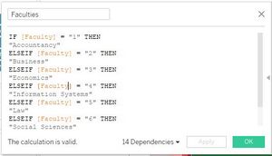
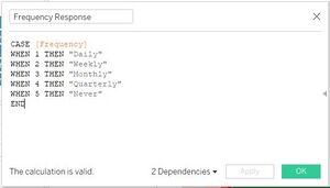
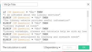
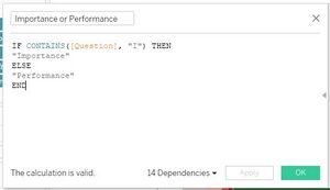
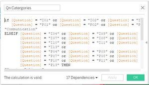
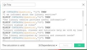
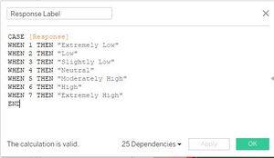
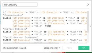
Solution: Since the dataset is in code format, to make it easier for the user who will be using the analytic dashboard, I had created calculated fields to help convert the data. I avoided using Alias although it gets the job done faster, the user will have to create their own alias every time they create a new Tableau file and it will be troublesome. By creating a calculated field, the code can be reused and the user will not be required to do alias multiple times. Overall, for the dataset, I had created calculated fields to rename the codes for the attributes: Study Area, Position, HowOften Responses, Yes No(NA) Question Title, Importance and Performance, Importance and Performance Question Categories, Importance and Performance Question Title, Response Label, and YN (NA) Question Categories.
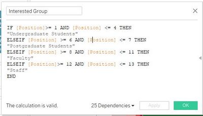
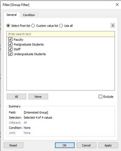
Also, as we're only interested in certain positions that fall in the groups - undergraduate students, postgraduate students, faculty, and staff. I had created a calculated field just to retrieve our interested groups.
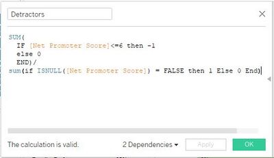
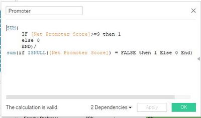
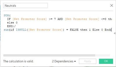
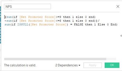
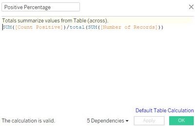
3. The survey question involves getting the net promoter score to gauge the loyalty of the library's relationships with its users but it is not possible to do the analysis without separating the results of the data attributes into the detractors, promoters, and neutrals and calculate the NPS score
Solution: In order to be able to create a visualization for the data, it is necessary to create four calculated fields to calculate the percentage of detractors, promoters, and neutrals as well as the NPS score.
4. In the dataset, the survey questions under the data attribute for Importance and Performance are on a Likert scale format. To perform an analysis of the Likert scale data type, the survey results need to be presented in the divergent stacked bar chart format. However, the current dataset is not friendly in allowing users to create a divergent stacked bar chart.
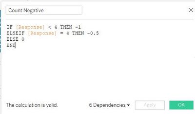
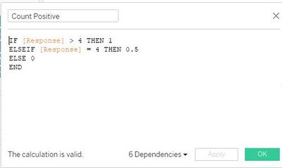
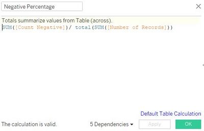
Solution: To be able to create a divergent stacked bar chart visualization for the Likert Scale data type, it is necessary to create four calculated fields. First, I created a calculated field to separate the number of positive and half of the number of neutral responses to build the right side of the chart. Second, I create another calculated field to separate the number of negative responses and half of the number of neutral responses to build the left side of the chart. Third, I created another calculated field to calculate the percentage of negative responses. Lastly, I created a calculated field to calculate the percentage of positive responses.
5. The dataset involved data on Performance(similar to satisfaction) and Importance, thus, I deemed that it is necessary to do a visualization on gap analysis for the performance compared to the Importance, however, the current dataset does not allow me to do so.
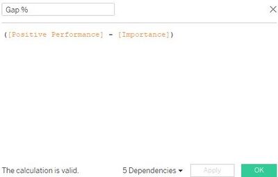
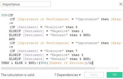
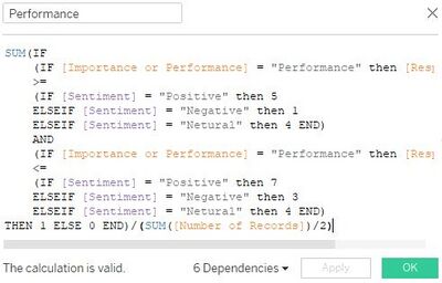
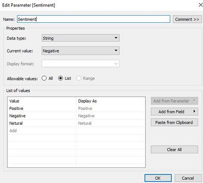
Solution: To be able to create visualization charts for gap analysis, I had to create a parameter called sentiment to act as a filter to users to select if they would like to a gap analysis for positive/neutral/negative responses. Also, I had created a calculated field to determine when the sentiment parameter is selected what falls under the Performance and a calculated field to determine when the sentiment parameter is selected what falls under the Importance. Lastly, I created a calculated field to find the gap percentage of performance and importance.
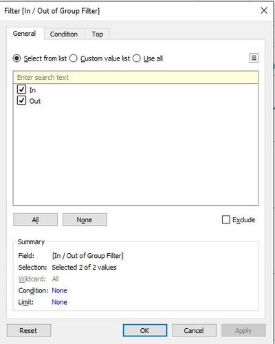
6. After all the creation of necessary dimensions and measures, we need to ensure that the visualization charts would only show the data belonging to the 4 groups mentioned earlier on, using filters and sets for excluding certain unnecessary data.
Solution: Make use of the previously created dimensions as filters to exclude out unnecessary data and create sets to ensure that only required data categories are shown.
Interactive Visualization
The interactive visualization can be accessed here:https://public.tableau.com/profile/tanny.lai#!/vizhome/TannyIS428IndividualAssignment/Story1?publish=yes
Throughout all the dashboard pages, useful guides/tips are provided to help users navigate through the different filters and actions so that their analysis can be performed smoothly. The following interactivity elements are also used throughout all the dashboards to maintain consistency:
Home Page
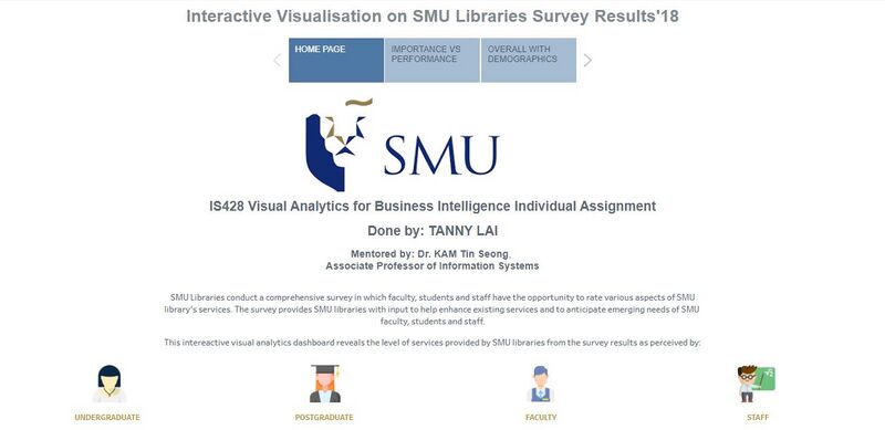
The dataset given contains a substantial amount of data attributes captured in the dataset provided. As such, it will not be possible to display all the attributes for a proper analysis in a single dashboard as users will be bombarded by the amount of information and insights. Furthermore, although many of these attributes are interrelated to each other, there were no clear guidelines and orders given to how the data attributes should be analyzed. To resolve this issue, flexibility has to be provided for users to navigate between different dashboards. To do so, a homepage is created to introduce the dataset and problem that the dashboard is trying to solve along with the groups that we are interested in analyzing to gather insights. The homepage explains that the visualization will be broken down into 4 groups to be analyzed. This will allow users to understand how the dashboard will work and that they will be able to choose the analysis that they are interested to look into to gather in-depth analysis.
The following shows the home dashboard:
Performance Vs Importance
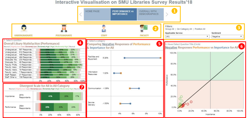
This dashboard page has charts to analyze the questions under the performance and importance data attributes as well as being able to filter them according to the group and position of the surveyee, sentiment based on the responses of the questions and if the services are applicable to the respondents.
| Box No. | Description |
|---|---|
| 1. | Navigation bar for users to navigate across the dashboards. |
| 2. | Filter icons for users to select a group they are interested in getting its insights with tooltips to prompt users to select a group. Default(Before filtering): Insights of all the 4 groups will be presented. |
| 3. | This shows the current filters in place for the dashboard. Users may also select the filters for:
1. Applicable Services (Based on NA Questions' results) with the selections:
2. Sentiment (Based on Importance and Performance Questions' results) with the selections:
According to the choices depending on what they are interested to know. |
| 4. | The chart in this box allows users to view the overall satisfaction of the selected group's positions (based on box 2) in a divergent stack bar chart. Also, users can select a position that they would drill down on for in-depth analysis by clicking on the word of the position. For example, by clicking on the word in the first column, undergraduate year 1, the visualization will filter all other charts in the dashboard to display only data from the position undergraduate year 1. The chart also has a tooltip to show the number of respondents for each response type. |
| 5. | The chart in this box compares the performance to the importance based on the selected sentiment (Box 3's Filter 2) as well as any other filters selected beforehand. Users can select a category of their interest and drill down for in-depth analysis by clicking on the word of the category. For example, by clicking on the word in the first column, Facilities and Equipments, the visualization will filter the charts in box 6 and 7 of the dashboard to display only data from the category Facilities and Equipments. The chart also has a tooltip to show the divergent stacked bar of the responses for each position. |
| 6. | The chart in box 6 shows which services based on the survey question are performing above the respondent's expectation based on whether performance is higher than importance. If the service in the question title is performing well, the circle plot will be in green color, if the service is underperforming, the plot will be in red color if performance is the same as importance, the circle plot will be yellow in color. Users are able to click on a specific question that they are interested to filter the divergent stack bar chart in box 7 accordingly. The chart also has a tooltip to show the gap for the specific question when hover. |
| 7. | This chart usually displays the overall responses into a divergent stacked bar of all available questions for the dashboard page. However, once a filter is selected, the chart will filter the data to display accordingly. |
Overall with demographics
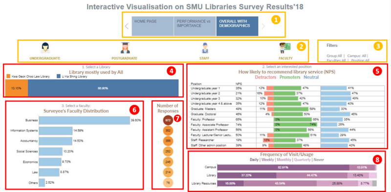
This dashboard page has charts to display the behavioral and demographic data of the survey's respondents as well as the NPS score. The dashboard have filters like the group, faculty, and position of the respondents, as well as filters by the library that is most used by the surveyees.
| Box No. | Description |
|---|---|
| 1. | Navigation bar for users to navigate across the dashboards. |
| 2. | Filter icons for users to select a group they are interested in getting its insights with tooltips to prompt users to select a group. Default(Before filtering): Insights of all the 4 groups will be presented. |
| 3. | This shows the current filters in place for the dashboard which includes the group, position, faculty of the surveyee as well the library most used by the surveyee. Users can filter the dashboard page according to what they are interested to learn. |
| 4. | The chart in this box tells the users the distribution of which library is mostly used. Users are able to select the library that they are interested in doing further analysis as the remaining charts in the dashboard will be filtered to display the data of those who have voted for the selected library. |
| 5. | This chart presents data on the NPS role in Position along with the NPS score. Users are able to select a position of the choice in this chart to filter the remaining charts to show data of their selected position. |
| 6. | The chart in box 6 shows the respondent's faculty distribution. The user may also select a faculty of their choice by clicking on the bar for the respective faculty to filter the charts in the dashboard and derive necessary insights. |
| 7. | This chart shows the number of respondents for each faculty based on the chart in box 6. |
| 8. | The chart shows the frequency of each respondent visiting the campus/ library/ using the library resources. The results will be filtered based on the selected filters if any. |
Analysis & Insights
Undergraduate Students
Overall and Demographic insights
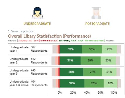
Overall, there are 2109 undergraduate respondents and at least 83% of the students in each study year at satisfied with the libraries' performance, and 5-7% of them in each study year are dissatisfied with the libraries' performance.
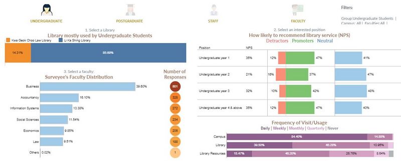
Majority of the undergraduate students, 85.7%, uses Li Ka Shing Library most while 14.31% of the students use Kwa Geok Choo Law Library. Most respondents, 824(39.6%), are from the business faculty. More than 92% of the respondents from Accountancy, Information System, Social Sciences and Economics use the Li Ka Shing library most while 72% of the law students use Kwa Geok Choo Law Library most.
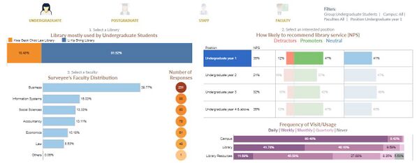
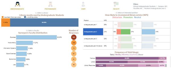
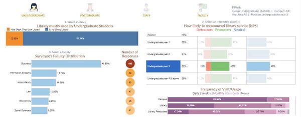
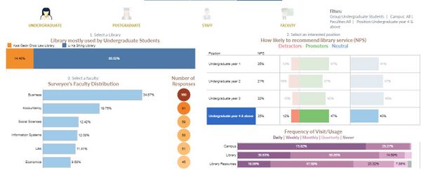
Interestingly, as the undergraduate students gain seniority, the percentage of the students that go to campus daily decreases. 90.5% of year 1 students go to school daily while only 74% of year 4 students go to school daily.
However, the trend for library resource usage is the opposite, as seniority increases the percentage of students using library resources daily increases. Merely 11.68% of year 1 students use the library resources daily while 19.06% of the year 4 students use the library resources daily.
Amongst all, Year 2 undergraduates visit the library daily (45.08%) the most. We would have assumed that if these students visit the library so frequently, they may be a promoter of the library. However, they have the highest % of detractors amongst all the position of undergraduates and least promoters. Additionally, their NPS for Kwa Geok Choo Law Library is 10%. This can be because the year 2 students spend most time in the library with 87.5% of the respondents visiting the library at least once a week and they get bored with the library facilities. Thus, they find the library uninteresting. The library should host a different variety of events like book fairs or interesting workshops frequently to bring new excitements to students.
Performance Vs Improvement
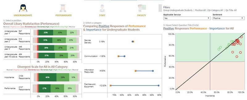
Among all positive applicable services response, for performance Vs importance (at least a score of 5 out of 7 in a scale), Service Delivery is the best performing category as it is the only service with performance score higher than importance overall, with 0.19%. Facilities and equipment is the worst-performing category with a negative gap score of 12.82% when comparing performance to importance.
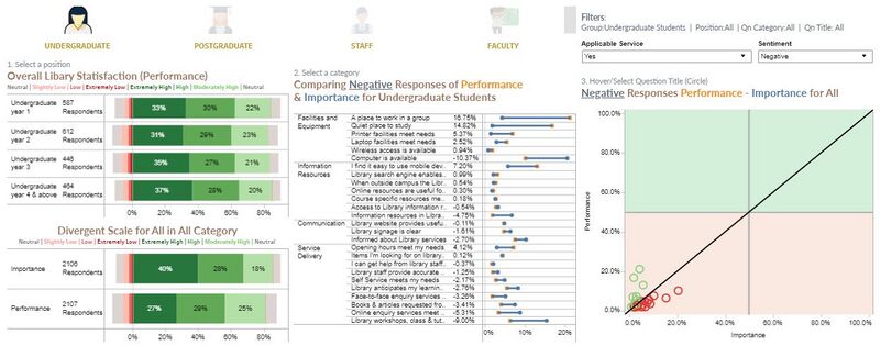
The top 5 most important services for the undergraduates are:
- Wireless access is available
- Printer facilities meet needs
- A quiet place to study when needed
- Laptop facilities meet needs
- Online resources are useful for studies, helps with learning and research needs
However, none of the performance for the top 5 most important services has met the user's expectations and needs. The libraries need to buck up the services in the top 5 importance to meet the expectations of the undergraduate students.
The top 5 best performing services are:
- Wireless access is available
- Surveyee can get help from library staffs
- Library staff provide accurate answers to enquiries
- Online resources are useful for studies, helps with learning and research needs
- When outside campus, library resources are accessible
When comparing the top 5 most important services with the top 5 best performing services, we can identify that these services need to be improved:
1. Printer facilities meet the needs
- The library only has 1 color printer and queue for the printer could be crowded especially during exam periods. The library should place more color printers.
2. There is a quiet place to study when needed
- The number of seats in a quiet place is limited and during exams when many students wish to study in the quiet place it will be hard to find a seat.
3. Laptop facilities meet the needs
- Although there are computers placed in the libraries, there are very little people using it. Students are not taught how they can use computers. Also, the computers can have paid software to value add for students to use the computers, if not, students will have no uses to choose to use library computers over their own laptops.
The top 5 lowest gaps (best performing) between performance vs positively rated important services (rated at least 5 out of 7):
- 10.51% Library workshops, class, and tutorials helps with learning and research needs
- 9.36% gap for Computer is available
- 4.65% gap for Information resources meets learning and research needs
- 3.22% gap for Online enquiry service meets needs
- 2.47% gap for face-to-face enquiry services meets needs
The library does not need to concentrate on improving these services for time-being as they met the satisfaction of the users.
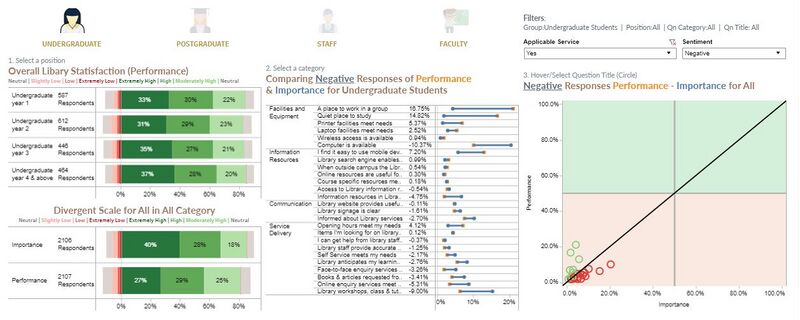
The top 5 least important services:
- Computer is available
- Library workshops, class, and tutorials help with learning and research needs
- Informed about library services
- Online enquiry service meets needs
- Library anticipates my learning and research needs
The top 5 least performing services:
- Place to work in a group
- Quiet place to study
- Easy to use mobile devices to access online services
- Computer is available
- Informed about library services
Although all this service is available in the library, however, they are lacking and inadequate. Hence, they fall under the least performing services.
The top 5 highest gaps (Most underperforming) between performance vs positively rated important services (rated at least 5 out of 7):
- -31.01% gap for place to work in a group
- -28.91% gap for quiet place to study
- -16.58% gap for easy to use mobile devices to access online resources
- -13.26% gap for printer facilities meets needs
- -8.20% gap for opening hour meets needs
Many of the highest gap services also fall under the least performing services, especially finding a place to work/study. A reason for this could be due to overcrowding students in the library space. And the library needs to enforce the seat hogging policy to improve the performance of the service. Lastly, the library should conduct an in-depth analysis to understand the cause of the huge gap.
Postgraduate Students
Overall and Demographic insights
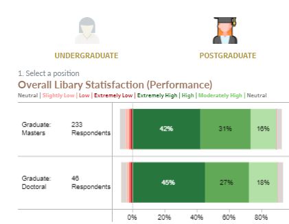
Overall, there are 279 postgraduate respondents and at least 89% of them pursuing either master and doctorate are satisfied with the libraries' performance and around 3% of them are dissatisfied with the libraries' performance.
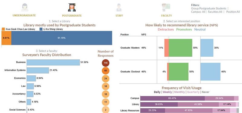
The majority of the postgraduate students, 91.2%, uses Li Ka Shing Library most while only 8.8% of uses Kwa Geok Choo Law Library. Most of the respondents, 146(51.5%) are from the business faculty. All the postgraduate respondents from Information System, Economics faculty uses the Li Ka Shing library most, while 90% of the law students use Kwa Geok Choo Law Library most.
74% of the doctoral students go to campus daily while only 63.6% of the master students go to school daily. However, there is a higher % of master students who use the library daily (40.6%) as compared to doctoral students (25.8%). Interestingly, 63.2% of the doctoral students access the library resources daily which means that although they do not head to the library, access to the resources online daily. As compared to only 17.3% of the master students who use the library resources daily.
It is observed that Li Ka Shing library has the most % of promoters as compared while Kwa Geok Choo Law Library has most % of detractors. 60% of the master students and 55% of doctoral students are promoters of Li Ka Shing Library while 49% of the master students and 0% of doctoral students are promoters of Kwa Geok Choo Law Library. Instead, 30% of the doctoral students are detractors for Kwa Geok Choo Law library, thus resulting in a -30% NPS as compared to 55% NPS score for Li Ka Shing Library. The NPS score represents the willingness of the surveyees to recommend other students to use the library and a negative score means that there are many dissatisfied library users. The Kwa Geok Choo Law library seriously needs to improve and adapt the facilities/resources of the Li Ka Shing library to meet the demands of the doctoral students.
==== Performance Vs Improvement ====
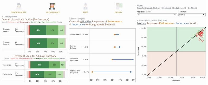
Among all positive applicable services responses (at least a score of 5 out of 7 on a scale), Communication is the best performing category as it has the least negative gap of 0.99% overall. Facilities and equipment are the worst-performing categories with a negative gap score of 10.15% when comparing performance to importance.
Results are filtered to applicable services responses.
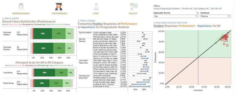
The top 5 most important services for the postgraduate are:
- Wireless access is available
- Laptop facilities meet needs
- A quiet place to study when needed
- Printer facilities meet needs
- I can get help from library staff when needed
However, none of the performance for the top 5 most important services has met the user's expectations and needs. This means that the libraries need to brush up the services in the top 5 importance to meet the expectations of the postgraduate students.
The top 5 best performing services are:
- Wireless access is available
- Self-service facilities meet needs
- Library staff provides accurate answers to enquires
- I can get help from library staff when needed
- Online enquiry services is available when needed
When comparing the top 5 most important services with the top 5 best performing services, we can identify that the services below need to be improved as the most important services are not performing the best. From the postgraduate responses, these services that need to be improved is the same from the undergraduate responses. This represents that the services required by the postgraduate students are the same as undergraduate students and reinforces the importance to improve these services:
- Laptop facilities meet needs
- A quiet place to study when needed
- Printer facilities meet needs
The top 5 lowest gaps (best performing) between performance vs positively rated important services (rated at least 5 out of 7):
- 3.56% gap for Self-service facilities meet the needs
- 2.46% gap for Library workshops, class and tutorials helps with learning and research needs
- 1.92% gap for Online enquiry service meets needs
- 1.76% gap for Face-to-face enquiry services meets needs
- 0.54% gap for Computer is available
The library does not need to concentrate on improving these services for time-being as they met the satisfaction of the users.
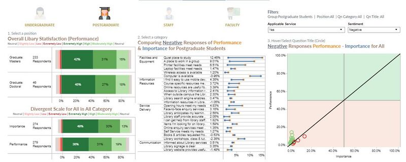
The top 5 least important services (Most negative responses):
- Computer is available
- Library workshops, class and tutorials help with learning and research needs
- Books and articles requested are delivered promptly
- Information resources meet the learning and research needs
- Items I’m looking for in library shelves are usually there
The top 5 least performing services (Most negative responses):
- Quiet place to study
- A place to work in a group
- Computer is available
- Printer facilities meet needs
- Easy to use mobile devices to access online resources
Although these services are available in the library, however, they are lacking, and inadequate. Thus, they fall under the least performing services. Many of the least performing services rated are the same as the results from the undergraduates which reinforces the poor performance of these services.
The top 5 highest gaps (Most underperforming) between performance vs positively rated important services (rated at least 5 out of 7):
- -23.13% gap for Quiet place to study
- -15.20% gap for Place to work in a group
- -13.43% gap for Printer facilities meets needs
- –8.95% gap for Easy to use mobile devices to access online resources
- -8.20% gap for Course-specific resources meet my learning needs
4 out of 5 of the highest gap services also fall under least performing services, especially finding a place to work/study. A reason for this could be due to the overcrowding students in the library space. The library should conduct an in-depth analysis to understand the cause of the huge gap as the results are very similar to the undergraduate students’ which highlights are lacking of performance for the services mentioned above.
Staff
Overall and Demographic insights
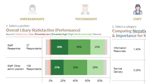
Overall, there are 136 staff respondents and at least 85% of the staff are satisfied with the libraries' performance and around 4% of them are dissatisfied with the libraries' performance.
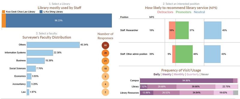 The majority of the staff, 96.2%, uses Li Ka Shing Library most and only 3.8% of them are all administration staffs use Kwa Geok Choo Law Library. 66 (45.3%) of the staff respondents are not from any school faculty and they hold an administration position. All the staff from Information System, Business and Economics faculty uses the Li Ka Shing library most.
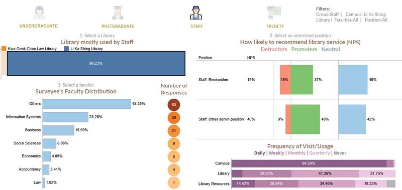
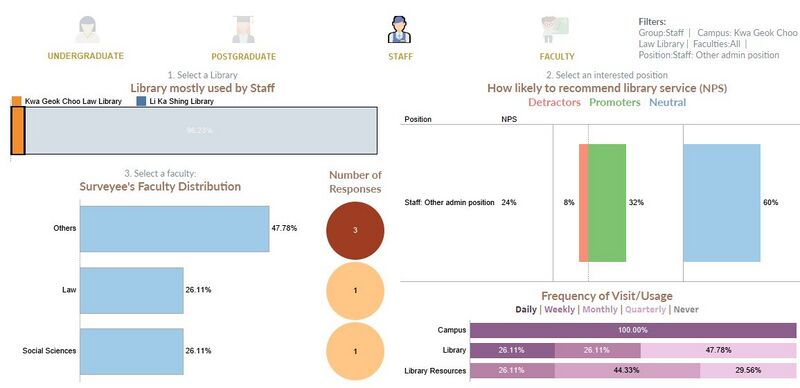
Approximately 95% of all the staff go to campus daily. Interestingly, none of the research staff goes to the library daily, however, 45% of the staff would access to library resources daily. On the other hand, 9.5% of administration staff visits the library daily and only 5.6% of these staff use the library resources daily.
Research staffs have most library detractors, 18% of them are detractors and all of them use Li Ka Shing Library most. Administration staffs are more likely to be a promoter, almost 1 in 2 staffs are promoters for all the libraries. As there is no research staff who uses the Kwa Geok Choo Law Library, it could mean that the library does not have the resources that they need and thus they do not visit the library. The library should conduct a survey to target the research staffs to gain insights on the reason and how they can improve to meet their demands.
Performance Vs Improvement
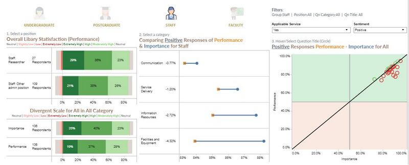
Among all positive applicable services responses (at least a score of 5 out of 7 on a scale), Communication is the best performing category as it has the least negative gap of 0.77% overall. Facilities and equipment are the worst-performing categories with a negative gap score of 4.32% when comparing performance to importance. The worst performing category’s gap score from staff responses is far lower than the responses from students.
Results are filtered to applicable services responses.
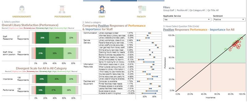
The top 5 most important services for the staffs are:
- Wireless access is available
- I can get help from library staff when needed
- Online resources are useful for studies, helps with learning and research needs
- Quiet place to study
- Place to work in group/ Library staff provides accurate answers to enquires
However only services involving library staffs have met the staff’s expectations and needs. This means that the libraries need to brush up the other services to meet the expectations of the staffs. Moreover, some of the top 5 most important services for staffs are the same as students.
The top 5 best performing services are:
- Wireless access is available
- I can get help from library staff when needed
- Library staff provides accurate answers to enquiries
- Self-service facilities meet needs
- Face-to-face enquiry services meet needs
When comparing the top 5 most important services with the top 5 best performing services, we can identify that the services below needs to be improved as they the most important services but not performing the best.
- Online resources are useful for studies, helps with learning and research needs
- Quiet place to study
- Place to work in group
Quiet place was repeated and place to work in group has appeared as the least performing services for both undergraduate and postgraduate students.
The top 5 lowest gap (best performing) between performance vs positively rated important services (rated at least 5 out of 7):
- 2.49% gap for Library workshops, class and tutorials helps with learning and research needs
- 1.78% gap for Computer is available
- 1.47% gap for Library signage is clear
- 1.17% gap for Printer facilities meet needs
- 1.11% gap for face-to-face enquiry services meets needs
The library does not need to concentrate on improving these services for time-being as they met the satisfaction of the users.
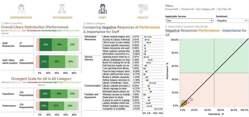
The top 5 least important services (Most negative responses):
- Computer is available
- Library workshops, class and tutorials help with learning and research needs
- Printer facilities meet needs
- Informed about library services
- Laptop facilities meet needs
The top 5 least performing services (Most negative responses):
- Computer is available
- Library anticipates my learning and research needs
- Library search engine enables me to find relevant resources quickly
- Easy to use mobile devices to access online resources
- Informed about library services
Although these services are available in the library, however, they are lacking, and inadequate for the staff. Thus, they fall under the least performing services. Some of the least performing services rated is the same as the results for both undergraduate and postgraduate students, reinforcing the need to improve these services.
The top 5 highest gap (Most underperforming) between performance vs positively rated important services (rated at least 5 out of 7):
- -13.82% gap for Place to work in a group
- -11.27% gap for Quiet place to study
- -10.5% gap for Items I’m looking for are usually at library shelves
- –5.1% gap for Library anticipates my learning and research needs
- -5.1% gap for Library search engine enables me to find relevant resources quickly
Point 4 and 5 fall under least performing services which reinforces the needs of the staffs in looking for resources and that the library needs to improve these services.
Faculty Members
Overall and Demographic insights
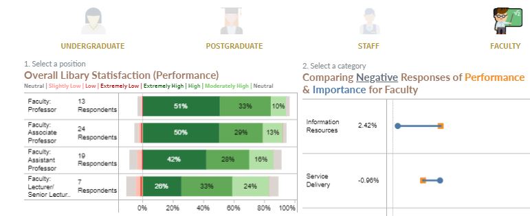
Overall, there are 63 faculty respondents and at least 83% of the faculty respondents are satisfied with the libraries' performance while less than 5% of them are dissatisfied with the libraries' performance.
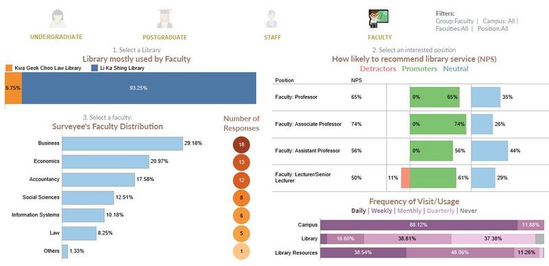
The majority of the faculty members, 93.3%, uses Li Ka Shing Library most and only 6.7% of them who are all from the law faculty use the Kwa Geok Choo Law Library. Most of the staff respondents, 18 Respondents(29.2%), are from the business faculty.
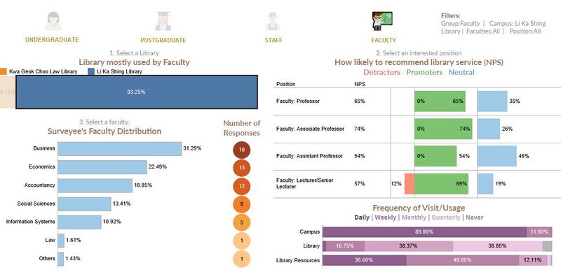
Approximately 88% of all the faculty staff go to campus daily and very little, 3.16%, of the faculty visits and use the library daily. However, approximately 1 out of 2 associate and assistant professors would access the library resources daily. Amongst all the faculty positions, Professors visit and use the least library resources, this may be due to their expertise in the area of their teaching.
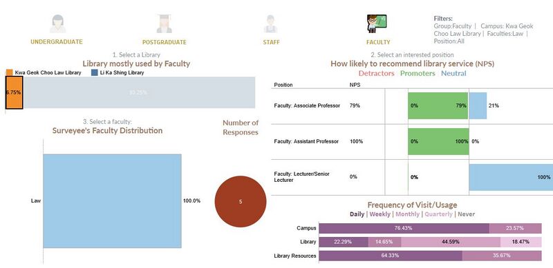
Interestingly, there are 0 faculty staffs detractors for Kwa Geok Choo Law Library and this is very different from the other groups. The only detractors for Li Ka Shing Library are Lecturer/Senior Lecturers, forming 12% of the position’s detractor. Overall, there are 0 professor detractors and the majority of them are library promoters. This means that the faculty staffs are very satisfied with the library’s services although most of the faculty do not visit the library frequently.
Performance Vs Improvement
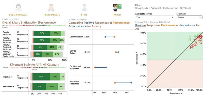
Among all positive applicable services responses (at least a score of 5 out of 7 on a scale), Communication is the best performing category as it is the only service with performance score higher than importance overall, with 3.89%. Information Resources are the worst-performing category with a negative gap score of 7.19% when comparing performance to importance. Similar to staff, the worst-performing category’s gap score from faculty responses is far lower than the responses from students.
Results are filtered to applicable services responses.
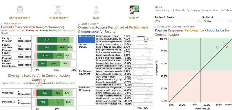
The top 5 most important services for the faculty are:
- I can get help from library staff when needed
- Library search engine enables me to find relevant resources quickly
- Information resources meet learning and research needs
- Library staff provides accurate answers to enquiries
- Access in library information resource helps me be successful
However, none of the performance for the top 5 most important services has met the user's expectations and needs. This means that the libraries need to brush up the services in the top 5 importance to meet the expectations of the faculty.
The top 5 best performing services are:
- Online enquiry service meets needs
- When outside campus, library resources are accessible
- Self-service facilities meet needs
- Library staff provides accurate answers to enquiries
- Wireless access is available
When comparing the top 5 most important services with the top 5 best performing services, we can identify that the services below need to be improved as they the most important services but not performing the best.
- I can get help from library staff when needed
- Library search engine enables me to find relevant resources quickly
- Information resources meet the learning and research needs
- Access in library information resource helps me be successful
The needs of the faculty are very different as compared to the students, however, as most faculty are promoters of the library, the library should consider improving the services deemed important for students where a majority of the detractors are from.
The top 5 lowest gaps (best performing) between performance vs positively rated important services (rated at least 5 out of 7):
- 13.2% gap for Opening hour meets needs
- 9.54% gap for Library signage is clear
- 4.92% gap for Informed about library services
- 3.77% gap for Face-to-face enquiry services meets needs
- 2.61% gap for Self-service facilities meet needs
The library does not need to concentrate on improving these services for time-being as they met the satisfaction of the users.
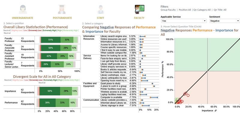
The top 5 least important services (Most negative responses):
- Computer is available
- Place to work in a group
- Quiet place to study
- Library signage is clear
- Opening hour meets needs
The top 5 least performing services (Most negative responses):
- Place to work in a group
- Quiet place to study
- Computer is available
- Items I’m looking for are usually at library shelves
- Library search engine enables me to find relevant resources quickly/ Printer facilities meet need
The point Library search engine enables me to find relevant resources quickly, falls under the top 5 most important services for faculty staff which means that the library should improve this service to meet the need of the faculty. Also, the top 3 least performing services are concurring in the other groups as well which reaffirm the need to improve these services.
The top 5 highest gaps (most underperforming) between performance vs positively rated important services (rated at least 5 out of 7):
- -16.18% gap for Information resources meets learning and research needs
- -11.98% gap for Items I’m looking for is usually at library shelves
- -10.64% gap for Library search engine enables me to find relevant resources quickly
- -10.05% gap for Printer facilities meets need
- -8.8% gap for Computer is available
Points 1 and 3 are two of the top 5 most important services for the faculty, however, they are also the top 5 most underperforming services. The library can consider improving these services to improve the satisfaction of the faculty users.

