Difference between revisions of "IS428 AY2019-20T2 Assign TIAN. MINGZE"
| Line 30: | Line 30: | ||
! style="font-weight: bold;background: #536a87;color:#fbfcfd;" | Brief Implementation Steps | ! style="font-weight: bold;background: #536a87;color:#fbfcfd;" | Brief Implementation Steps | ||
|- | |- | ||
| − | | <center>'''Filter participant postion with a single value selection list''' | + | | <center>'''Filter participant postion with a single value selection list''' <br/> |
| − | [[File:Mz6.png| | + | [[File:Mz6.png|250px|center]] |
</center> | </center> | ||
|| <center>Provide flexibility for analysts, the analyst can choose the participant position that they are interested to analyse. | || <center>Provide flexibility for analysts, the analyst can choose the participant position that they are interested to analyse. | ||
| Line 40: | Line 40: | ||
# Put both the calculation field and the 'position' dimension into the filter to filter out those useless value (ie. others, exchange...) | # Put both the calculation field and the 'position' dimension into the filter to filter out those useless value (ie. others, exchange...) | ||
|- | |- | ||
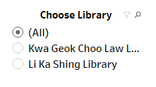
| − | | <center>'''Filter different libraries with a single value selection list''' | + | | <center>'''Filter different libraries with a single value selection list''' |
| − | [[File:Mz7.png| | + | [[File:Mz7.png|250px|center]] |
</center> | </center> | ||
| − | || <center> | + | || <center>It is unnecessary to use a drop-down menu right here since we only have two different libraries. This also provides the flexibility for analysts, the analyst can choose the library that they are interested to analyse.</center> |
|| | || | ||
# Use calculation field to convert the Campus dimension from digit value to plain text | # Use calculation field to convert the Campus dimension from digit value to plain text | ||
| − | + | <br> | |
| + | <center>2. Rename the calculation field as 'Choose Library'</center> | ||
| + | |- | ||
| + | | <center>'''Dynamic Title''' <br> | ||
| + | [[File:Mz8.png|500px|center]] | ||
| + | </center> | ||
| + | || <center>By adding this dynamic title, all the filter value will appear in the title. The visualization will become more intuitive for the analyst. </center> | ||
| + | || | ||
| + | # Double click the title and choose insert. Select the two calculation field (Choose Library, Choose Participant Position) | ||
| + | # Use the red colour to highlight important information. | ||
| + | |||
| + | |- | ||
| + | | <center>'''Dynamic Tooltip''' <br> | ||
| + | [[File:Mz9.png|500px|center]] | ||
| + | </center> | ||
| + | || <center>When the analyst hovers his mouse on this treemap, he will be able to see an interactive tooltip which shows the suggestions on this assessment. He can adopt further actions (ie check the satisfactory level, important comments) based on this suggestion.</center> | ||
| + | || | ||
| + | <center> 1. Create another calculation field 'tooltip_for_treemap' to generate appropriate suggestions based on the gap between library users' expectation of this service and this service's actual performance.</center> | ||
| + | <br> | ||
| + | <center> 2. Put this calculation field under 'detail' and insert into the tooltip.</center> | ||
| + | |- | ||
|} | |} | ||
Revision as of 20:11, 10 March 2020
Contents
Overview
Data preparation
We are given 2 datasets, Raw data 2018-03-07 and SMU Library Survey Comments. Unfortunately, these two given datasets are not well structured and cannot be directly used. So, I will mainly focus on data cleaning and data preparation in this section.
Raw data 2018-03-07 SMU LCS data file
There are two worksheets in this raw data. The first worksheet record all response data from all participants. The second worksheet contains all the column name (legend) for the first worksheet.
Issue 1: When I take a closer look into the data, I realized that all the assessments are in measures format instead of dimensions.
Solution: Use tableau to pivot the selected survey assessment values.
Detail steps 1. Select column from 'I01' to the end. 2. Under the drop down menu select 'pivot'. 3. Rename the Pivot Field Name to Assessments, Pivot Filed Value to score.
Issue 2: The column name (legend) and data rows are in two separate worksheets. Without knowing about each column's name, it is impossible for us to conduct the visualization.
Solution: Use tableau built-in function to join these two dataset together.
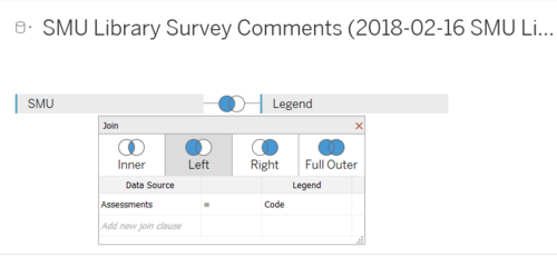
Detail steps 1. Import the raw data into tableau. 2. Drag the worksheets to the connection field and choose left join (SMU on left side, Legend on right side). 3. Under left join, select Assessments = Code.
Interactive Visualization
The interactive visualization can be accessed here:
asfdsdgvdfgfdxhxfgjdhtrxfdhgsdasFSgfhjnvbcxsdaewartfhgbvcxdaerthgfbxvcsdaertehgbxvdfghf
asfdghjghdgsdfcxbghjutrgfdvcxbnghjytrgdf
| Interactive Technique | Rationale | Brief Implementation Steps |
|---|---|---|
| ||
| ||
| ||
|
|
Dashboard
Analysis & Insights
Undergraduate Students
Postgraduate Students
Faculty
Staff
Reference
https://wiki.smu.edu.sg/1617t1IS428g1/IS428_2016-17_Term1_Assign3_Gwendoline_Tan_Wan_Xin


