IS428 AY2019-20T2 Assign LIM PAO LING RACHEL
Contents
Overview
Every 2 years, SMU libraries will conduct a comprehensive survey to provide an opportunity for faculty, students and staff to rate and comment various aspects of SMU library services. The survey aims at creating input that could possibly enhance existing services as well as to anticipate the emerging needs of SMU students, graduates, faculty and staff.
On the contrary, past library survey reports were not as comprehensive as intended, since the report consisted of numerous tables of data that could be better depicted with visualisations. The large amount of textual data collated poses as an issue when it comes to summarising data into a single visualisation, hence, appropriate categorising of charts and tables by performance metrics, importance metrics and other valuable metrics is key for an organised presentation of data.
Visual Analytics is used to provide insight into the various level of services provided by SMU libraries that is perceived by 4 main groups:
1. Undergraduate Students
2. Postgraduate Students
3. Faculty Lecturers
4. School staff
Data Description
| Data Attribute | Data Description | |
|---|---|---|
(online articles, databases, ebooks) | ||
Data Preparation
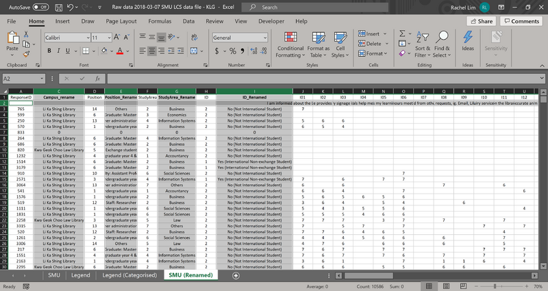
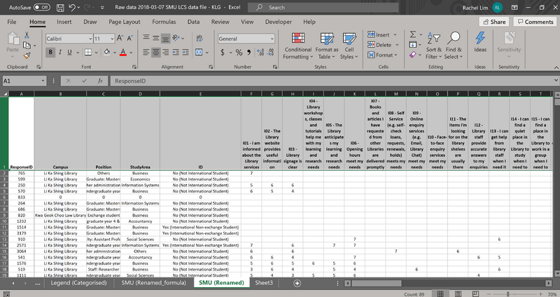
By referencing the Legend tab in the Raw Data excel file (Raw data 2018-03-07 SMU LCS data file – KLG), a reorganisation of data columns and rows were done to convert the coded data into textual representations. This is to ensure that there are readable headers when doing up the visualisations in Tableau. A general use of excel coding functions such as ‘VLOOKUP’, ‘HLOOKUP’ were used to match the legends to the specific header codes.
| Screen Shot | Data Cleaning Description |
|---|---|
| For dimensions:[ Campus, Position, Study Area, ID ] the use of HLOOKUP was done to create aliases for coded categorical data
=HLOOKUP(B3,'Legend (Categorised)'!$A$1:$R$8,2,FALSE)
| |
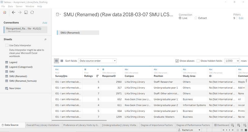
| Creating Pivot columns for the Survey Questions & Ratings
Using keyboard functions (ctrl + shift + right arrow key) to highlight all columns (I01 – I26, P01 – P27, NA01 – NA26) and right-click to select the pivot grouping function in Tableau. The 2 new columns containing the various survey questions and respondent ratings per question are renamed to ‘SurveyQns’ and ‘Ratings’ respectively.
| |
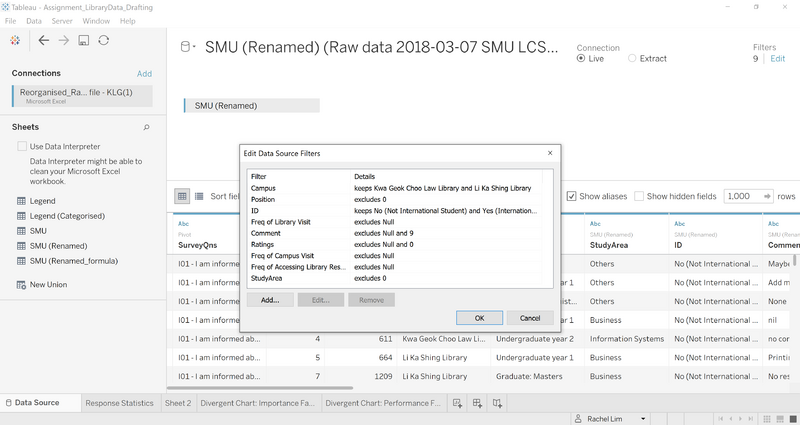
| Filtering out NULL or 0 data from the raw data set
While matching the headers to the appropriate columns found in the excel data set, there were some ‘NULL’ or ‘0’ data discrepancy found. When uploading the re-organised data set into Tableau, the filter function was used. The various columns were added to the filter to select data that was to be excluded before any visualisations can be created. | |
| Further adjustments to Data columns in Tableau:
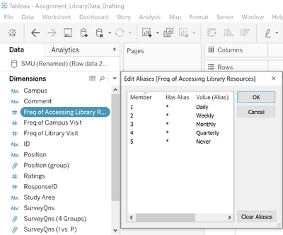
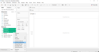
Converted measures into dimensions: HowOftenW --- Frequency of Accessing Library Resources HowOftenC --- Freq of Campus Visit HowOftenL --- Freq of Library Visit Ratings --- Ratings Renamed aliases: Daily, Monthly, Weekly, Quarterly, Never | |
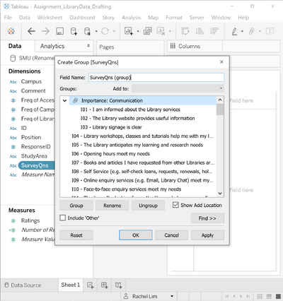
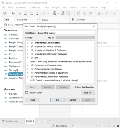
| Categorising the Survey Questions using ‘create groups’
Each of the survey questions are categorised into 5 main topics: 1. Communication 2. Service Delivery 3. Facilities Equipment 4. Information Resources 5. Not Applicable (NA) |
SMU Library Dashboards
Link to Visualisation ⇨ https://public.tableau.com/profile/rachel.lim#!/vizhome/Assignment_SMULibrarySurvey2018_Visualisation/OverallStatisticsDashboard
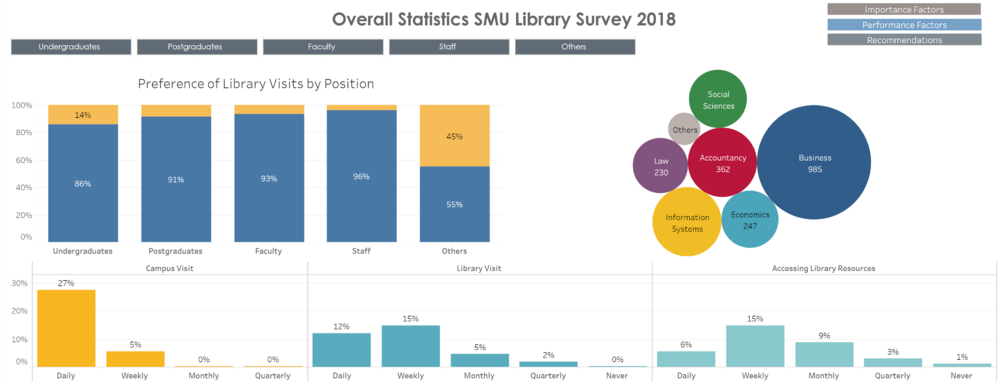
The Overall Statistics SMU Library Survey 2018 dashboard provides visualisations on the various statistics collected by the survey. Statistics such as the various groups who had taken the survey:
- Undergraduates
- Postgraduates
- Faculty
- Staff
- Others
The study areas in which the respondents work under:
- Business
- Accountancy
- Information Systems
- Economics
- Social Sciences
- Law
The frequency of visits:
- Frequency of visitations to the campus
- Frequency of visitations to the libraries
- Frequency of accessing library resources
The above 3 frequencies are categorised as:
- Daily
- Weekly
- Monthly
- Quarter
- Never
Dynamic filter buttons are used to provide a personalised view of the dashboard statistics for each focus group. A set of navigation buttons at the top right corner of the page are used to navigate between the 4 paged dashboard and the dashboards created can be viewed in any order desired, although it is preferable to view the dashboards in the order of Overview => Importance Factors => Performance Factors => Recommendations
Following the assignment requirements, I will only be focusing on the main 4 groups of respondents, hence, descriptions and insights will only focus on Undergraduates, Postgraduates, Faculty and Staff, excluding the "Other" category.
Insights Summary
Looking at the various library visits is it observed that there was a vast difference in the ratio of visits between KGC and LKS libraries. Each of the respondent groups seem to prefer visiting the LKS library to KGC library by at least 75% more. Perhaps in the next year’s library survey, it could include a question or various reasons as to why LKS is a more preferred library to visit compared to the KC library.
While observing the frequency chart, the general visitations to campus is almost daily with a portion of the respondents only visiting campus weekly visits. Library visits on the other hand have almost equal visitations frequencies between daily and weekly. Higher frequency of accessing library resources range from weekly to monthly visits.
This is another where future surveys could focus on; questioning the respondents as to how likely they are to access library resources physically at the library or virtually over the online library services. It would be helpful to pinpoint where the improvement could be further established for better convenience in accessing library resources.
