IS428 AY2019-20T2 Assign CHOY YU MIN JUSTIN
Contents
Background and Motivation
SMU Libraries strives to achieve the following Mission and vision
Mission:
- To enable a culture of life-long learning through collaboration, engagement and outreach. It aims to provide seamless access to information using innovative and leading edge technology. The Library is committed to delivering exceptional services and building dynamic relationships within the SMU community and beyond.
Vision:
- To be a leading research library providing ubiquitous access to information using innovative strategies to drive intellectual exchange and the creation of knowledge.
As such, they have built their library service offerings that cover 4 main areas: Communication, Facilities and Equipment, Information & Resources, and Service delivery. These offerings cater to the Library's 4 main stakeholders - Faculty, Graduates, Staff, and Undergraduates (The biggest stakeholder). We can also understand that these stakeholders mainly fall under SMU's schools (Law, Information Systems, Social Sciences, Economics, Business(Largest number), Accountancy, and Others.
To ensure that SMU's offerings are constantly relevant and meet the demands of their stakeholders, SMU Libraries conducts a 2 yearly survey to gather important KPIs to better improve their services. However, this data is large in dimentionality and is largely opinionated in nature. This makes it difficult to draw truthful insights and careful analytics is required to clean, process, and visualise the data for accurate insights. Given the richness of the 2018 Library survey, it is all the more exciting to carefully unpack the data and visualise it to help SMU Libraries draw key insights to better improve their offerings.
Objectives
The objective of this project is to build a good and truthful data visualisation to help gather key insights from the libraries four main stakeholders:
- The undergraduate students,
- The postgraduate students,
- The faculty,
- The staff.
Success of the project would be seen as the following: (Users are able to...)
- Able to acquire clear insight on how the library is doing overall.
- Able to acquire clear insight on how satisfied each stakeholder group is with each offering.
- Able to identify specific areas that contribute to dissatisfaction/satisfaction through survey questions.
- Numbers backed up by relevant comments that show more objective feedback for actionable improvement.
Dataset Analysis
Raw Data Set
The Data provided was a set of 3 files:
- Raw data 2018-03-07 SMU LCS data file - KLG.xlsx
- 2018-02-16 SMU Library Survey Comments MAC.xls
- SMULibraries_BeHeardSurvey_FullReport.pdf
Of which, I only utilized "Raw data 2018-03-07 SMU LCS data file - KLG.xlsx" (I will refer to as "RAW DATA" from hereon), as it contained all the necessary fields and data points needed for the analysis. Nonetheless, as the first step of the project, I reviewed all the provided documents, and read through the BeHeardSurvey Full Report to get a baseline understanding of the fields available and used to evaluate the Library's performance. From here, I got a clear picture of the fields that were available that I needed to pre-process for my Data Visualisation. I also worked through the report to gain some initial ideas and things they did well and did not do well. The RAW DATA contains two sheets: Encoded Raw data, and Legend (mapping for encoding); as these are confusing, I will give a high level summary of the data fields available (and relevant) and their rough description below
Below is a breakdown of the key fields available in the RAW DATA:
| No. | Field | Description |
|---|---|---|
| 1. | Campus | This data is an encoding that represents which library the respondent most frequently used. options were 1:Li Ka Shing Library, 2:Kwa Geok Choo Law Library |
| 2. | Position | This data is an encoding that represents the respondent's stakeholder group in high detail (e.g. year1-4 undergrad, Graduate: doctoral... etc) |
| 3. | Study Area | This data is an encoding representing the respondent's field of study e.g. Accounting/Law. |
| 4. | Frequency of Visit | This data comes from the survey question "How frequently do you visit the library" and it is key for us to get an idea of the "loyalty" of stakeholders. |
| 5. | Likelihood of recommendation | This follows the market practice of collecting data to calculate Net promoter score. This field with answers from 1-10 needs to be pivoted and pre-processed. |
| 6. | Communication Offering Survey Questions (Importance & Performance) | This data comes in the form of Likert survey from 1(Low Importance)-7(High Importance). It needs to be pivoted and pre-processed to analyse the library's performance in the Communication offering. |
| 7. | Facilities and Equipment Offering Survey Questions (Importance & Performance) | This data comes in the form of Likert survey from 1(Low Importance)-7(High Importance). It needs to be pivoted and pre-processed to analyse the library's performance in the Facilities and Equipment offering. |
| 8. | Information & Resources Offering Survey Questions (Importance & Performance) | This data comes in the form of Likert survey from 1(Low Importance)-7(High Importance). It needs to be pivoted and pre-processed to analyse the library's performance in the Information & Resources offering. |
| 9. | Service Delivery Offering Survey Questions (Importance & Performance) | This data comes in the form of Likert survey from 1(Low Importance)-7(High Importance). It needs to be pivoted and pre-processed to analyse the library's performance in the Service Delivery offering. |
| 10. | Comments | This data comes in the format of free text, and should be made accessible in the Data visualization when relevant to help users go deeper than just a numeric opinion evaluation. |
Dataset Transformation
As the data generally existed in two sheets (1.Encoded raw data, 2. Legend Mapping), this served to be a big challenge that required a mix of pivot tables and creating calculated fields in order to join the data into one clean data source. Similarly, in the data cleaning process, I came to realize that there were some Visualizations that I wanted that would need me to carefully perform inner joins to ensure that the relevant dependencies existed for my analysis later. Lastly, as many questions were based on a Likert Scale, it was all opinionated and thus it would not be accurate to stick to the current Library mapping (which was by ordinal ranking). As such, I needed to re-map all the Likert answers accordingly into categorical fields. These steps are outlined below with their detailed problems and solutions specified accordingly.
Handling NA Responses
Problem:
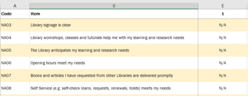
- The library survey allowed for NA (Not applicable), and I did not want to factor these responses into the total percentage calculations later on. This can be seen from the raw data set (shown below)
Solution:
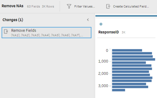
- In my tableau prep pre-processing step, I used a simple remove fields function before any pivoting to ensure that no NA records would be included for my analysis later.
Pivoting Encoded Survey Data
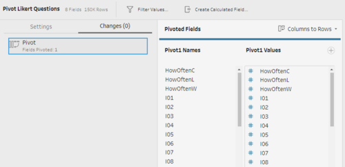
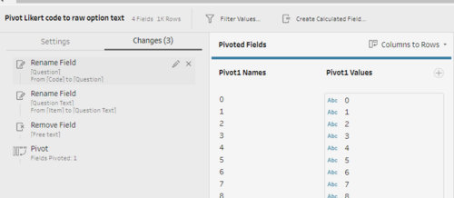
Problem:
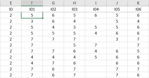
- Survey data was stored into encoded fields in the raw data sheet.
- Different sets of survey questions with different sets of responses were used (e.g. likert 1-7, NPS 1-10... etc). This made the pivoting a lot more tricky as seen below
Solution:
- In my tableau prep pre-processing step, I set up pivot fields for both Raw data sheet and "Legend" Sheet to be inner joined carefully later.
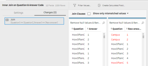
Encoding of Data (Inner Joining Legend to Raw Data)
Problem:
- After pivoting, the data was still encoded and needed to be inner joined back to mapping for tableau analysis.
- Such Inner Joining would be tricky as it is between two sheets and we can expect many Null values to appear after each inner join.
Solution:
- I used multiple Inner Joins with remove data steps to slowly build the master data set correctly. One such example is shown below.
Eventually, after all the pivoting, filtering, and grouping, I exported the .hyper dataset to tableau as the baseline. The above steps are outlined in the tableau prep process shown below (click for clearer view).

Handling Likert (ordinal to categorical)
Problem:
- Even after building the sourcedata, I still needed to re-map the Likert options respectively into categorical values.
- Ordinal values and numbers should be avoided for likert scale options as they are opinionated and the gaps between numbers are not objective
Solution:
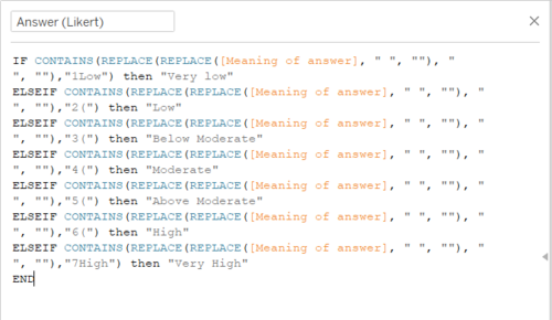
- To fix this issue, I did some research on good likert scales and settled on the following 7 scale ranking: Very Low, Low, Below Moderate, Moderate, Above Moderate, High, Very High.
- To perform the mapping, I created a simple tableau calculated field as shown below.
Interactive Visualization
The interactive visualization can be accessed here: https://public.tableau.com/profile/justin.choy#!/vizhome/JustinChoySMULibrarySurveyAnalysis/SMULibrary2018Storyboard
- Note to use the following settings for best experience:
- Set view to fullscreen
- Zoom out till 80%-90% when charts are most aligned.
Data Viz user journey Design
I am a firm believer that we will rarely find something if we do not know what we are looking for. As such, I have designed the overall storyboard to help users first explore at a high level to first gather some interesting findings and then follow through with the rest of the dashboards to dig up deeper insights based on the general question they already have. Similarly, to allow users to get a clear starting insight faster, I have built in meaningful filters between charts of each dashboard to help analysts focus their attention on factors that are more relevant to each other. The outcome of this design is the storyboard flow as shown below.

The dashboard modules in blue basically serve to help the user get higher level information on the library's key performance indicators and help them narrow down a little on a high level insight they might want to use the yellow dashboard modules to explore. The yellow dashboard modules on the other hand allow for a more granular level of exploration and helps users gather actionable insights so that they know where the library can be improved and how they can improve it for the specific stakeholder groups. I will go into detail explaining each dashboard.
Survey Summary
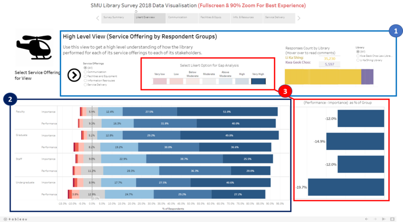
This is the storyboard view of the Survey Summary Visualisation and its features:
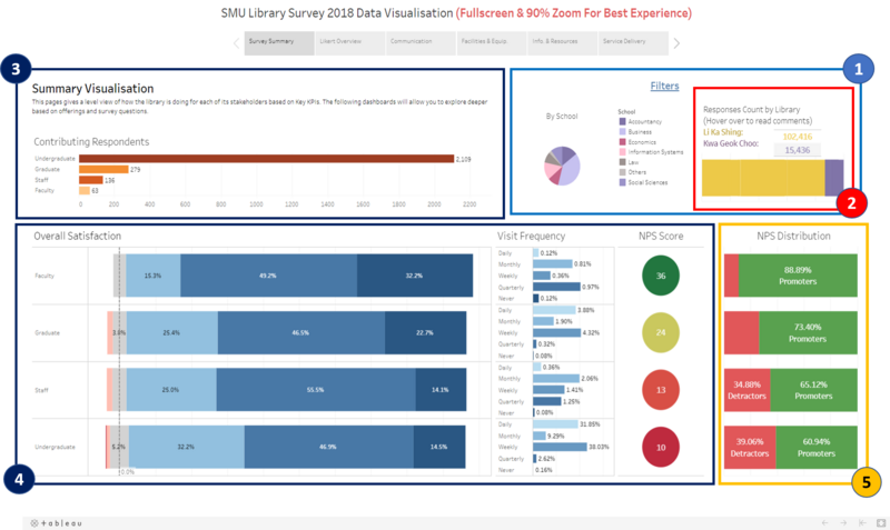
| No. | Feature | Description & Benefits |
|---|---|---|
| 1. | Filters by School and Library | Description:
Benefits:
|
| 2. | Number of Responses by Library with Hover over comments. | Description:
Benefits:
|
| 3. | Contributing Respondents | Description:
Benefits:
|
| 4. | Key Overall Performance Indicators | Description:
Benefits:
|
| 5. | NPS Distribution | Description:
Benefits:
|
Likert Overview
| No. | Feature | Description & Benefits |
|---|---|---|
| 1. | Filters by Service Offering, Likert Response, Library | Description:
Benefits:
|
| 2. | Diverging Stacked Bar Chart (Likert scale) | Description:
Benefits:
|
| 3. | Gap Analysis Per Likert Scale Option | Description:
Benefits:
|
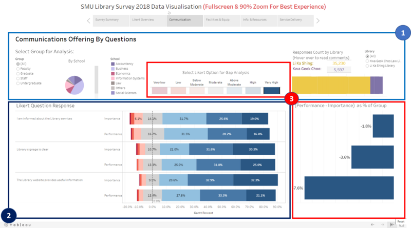
Granular Exploration: Communication, Facilities & Equipment, Information & Resources, Service Delivery
| No. | Feature | Description & Benefits |
|---|---|---|
| 1. | Filters by School, Likert Response, Library | Description:
Benefits:
|
| 2. | Diverging Stacked Bar Chart (Likert scale) by survey question | Description:
Benefits:
|
| 3. | Gap Analysis Per Likert Scale Option | Description:
Benefits:
|
Analysis & Insights
As the data for undergraduates is richer (approximately 2500 respondents), I will do a more thorough analysis for undergraduates using more charts and features. However, as data for the other 3 groups is rather limited (approximately less than 500 participants all combined, and only 34 Respondents for KGC), I will only do the analysis for Li Ka Shing, and with reservations especially from drawing conclusive results from percentage based interpretations - a single response could sway the whole scale. Moreover, as these groups are relatively similar in nature - in terms of needs (i.e. more based on Information, service, and research as compared to study area) I will review these 3 groups collectively.
Undergraduate Students
Li Ka Shing Library
Finding 1 - Undergraduates seem to have the lowest NPS & Proportion of High/Very High Satisfaction
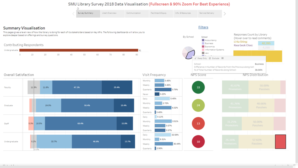
At surface level, undergraduates seem to be the least satisfied compared to other stakeholders. A quick hover over the library bar comments revealed a large bulk of respondents' unhappiness about limited study places, seats, and opening hours. There are also a handful unhappy about toilet facilities and water coolers. This begs the question for us to look closer into Facilities and Equipment.
Furthermore, from looking at the distribution by school, we notice that business students make up about a third of the detractors (38%), we also see that business students visit frequency tends to largely fall into two main groups - Daily(32%) and Weekly(36%). Essentially:
- Undergraduates lowest NPS & Proportion of High/Very High Satisfaction
- Unhappiness might stem from Facilities and Equipment
- Business students make up a third of detractors and have quite high frequency of visit.
Finding 2 - Facilities and Equipment the likely cause for undergraduate dissatisfaction.

From these charts we can clearly see that the biggest gap between performance and importance is in the Very High ranking of the likert scale. In this ranking, we notice that the gap for Facilities and equipment is almost two times as much as that of the gap from the overall performance of all offerings. This is in line with the first suspicion and prompts us to investigate down to the granular survey question level to find the main culprits that bring down this offering. Essentially:
- Confirmed that Facilities and Equipment is likely cause for undergraduate dissatisfaction.
- Need to investigate further to identify main areas to improve.
Finding 3 - Identified top 3 main areas contributing to performance gap

From these charts it is clear that there are three main sub-offerings under facilities and equipment that are the main contributors to the dissatisfaction of undergraduates. These areas are (ranked from most severe to least severe):
- "Able to find a quiet place in the library to study when needed"
- "Able to find a place in the library to work in a group when needed"
- "Printing, scanning, photocopying available and meets needs"
Having discovered this, the library can now focus more of its resources to close these performance gaps. This finding thus demonstrates the use of this data visualization as designed, to identify general insights and to slowly work towards concrete actionable wisdom and decision making.
Kwa Geok Choo Law Library
Finding 1 - Undergraduates seem to have moderate NPS & Proportion of High/Very High Satisfaction
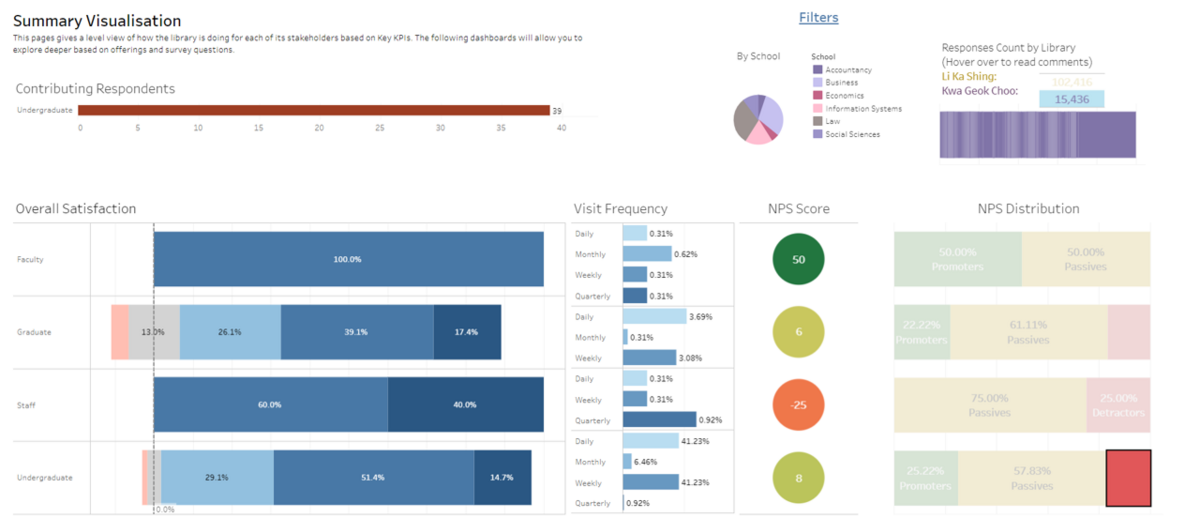
Similar to LKS, the undergraduates seem to be on the lower side of library performance. A quick hover over the library bar comments several respondents' unhappiness about limited study places, seats, opening hours, with some complaints on the air conditioning. This seems similar to LKS's low performing Facilities and Equipment. Interestingly however, there were some comments on the law Library's information and resources.
Furthermore, from looking at the distribution by school, we notice that although business students make up about a third of the detractors (30%), law students contribute to another third as well (30%). This might be worth looking into with more follow up targeted survey to better understand the wants of these two schools of undergraduates. We also note that there is a similar distribution of visit frequency to LKS with Daily frequency of 41% and Weekly frequency of 41%. Essentially:
- Undergraduates Moderate NPS & Proportion of High/Very High Satisfaction
- Unhappiness might stem from Facilities and Equipment, but we should look at information and resources as well
- Business and law students make up two thirds of detractors - main target group of concern for detractors.
Finding 2 - Top 2 contributors to very high gap are "Facilities and Equipment" and "Information Resources"

From the charts, we can see that the bulk of the Very high gap comes from "Facilities and Equipment" and "Information Resources". This ascertains some of the comments we read earlier and prompts us to investigate these categories by survey question to discover action items. However, as I suspect the unhappiness for "Facilities and Equipment" is similar to LKS, I have decided to investigate "Information Resources" in the next step instead.
Finding 3 - Top 3 Gaps in line with comments

From these charts it is clear that there are three main sub-offerings under Information Resources that are the main contributors to the dissatisfaction of undergraduates. These areas however seem to be all related to the quality and accessibility to online resources and course resources.
Having discovered this, the library can now focus more of its resources to close this performance gap by improving on its online resource quality and accessibility.
Non-Undergraduates (Faculty, Graduate, Staff)
Li Ka Shing Library
Finding 1 - Investigating the NPS and overall satisfaction at high level
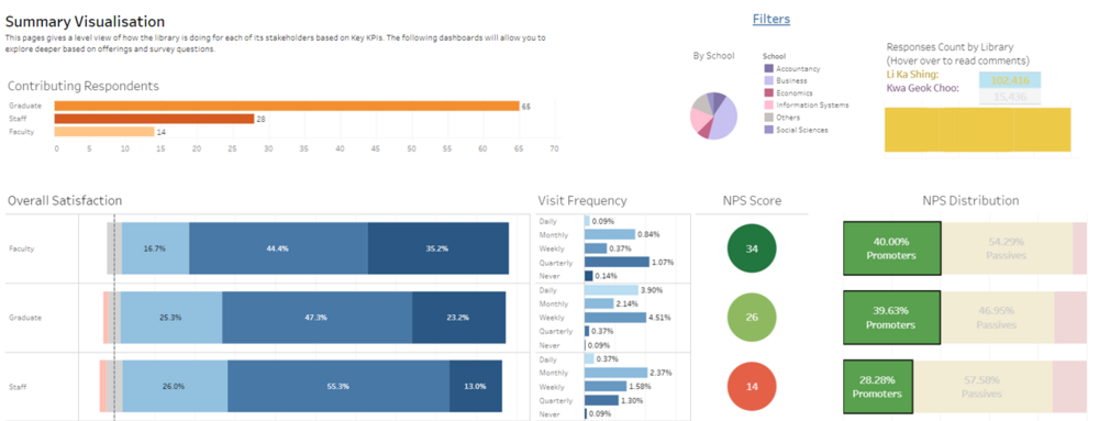
Faculty:
From the chart we can observe that faculty has the largest net promoter score of 34 close to Graduates. This value is similar to their large proportion of overall satisfaction in the high and very high categories as well. However, we must also remember that the total number of Faculty participants is only 58, and thus the 14 promoters will heavily sway this score. We also can see from here that the visit frequencies of faculty members are very low, with the larger bulk of them visiting only Monthly and quarterly. This might very well be the reason that they have such a high net promoter score as they would not face the same issues as students regarding facilities and equipment that lead to dissatisfaction. This then prompts us to look a little deeper for service offerings to get a better picture of why Faculty members seem to view LKS library so highly. Essentially:
- Faculty seems to have highest NPS and overall satisfaction with LKS
- Small number of Faculty Members
- Investigate by library offering to find out if faculty members really rate high because they don't use the library as much as students or if it is other reasons.
Graduates:
From the chart we can observe that Graduates has the second largest net promoter score of 26. Likewise, the overall satisfaction also mainly falls in the high categories, but is still less than that of Faculty. Interestingly however, we do notice that their visit frequency is much higher than that of Faculty members, with the majority of their visits falling under daily and weekly. This might contribute to them needing Facilities and Equipment and thus need to compete with undergraduates, leading to the observed lower satisfaction than faculty members. Nonetheless, they still have quite a high net promoter score out of their total number of respondents of 255. We will also need to look a little deeper for service offerings to get a better picture of why Graduate members seem to view LKS library so relatively highly.
- Graduates seem to have moderate NPS and overall satisfaction with LKS
- Moderate number of Faculty Members
- Investigate by library offering to find out why graduates still have relatively high NPS despite similar visit frequency to undergraduates.
Staff:
- From the chart, we can observe that staff have the lowest NPS - in fact, almost as close to undergraduates (10). This seems to be a little interesting as staff seem to have a fairly distributed visit frequency of Weekly, Monthly and Quarterly. Their NPS also corresponds to their lowest overall satisfaction in the "Very High" category. This causes me to imagine that their dissatisfaction could be very specific to the nature of which they use the library's offerings. We must also note that they are still a sizable group of 133 respondents in this survey. As such, we will need to look a little deeper for service offerings to get a better picture of why they seem to have quite a notable dissatisfaction with LKS. Essentially:
- Staff seem to have the lowest NPS and overall satisfaction despite moderately low visit frequency
- Moderate number of Staff
- Investigate which offering might be contributing so much to their dissatisfaction.
Finding 2 - Information Resources as biggest "Very High" Gap contributor for Faculty
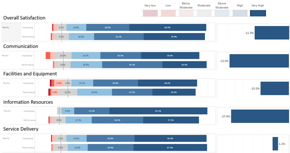
As expected for Faculty, with such a low visit frequency, their satisfaction is likely less affected by by Facilities and Equipment. Instead, it was as expected, that Faculty members probably use the library for its resources and information for teaching/research and thus this would likely be where their satisfaction gap stems from. As we can see from the charts, the percentage of faculty respondents generally fall in the "High" and "Very High" - corresponding to their high overall satisfaction and NPS score. When we look across the "Very High" Gap analysis however, we then can see clearer that the gap here is the main contributor to dissatisfaction (-27.4%, almost 2 times the gap of every other offering).
If we do take a closer look at Information Resources, we can partly attribute this to the extremely big percentage on the "Very High" importance rating of 65.1% as compared to the 37.1% on performance. This simply tells us that Faculty members have higher expectations for the Li Ka Shing Library's Information Resources that is not up to their expectation yet. As such, the library should take note that for this stakeholder, they need to consider improving their Information Resources. The library can also note that one the strongest offering for faculty members is currently Service Delivery and they should keep up the good work there.
Finding 3 - Facilities and Equipment still valued by graduates (and not up to their expectations)
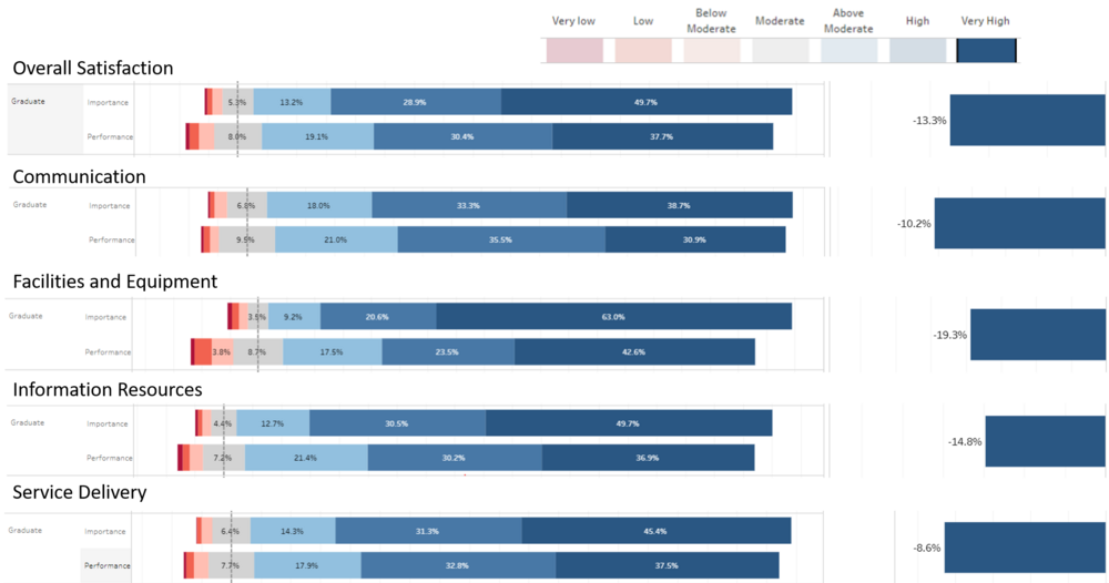
Following our prior analysis, we hypothesized that given the moderately high visit frequency of graduates, the likely offering that is lowering their NPS and overall satisfaction is most likely still Facilities and Equipment - similar to undergraduates. From the charts we see that the overall "very high" gap is reasonably small, and this seems to be in line with their moderately high NPS and overall satisfaction. As we inspect the gap for each offering, we also find that it is relatively around the same level, except for facilities and equipment. looking at facilities and equipment, we see a big gap of -19.3% that is almost two times as large as all the other offering gaps. Given this information, the library should consider working to improve their Facilities and equipment, as Graduates form the second largest group of their stakeholders. In addition, this is a critical offering that is the main source of dissatisfaction for undergraduates.
Finding 4 - Information Resources as biggest "Very High" Gap contributor for Staff
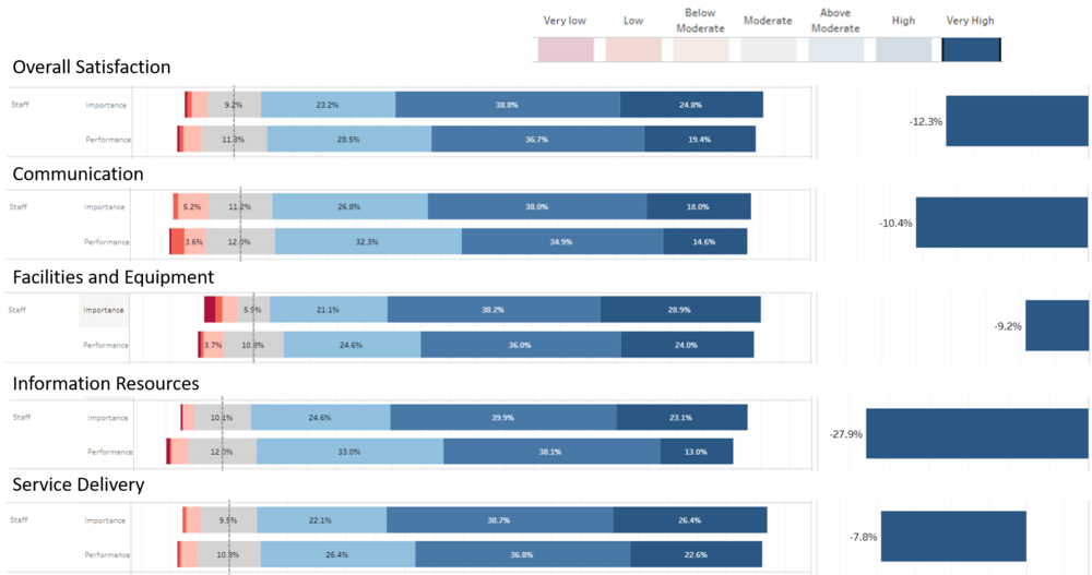
Following our prior analysis of Staff, we expected that their needs and usage of the library's offering are very different from all other groups. Following this thought, we considered that given their relatively low visit frequency, Information Resource might be the reason for their low NPS and overall satisfaction - as they are likely to use the library more for research and preparation of teaching materials. From the charts, it seems like this suspicion is proven correct. Firstly, we see that the "very high" gap is relatively low for overall satisfaction. This might seem contrary to resulting in such a low NPS, but if we look at Information Resource with the biggest gap (27.9%) it gives us a potential hint as to why NPS is so low for Staff. It could likely be that when staff consider promoting the Library, they are thinking about other staff. Therefore, because staff generally use the library's Information Resources more than any other offering, it would then be expected that they would not want to promote the library for this reason although they are reasonably satisfied with all other offerings. The library should explore this further to pin point specific areas that they can improve their information resource offering to both Staff and Faculty.
Conclusion & Future Work
Conclusion
From the short project, the visualization has shown to give insights that were able to be developed into specific actionable items for each library to improve its performance. At a glance, the main findings can be summarized as such:
- Graduates and Undergraduates:
- Graduates and Undergraduates seem to have similar needs, wants, low NPS, and similar areas of dissatisfaction
- They make up the largest proportion of library users (especially users of physical resources)
- Given their relatively low satisfaction and NPS, the library should actively set aside resources to improve the respective sub-offerings with largest performance gaps based on survey questions.
- Staff and Faculty:
- Seem to have a lower visit frequency and this seems to potentially be a possible reason that they are not so dissatisfied with Facilities and Equipment
- They make up a small proportion of library users
- Their needs are very different from graduates (need to improve Information Resources for both)
The Library's Managers and Analysts should also use this data visualization and similar ones to further identify areas that need improvement and perhaps areas that might not need as much resources (i.e. Service and Communication).
Future Work
Given the usefulness of this visualization, I believe that there is a lot more potential in improving it and using it to do further analysis. As future work considerations, these are the areas that will have value going into:
- Supplementing the visitation data with live student data from the gantry system
- Gathering more data for Kwa Geok Choo Law Library as the data is very limited, and thus might not be a good representation of each stakeholder group's sentiment
- Use this visualization for deeper analysis to identify both high level insights and specific areas to take action for improvement.
- Future library surveys can be crafted more specifically to the needs of each stakeholder group and be reworked using reappearing comments from the past survey that potentially highlight new/specific areas for analysis (e.g. air conditioning, toilets, and water coolers - tend to be a common comment but not a survey question).
References and Helpful Resources used
- Building the Diverging Stacked Bar Chart: https://www.youtube.com/watch?v=JodWmiIxl2c
- Choosing appropriate colors: http://www.perceptualedge.com/articles/b-eye/choosing_colors.pdf
- Understanding the use of Diverging Stacked Bar Charts: https://www.perceptualedge.com/blog/?p=2239
- Baseline Ideas for Dashboard Actions: https://youtu.be/HECRaz_jFr8
Comments
Feel free to leave your comments here for improvement
| No. | Comment |
|---|---|
| 1. | <type comment here> |
| 2. | <type comment here> |
| 3. | <type comment here> |
| 4. | <type comment here> |
