SMT201 AY2019-20T1 EX2 Ho Wei Jie Clint Criterion Scores
TAKE HOME 2: National Communicable Disease Quarantine Centre - Gombak
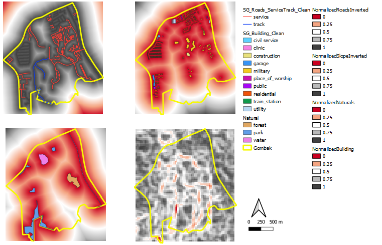
In general, the rationale behind standardizing/normalizing the proximity for each factor is to ensure that the comparison are done on the same scale (i.e comparing apple to apple). The darker regions (black) represents "better", closer to the value of 1, and the lighter regions (towards red) represents "worse".
Criterion Score of Roads
As it is important that the quarantine centre is located nearer to roads, I inverted normalized roads "1-Normalized_Roads", so that the darker regions will show a more suitable representation of where to place the quarantine center.
Criterion Score of Buildings
There is no need to invert for Normalized_Buildings as land that is away from buildings are ideal. The red part represents the unsuitable area and the black part represents the more suitable area for the quarantine centre.
