SMT201 AY2019-20G1 EX2 Kelvin Chia Sen Wei
Contents
- 1 Q1a. Gombak and its target roads
- 2 Q1b. Gombak and its buildings
- 3 Q1C. Gombak and its target natural features
- 4 Q1d. Gombak and its digital elevation
- 5 Q2a. Gombak and its proximity to target roads layer
- 6 Q2b. Gombak and its proximity to buildings layer
- 7 Q2c. Gombak and its proximity to target natural features layer
- 8 Q2d. Gombak and its slope layer
- 9 Q3. A map layout with four views showing the criterion scores of each factor layers
- 10 Q4. Analytical Hierarchical Process input matrix and result report
- 11 Q5. A map layout with the suitability land lot(s)
- 12 Explain the reasoning behind your classification choices, how you derived the new variables and handled missing values, and any other relevant judgments and assumptions. Please limit this discussion to a maximum of not more than 500 words.
Q1a. Gombak and its target roads
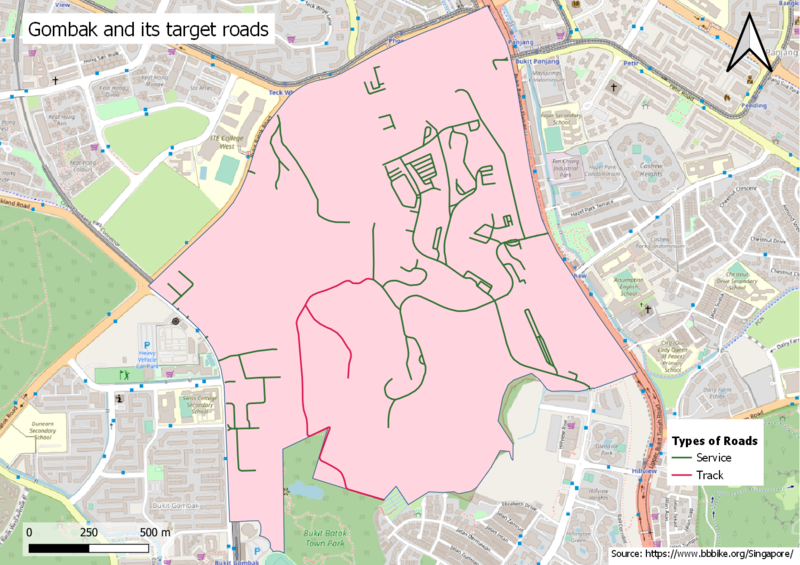
There is a denser network of service and track roads on the eastern side of Gombak. Hence, the eastern area can be prioritized as it ensures easy transportation of building materials during the construction stage.
Q1b. Gombak and its buildings
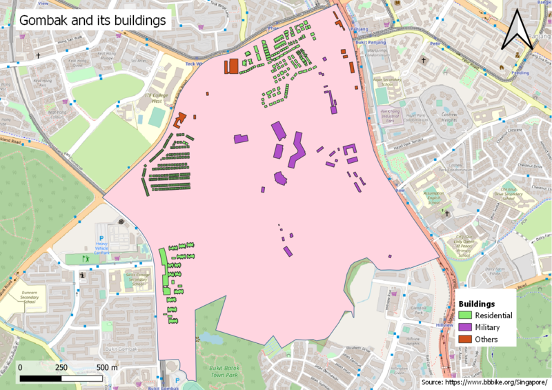
Residential buildings are mainly concentrated at the northern and western side and we should avoid these areas when building the CDQC to avoid disease spreading to the nearby population. The southern area can be considered as it is mainly a military area and is away from away from the population.
Q1C. Gombak and its target natural features
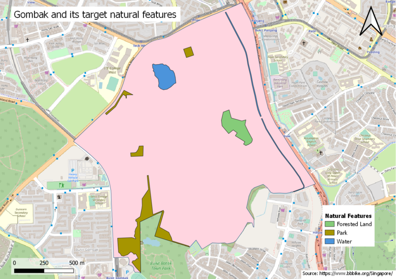
As the selected site should be away from forested land, park and water, the southern part of Gombak would be the ideal area.
Q1d. Gombak and its digital elevation
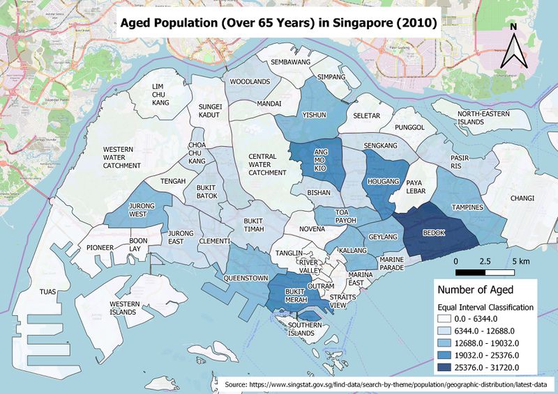
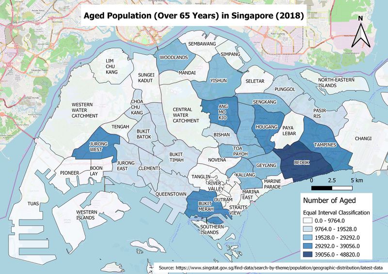
From both of the maps above, we can see that the distribution of Aged population is generally similar. Bedok is still the area with the most Aged population throughout the years. However, I feel that utilising solely the Aged Population count is misleading and utilising the proportion in Qn. 2b would be a better visualisation to depict the Aged population in Singapore.
Q2a. Gombak and its proximity to target roads layer
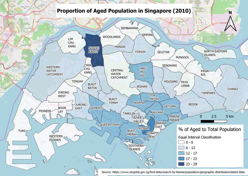
When depicting the proportion of Aged to Total Population for 2010 and 2018, we can clearly see that areas like Ang Mo Kio, Queenstown and Kallang have higher proportion of Aged Population over the years.
Q2b. Gombak and its proximity to buildings layer
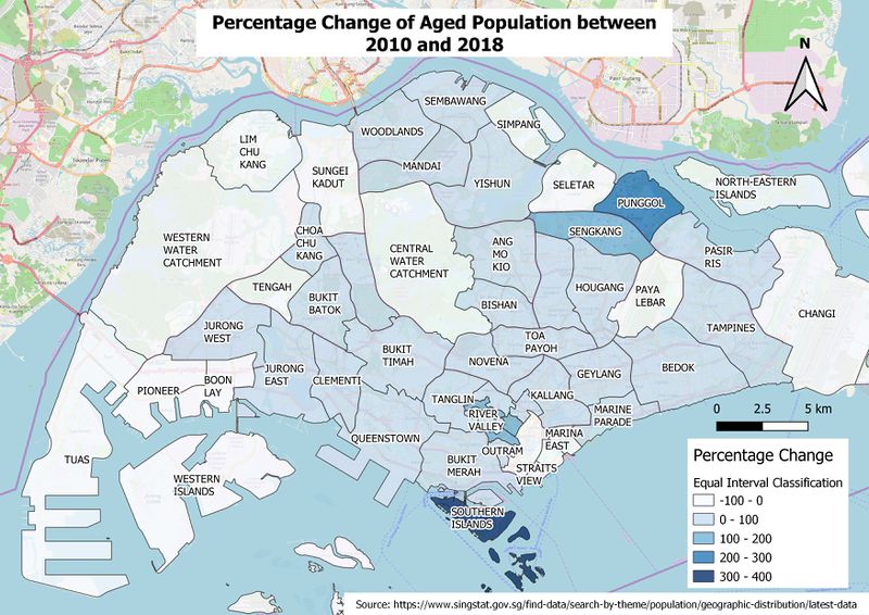
The above map shows an increase in aged population growth in non-mature estates in Punggol and Sengkang. This might be due to increase in development of 2 Room Flexi flats in the area in the recent years which mainly targets the aged population to downgrade to smaller flats. Surprisingly, Sentosa (Southern Islands) shows an increase in aged population growth, at an area with mostly premium private estates. Generally, Singapore is ageing at a faster pace in 2018 as compared to 2010.
Q2c. Gombak and its proximity to target natural features layer
The above map shows an increase in aged population growth in non-mature estates in Punggol and Sengkang. This might be due to increase in development of 2 Room Flexi flats in the area in the recent years which mainly targets the aged population to downgrade to smaller flats. Surprisingly, Sentosa (Southern Islands) shows an increase in aged population growth, at an area with mostly premium private estates. Generally, Singapore is ageing at a faster pace in 2018 as compared to 2010.
Q2d. Gombak and its slope layer
The above map shows an increase in aged population growth in non-mature estates in Punggol and Sengkang. This might be due to increase in development of 2 Room Flexi flats in the area in the recent years which mainly targets the aged population to downgrade to smaller flats. Surprisingly, Sentosa (Southern Islands) shows an increase in aged population growth, at an area with mostly premium private estates. Generally, Singapore is ageing at a faster pace in 2018 as compared to 2010.
Q3. A map layout with four views showing the criterion scores of each factor layers
a short description of not more than 150 words for each view.
Q4. Analytical Hierarchical Process input matrix and result report
a short description of not more than 150 words discussing the analysis results.
Q5. A map layout with the suitability land lot(s)
A short description of not more than 200 words commenting on each of the suitable land lot identified.
Explain the reasoning behind your classification choices, how you derived the new variables and handled missing values, and any other relevant judgments and assumptions. Please limit this discussion to a maximum of not more than 500 words.
There are multiple ways to derive with the aggregated data that we will need for our visualisation. The most efficient way is to create a virtual layer for each of the aggregated data that we need. For example, we can simply query using SQL for the aggregation of Aged population for the Year 2010 by Subzone as shown in the screenshot below.
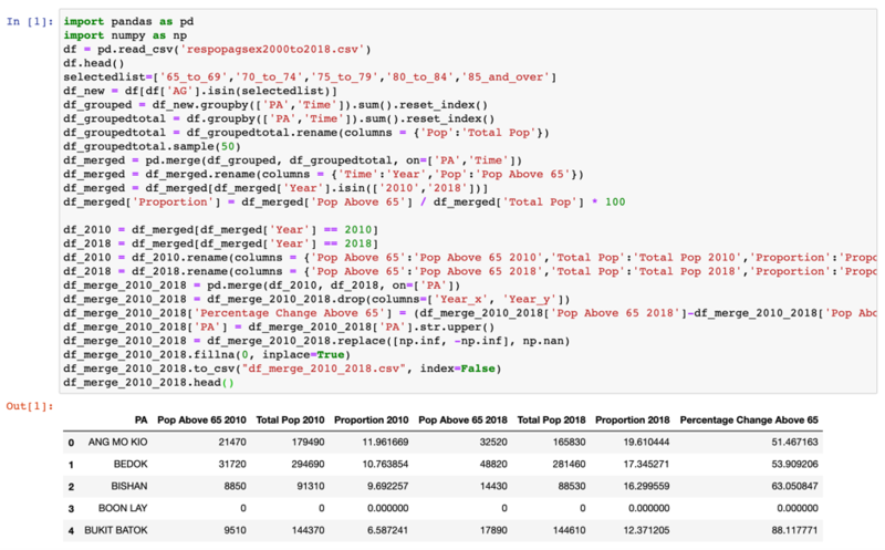
Firstly, null values are replaced with 0 and each population count is grouped by its town and year. ‘SZ’ field was converted to uppercase to match the data in QGIS. The years are then filtered out to retrieve year 2010 and 2018. Proportion was calculated for Qn. 2b and percentage change was calculated for Qn. 2c. The virtual layers are then joined with Singapore’s Sub Zone 2014 Map via the relation field: ‘SZ’ and ‘SUBZONE_N’. Do note that electoral boundary plays a part, so we have to make use of the 2010 Subzone Planning Map for Year 2010 and the latest Subzone Planning Map for 2018. These data are then classified using equal interval classification and created into the maps as shown above.
Another method that we can use to aggregate the data is via Python.
