SMT201 AY2018-19T1 EX1 Tan Jie Ting Christine
Part 1: Thematic Mapping
Public Education Institutes
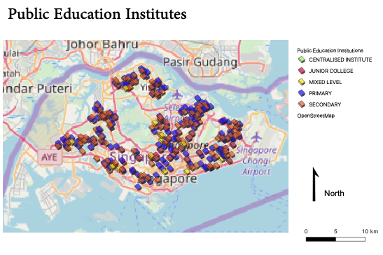
I used a different colour to represent the different types of public education institutes as shown below, so that it is easy for people to identify the type of school by the colour. I used simple markers so that we can see where the schools are located on the map. I also made the symbols less opaque so that you can see if there happens to be symbols that overlay on each other.
Hierarchy of Road Network Systems
I used different colours and thickness for the different road types to show the hierarchy of the road network systems. For example, I used a green line with a width of 1.50 for the expressway, and a dark pink line with a width of 0.50 for the major line. The difference in the width shows the difference in the levels of traffic the road can contain.
2014 Master Plan Land Use
Part 2: Choropleth Mapping
- For the aged population of each year, I used the calculated field to add all the values from the baskets of ages above 65 years old, e.g. Ages 64 to 69 + Ages 70 to 74, and so on.
- For all the missing values, I used an if condition to replace all null values to 0.
Aged Population in 2010 and 2018
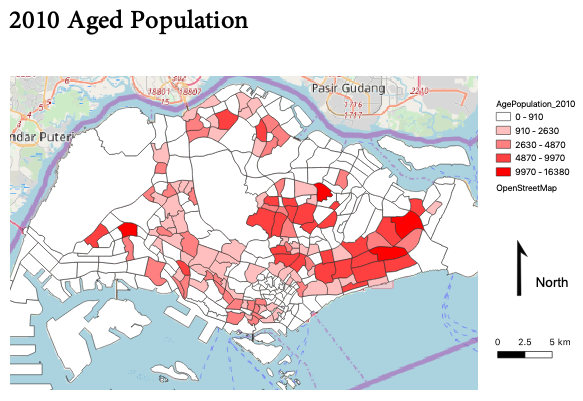
Across the two maps, we can see that in numbers, most of the elderly in Singapore stay in the east. Looking at the legend, however, we can see that there is generally an increase in the number of elderly, as the heatmap remains about the same.
Aged Population in 2010
Aged Population in 2018
Proportion of Aged Population in 2010 and 2018
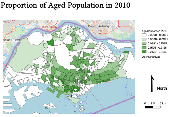
For the proportion of aged population for each year, I used the calculated field to take the aged population divided by the total population in each subzone.
Proportion of Aged Population in 2010
Proportion of Aged Population in 2018
Percentage Change of Aged Population between 2010 and 2018
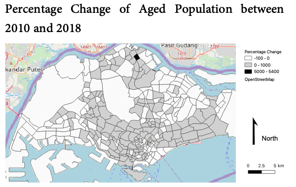
To obtain the values of percentage change per subzone, I used the calculated field to do (pop2018 – pop2010)/pop2010, where pop2018 is the aged population in 2018 and pop2010 is the aged population in 2010. For the map showing the percentage change, unlike the other maps which I used natural breaks (jenks) for the mode, I used pretty breaks instead. This is because I wanted to show the difference between positive and negative values. Hence, one can easily see that all the white subzones have negative or no percentage change in the aged population from 2010 to 2018.


