SMT201 AY2019-20T1 EX1 Zang Yu
Part 1: Thematic Mapping
Distribution of public education institution by school types
Since the nature of the data is discrete, I have categorised the school layer into 4 categories based on the school types and symbolise them using different svg symbols. I used MP14 planning area layer as the background reference map to show the distribution of public education institutions across Singapore.
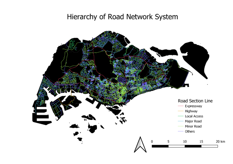
Road network system of Singapore
Based on the data from road section layer we could not distinguish the major roads and minor roads. Therefore, I joined road section layer with national map line layer as information about expressways and major roads can be retrieve from the national map line layer. The rest of the roads I assumed they are minor roads. After categorised the road network into different types of road, I used lines with different colours and thickness to represent them.
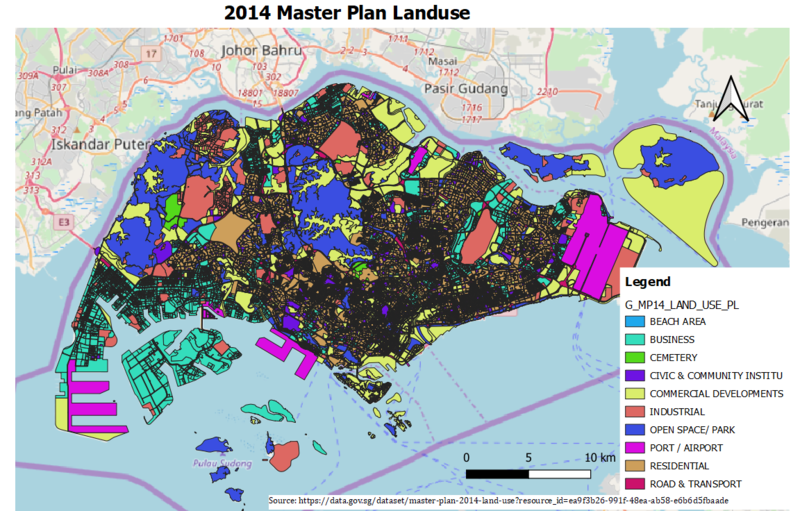
2014 Master Plan Landuse
In the original data, there are too many types of uses for land which made the map difficult for visualisation. Therefore, I reduce the number of categorises by merging lands with similar function together. For example, I have grouped Educational Institution, Place of Worship and Civic & Community Institution all under one category Civic & Community Institution. I used different colours to represent different types of landuse.
Part 2: Choropleth Mapping
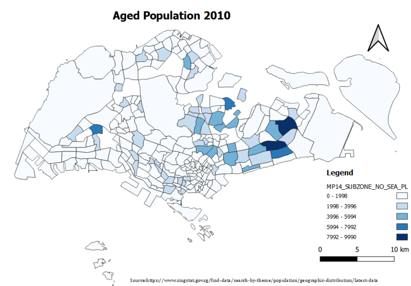
Aged population (+65) in 2010
For this choropleth map, I used datasets from Singstat and data.gov.sg. In order to do a relational join between population attribute layer and MP14_SubZone GIS layer, I need a unique identifier between these two datasets. Both datasets contain fields about the subzone name but they were different forms. The subzone name in population attribute layer was capitalized only the first letter but in MP14_SubZone GIS layer it is all in capital letters. Therefore, I converted the subzone names all to capital letters using UPPER() function in excel before I imported it into QGIS. I also filtered out the aged population in year 2010. Next, I used GroupStats plugin to sum up the aged population by subzone and created the relational join between the two layers. I have used equal interval classification method as it provides a clear picture of the subzones with more aged population.
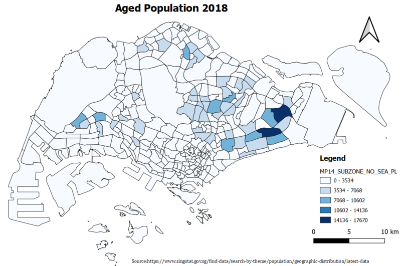
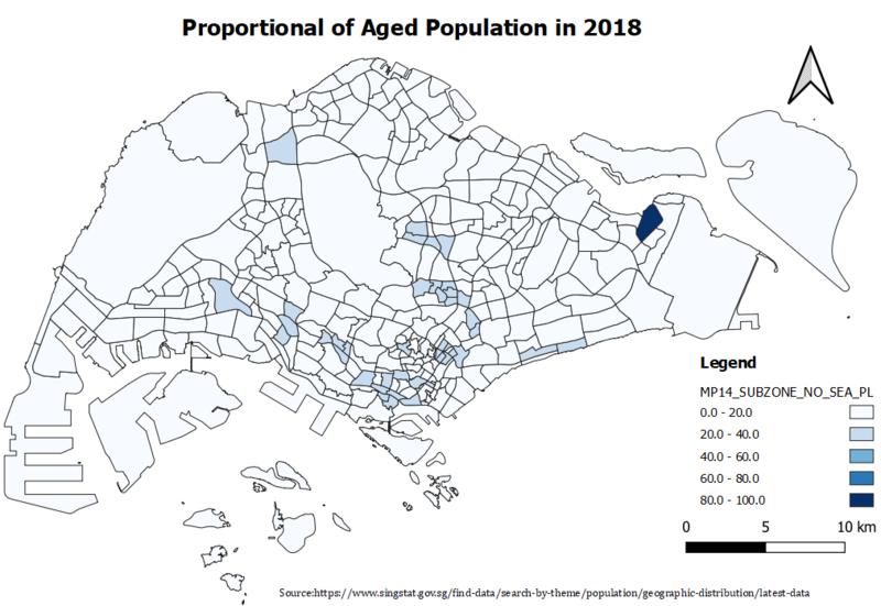
Aged population (+65) in 2018
Proportional of aged population in 2010
Proportional of aged population in 2018
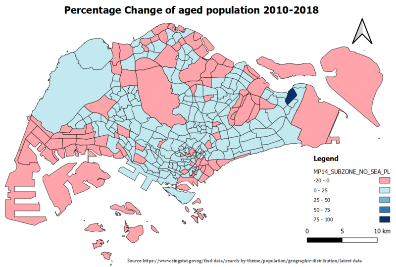
Percentage change of aged population between 2010 and 2018

