SMT201 AY2019-20T1 EX1 Zang Yu
Part 1: Thematic Mapping
Distribution of public education institution by school types
Since the nature of the data is discrete, I have categorised the school layer into 4 categories based on the school types and different svg symbols. MP14 planning area layer was used as the background reference map to show the distribution of public education institutions across Singapore. Data on the locations of the schools shows that more schools are in the central areas.
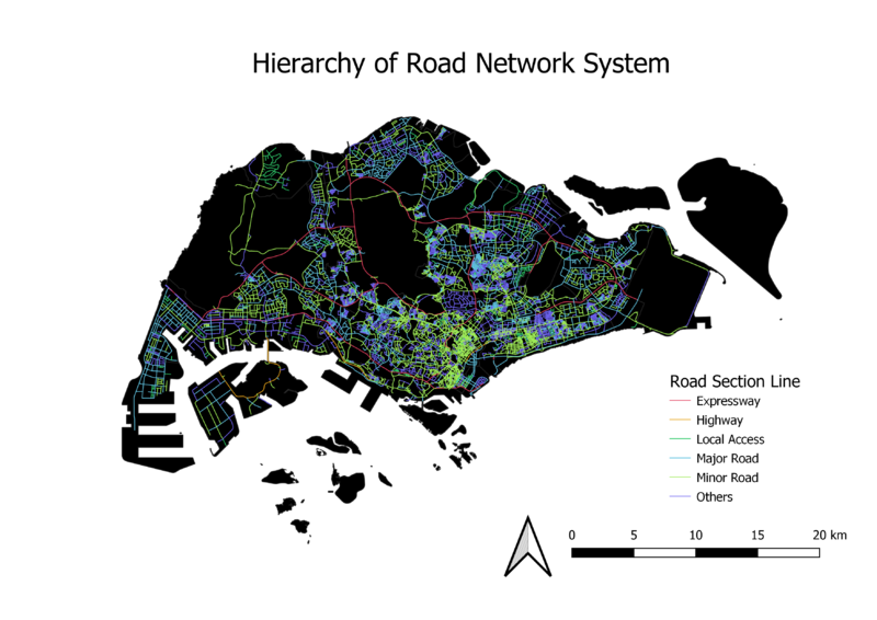
Road network system of Singapore
Based on the data from road section layer, we are unable distinguish major and minor roads. Therefore, I combined the road section layer with the national map line layer to gain new information about expressways and major roads. The remaining classified as minor roads. Lines with different colours and thickness were used to represent the different roads.
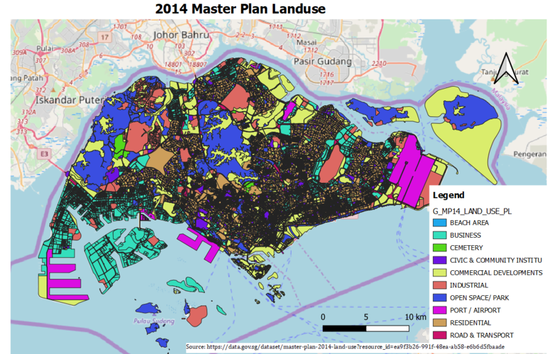
2014 Master Plan Landuse
In the original data, there were too many types of uses for land which made the map difficult for visualisation. Categories with similar functions were merged to form a more general classification. For example, Educational Institution, Place of Worship and Civic & Community Institution are now grouped under one category named Civic & Community Institution. Different colours were then used to represent each type of landuse.
Part 2: Choropleth Mapping
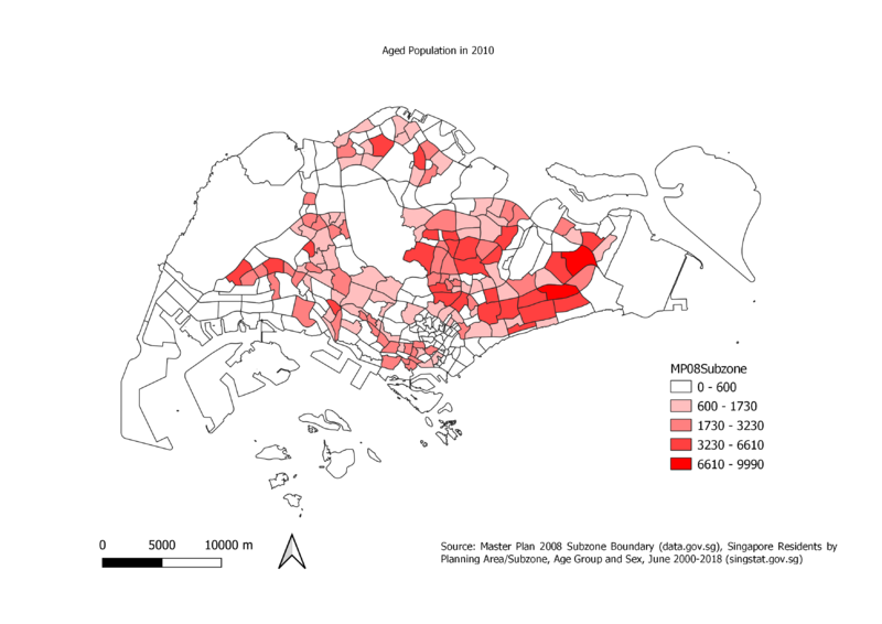
Aged population (+65) in 2010
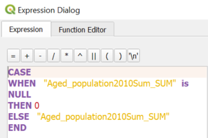
In order to do a relational join between population attribute layer and MP14_SubZone GIS layer, I needed a unique identifier between these two datasets. Both datasets contain fields with similar subzone names in different forms. The subzone name in population attribute layer was in proper case format in comparison to MP14_SubZone GIS layer's uppercase format.Therefore, I converted it to uppercase as a standarisation. We filtered out the aged population in year 2010. GroupStats plugin was used to sum up the aged population by subzone allowing us to create a relational join between the two layers. We also used the equal interval classification method as it provides a clearer picture of the subzones with more aged population. Datasets from Singstat and data.gov.sg were used as reference.There were some subzones with NULL value in the number of aged population field which causes the subzone to not appear on the map. Therefore, I used the expression shown below to show the population column.
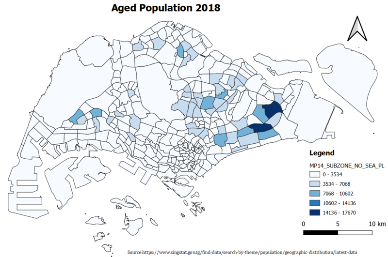
Aged population (+65) in 2018
Similar steps were used from the 2010 Aged Population map. Since there were no NULL value in the population count column no other expressions were required.
Proportional of aged population in 2010
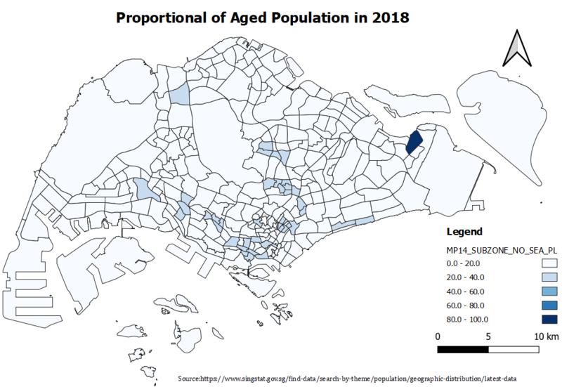
In order to get the proportion of aged population in each subzone, the total population in each subzone in 2010 were filtered out from the whole population data. A new field was added into the MP14_SubZone attribute table to calculate the percentage of aged population out of the total population in 2010. Subzones with higher proportion of aged population are different as the subzones with the greater number of aged populations. This is because the proportion maps describe the share of aged population in relation to the whole population instead of the actual number of aged population count.
Proportional of aged population in 2018
Similar steps were used from the Proportion of aged population in 2010 map.
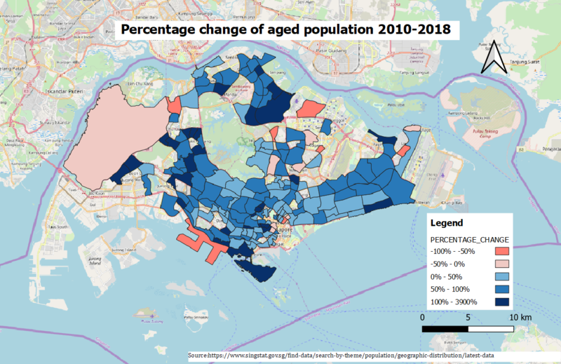
Percentage change of aged population between 2010 and 2018
A new field was added to the attribute table to store the percentage change. Since some aged population field in 2010 were NULL so we exclude these subzones to ensure the map shows the correct information about the change in percentage. We used different colours to differentiate the positive and negative percentage change. Different colour intensity were used to represent the different percentage range. From this map, we can see the percentage change of aged population has increased in most of the subzones.
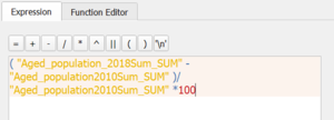
The percentage change between 2010 and 2018 is derived using following formula. We use CASE function to clean the data.

