SMT201 AY2019-20T1 EX1 Goh Jia Xin Genice
Contents
Part 1: Thematic Mapping
Part 2: Chloropeth Mapping
Aged Population (65+) in 2010 and 2018
Description
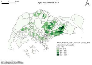
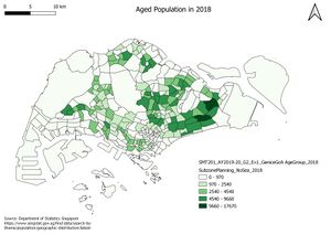
These maps show the spatial variation of aged population (65 and above) across Singapore in 2010 and 2018 respectively. The increase in the number of subzones which are coloured with a greater intensity of green from 2010 and 2018 evidently shows that the number of Singapore Residents who are aged 65 and above is on the rise.
Proportion of Aged Population (65+) in 2010 and 2018
Description
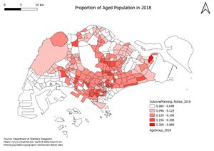
These maps show the spatial variation of the proportion of aged population (65 and above) across Singapore in 2010 and 2018 respectively. Likewise, the proportion of aged population in 2010 and 2018 follows a similar trend as the aged population. The increase in the number of subzones which are coloured with a greater intensity of red from 2010 and 2018 evidently shows that the proportion of Singapore Residents who are aged 65 and above is on the rise.
Percentage Change Of Aged Population in 2010 and 2018
Description
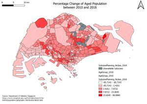
This map depicts the spatial variation of the percentage change of aged population between 2010 and 2018 across Singapore. We can see that approximately half of the subzones experience a percentage increase in aged population between 2010 and 2018. This supports the fact that Singapore is experiencing a silver tsunami and the number of Singapore Residents who are aged 65 and over is on the rise.
Discussion
I extracted data from the master file provided by the Department of Statistics Singapore and separated them into 2 CSV files containing the 2010 and 2018 Population Age Group Data respectively. I replaced the missing values in the CSV files with 0 to allow for a more accurate visualization and analysis afterwards.
I joined the 2010 Population Age Group Data and 2018 Population Age Group Data with the 2008 Subzone Planning Map and 2014 Subzone Planning Map respectively. I created a new variable named ‘Age65+’ and added it to both the joined tables, which stores the value of aged population in the individual subzones. I calculated it by summing the number of residents aged 65 and above in each subzone. I also created another variable named ‘Proportion_Age65+’ to store the proportion of aged population in the subzones and it is calculated taking ‘Age65+’/ Total population.
To obtain the map of percentage change of aged population between 2010 and 2018, I joined the 2010 and 2018 Population Age Group Data to the 2014 Subzone Planning Map. With the knowledge that some subzones in the 2010 Population Age Group do not exist in the 2014 Subzone Planning Map, I did a rule-based symbology to obtain all unavailable subzones instead of replacing their values with 0. I also created another variable named ‘Percentage Change’ and added it to the joined table. It is calculated by taking (‘ProportionAge65+_2018’ – ‘ProportionAge65+_2010’) * 100.
For all maps, I used the Graduate symbology with the mode ‘Natural Jenks’ to create the chloropeth maps. I used the ‘Age65+’ column to classify the data to obtain the maps of Aged Population in 2010 and 2018 respectively while I used the ‘ProportionAge65+’ column to classify the data to obtain the maps of Proportion of Aged Population in 2010 and 2018 respectively. Lastly, I used the ‘PercentageChange’ column to classify the data to get the map of Percentage Change of Aged Population between 2010 and 2018.


