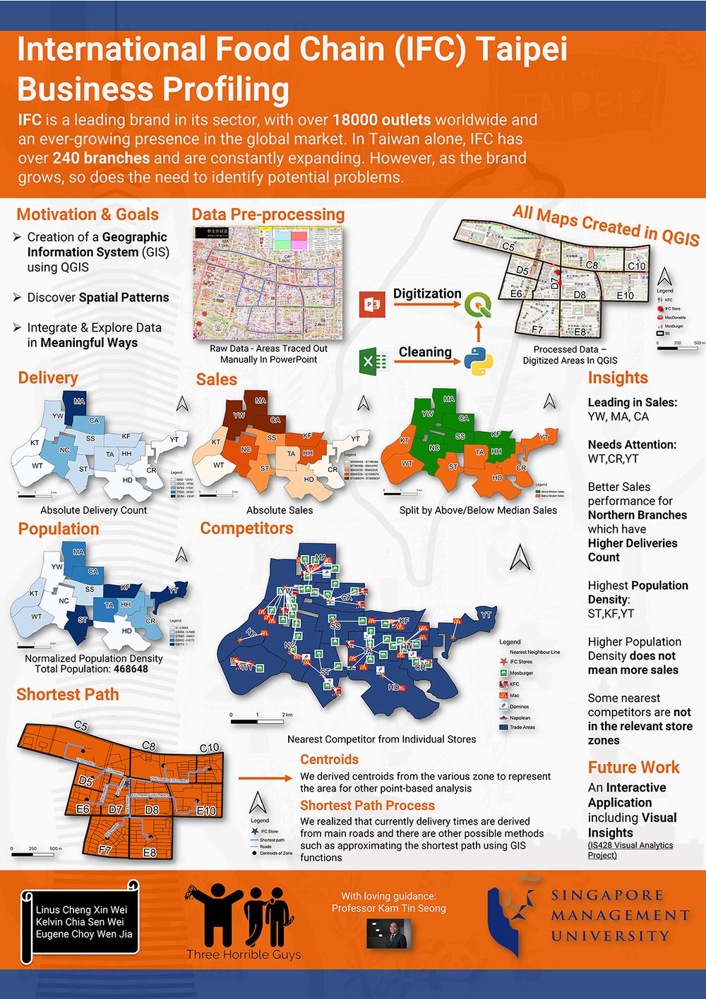
Three horrible guys Poster
Contents
Missing Area Analysis
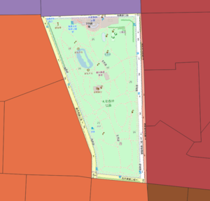
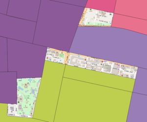
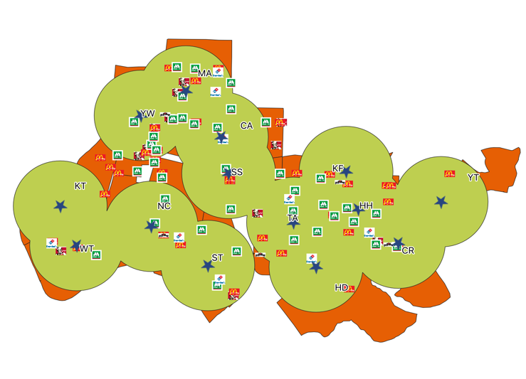
As we observe the generated trade areas, it seems there are some areas which are not covered by any of the branches. Hence, we decided to analyse these areas.
In the above figure, the uncovered area is 大安森林公园 which is a park. As it is not common to order a pizza to a park, being uncovered is to be expected.
In the above figure, we do see buildings that are not in any trade area. Therefore, this uncovered area may have been omitted and should be fulfilled by one of the branches.
Store Sales Analysis
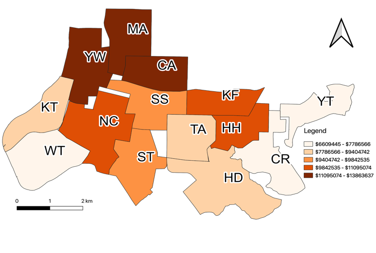
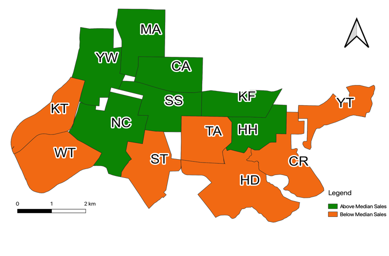
The yearly store sales of Pizza Hut located in Taiwan range from USD$6,809,445 - $13,863,637, with the branch YT being the lowest, and the branch MA having the highest sales. The median sales is branch SS, with USD$9597893.5
Based on the following thematic map, we can see that the top performers are branches YW,MA,CA and the branches WT,CR,YT are the worst performers. Our recommendation in this case would be to look at the factors surrounding the top performers and apply said factors to the worst performers in order to boost their sales.
The map above reveals an interesting pattern, where the northern stores perform better than southern stores. Our suggestion would be to look at location based factors, such as type of buildings (residential/office) and see whether they vary between areas. It is also possible to look at connectivity with regards to road types, and see if accessibility is a problem for some stores.
Total Delivery Analysis
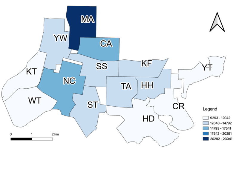
Unsurprisingly, having a high delivery count leads to higher sales when compared to the sales thematic map . This is possible as unlike a store where products are priced with vastly different ranges E.g. $5, $5000, the price range of Pizza Hut products are roughly the same. Although there might be orders which are of higher value, it seems these orders do not affect the sales amount by much. The exception to this is the area ST, where although it has a comparable delivery count to areas that perform better than the median, it is still slightly behind in sales.
Population Density Analysis
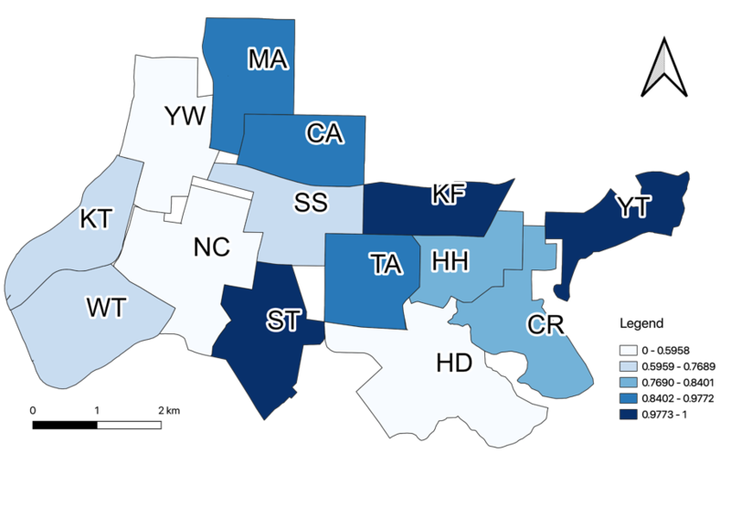
From the above charts where we analyse the normalized population density, we can see that most stores have a high population density. However, when compared to the thematic map of sales, it seems that population density has little to no relation; having a higher population density does not necessarily mean higher sales.
Buffer Analysis
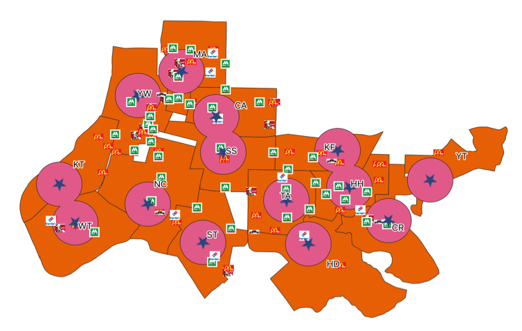
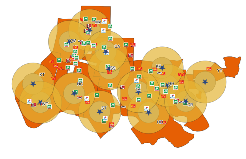
Buffer Analysis was performed to evaluate the proximity of each IFC.
Based on the 500m buffer, we can see that there are 3 overlapping pairs of stores:
- WT,KT
- CA,SS
- KF,HH
In the 1000m buffer, we can see all stores have some form of overlap with each other.
When we overlay the two maps, we can see that the overall proximity of Pizza Hut stores to each other in Taipei is rather close. This has interesting implications, as some competitors might affect multiple stores due to the close proximities.
