SMT201 AY2019-20T1 EX1 Renata Dharma
Part 2 Generated Maps
The above generated tables and columns were then used to join with the Master Plan 2014 Subzone Layer via the key attribute Subzone_N.
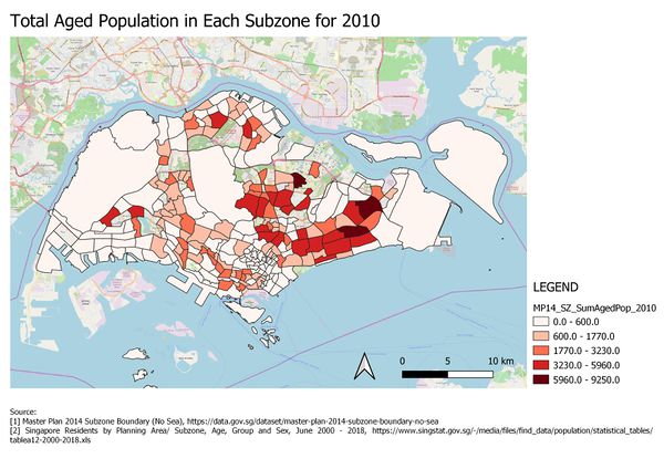
Classification: Natural Breaks (Jenks)
Symbology: Colour Fill (red)
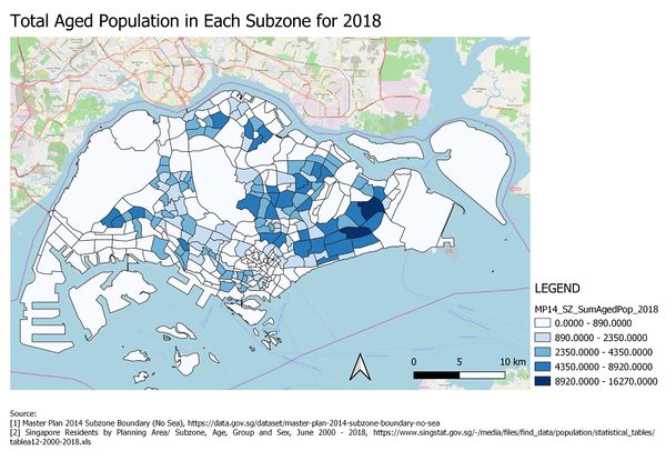
Classification: Natural Breaks (Jenks)
Symbology: Colour Fill (blue)
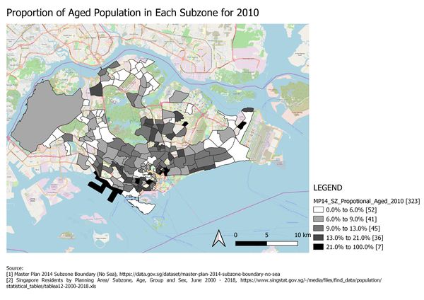
Classification: Natural Breaks (Jenks)
Symbology: Colour Fill (grey)
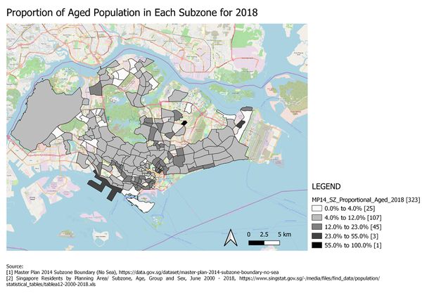
Classification: Natural Breaks (Jenks)
Symbology: Colour Fill (grey)
Classification: Natural Breaks (Jenks)
Symbology: Colour Fill (grey)
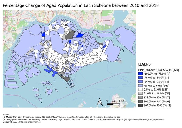
Spatial pattern: From Map 5, the dark blue spots reveal that areas like Fernvale and Yio Chu Kang East and Kangkar are places with a decreasing number of citizens older than 65. On the other hand, subzones like Yio Chu Kang North, Kent Ridge, Pasir Ris, Bukit Merah experience a significant increase in the aged population. Taking this into account, it would be wise to evaluate redevelopment plans, ensuring that more elderly-friendly facilities are only added where the frequency of the aged population is high. Overall, it can be seen that Singapore is undergoing a silver tsunami. It is perhaps worth noting that an equal distribution of citizens by age can help foster more cohesive environments.
