From Geospatial Analytics for Urban Planning
Jump to navigation
Jump to search
Part 1
| Stage 1
|
In the first stage, 1 data file was sourced:
- School Directory and Information zip folder containing a csv file titled 'General information of schools'
Inside the datasets:
- The relevant features of this file include School Name, School Address, Postal Code, MainLevel_Code.
Data processing:
- Due to the x & y coordinates being unavailable from the csv file, each data point must be geocoded into its coordinates on the map. For this, the use of MMQGIS was employed.
- The shapefile was then modified such that its projection matched SVY21 / Singapore TM, EPSG:3414
- 2 schools could not be geocoded due to error in address: Raffles Institution & Bowen Secondary School
Visualising the layers:
- A point symbol map showing the education institution in Singapore by tenure types was also prepared.
|
| Stage 2
|
In the second stage, 2 data files were sourced:
- Road Selection Line dataset from SLA
- SLA’s National Map Line from data.gov.sg
Inside the datasets:
From the Road Selection Line dataset, the entire country's Road System Network was obtained, which included the major and minor roads.
From the National Map Line dataset, major features for national map data represented in polyline form were found. Data includes road data like expressway, major roads, international boundary and contour lines.
Data Processing:
The data were categorized into 3 different colours: yellow, green and blue. As the island contour lines did not apply to this stage of the Take-Home Exercise, it has been removed so that only Major Road, Expressways and Intersections were shown.
Visualising the layers:
The vector representing Major Roads, Expressways and Intersections have been modified to a larger width so that it is more obvious on the map.
By making use of layer ordering, by placing (2) over (1), the non-overlapping vectors would represent the Minor Roads.
|
| Stage 3
|
In the 3rd stage, 1 file was sourced:
- MP14_Planning Area from data.gov.sg
Data Processing:
The layer was modified to ensure consistent projection.
Visualising the layers:
The layers' dependent visibility was scaled to a minimum of 1:50000. This ensures that the map does not take too long to render while it was initially opened and that only meaningful base maps were used. At a lower scale, there is a need to see the individual roads and buildings surrounding lanes or roads. However, at a higher level, it is better for the specific area in Singapore to be seen so as to aid analyzing frequency base on each neighbourhood.
The image shows a map view at 1:50000 (top) and another at map view 1:49999 (below), where the planning area base map is visible.
|
Part 2
| Stage 1
|
In the first stage, these data files were sourced:
- Singapore Residents by Planning Area/Subzone, Age Group and Sex, June 2000 - 2018 from Department of Statistics Singapore
- Singapore Master Plan 2014 Subzone and Planning Area 2014 boundary data from data.gov
Inside the dataset:
- The relevant features include Population, Age Group, Planning Area, Subzone, Time (in years)
- Subzone and Planning Area base maps from which contains the primary key attribute Subzone
Data Processing:
- Due to the absence of a common primary key between the two data sets, upper("SZ") was implemented through field calculator to generate the primary key for dataset (1).
- To filter dataset(1) for relevant years, QueryBuilder was used to filter where time=2010 or time=2018.
| Time=2010 |
Time=2018
|
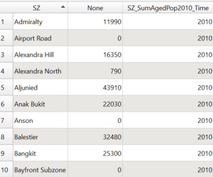
Table 1.1 generating Subzone, Population Count, Time respectively
Layer: SZ_SumPop2010
|
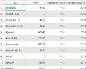
Table 1.2 generating Subzone, Population Count, Time respectively
Layer: SZ_SumPop2018
|
- Using field calculator to select AG for 65 and above, and also using a plugin called Group Stats, the AG column was aggregated into 65 and above, so as to determine the frequency of aged population per subzone.
| Time=2010 |
Time=2018
|
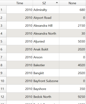
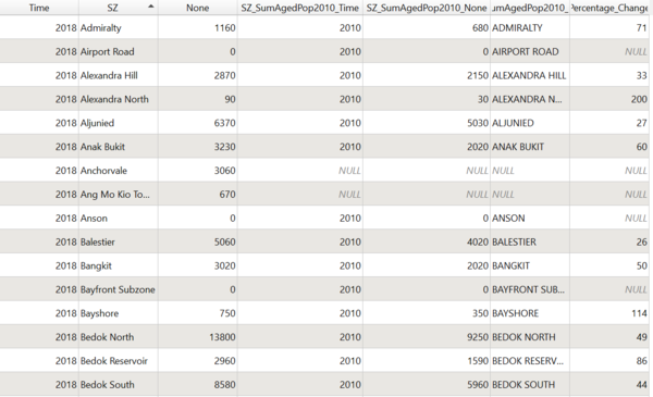
Table 2.1 showing Aged Population Frequency at each Subzone in 2010
Layer: SZ_SumAgedPop2010
|
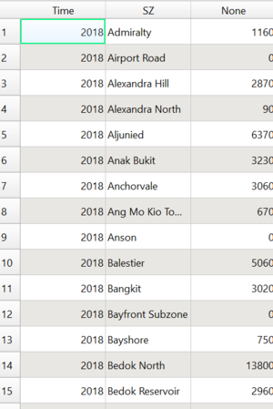
Table 2.2 showing Aged Population Frequency at each Subzone in 2018
Layer: SZ_SumAgedPop2018
|
- Next, in order to calculate the proportion, within a subzone, the total number of people belonging to the aged population must be divided by the same subzone population. Hence, the formula below is implemented via Field Calculator:
| Time=2010 |
Time=2018
|
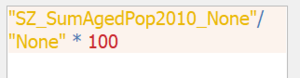
Formula for calculating proportion aged within a subzone in 2010
Layer: Proportion_Aged_2010
|
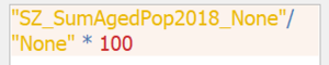
Formula for calculating proportion aged within a subzone in 2018
Layer: Proportion_Aged_2018
|
The result will be a proportion column (in %) within the same layer:
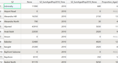
Proportion Column in % has been generated
Layer: Proportion_Aged_2010
|
The result will be a proportion column (in %) within the same layer:
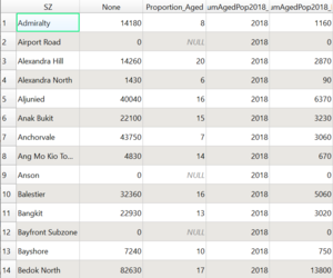
Proportion Column in % has been generated
Layer: Proportion_Aged_2018
|
- Lastly, in order to calculate the percentage change, within each subzone, the total number of people belonging to the aged population in 2010 must be subtracted from the aged population in 2018, then divided by the aged population in 2010. Hence, the formula below is implemented via Field Calculator:
| Formula for calculating Percentage Change between 2010 and 2018
|
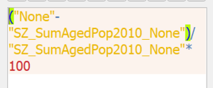
Layer: Percentage_Change_2010_2018
|
| Resulting Table
|
|
Layer: Percentage_Change_2010_2018
|
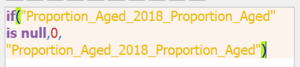
- Noticing that there are NULL values, these values were edited within the respective tables using the following formula through field calculator:
Part 2 Generated Maps
The above generated tables and columns were then used to join with the Master Plan 2014 Subzone Layer via the key attribute Subzone_N.
Classification: Natural Breaks (Jenks)
Symbology: Colour Fill (red)
Classification: Natural Breaks (Jenks)
Symbology: Colour Fill (blue)
Classification: Natural Breaks (Jenks)
Symbology: Colour Fill (grey)
Classification: Natural Breaks (Jenks)
Symbology: Colour Fill (grey)
Classification: Natural Breaks (Jenks)
Symbology: Colour Fill (grey)
Spatial pattern: From Map 5, the dark blue spots reveal that areas like Fernvale and Yio Chu Kang East and Kangkar are places with a decreasing number of citizens older than 65. On the other hand, subzones like Yio Chu Kang North, Kent Ridge, Pasir Ris, Bukit Merah experience a significant increase in the aged population. Taking this into account, it would be wise to evaluate redevelopment plans, ensuring that more elderly-friendly facilities are only added where the frequency of the aged population is high. Overall, it can be seen that Singapore is undergoing a silver tsunami. It is perhaps worth noting that an equal distribution of citizens by age can help foster more cohesive environments.
References
[1] https://data.gov.sg/dataset/school-directory-and-information
[2] https://www.singstat.gov.sg/find-data/search-by-theme/population/geographic-distribution/latest-data
[3] https://data.gov.sg/dataset/national-map-line
[4] https://data.gov.sg/dataset/master-plan-2014-subzone-boundary-no-sea
[5] https://data.gov.sg/dataset/master-plan-2014-land-use?resource_id=ea9f3b26-991f-48ea-ab58-e6b6d5fbaade
|


