Difference between revisions of "SMT201 AY2019-20T1 EX1 Riana"
Riana.2016 (talk | contribs) (Created page with "== Part 1: Thematic Mapping == === Distribution of public education institution by school types === <br>File:School Distribution in Singapore (2019).png|800px|frameless|cen...") |
Riana.2016 (talk | contribs) |
||
| Line 2: | Line 2: | ||
=== Distribution of public education institution by school types === | === Distribution of public education institution by school types === | ||
| + | |||
<br>[[File:School Distribution in Singapore (2019).png|800px|frameless|center]]<br> | <br>[[File:School Distribution in Singapore (2019).png|800px|frameless|center]]<br> | ||
| − | + | Due to the nature of the data, I chosen a different shape and colors to represent the type of school. A different color is used on top of the different shapes as the different types of school are cluster together. Therefore, variety of colors are used for better visualization. Besides the school type, I chosen a different color to represent the different region of Singapore to categorize the region of the school in one glance. Furthermore, a different color scheme is used to distinguish the region and school type. | |
=== Road network system of Singapore === | === Road network system of Singapore === | ||
| − | <br> <br> | + | <br>[[File:Type of Road.png|800px|frameless|center]]<br> |
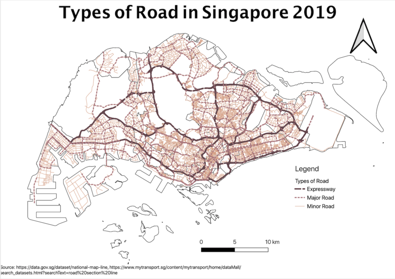
| − | + | For this map, I use the different types and thickness of the lines and different colors to represent different types of road. Since expressway is the most important road, I use a thicker line to represent it, then follow by major road and minor road. In order to distinguish the line more, I used the different types of line to represent each of the road. Classification of expressway and major road is retrieved from the data.gov.sg while the minor road is retrieved from LTA DataMall. | |
=== 2014 Master Plan Landuse === | === 2014 Master Plan Landuse === | ||
| − | <br> | + | <br>[[File:2014 Master Plan Landuse Riana.png|800px|frameless|center]]<br> |
| − | + | For this map, I have used a different colors and pattern to represent the different landuse purpose. Since there are a lot of categories from the data, I combined some of the categories such as Residential and Business. Besides colors, I used patterns to further distinguish the landuse. Furthermore, I have chosen colors that are the closest to the categories, e.g. red for restricted area and blue for waterbody. | |
== Part 2: Choropleth Mapping == | == Part 2: Choropleth Mapping == | ||
Revision as of 01:26, 15 September 2019
Part 1: Thematic Mapping
Distribution of public education institution by school types
Due to the nature of the data, I chosen a different shape and colors to represent the type of school. A different color is used on top of the different shapes as the different types of school are cluster together. Therefore, variety of colors are used for better visualization. Besides the school type, I chosen a different color to represent the different region of Singapore to categorize the region of the school in one glance. Furthermore, a different color scheme is used to distinguish the region and school type.
Road network system of Singapore
For this map, I use the different types and thickness of the lines and different colors to represent different types of road. Since expressway is the most important road, I use a thicker line to represent it, then follow by major road and minor road. In order to distinguish the line more, I used the different types of line to represent each of the road. Classification of expressway and major road is retrieved from the data.gov.sg while the minor road is retrieved from LTA DataMall.
2014 Master Plan Landuse
For this map, I have used a different colors and pattern to represent the different landuse purpose. Since there are a lot of categories from the data, I combined some of the categories such as Residential and Business. Besides colors, I used patterns to further distinguish the landuse. Furthermore, I have chosen colors that are the closest to the categories, e.g. red for restricted area and blue for waterbody.


