SMT201 AY2019-20T1 EX1 Tan Hui Qin
Contents
Part 1: Thematic Mapping
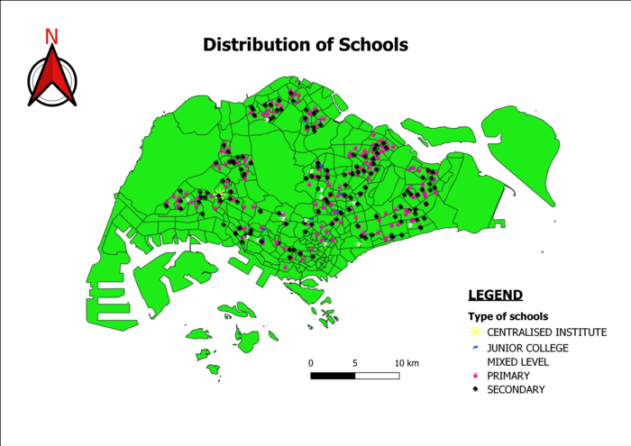
Distribution of Public Education
Different coloured icons were used to map out the different types of public schools. Against the green coloured background of the subzone map of Singapore, the coloured icons stand out and makes it easy for people to view the distribution of the types of public schools. Icons blocked by overlapping features have been enlarged and given bright colous so that viewers can still see it.
Road Network System
Line symbols were used to map out the road network as details of the dense road system in Singapore can be more easily captured. Different thickness and colours were used to differentiate the different road types. To show the road hierarchy, bigger roads like Expressways and Highways were represented by thicker lines while smaller roads like Lanes and Links were represented by thinner line symbols.
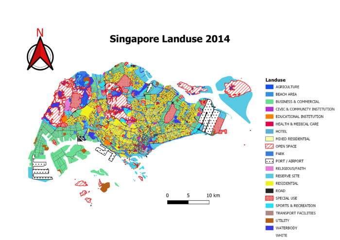
2014 Landuse in Singapore
Different colours were used to map out different areas of landuse. Textures were used to map out Significant landuse like the port and airport to make them stand out to viewers. Similar categories like 'Business' and 'Commercial' land areas were grouped together under 'Business' to reduce the number of categories and colours on the map, making it easier to find general distribution patterns from the map.
Part 2: Choropleth Mapping
Aged Population
A new column of the total number of aged people in each subzone was derived by joining the attribute tables of the subzone map layer and the dataset containing number of Singaporeans that were classified according to the subzone and age group. As the subzone layer and the data sets had different number of attributes, I had to replace the resulting NULL values from the join with the value zero. As the distribution of the values for each subzone was concentrated around the value 0, I utilised the natural break mode to classify the values of the aged population as seen in the maps above.
To allow for easier comparison between the two maps, I ensured that the legends of both maps were the same. From the two maps we can see that the aged population generally increased throughout Singapore. But there was a slight decrease in the aged population in the southern areas of Singapore.
Proportion of Aged Population
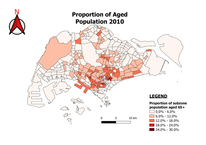
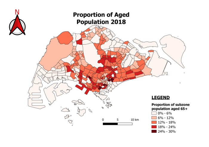
The proportion of aged population was computed and added to the joined attribute tables using the number of aged population that I had found in the previous mapping. I divided the number of aged population in each subzone and divided it over the total population in each subzone to get the proportion in percentage.
Similarly, I ensured that the legends of both maps were the same to allow for easier comparison. From the two maps we can see that the proportion of aged population generally increased throughout Singapore as well. This could probably be due to the combination of our nation's aging population and decreasing birth rate.
Change in Percentage of Aged Population
The difference in the number of aged population was computed and divided over the aged population number in 2010 to find the percentage change. I ensured that the percentage signs were added into the legend for easy reference. From the maps, we can see that generally the aged population in each subzone increases about 30 to 91 percent. This is an expected result of the aging population phenomenon that is happening in Singapore.
Reflections
It would be important to note that due to missing data in the data sets, the choropleth maps may not be the most accurate representation of the aged population in Singapore. Some in the northern parts of Singapore may be more inaccessible and hence data of Singaporeans living there may not have been captured. This leads to the NULL values that wee see in our data. With better data we may be able to come up with more accurate mappings.


