SMT201 AY2019-20T1 EX1 Ong Sin Kai Brendan
Part 1: Thematic Mapping
Distribution of Public Education Institutions by School Type
Categorized symbology was chosen in order to provide a visual representation of the different types of schools. The different school types are represented by a building icon of varying colors. The different colors provide a quick overview of the number of schools in each area. Based on the map, there is a high number of secondary and primary schools as compared to the rest.
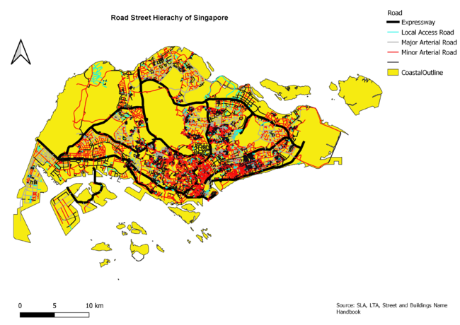
Road Network System Hierachy of Singapore
Categorized Symbology was chosen in order to provide a visual representation of the different road types on the map. The local, minor and major roads are differentiated by their colors while the expressway uses a thick black line. This makes it easier for users to identify the expressways and refer to the legend only for the other types. The road types were determined with reference to the handbook on guidelines for naming streets by the street and building names board.
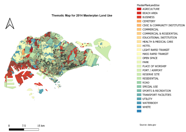
2014 Master Plan Land Use Singapore
The categorized symbology has also been chosen to show the different types of land use via color coding. Some categories were combined as they were similar in nature to reduce the different number of colors on the map (business 1 and 2 combined to business etc). This helps to make it easier for the user to understand the map by reducing the number of items on the legends they need to refer to.
Part 2: Chloropleth Mapping
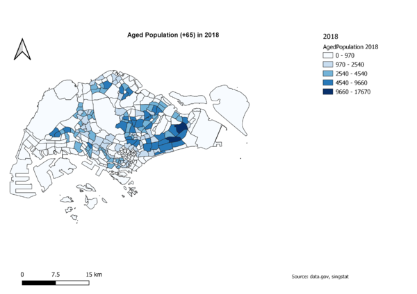
Aged Population (+65) in 2010 and 2018
The two maps show the aging population in both 2010 and 2018. The darker the shade of blue, the higher the number of aged populations in that area. Comparing the two maps, there seems to be a slight increase in the aging population from 2010 due to more areas becoming shaded and some areas turning darker. This might indicate that there are a significant number of residents that are at least 57 years old in some of the subzones, causing the change in color and shade 8 years later in 2018.
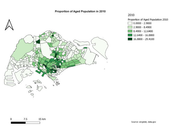
Proportion of Aged Population in 2010 and 2018
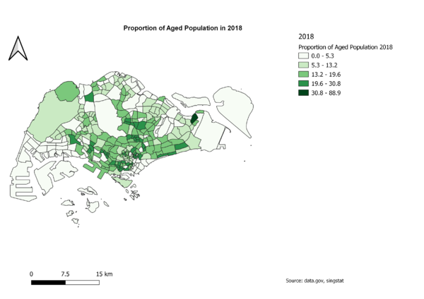
The two maps show the proportion of aged population in both 2010 and 2018. An increase in the proportion of aged population would cause the green shade to turn darker. Comparing the 2 maps, there seems to be a higher proportion of aged population in 2018 as compared to 2010. While at first glance it might seem like it is lesser due to there being lesser dark shades of green in the 2018 map, a comparison of the legends for both maps would tell us otherwise. It shows us that the second darkest shade in the 2018 map is equivalent to the darkest shade in the 2010 map. The 2018 map, having more shades of the second darkest green, indicates a higher proportion of aged population.
Percentage Change of Aged Population Between 2010 and 2018
The map shows the percentage change in aging population between 2010 and 2018. A color ramp of green and red is used, with green signifying a drop or small increase in aging population and red signifying an increase. The darker the shade of red, the higher the increase. From the map, we can see that many subzones are shaded bright red. This might indicate that aging population is becoming an issue in Singapore.
Discussion
I got the population data by subzone and age group from Singstat and separated them into 2 csv files (2010.csv and 2018.csv). Edits were done to the csv files such as uppercasing the subzone field, removing unnecessary columns and replacing dashes with zeroes. I joined both csv files to the MP14 subzone data and created new fields to help map the aged population, proportion and percentage change.
To calculate the values for the new fields, field calculator was used. To get the aged population in 2010 and 2018, I summed up age groups 65 and above for each year and stored them into 2 new columns. To get the proportion of aged population, I took the total aged population divided by the total population and multiplied 100 to the result to get a percentage for each year and saved them to 2 new columns. To compute the percentage change, I used the formula ((2018age – 2010age)/2010age) * 100 to derive the values and saved them to a new column. Any null values that were essential for calculation purposes were changed to 0 using the field calculator.
Graduated symbology was used to classify all the Choropleth maps. However, natural break was used to classify the aged population and proportion while quantile was used for percentage change. For maps regarding the aged population and proportion, the same colour ramp was used for both the 2010 and 2018 maps to make comparison simpler. The blues and greens colour ramps were used as they were easier to compare through the darkening of the shades. For the percentage change map, a colour ramp of green and red was made to make identifying the percentage change easier. Green would signify a drop or small increase while red signifies an increase. As we tend to associate green with good and red with bad, it provides the user with an idea whether there are potential issues at a glance. In the case of the percentage change map, slightly less than half of the map were covered in red, indicating a potential aging population issue.

