SMT201 AY2019-20T1 EX1 Nicole Ng Linn
Take Home Exercise 1:
Part 1: Thematic Mapping
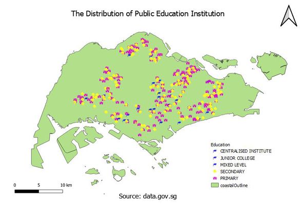
A thematic map showing the distribution of public education institution by school types:
Point symbols are used to map zero-dimensional features. Map point symbols are individual discrete dots existing at single spots or locations. The point symbols are quantitative values. In the thematic map, each type of educational institute represents a different symbol. This benefits the user or viewer to easily identify the schools as well as the type of school.
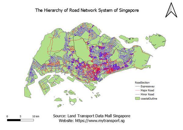
A thematic map showing the hierarchy of the road network system of Singapore:
This cartographic technique of road network systems is used to display qualitative data. The line symbols are used to represent one-dimensional or linear features. Each coloured line represents different roads such as the expressway, minor and major roads.
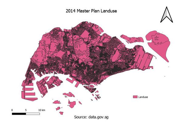
A thematic map showing 2014 Master Plan Landuse:
This cartographic technique of Landuse is used to display qualitative data. The single lines represent the road, the double lines represent the overpass and underpass roads. There are also uneven lines that form polygons which represent the water catchment areas.
Part 2: Choropleth Mapping
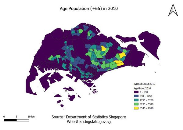
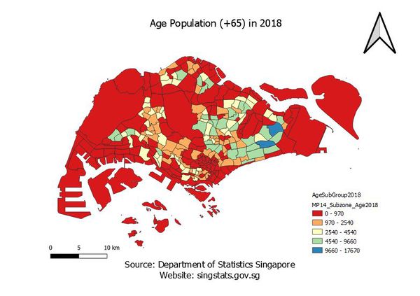
1. Aged population (+65) in 2010 and 2018.
- The data is classified into 5 classes by natural breaks. The advantage of the Natural Breaks (Jenks) classification is that it identifies real classes within the data. This is useful because it presents accurate representations of trends in the data. Data for the year 2010 refers to areas demarcated in the Urban Redevelopment Authority’s Master Plan 2008 and data for the year 2018 refer to the Urban Redevelopment Authority's Master Plan 2014.
- A new variable named Age 65+ created in QGIS that sum up the aged population in 2010 and in 2018. There are a few assumptions such as that the figures in the data have been rounded to the nearest 10 and may not add up due to rounding.
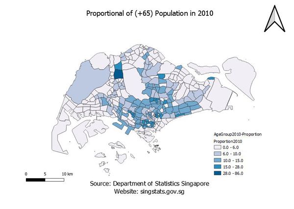
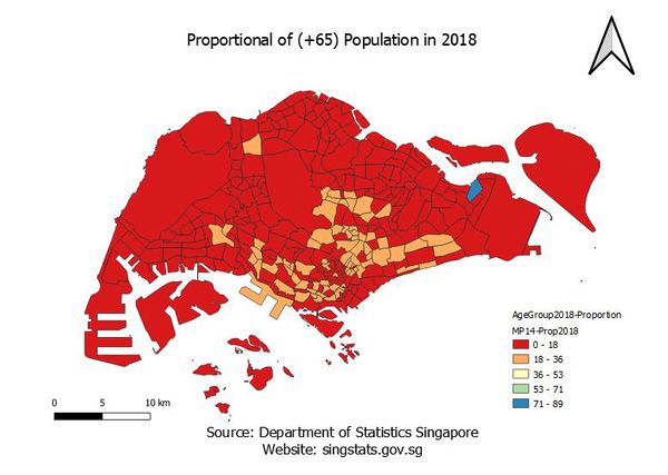
2. Proportional of aged population in 2010 and 2018.
- The data is classified into 5 classes by natural breaks. The advantage of the Natural Breaks (Jenks) classification is that it identifies real classes within the data. This is useful because it presents accurate representations of trends in the data. Data for the year 2010 refers to areas demarcated in the Urban Redevelopment Authority’s Master Plan 2008 and data for the year 2018 refers to the Urban Redevelopment Authority's Master Plan 2014.
- A new column was added into the excel file which sums the “Total Population” in each subzone. A new variable named “Age 65+” is created in QGIS, to sum up the aged population in 2010 and in 2018. To get the proportion, the equation used is “(Age 65+ / Total Population) * 100%”. There are a few assumptions such as that the figures in the data have been rounded to the nearest 10 and may not add up due to rounding.
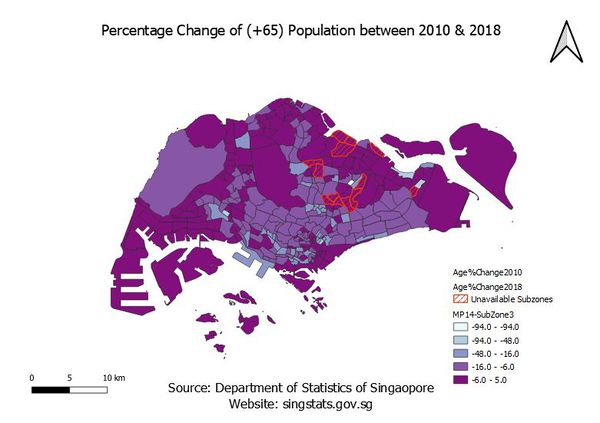
3. Percentage change of aged population between 2010 and 2018.
- The data is classified into 5 classes by natural breaks. The advantage of the Natural Breaks (Jenks) classification is that it identifies real classes within the data. This is useful because it presents accurate representations of trends in the data. Data for the year 2010 refers to areas demarcated in the Urban Redevelopment Authority’s Master Plan 2008 and data for the year 2018 refer to the Urban Redevelopment Authority's Master Plan 2014.
- To get the percentage change between 2010 & 2018, the equation is (“Prop aged in 2018” – “Prop aged in 2010”) * 100. To get the Proportion Change for each year, the equation is (Total 65+ of year/Total Age of Year). 4 new variables were created, “Total2010” is Total 65+ in 2010, “Total2018” is Total 65+ in 2018. “Prop2010” is Proportion aged in 2010, “Prop2018” is Proportion aged in 2018. A new layer was created as well to store the 13 Subzones that are not present in the 2008 Planning Subzones.
There are a few assumptions such as that the figures in the data have been rounded to the nearest 10 and may not add up due to rounding.
