SMT201 AY2019-20T1 EX1 Lee Wan Ning
Contents
- 1 Part 1:Thematic Mapping
- 2 A: Distribution of public education institution by school types
- 3 B:Hierarchy of Road Network system in Singapore
- 4 C:2014 Master Plan Landuse
- 5 Part 2:Choropleth Mapping
- 6 A: Aged population in 2010 and 2018
- 7 B: Aged population proportion in 2010 and 2018
- 8 C: Percentage change of Aged population between 2010 and 2018
- 9 Credits
Part 1:Thematic Mapping
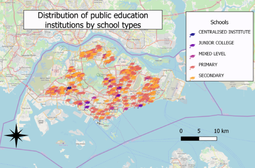
A: Distribution of public education institution by school types
Choice of classification:
Categorisation by school types
Visual variable:
Using an SVG marker of a graduation hat as symbol
Reason:
School types is a qualitative variable with nominal scale, SVG marker more relevant to the context of education institutions
Observation:
Generally, there are more secondary and primary schools than that of centralised institute mixed levels education institutions and junior colleges. Generally, there are more education institutions congregated near the East and North-East region
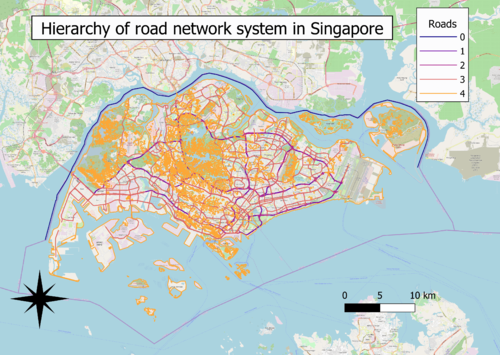
B:Hierarchy of Road Network system in Singapore
Choice of classification:
Categorisation by roads
Visual variable:
Using line as symbol
Reason:
Road types is a qualitative variable with nominal scale, road network is more suited to be represented as lines
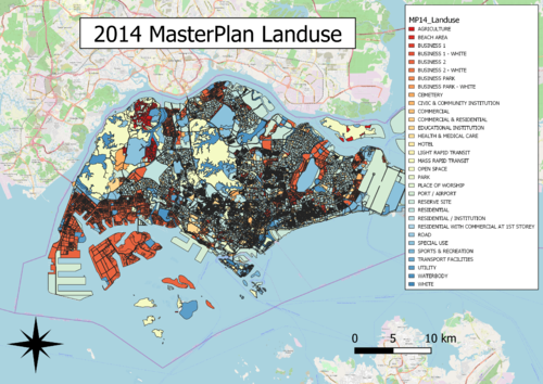
C:2014 Master Plan Landuse
Choice of classification:
Categorisation by type of uses
Visual variable:
Colour fill as the respective type of land uses
Reason:
Type of land uses is a qualitative variable with nominal scale, colour fill as it is more relevant to the context of land uses
Part 2:Choropleth Mapping
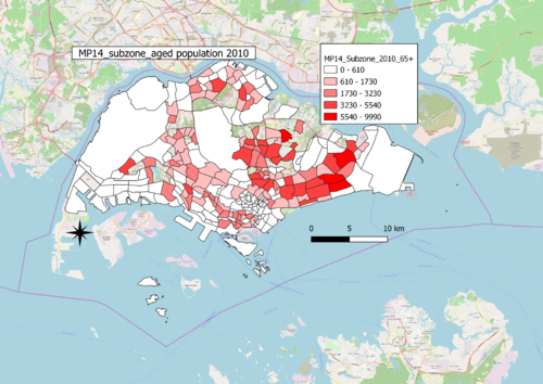
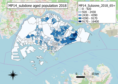
A: Aged population in 2010 and 2018
Choice of classification:
Graduated by values
Visual variable:
Colour fill, with colour intensity increasing with increasing values
Reason:
Aged population is a quantitative variable with nominal scale
Observations:
North-East and East region generally have the most number of aged people. Generally, there has also been an increasing trend of aged population from 2010 to 2018, as evident by the larger range in the scales.The choropleth map of 2010 is incomplete as there are no data for some of the areas, however in choropleth map of 2018, there has been data gathered on this missing areas.
B: Aged population proportion in 2010 and 2018
Choice of classification:
Graduated by proportion
Visual variable:
Colour fill, with colour intensity increasing with increasing proportion
Reason:
Aged population is a quantitative variable with nominal scale
Observation:
In contrast with the counts of aged population, it is observed that generally the Central regions have the most proportion of aged. By taking into account the total population, the maps with the aged population proportion is a more accurate estimate of the real situation. Generally, there has also been an increasing trend of aged population from 2010 to 2018, as evident by the larger range in the scales.
The choropleth map of 2010 is incomplete as there are no data for some of the areas, however in choropleth map of 2018, there has been data gathered on this missing areas.
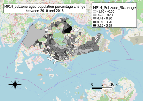
C: Percentage change of Aged population between 2010 and 2018
Choice of classification:
Graduated by percentage change
Visual variable:
Colour fill, with colour intensity increasing with increasing positive percentage changes
Reason:
Aged population is a quantitative variable with nominal scale
Observation:
Generally, it is observed that the North, West and Central regions have the most percentage increase in aged population. In addition, the West region and the region between Central and East generally have the most percentage decrease in aged population. But generally, there are much more percentage increases and no change in percentages than percentage decreases.
Credits
- Data.gov.sg
