From Geospatial Analytics for Urban Planning
Jump to navigation
Jump to search
Part 1: Thematic Mapping
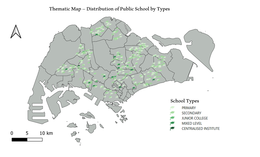
1. The Distribution of Public Education Institution by School Types
- Source of Data : data.gov.sg (general-information-of-schools.csv)
- The graduation hat was chosen to location the schools, as the hat symbolizes education institutions.
- With Primary School being the lightest shade of green, the marker gets darker as the education level goes up. (With the exception for Mixed Level School and Centralised Institute.)
2. The Hierarchy of Road Network System of Singapore
- Source of Data: LTA (RoadSectionLine)
- Different thickness of lines were used to represent the different hierarchy of the roads, along with different shades of colour blue.
- Thicker and darker the lines, the higher the hierarchy of the road is.
- The road classification was done with reference to the table below.
| Road Category |
Types of Roads |
Examples of Street Name Descriptors
|
| Category 1 |
Expressway |
Expressway, Parkway, Highway
|
| Category 2 |
Major Arterial |
Boulevard, Avenue, Way
|
| Category 3 |
Minor Arterial |
Drive, Road, Street
|
| Category 4 |
Primary Access |
Drive, Road, Street
|
| Category 5 |
Local Access |
Walk, Lane, Link, View, Crescent, Terrace, Park, Circle etc.
|
- Because there were no differentiating descriptors for Minor Arterial and Primary Access, they were classified as "Minor Arterial/" as seen on the legend of the map.
- Reference: Remember Singapore,LTA Singapore
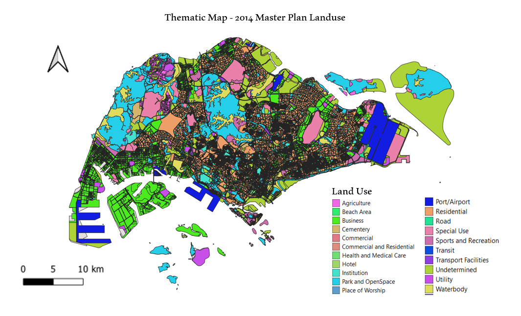
3. 2014 Master Plan Landuse
- Source of Data: data.gov.sg (Master Plan 2014 Subzone Boundary (No Sea))
- There were many fields in the original file. Therefore, the following fields were grouped together under a single legend. The fields that aren't mentioned in the table below were left ungrouped.
| Field Name After Grouping (Legend) |
Grouped Fields From The Original Data Set
|
| Business |
"LU_DESC" in ( 'BUSINESS 1' , 'BUSINESS 1 - WHITE' , 'BUSINESS 2' , 'BUSINESS 2 - WHITE' )
|
| Park and OpenSpace |
"LU_DESC" in ( 'BUSINESS PARK' , 'BUSINESS PARK - WHITE' 'PARK' 'OPEN SPACE' )
|
| Commercial and Residential |
"LU_DESC" in ( 'RESIDENTIAL WITH COMMERCIAL AT 1ST STOREY' , 'COMMERCIAL & RESIDENTIAL' )
|
| Transit |
"LU_DESC" IN ( 'LIGHT RAPID TRANSIT' , ‘MASS RAPID TRANSIT' )
|
| Institution |
"LU_DESC" in ( 'CIVIC & COMMUNITY INSTITUTION' , 'EDUCATIONAL INSTITUTION' , 'RESIDENTIAL / INSTITUTION' )
|
| Undetermined |
"LU_DESC" in ( 'RESERVE SITE' , 'WHITE' )
|
- As there were many legends even after grouping some fields, only colours were used to visualise the legends to make the map less crowded.
Part 2: Choropleth Mapping
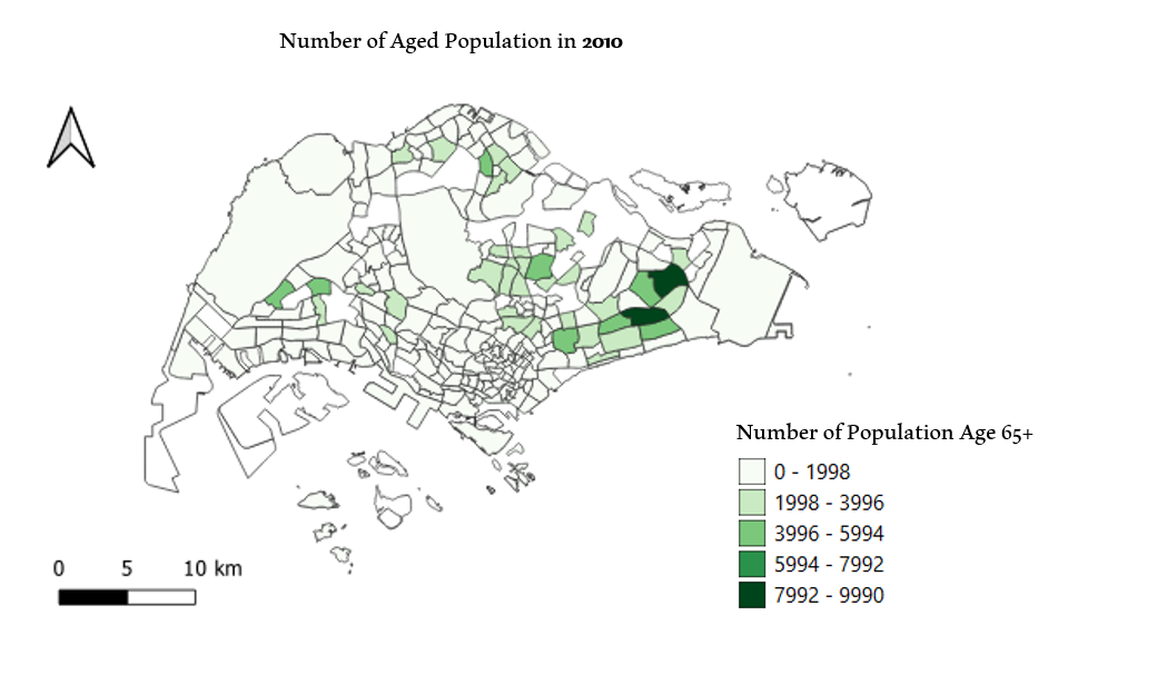
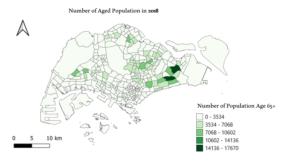
1. Aged Population (Ages 65+) in 2010 and 2018
- Source of Data: data.gov.sg (Master Plan 2014 Subzone Boundary (No Sea)), Department of Statistics Singapore (Singapore Residents by Planning Area/Subzone, Age Group and Sex, June 2000 - 2018 )
- Darker shade of the filled subzone, the bigger the number of residents above the age of 65 staying in the subzone.
- Although it is quite difficult to see the difference (due to the difference in the scales of the legends for each of the map), it is still visible that there has been an increase in number of aged population above the age of 65 from 2010 to 2018.
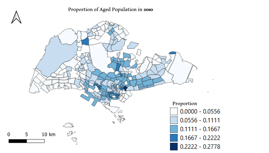
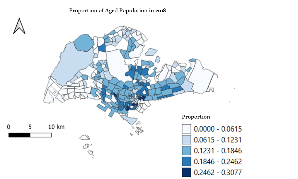
2. Proportion of Aged Population in 2010 and 2018
- Source of Data: data.gov.sg (Master Plan 2014 Subzone Boundary (No Sea)), Department of Statistics Singapore (Singapore Residents by Planning Area/Subzone, Age Group and Sex, June 2000 - 2018 )
- Along with QGIS, Excel was used to form attribute tables needed for preparing the choropleth maps.
- For both the year 2010 and 2018, the total number of residents in each of the subzone was calculated. Then, the number of aged population (Ages 65+) was divided by the total number of residents to get the proportion for each of the subzone.
- Darker the shade of the filled subzone, the higher the proportion of the aged population of ages 65+.
3. Percentage Change of Aged Population between 2010 and 2018
- Source of Data: data.gov.sg (Master Plan 2014 Subzone Boundary (No Sea)), Department of Statistics Singapore (Singapore Residents by Planning Area/Subzone, Age Group and Sex, June 2000 - 2018 )
- The following formula was used to calculate the percentage change:
Percentage Increase = (Total Number of Aged Population in 2018 - Total number of Aged Population in 2010) / Total Number of Aged Population in 2018
- Darker the shade of the filled subzone, the bigger the percentage change of Aged Population between 2010 and 2018.
- Labels were added, up to 1 decimal place, for each region for a clearer visualisation of percentage change of Aged Population for each subzone.
- From the map we are able to see that overall in Singapore, there has been an increase in the aged population and in certain subzones the increase is more significant than others.