SMT201 AY2019-20T1 EX1 Kim Chang Heon
Part One: Thematic Mapping
Thematic Mapping of Public Education Institutions by School Types
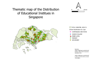
As the classification data of each school was discrete in nature, categorized symbology was used to visualise the distribution of public educational institutes. For each category of educational institutes, different symbols and colours were used such that they could be easily told apart from each other. Some python code was used in order to geocode the educational institutes onto QGIS as only their ZIP codes were provided in the dataset.
Subzone data provided by data.gov.sg was used as the backdrop such that the reader would be able see the distribution of schools across Singapore.
Thematic Mapping of the Hierarchy of Roads
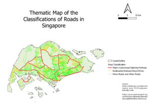
An assumption used was that the road prefixes were indicators of hierarchy, as road classification data was not directly available. By calculating a new field on the attribute table of the road data layer found on data.gov.sg, each road was assigned one of 3 groups. Based on this grouping, categorized symbology was used to visualise the hierarchy.
From this, roads were given different colouring and thickness based on their hierarchy, with expressways and highways being the thickest. This was done to show the branching out of each group of roads from the group of roads that are higher in hierarchy.
Thematic Mapping of the Distributino of Landuse in Singapore
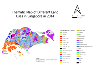
Data provided was discrete in nature, so categorized symbology where different uses of land had different colours were used. Depending on the land use functions and appearances, different groups of colours were used. For example, parks and agriculture were assigned green, while business and commercial land uses were assigned red and orange. Transport and utility functions were assigned shades of yellow, while residential areas were given light and white-ish blue shades. This type of grouping where similar functions are of different shades of the same colour allows the map to visualise how different areas of Singapore are being used.
Part Two: Choropleth Mapping
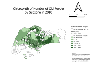
5 main groupings of the numbers plus 1 more grouping for subzones in which data was not available (labelled white) were used as too many groupings would result in too many shades of the same colour that is difficult to differentiate. From the dataset of demographics grouped by subzone and gender, I cleaned the file and used Excel’s “Replace” function to replace all the dashes with 0s for the cells with no data as QGIS was importing columns as a text field when it was imported. I then exported the sheet containing data for 2010 and 2018 in separate .csv files and added them into geopackage. I then joined the data with the 2014 subzone layer data and calculated the new fields required before adding into the geopackage and then adding a .qgs file to work from.
Elderly (+65) in 2010 and 2018
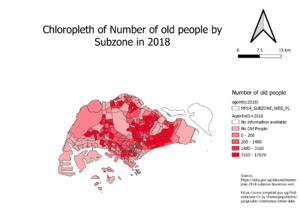
For the 2 choropleths of the number of old people by subzone in 2010 and 2018, quantile (equal count) classification was used, due to the high number of outliers resulting in a right skew. This means more variation in colours in the map, thus being a better mode of classification in order to show the distribution. I calculated the total number of old people (age 65+) using the field calculator to sum up the fields of age groups above 65 years old and labelled them Old2010 and Old2018. From the 2 maps, we can see that there is a higher number of elderly people living in the Eastern and North-Eastern parts of Singapore. There are lesser elderly people living in the central part of Singapore, and no elderly at all in the industrial Western and Eastern parts and the Central Water Catchment.
Proportion of Elderly in 2010 and 2018
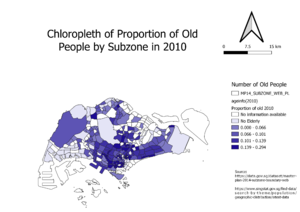
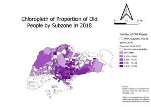
Quantile (equal count) classification was used for the 2 choropleths of the proportions of old people by subzone in 2010 and 2018 as it was the method which produced the largest number of variation in the colouring of the subzones, allowing for a clearer visualisation of the proportion. Using the Old2010 and Old2018 fields, I divided those fields with the field for the total number of people in each subzone to calculate PropOld10 and PropOld18 to derive the choropleths. There is the highest proportion of elderly people in the central part of Singapore, while the industrial areas in the West and the East have no elderly due to the fact that there is no one residing in those subzones.
% Change of Elderly between 2010 and 2018
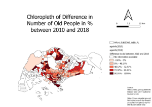
For the choropleth of difference in % of old people by subzone between 2010 and 2018, quantile (equal count) was used again due the left skew, resulting in more variation in colours and a clearer visualisation of the distribution. A little bit of modification was done, such that the subzones with a negative % change were classified into a separate grouping. I used the formula (Old2018-Old2010)/Old2010 to arrive at the % change in old people. Only Western water catchment and Queenstown had a decrease in %change while Sentosa, the Northern and Western parts had a large % increase.
