SMT201 AY2019-20T1 EX1 Erika Aldisa Gunawan
Part 1: Thematic Mapping
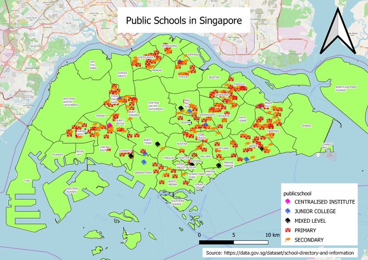
1. Using school information from data.gov.sg, prepare a thematic map showing the distribution of public education institution by school types
I used SVG Marker to differentiate the levels of public education institutions in Singapore to facilitate easier observation. I also try to not use too many SVG marker icon and have the same icon for Centralized Institute, Junior College and Mixed Level because I find it easier to look at. Strong colours of the icon in contrast to the light background also make it easier to spot the schools.
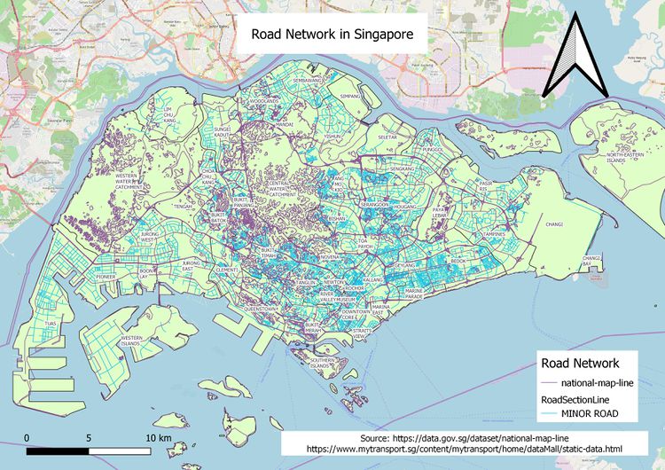
2. Using road GIS data of LTA, prepare a thematic map showing the hierarchy of road network system of Singapore such as expressway, major road, minor road, etc.
The map above uses data from 2 different sources. The expressways and major roads are extracted from the National Map Line data from Data.gov because the description says so. While the minor roads are extracted from the other data, Road Section Line from SLA Data. Since minor roads data is not included in National Map Line, we can combine/join the 2 attribute tables and the null data will be the minor roads. Thus, I added one more column to the attribute table to categorize the data into minor roads and others so that we can use Categorized feature in Symbology to show the minor roads only. I also add another column to categorize between expressway and major road and do the same for symbology. With everything combined, the map shows the road hierarchy network of Singapore.
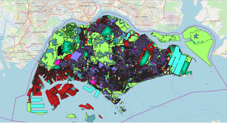
3. Using master plan landuse GIS data from data.gov.sg, prepare a thematic map showing 2014 Master Plan Landuse
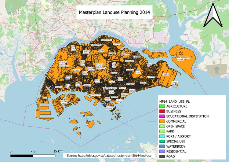
The reason why I have 2 maps is that the original land use planning map (2nd picture) takes too long to render when I try to print layout, so I saved the file into a shapefile and simplified it into 8 pixels instead of 1 pixel. Please refer to the 2nd picture for the actual map. For similar attributes such as Business 1 and Business 2, I chose the same colour for similar attributes to get more insights from my map. From the map above, we can see businesses crowding the west area while residential areas cover the central and east area. You can also clearly see Tuas and Changi Airport as one colour on both ends of the map.
Part 2: Choropleth Mapping
1. Using planning subzone GIS data from data.gov.sg and Singapore residents by age group and gender, prepare the following choropleth maps:
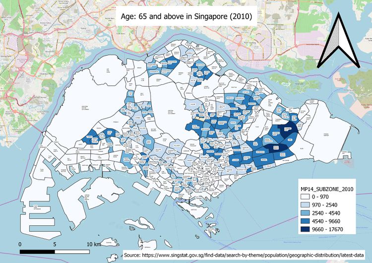
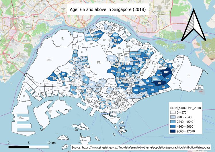
- Aged population (+65) in 2010 and 2018
The map above shows that the Aged Population in 2010 is mainly concentrated on the east, highest in Bedok Area and some lower numbers in Bukit Batok and Bukit Timah Area. Populated areas are still accessible and a fair distance from the central area.
I created a new column in the attribute table for Age 65+ by using expressions to add the relevant values. I use the newly calculated column for symbology.
The map above shows that the Aged Population in 2018 is mainly concentrated on the east, highest still in Bedok Area. I use the newly added column of Age 65+ in the attribute table for symbology.
- Proportional of aged population in 2010 and 2018
From the map above, we can see that a big part of central area, east area, north eastern area and western catchment area have approximately ~10%-20% aged population dwelling in those areas.
I added the Age 65+ value and divide it with the total population of each subzone to get the percentage of aged population.
From the 2018 data, one subzone area stands out with high percentage, so this makes the colours of the zone paler compared to map of proportion of aged population in 2010. Loyang west’s aged population is approximately 75% of its entire population.
I added the Age 65+ value and divide it with the total population of each subzone to get the percentage of aged population.
- Percentage change of aged population between 2010 and 2018
%Change = Difference of Aged Population between 2018 & 2010 / Aged Population of 2010
For 2010 Age 65+ data which is 0, %Change would be infinity so I used an IF condition whereby if 2010 Age 65+ is equal to 0, %Change would be difference divided by 1. However, if 2010 Age 65+ data is null, this would greatly exaggerate the difference hence the %Change, explaining the 716000%.
The more prominent areas with significant change are Hougang area, Rivervale, Kovan, Anchorvale and Yuhua.
- Explain the reasoning behind your classification choices, how you derived the new variables and handled missing values, and any other relevant judgments and assumptions.
For part 1, the maps are mostly classified using Category feature in Symbology because of the different inherent nature and use of the attributes and since we are not concerned about the numerical value here. I did not have to handle any missing data for part .
For Part 2, the maps are all classified using the Graduated feature in Symbology because we want to see the enumeration of the subzones area for comparison. Also depending on the visibility of values comparison (colours), I would interchange between using Equal Interval and Natural Breaks to divide the values range. This is important because some areas would appear blank if their values are not inside the range. There are some null values here and there which would mess with the calculation of new values so I replace null values with 0 by toggling the attribute table.
Overall, I learnt to always check your data first before manipulating it because we might end up changing the value of our data. Also, I learnt how to better make use of the plugins in QGIS such as Group stats which may be useful in the future. I spent a lot of time trying to find my files and checking data so I think it’s really good to be organized and to know your data before you play with it.
