From Geospatial Analytics for Urban Planning
Jump to navigation
Jump to search
Part 1: Thematic Mapping
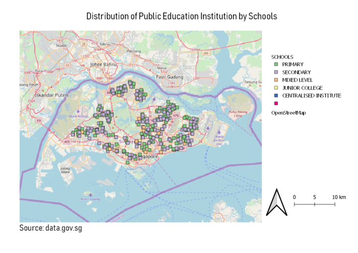
Distribution of Public Education Institution by Schools
- Different colors were used to represent the different levels of institution on the map. Squares were used as symbols as it stood out more from the map, allowing for better visualization. OpenStreetMap was also employed to allow users better understand the distribution and locations of these public institution across Singapore.
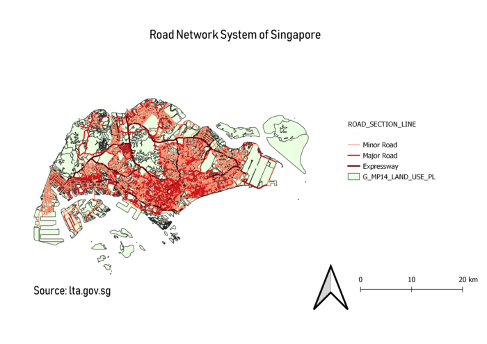
Road Network of Singapore
- Different shades of a color as well as different thickness of lines were used to represent the different types of roads on the map. The combination of different shades and thickness, as compared to different colors, allows for more intuitive visualization of the different types of roads (thicker and darker lines for expressway etc.). The background (MP14_LAND_USE layer) is also in a color that presents a contrast to the colors of the lines for clearer visualization.
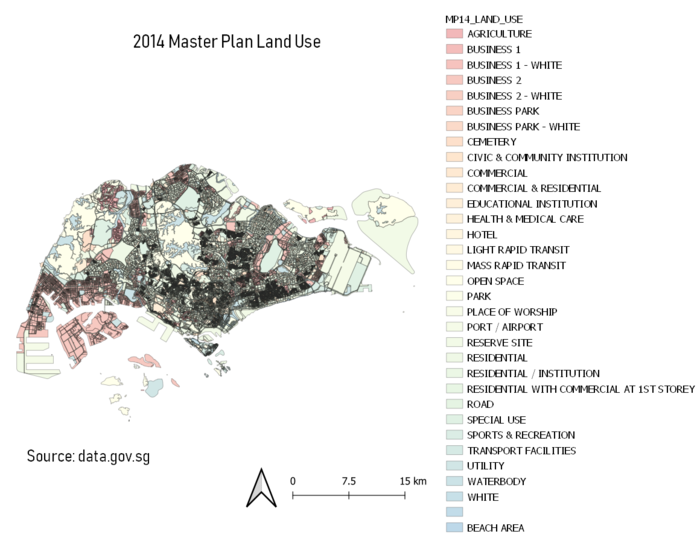
2014 Master Plan Landuse
- The map was divided into the various purposes and uses for that particular piece of land. To reflect that, different colors and shaded was used. As the map was divided into many sections, the color used was analogous so that it is more visually pleasing and comfortable for the user.
Part 2: Choropleth Mapping
Aged Population (+65) in 2010 and 2018
- From the above two choropleth maps, we can see that the distribution of aged population in Singapore have been rather similar and constant over the 8 years. It is apparent that the aged population generally resides in the East, and specifically Tampines East and Bedok North having the highest population of the aged in Singapore.
Proportional of Aged Population in 2010 and 2018
- However, when it comes to the proportion of the aged population, we have rather different results. In 2010, Mandai have the highest proportion of aged population and in 2018, Pasir Ris Park holds the highest proportion of aged population in Singapore. Furthermore, in 2018, there are more areas with moderate to high proportion of aged population as compared to 2010. This perhaps coincides with the fact that Singapore have a growing aging population over the past years.
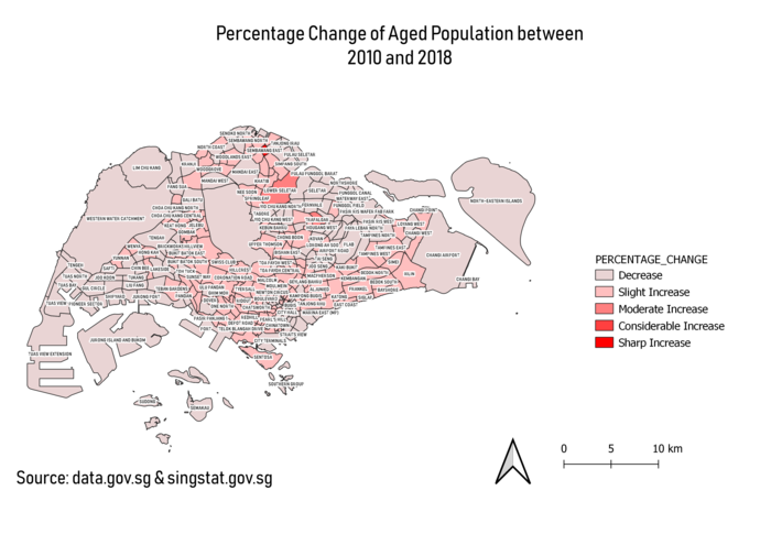
Percentage Change of Aged Population between 2010 and 2018
- Lastly, the between 2010 and 2018, most areas are seen to have an increase in the aged population. On first look, it looks like majority parts of Singapore have a decrease in the aged population. However, upon closer analysis, many of these areas are non-residential areas (e.g. water catchment areas, Jurong Island, North-Eastern Islands etc.), which thus explains for the decrease or negligible change in the aged population.
- To derive these maps, new calculated fields were added to the attribute tables:
| To derive: |
New calculated fields:
|
| Distribution of Aged Population |
Sum of Age65-69, Age70-74, Age75-79, Age80-85, Age85 and above
|
| Proportion of Aged Population |
(Sum of Age65-69, Age70-74, Age75-79, Age80-85, Age85 and above) / Sum of all age group
|
| Percentage Change of Aged Population between 2010 and 2018 |
{[(Sum of Age65-69, Age70-74, Age75-79, Age80-85, Age85 and above of 2018) – (Sum of Age65-69, Age70-74, Age75-79, Age80-85, Age85 and above of 2010)] / (Sum of Age65-69, Age70-74, Age75-79, Age80-85, Age85 and above of 2010)} * 100
|
Relevant Judgement and Assumptions
- Missing values was replaced by 0 (int).
- According to the data taken from singstat.gov.sg, the figures have been rounded to the nearest 10, and hence data might not add up due to rounding.
- Data of Singapore residents in 2010 and 2018 was based on URA’s Master Plan 2008 and 2014 respectively. Choropleth map of Percentage Change of Aged Population between 2010 and 2018 was however, made based on Master Plan 2014 and hence subject to discrepancy.